August 16th, 2008

sarah-schneider-sarahaerial.jpg

Asemic Scapes – Rehabilitation Center Rainberg is concept for a medical rehabilitation centre in the Austrian Alps designed by architecture gradute Sarah Schneider.

sarah-schneider-rend3.jpg

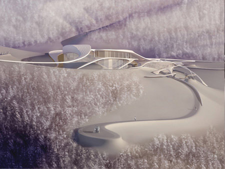
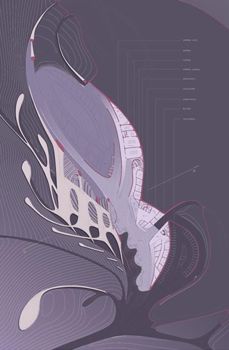
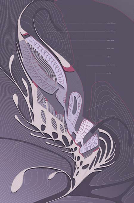
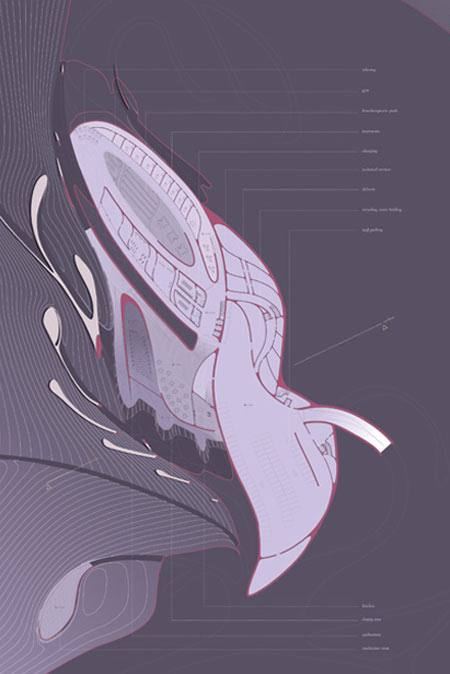
Designed to accommodate 50 patients, it features balconies overlooking the mountains and raised walkways running through the surrounding forests.

sarah-schneider-sarahinteri.jpg

Schneider is a recent graduate of Studio Lynn, an architecture course run by American architect Greg Lynn at the University of Applied Arts in Vienna. Asemic Scapes was her Diploma project.

sarah-schneider-rend1.jpg

The following is from Sarah Schneider:

Asemic Scapes – Rehabilitation Center Rainberg

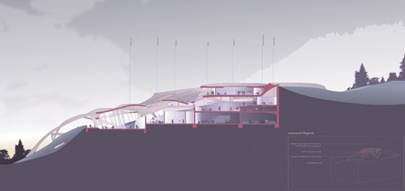
This project is a conceptual design for a rehabilitation center for trauma and post surgery patients with a capacity of 50 beds in the Austrian Alps, in Vorarlberg.

sarah-schneider-mod2.jpg

In general rehab centers like their predecessors the sanatoriums of the 19th and 20th century are based on a dualistic set of values: they embody the belief in the healing power of technology and the healing power of nature, which is why they are mostly situated in prestine landscapes.

sarah-schneider-mod3.jpg

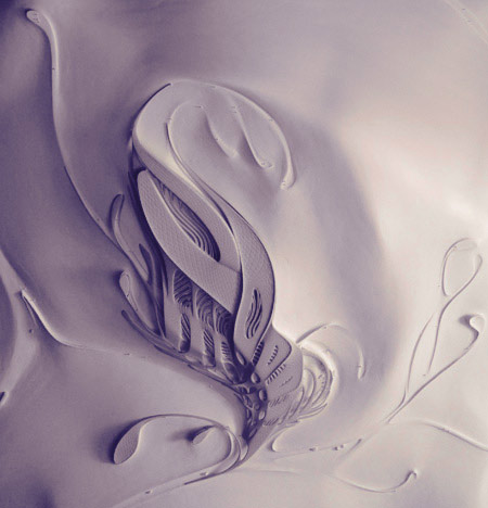
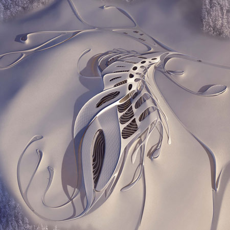
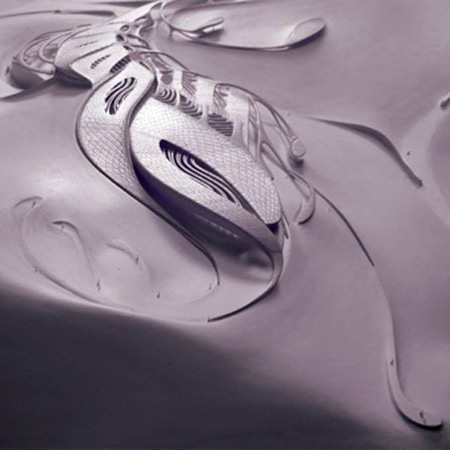
Therefore my attempt was to develop a contemporary relationship to the landscape based on calligraphic ornamentation.

sarah-schneider-lasersinter.jpg

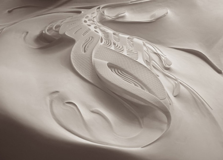
Calligraphy is adding an idea of creating variation through artistic expression to a technical matter of communication and is connected to ornamentation which generally uses natural motifs and often rules of natural growth.

sarah-schneider-diplommodel.jpg

The project develops an architecture that uses rules of natural growth and connects both growth and ornament, with a landscape environment, topologically and calligraphically.

sarah-schneider-sarahsectio.jpg

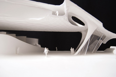
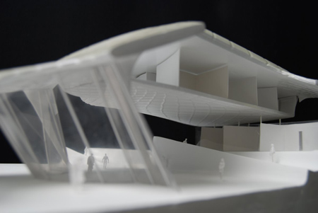
The ornament creates a symbiotic relationship with the existing environment by framing existing topographic features and at the same time giving a feedback to the landscape by creating topographical irregularities.

sarah-schneider-mod1.jpg

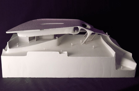
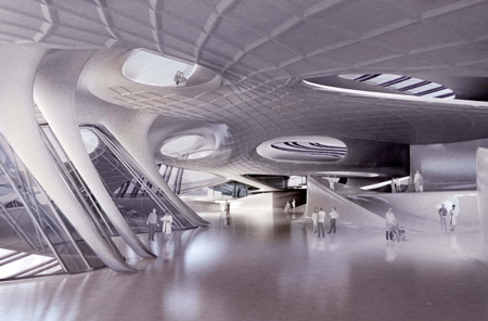
In the landscape the ornament starts to organize the ground by subtle terracing and it creates paths that break the clear definition of an indoor ñ outdoor boundary by running through the building, widening up to create bigger platforms and shrinking back to paths when leaving the building again.

sarah-schneider-dsc_0179.jpg

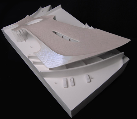
This ornamented landscape topography develops the roof structure transforming from a plan calligraphy into a complex volumetric condition of overlay and envelope.

sarah-schneider-diplomplots-7.jpg

sarah-schneider-gl.jpg

sarah-schneider-og.jpg

sarah-schneider-ug.jpg


Posted by Rob Ong

78 Responses to “Asemic Scapes by Sarah Schneider”

  1. leopoldo Says:

    schön !!!!!!!!!!!! congratulations!!!!!!!!!!!! Great work

  2. Lise Says:

    Wow! Gorgeous! I especially love the look of those raised walkways covered in snow.

  3. Azeem Says:

    Its beautifull!!!!!!!.
    But just 50 beds ?! The scale of the project seems much more Bigger??

  4. jarmo k Says:

    wowza. this is zaha gone crazy… zahart nouveau… so, as it’s just a graduate work, there will be no chance of this thing getting built? [would be too expensive anyway...]

    nb! large scale renders on schneider’s homepage!!

  5. gaque Says:

    but when you look at the section…its the same old floor ontop of floor ontop of floor.

    like zaha’s approach, this is graphic/visual. the best “view” is from the top–when you look at it from the side, it has no interesting composition.

    its one thing to be inspired by calligraphy, its another to implant extruded letter forms into a building plan.

    although not impressive, its a sexy plan–in a strictly naive architect-trying-to-be-artist kind of way.

  6. tiago Says:

    wannabe zaha.

  7. DJ Says:

    Sarah is sooooo hot!

  8. tommi Says:

    really good work!

  9. nomad Says:

    give the girl a break. trying to do a thesis whether its two semesters or a semester is a tough task for an individual. Yes she could have expanded on her idea and incorporated the calligraphy into the guts of the building. That is why this is a thesis, you can learn and build upon the ideas and techniques you were developing. These sites have poor criticism instead of posting insight. With that being said, I would love to see how this idea of calligraphy could have been executed in the rooms where the patients reside. Remember that patients are bed ridden alot of the times, so Alvar Alto should have been a source of research and inspiration. Do not worry about these negative posts, just build from your shortcomings in every project. Regardless of how successful one is, there were always be some form of shortcoming to learn from

  10. valthewu Says:

    Hey Sarah!
    great!

    Bin begeistert! Geile Arbeit! Und auf Dezeen!
    Nicht schlecht!

    lg val

  11. Ehsan Says:

    I like this approach to landscape design…for me, this project is mostly a beautiful landscape with some newStyle interiors…
    great work sarah…

  12. gaque Says:

    sanitarium = technology + nature
    calligraphy = technology + nature
    sanitarium = calligraphy

    does nobody else find this connection disappointing?

  13. edward Says:

    Ms Schneider posses a formidable talent as an artist. But looking at the plans I have to wonder how much of the effort was in a study of program requirements as opposed to developing the 3 dimensional fantasy of the design. Looking at the link to the school, I expect it wasn’t given a high priority. It’s an amazing bit of work that would look right at home on the planet Mongo.

  14. SC.... Says:

    Hi, Sarah!
    Great to see that your work has been posted here…. I think the project is very impressive, particularly considering the time restraint that you’ve had to accomplish such work; I would urge the critics to post [their] solo thesis that also encompassed a time period of 5 months for critique and see how they do……. :)

    LG, Die AK Wien

  15. Mario Says:

    people keep on melting stuff, …just trying to make it look good!!!!

    good renderings tough!!!

  16. m_nesia Says:

    sexy

  17. atomant Says:

    I don’t wanna sound negative or not supportive or w/e but I raelly goota tell that the first thing that came into my mind before clicking the read more link was zaha. Not zaha hadid or hadid, just “zaha”.

  18. Vico Says:

    It’s great to see graduate work on this site, there have been some interesting projects posted lately. I recently completed my graduate project too so I feel authorised to comment here. Sarah’s project is extraordinarily well visualised and modeled, both virtually and physically. She is obviously a top talent.

    However I think that ambitious young designers striving to emulate the style of professional proposals – published frequently on this and other websites – are selling themselves short. The pervading digital language of fluidity, surface topographies and distorted patterns has made much of contemporary architecture boringly similar and devoid of personality.

    There is no future for this form other than redundancy.

  19. Andrew Says:

    Interesthing idea, but I dun understand why Caligraphy as what Gaque said, and secondly i think Sarah does not fully develop and intergrate her idea in her Section, or else it would be awesome.

  20. zuy Says:

    it’s nice, great but it’s the lines and shapes of Zarah Hadid…
    I hope to see a Zarah School of design and architecture or a master class on BBC 2!!!

  21. zuy Says:

    @ wowza.I like your naming “zahart nouveau” including the following designers , architectes and artists….Amanda Levete….

  22. zuy Says:

    ….Brodie NEIL

  23. mama40 Says:

    zaha schneider

  24. Haarblicher Says:

    How did the plan evolve ? – from an extruded calligriphic doodle. Sadly misguided.

  25. MIRTEC Says:

    very nice and inspiring project… as stated before, the section could have been more exciting, but apart from that I feel much potential in this project… keep on exploring Sarah, and don’t forget to kill your idols while doing that ;-)

  26. mon Says:

    fdaf

  27. andi Says:

    why caligraphy?

  28. john ruder Says:

    It’s interesting how some human beings tend to be muddling around. Is this the real quality of architecture? The patients in rehabilitation for trauma will live in a constant pseudo-vegetative surgery, a reflection on how insane our world goes.

  29. bald skull Says:

    i think all this eye candy design overshadows the whole purpose of what this building is supposed to do : a medical rehabilitation centre that accommodates 50 patients (ONLY 50? in the alps?).

    all of this design is fluff if at the end of the day there isn’t any new benefit to the patients housed there. was there any research done to develop rooms that cater better to patients and their ailment? how about NOT using the color white throughout, the most sterile color to use for a hospital.

    this project is just a macro view of a space and maya renderings. might as well be helipad for the wealthy. what’s the advantage of this space vs the current state of hospitals found around the world? i don’t see this solving any of the real issues that a thesis should for a a medical rehabilitation centre of the future.

  30. Thiefsie Says:

    I like it, and I dislike most of Zaha’s work.

    At least she admits artistic expression as opposed to codified rulebase building!

    Would be crazy to see that thing built in the alps somewhere

  31. yimyim Says:

    this project somehow embodies everything that i believe is going wrong with architecture today. Instead of being a rigorous study of relationships of space, program, use and ultimately concerned with bettering the human condition, its concerned with a nice image or rendering that will ’sell’ it, and have a client asking for public building #62, like #14. The concept simply defines a form instead of the way the building will be experienced or work. Its superficial and what im coining adver-tecture, meaning .advertising architecture. and our industry is being destroyed by it!

  32. JB Says:

    over designed!

  33. Bozo Says:

    It’s the language of digital design process, not Zaha. You going to call every box a Richard Meier

  34. michael Says:

    I would like to encourage Sarah to keep up the good work. I myself am a recent graduate and interested in all kinds of formal experiments. Here though i have a thought…this is supposed to be an ENVIRONMENT for the traumatized patients. I wonder if such patients need such a para-normal space. Humans are not yet used to live in cavernous open spaces, specially not patients. I would suggest that patients need first of all NORMAL spaces. But the spatial potential of this design is for sure not in it being a clinic. but i like to think of it as a spa or wellness, maybe even as an attraction park…
    the second thought is that those kind of shapes are nice to look at on screen but what is the SPACE developed within it and around it. Architecture is first and all about that. Take the lesson, i did, it helped me get way more skeptical towards this branch of computer aided design.
    What Mrs Hadid does in her design is most of the time not so convincing…. why? because she has to deal with reality of construction and spatial needs. so her most beautiful shapes are those which are without function and in the realm of art!

  35. mamaa Says:

    art nouveau + zaha?

  36. Ethem Says:

    Sarah Hadid ?

  37. Oxotnic.gr Says:

    Since when has graphic design been identified with architecture? The best intention, I’m just really really curius.

  38. White Paper Says:

    I can only see a talent in Maya modelling and v-ray rendering…from the design point of view I find it quite superficial and self-referential (Lynn). It’s a real shame ‘cose obviously spending too much time with Prof. Lynn students get completely detached from real architectural issues and isolate themselves into the magic, soft, reassuring digital world. What is the difference between these students and Pixar’s animators…?
    Dreaming is necessary and going one step beyond what’s possible is compulsory BUT the awareness of materials and realistic building technologies should never be absent in students work. I don’t see any indication of how this project could be built or the poetry of materials and finishes….I was really hoping we did leave behind this reality-alienated digital crap of the mid-nineties…obviously not….

  39. Trukz Says:

    Sarah, great work and georgeous illustrations! Are u married?

  40. katarina Says:

    sarah’s work really puts one in perspective.. if I had just one 10th of her talent I’d be happy..tis truly amazing.

    some of you criticize the sections of being too basic but that is always going to be an issue while dealing with this kind of design- contrary to what you say I think this brings the proposal to another level where it becomes realistic & it is evident that it actually could work. the somewhat “boring” sections are probably just the result of studying the brief & making spatial decisions according to use.

    sarah- I am truly looking forward to seeing more of your absolutely stunning work!

  41. Tp Says:

    Better than Zaha………

  42. ddd Says:

    Overkill!

    Just keep it plain and simple.

    Some professors would kill you in a school review for value engineering, some praise this. I think it’s too much, oversized, overkill.

  43. heath Says:

    i agree with gaque, i don’t see the connection with calligraphy. here, it seems to be used only as a means for formal expression, while instead, it should be explained in terms how the building is used, etc.

    with that said, this is nevertheless a very beautiful project, and i would love to see it built (which poses another problem…).

  44. rek Says:

    A mountaintop rehab centre with 50 beds? So this is for celebrities and the rich.

  45. kula Says:

    like a phoenix in ancient China

  46. ZAHA Says:

    Good copy job, you can work in my office but please bring your own laptop…and a bowl for storing the peanuts I will be paying you in..

  47. betuwill Says:

    dear white paper,..i assume you can only read black and white, but sometimes you should read between the lines. evaluating this project against reality is not what it is about….studio lynn is exploring possibilities beyond value engineering,…consiously neglecting certain constrains for the sake of a certain specialization,..in this way it is mies-ian,…this in my opinion is exactly where an academic environment should be heading for,…

  48. richard Says:

    waow it’s amaizing but yaou have not develope an individual styal it’s look laike zaha ’s pojects. however thanke you i appreciate your idea.

  49. jonathan@dailydesignspot Says:

    well.. first off as many above have said.. very zaha.. and to be honest.. i have seen a little much of it as of late… but in any event i think this is a very interesting proposal for a building… especially a hospital environment..
    as a therapist working in a hospital i think it would be wonderful to go to work here…. but with only 50 beds.. maybe it would be better off a rehab center for celbs to fund it? ha.

    best of luck!

    jonathan
    dailydesignspot.com

  50. joe Says:

    a dull derivative project. curvy and seductive doesnt mean accomplished. this is just unoriginal. it is nothing we have seen time and time again from every graduate of a digitally orientated studio. why give this particular project time on this blog.

  51. joe Says:

    correction- a dull derivative project. curvy and seductive doesnt mean accomplished. this is just unoriginal. it is nothing we HAVENT seen time and time again from every graduate of a digitally orientated studio. why give this particular project time on this blog.

  52. celine mondieu Says:

    Zaha Hadid on steroids.

  53. isobel Says:

    all you critics out there – can’t you just be positive about things? this is a graduate work – parts of it are amazing but i dont see enough credit given for it here. yeah sure its not perfect but whose work is? and who are you to tear it apart after reading a 100 word description of it?

    i keep reading the same thing all over this website – “zaha ripoff, zaha ripoff”- that is not what i call being critical, more than half of you are beating the same drum.

    nice work sarah, that interior perspective shot of the model is hott. i wish i could go there.

  54. ignacio Says:

    It´s just a shame that after all that effort in doing an incredible structure and volume you see those hideous clumsy plans. If she had spent some time trying to make the spaces more fluid in plan the result could have ben better…but anyway congratulations

  55. Kamil Says:

    These days architecture gets too much influenced by 3D software. There is not so much thaught given in this project hor to make rehab clinic nice and pleaseant space for patients.
    Another thing, 50 patients only? this kind of designs bacame veru fasionable at recent years, but this gona end soon, as it’s just too expensive.

  56. Brian Says:

    Dude,
    CONTEXT!!!!!!!!!!!!!!!!!!!!!!!!!!!!!!!!!!!!!!!!!!!!!!!!!!!!!!

    (I did love it from a visual standpoint though!)

  57. Dewhirst Says:

    Yes Victoria, there is gender in design.

  58. Mama Says:

    What exactly are “prestine landscapes”?

  59. ABER Says:

    AWESOME IN SHEETS AND IMAGES,possible to contruct?….plzzzzz consult ZAHAAAAAAAAA

  60. rech Says:

    good work on the graphics!but the whole state -of -art complex much suitable for a more arts kind of function ,maybe better off as a performance arts center or a convention center ,also an iconic structure much reflecting various laws of fluidity and all! but being a rehab center the design may be as simple as it may be to invoke more positive energy to enhance better recovery of the residents.
    i wonder how the functionality of the building will be..becos architecture is best appreciated when functionality goes in hand with the aesthetics..anyways a bit of more research will do more good…all the best!

  61. silicon m Says:

    The philosophy of sound never looked so good.
    I could just eat it.

    well done, bring on the loonies.

    They can only get better.

  62. Kubrick Says:

    hmmm…the Alps…the snow…the roof…muuuaaahaahaa

  63. Michael Jacobson Says:

    It’s nice to see asemic writing applied to architecture!

  64. Werd Says:

    Stunning, my dear, simply stunning.

  65. bauster Says:

    hey gaque,
    you are a disappointed gaque…

    it may not be your kind of work and style..
    show some of your things, then we’ll see.. maybe it’s chipperfield style wannabe..

    quoting whitepaper:
    “I was really hoping we did leave behind this reality-alienated digital crap of the mid-nineties…obviously not….”

    did I miss that? what should that have been then..
    man look around these projects are built now..

    and if so.. the question is: what does promote architecture? where do we take the necessary steps to put architecture some steps further these days.
    people ask yourself: do you drive the same looking cars than 20 or 30 years ago?? why not? development has to happen..
    and for the “only buildable league of crits”.
    unluckily you seem very depressed and bored of your own work…

    and one last thing you crits didn’t get: this is diploma work.done in 12 weeks…
    so shut up! whose diploma has been built? step forward!
    this is about genuity and progress..doesn’t have to be realistc.
    realism comes later, when we all start to work; and that pretty soon.
    architecture though can be more than only realistic; it’s an image aswell.

    big up sarah…

  66. justincase Says:

    for a minute there i thought it was a project of zahad hadid’s… i’ll bet she would hire her!

    what a fantastic piece of architecture. so organic, and pleasing to look at. it would also be nice to walk through those spaces…

    look at how many models she built! absolutely fantastic and expensive…

  67. mauro paparo filomarino Says:

    I think that this work is conceptual and rich memory of Zah………..

  68. Brittany Says:

    AMAZING!!! This is totally the architectural direction our generation is taking, whether a older (could I say ‘jealous’ because you can’t use maya/max/g.e?) who hide behind modernism and theory to hide the fact buildings have become very measurable …I disagree with everyone saying this is like Zaha, it is much more articulated. Beautifully imaginative, totally inspiring for young architecture students!

  69. glynn Says:

    beautiful, woof!

  70. nathalie Says:

    sarah its really a gd work…..wanted to ask about material (cover)and about maquette!!!what kind of material u used to do it?

  71. THIERRY Says:

    This is captivating and it’s obvious Sarah Schneider shows as much dexterity in digital representation as artistic and spatial awareness. I would encourage her to collaborate directly with professionals in the healing therapies and geology fields in order to feed the project.

    While the bird view and some interior views of this project show a symbiotic relationship with the landscape, the section shows a massive vertical cut into the site and one can wonder how this would affect the symbiotic continuity between architectural structure and natural support, not to mention water dam effect, and other phenomenons most of us ignore.

  72. uca Says:

    what program did you use? the renders look great! love what you did with the landscape.

  73. Douglas Alford Says:

    That is a wicked amazing program and design. Sarah’s work will be an inspiration to the future of architecture.

  74. Mardi Says:

    I think this would look amazing in desert sand dunes…beautiful!

  75. gx Says:

    the design is not THAT GOOD , but its good.there something lacking. this design is preety IF AND ONLY IF YOU WERE SITTING IN A BLOODY HELICOPTER VIEWING IT. after all, what you get in a human’s eye view is the elevation you see. yeah its a bit like a zaha wanna be design. go and find your own style.

  76. Mark Says:

    Modern art as it should be, alive and fun. This is better than Zaha. This has got past my dislike of modernism. It would also be good as a basis for a public building.

  77. Tamara Rebeka Says:

    Great work…

    Does anyone know what kind of material did she use for making that model?
    and what programs did she use?

    Thanks

  78. Douglas Alford Says:

    It just blows my mind that many would tear this project down as you have. This is the problem with architecture today. I truly believe that there is a real deep rooted psychological fear of these types of forms. Even more so architecture will never evolve if practitioners of architecture and those whom occupy architecture do not open up to new and innovative forms that are simply better for the state of mind and physical well being of humans.

Submit a comment

See our comments policy