Leonardo Glass Cube by 3Deluxe
Leonardo Glass Cube is a glass-fronted brand pavilion in Bad Driburg, Germany designed by 3Deluxe .
Designed for the Glaskoch Corporation and completed in May last year, the pavilion is used for informal meetings and corporate hospitality.
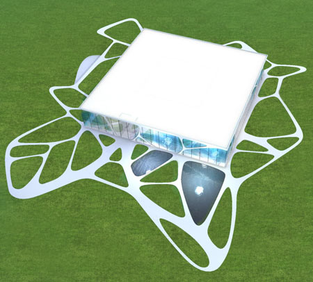
The pavilion features six metre high frame-less glass panels, fitted with disc springs to reduce stress from wind pressure.
The following is from 3Deluxe:
--
Leonardo Glass Cube – Exhibition pavilion with conference rooms
Having developed a number of temporary architectures and several virtual architectural concepts, the Leonardo Glass Cube is the first permanent building implemented by 3deluxe. The result of the interdisciplinary design process is an integrative concept that combines architecture, interior design, graphic design and landscape architecture into a complex aesthetic entity.
The grounds of the glaskoch corporation, which has been run by the founding family for five generations and distributes innovative high-grade glass and gift articles under the “Leonardo” brand name world-wide, now boast striking corporate architecture. Since the official inauguration on 24 May 2007 it now forms a central element in the brand’s overall communicative presence.
As an atmospheric brandworld, the Leonardo Glass Cube conveys to guests and the staff alike the company’s philosophy and visions in a stimulating manner. The open floor plan layout of the clearly designed and multi-functional Leonardo building enables an integrative linkage of product presentation zones, seminar and meeting rooms, inspiring work areas and a lot more besides across a total area of 1,200 square meters.
Unlike previous interior projects – mostly designed as self-contained experience spaces separated from the exterior and the architectural context – the interior of the Leonardo Glass Cube is closely interrelated to its surroundings. This aspect allows for a reinterpretation of one of 3deluxe’s essential leitmotifs: the staged overlaying of real and virtual elements with the intention of changing both the space and the observer’s patterns of perception.
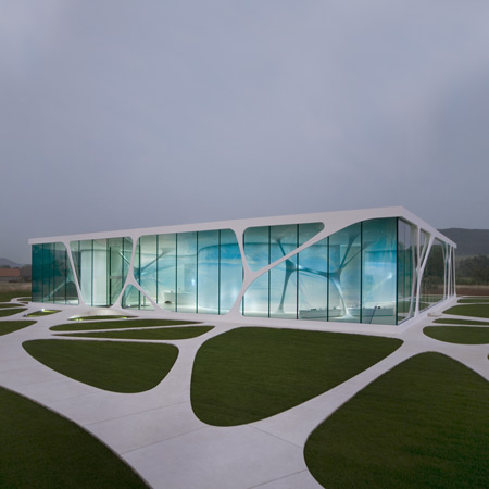
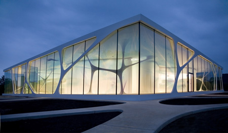
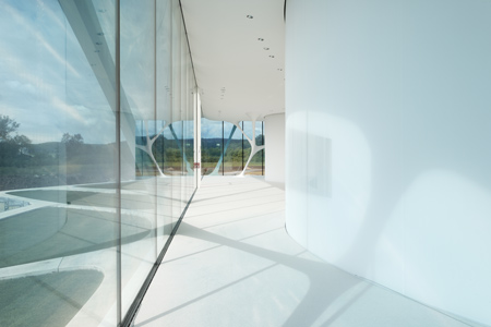
The glass façade of the building represents not only the interface between interior and exterior, but also the passage to a hyper-naturalistic world with heightened aesthetic appeal. A transparent print slides into the insight or outlook as a subtly visible image plane. The graphically illustrated elements displayed on it were derived from the architecture and the surrounding landscape. They create a subtle puzzle, mingling with the reflections of their models in reality.
This process of visual concentration creates a more intense impression of reality than the direct perception of real objects would allow. In addition, through changes of perspective and the incidence of light changing with daytime and seasons, a wide variety of appearances is made possible. They lend the building poetic quality – stories can be discovered, artificial landscapes explored.
The façade design not only entails references to the location and the materiality of the company’s products, but also highlights a key feature in the Leonardo brand philosophy: a modern, inspiring design that fires the imagination and enables people to constantly perceive and shape their environment anew.
By melding medium format images of 6 x 7 cm with computer visualizations of the interior the design devised by 3deluxe graphics brings together two media that are completely different in aesthetic and crafts terms: digitally generated pixel images and analog photography. The result: a pixel-perfect artwork sized 6 x 96 m with a resolution of 100 dpi (which involves an immense volume of data).
It was printed onto PVB foil in 48 segments that were then laminated onto the back of the glass in the interspace between the panes. Another special feature lies in the transparent quality of the print in both directions, rendering the conventional method of dot raster grids superfluous.
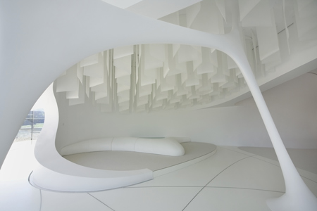
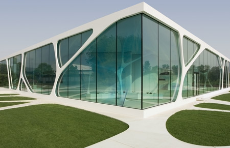
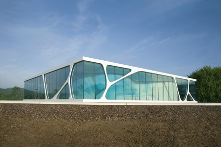
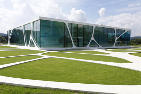
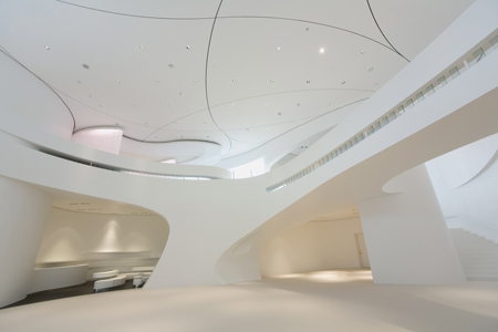
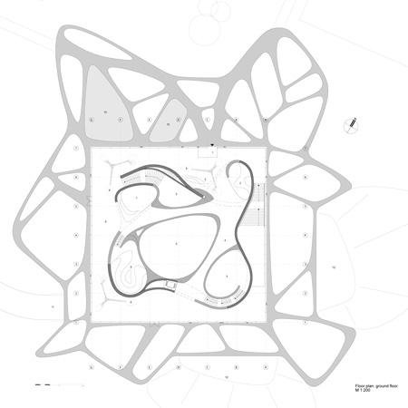
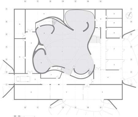
The technology, at present only available in the US, was used for the first time on such a large scale. The edificial structure consists essentially of two formally contrasting elements: A geometrically stringent, cube-like shell volume and a freeform positioned centrally in the interior. The undulating, curved white wall encases an introverted exhibition space and its other side circumscribes the extroverted hallway along the glass façade.
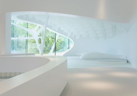
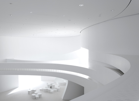
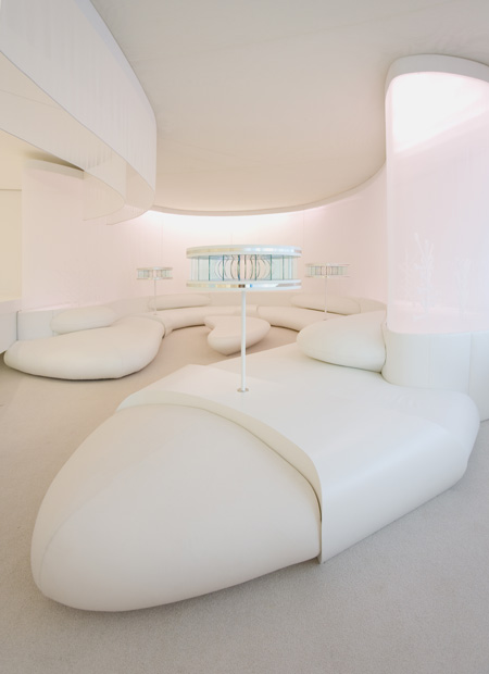
This “space within space” arrangement meets the usage requirement of an artificially-lit product presentation just as much as the high demands placed on it by those lingering in the building. The hallway, which is truly bathed in natural daylight, can be used for informal meetings and events as well as short breaks. As such it is fitted out for the most part with made-to-measure lounge furniture.
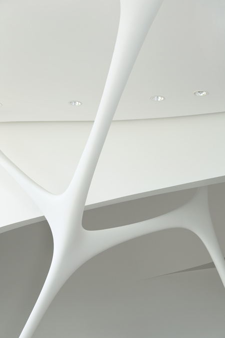
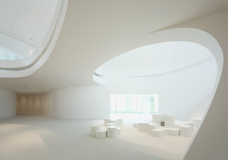
Three white sculptural structures, so-called ‘Genetics’, partly extend through openings in the curved wall and connect the separate zones of the building to each other again. The organic shape of the objects necessitated an elaborate construction method: Their surfaces are each composed of two deep-drawn semi-shells made of acrylic material, for the production of which original size models first had to be made. The substructure consists of a steel tubing, encased in a timber skeleton frame.
One of the ‘Genetics’ marks the access point to the lobby, which is set back from the façade inside the free form. The vertical pathways through the two-storey building generally proceed along the fluently formed boundary, in the centre of which a void crossed by bridges connects top floor and basement.
Entering the Glass Cube through the ground-floor main entrance, visitors encounter a space that opens up not just horizontally, but also upwards and downwards. The ground-floor bridge affords a generous view of the main exhibition area one storey below and provides an initial point of orientation in the edifice as a whole. On both floors the wall rolls in to form niches that are used for various functions such as themed product orchestrations and meeting lounges.
The structure of the free-form inner wall represents an innovation in dry construction: As the plasterboard panels of the outer layer can only be bent one-dimensionally, experiments were conducted that involved interlacing mutually curved panels in complex shapes. In particular in the breaks in the wall the resulting joint design predominates as a significant graphic design element.
In order to ensure that the wall realised corresponds precisely with the 3D computer model, the full length projections of the wall segments were divided into a dense grid of measurement points. On the side facing the façade, the material nature of the white surface is visually dissolved by means of a layer of gauze suspended in front. The natural daylight pouring in produces dazzling moire effects in the translucent fabric’s delicate texture, which in turn are reflected in the glass facade.
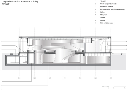
The fact that the curvature of the walls and floors is continued in the suspended ceiling in the form of a system of ventilation joints also required high precision with regard to planning and execution.
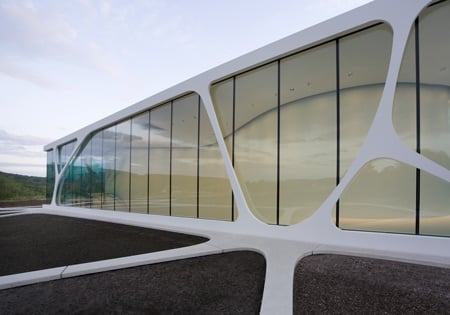
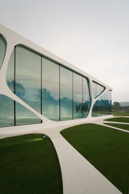
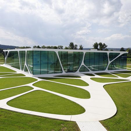
Every single one of the approximately 250 plasterboard panels that meet up with the joints was CNC milled, numbered and assembled using a laying plan and exact measurement points, before the interstices were filled with rectangular standard formats. So as to enable an almost unhindered view outside, the glass façade was constructed over a width of 36 meters without any pillars. In the joints of the six meter-high, frameless panes of laminated safety glass thin steel cables are suspended between floor and ceiling, disk springs counterbalance deformations caused by wind pressure. Nor was there any need for vertical supporting profiles on the corners of the building (façade planning: Schlaich Bergermann und Partner).
On the glass façade ‘Genetics’ appear again in the form of superimposed pilaster strips, which give the impression of a two-dimensional silhouette of the structure on the interior. Their ramifications are continued in a network of white concrete pathways that surrounds the entire building and lets it grow together with its location. An individual mould was made for each of the 187, approximately eight square meter elements. The areas between the paths are vegetated with lawn or sloped to illuminate the basement.
With its trailblazing corporate architecture, the Leonardo brand once again presents itself in a visionary manner – in keeping with its claim “inspiration for modern living“.