
Office for Metropolitan Architecture last week unveiled designs for a 24-storey residential tower in New York.

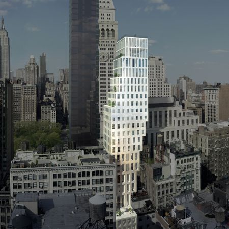
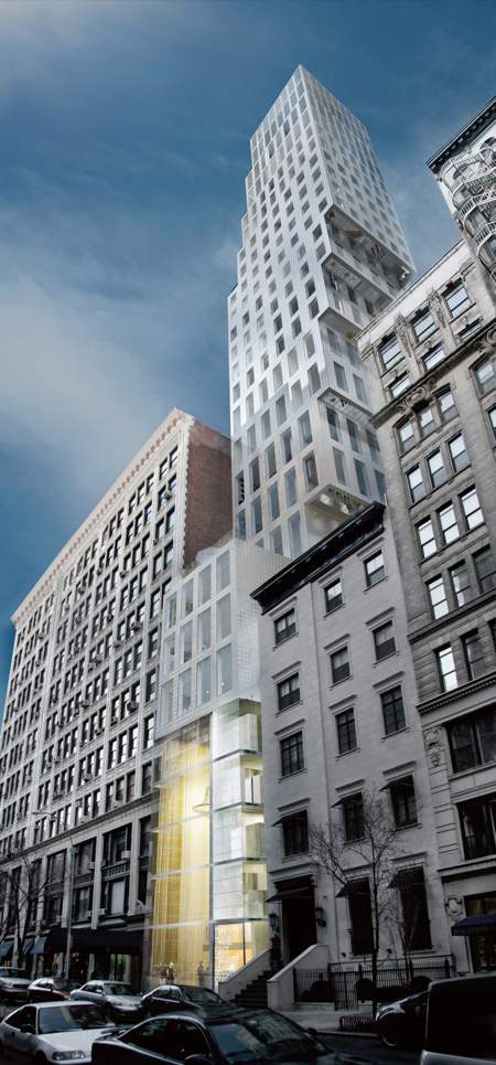
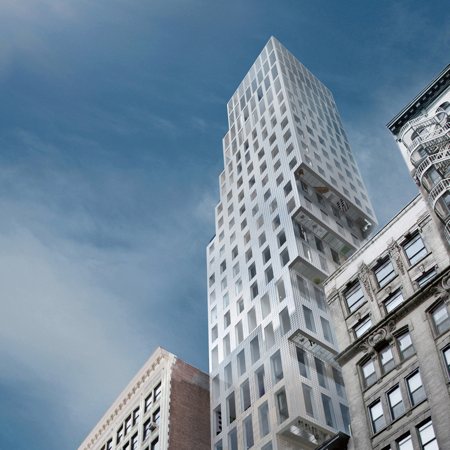
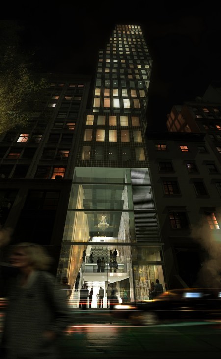
The 23 East 22nd Street tower cantilevers eastwards to provide views of Madison Square Park from the upper floors.

Here’s some info from OMA:
–
23 East 22nd Street Residential High-Rise in New York City
2008.09.11

(New York City, September 11, 2008) – Slazer Enterprises, developer of One Madison Park, in collaboration with the Office for Metropolitan Architecture (OMA) and Los Angeles based Creative Artists Agency (CAA) presents to the public today their design for a new luxury residential high-rise, 23 East 22nd Street, OMA’s first in New York City.

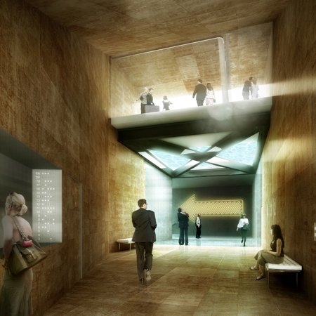
To be completed by OMA’s New York office, 23 East 22nd Street is located just off Madison Square Park in the ‘Flatiron district’. The building will include 18 residences within 24 residential floors. Amenities such as the Creative Artists Agency (CAA) Screening Room, main lobby, pool and gym, are also being designed by OMA, and will be shared with One Madison Park, a second residential tower located immediately adjacent on 23rd Street.

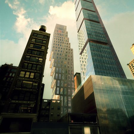
“We wanted to exploit the potential of the building’s scale—more modest than One Madison Park and other residential high-rises emerging in the area, yet larger than the surrounding neighborhood,” said OMA partner Shohei Shigematsu. “This mid-rise condition allows us to create an unusual degree of spatial and programmatic variety in the building,” he said.

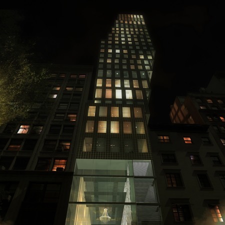
As it rises to a height of 355ft (107m), the OMA-designed tower stretches up and to the east gaining additional area as well as views of Madison Square Park as it cantilevers 30 feet over its neighbor.

“Mirroring the traditional New York setback, the building’s form is at once familiar and distinctive”, said OMA founder and partner Rem Koolhaas. “The form provides a number of unexpected moments that appear at each step – balconies at the upper part of the building and floor windows at the lower part—providing a variety of unit types and features throughout the building”, he said.

The building is scheduled for completion in 2010. The project is led by OMA partners Shohei Shigematsu and Rem Koolhaas in collaboration with project architect Jason Long.

–
Posted by Marcus Fairs


September 15th, 2008 at 6:20 pm
Wow!
It reminds me of every lego building I ever made - in a good way!
September 15th, 2008 at 6:27 pm
Very nice. It’s a heroic structural feat and the staggered floor plates create balconies, or more unexpectedly, downward views through the glass floors.
This same technique was employed by SANAA at the New Museum and will also be used by H & deM in their Leonard St. high rise. It’s quickly becoming the visual language of choice for taller NYC buildings. It also bears noting how superior these three projects are to Gehry’s proposal for the Atlantic Yards which is at once ostentatious and tired, and Tschumi’s banal blue wedge building.
September 15th, 2008 at 6:30 pm
i think dezeen ought to only show buildings when they are finished
these computer graphics mean nothing … they dont mean anything
September 15th, 2008 at 6:44 pm
Did they have to purchase the air rights over the building next door to do this?
September 15th, 2008 at 6:46 pm
Absolutely lovin’ it!!
September 15th, 2008 at 7:45 pm
mmmm….
September 15th, 2008 at 7:55 pm
Umm…Magna_Carta, I don’t know where you’ve been lately but whether one likes them or not, “these computer grahics” as you say, are laden with meaning and will likely be around for a while to come. Qualify them and critique them…ignoring them is useless.
September 15th, 2008 at 8:18 pm
love it!!!
September 15th, 2008 at 11:26 pm
Just tremendous.
September 15th, 2008 at 11:36 pm
CAN’T SEE, SO I’LL JUST PEEK AROUND THE OTHER TOWER
September 15th, 2008 at 11:39 pm
Innovative approach to high rise buildings in NYC. I’m wondering how the structural framework is designed. The windows don’t appear to be staggered as the floors go up. Any thoughts?
September 16th, 2008 at 12:01 am
I really think this is an interesting New York highrise. But to be honest, the first thing I thought was, “this is so much luxury…why aren’t the worlds greatest architects doing more humanitarian projects?”
September 16th, 2008 at 12:13 am
Splendid! I also like the way the grain of the openings is subtly tweaked up the building.
September 16th, 2008 at 12:59 am
awesome!
i was sad to see OMA’s cantilevered Whitney cancelled. Hopefully this cantilever will become a reality.
i really love how the window rhythm changes as you go up the building.
does anyone know what the cladding is? it kind of looks like ceramic tiles.
September 16th, 2008 at 1:50 am
HAHAHAHA!
oh what an honest answer to building codes.
with a little irony.
i love ‘em OMA people!
September 16th, 2008 at 3:05 am
no they didnt build into the other site, its in the same site, the base is like quarter of the site.
September 16th, 2008 at 4:59 am
Wow! this blows the Herzog tower out of the water! Looks like a birdsnest hangover. Rem’s is so much sweeter, such a clever riff on nyc. Feel sorry for the squashed Kapor.
September 16th, 2008 at 6:05 am
no más OMA, cada vez es peor.
September 16th, 2008 at 6:24 am
beautiful building
September 16th, 2008 at 6:48 am
hdm won this one easily
September 16th, 2008 at 10:01 am
You can see how fast a theme becomes fashion. Wonder what next years item will be. Maybe the financiel crisis on wallstreet becomes a metaphor. When pieces of building seems like falling of. Or collapsing
September 16th, 2008 at 10:35 am
deliriusss!!!!
September 16th, 2008 at 10:50 am
the neighbour??????? doesn’t the neighbour wana go higher perhaps in the future. cool structure and design, but i dun agree on the implementation
September 16th, 2008 at 12:08 pm
like it… no rational reason for liking this one but definitely like it very much by feelings… bit postpodern perhaps but with this rationalists/minimalist touch on the fassade patterns… would like to see a critic by kollhoff on this one…
September 16th, 2008 at 12:16 pm
what a lovely addition to the city. Madison Square Park is lovely, but is it lovely enough to cover the premiums imposed by such an elaborate structure? Guess some Bank somewhere thinks so…would love to know the financial plan.
September 16th, 2008 at 12:42 pm
I like the cantilever idea but I would have liked to see more of the structure exposed!
I love how the structure of builds like the birds nest and CCTV and the ‘water cube’ is allowed to dictate/influence the aesthetics and graphics of the facades. Why would you want to hide such innovative and clever structures!? With FEA and other analysis methods these beautiful structures are finally able to be realised. A real nod to simulation methods/computing power and a definite signature of the times and technology we currently live in/with.
The only hint of structure we have here is the reduction of window size at the centre of the building - presumably where reinforcements are most needed…
Fantastic job nonetheless!
September 16th, 2008 at 12:49 pm
Koolhaas’ has always been interested in the high-low contrast of simple forms and complex engineering. This is a riff on themes developed in the Bordeaux house and Casa Da Musica. What I find fascinating is how he is able to continuously uncover unusual spatial conditions and imagery. I think the question raised by gaque is presumptuous. Shouldn’t architects be allowed to choose their job like the rest of us? Humanitarian projects require a passion and commitment beyond the ideological.
Herzog & deMeuron designed a compelling stadium. But they seem like bewildered children trapped in a lolly store. What do I eat first? Do I eat it all at once? Koolhaas knows that a certain amount of childlike simplicity is required for true spectacle.
September 16th, 2008 at 1:01 pm
Simply amazing! It doesn’t make sense, but I love that! Never seen something similar…
September 16th, 2008 at 2:21 pm
Wooww Like it!!
September 16th, 2008 at 3:28 pm
Great design.
@Magna_Carta: like all architects/students know, renders are an important part of the design process and the communication to the outside world. Why not showing them? Because the reality will be different? So what.
September 16th, 2008 at 3:42 pm
Interesting, but this building does not cut, with its concept, rather confuse me!
September 16th, 2008 at 3:52 pm
How’s that legal?, does the developer owns the building next door?
September 16th, 2008 at 6:12 pm
I think it’s plain assholic.
September 16th, 2008 at 8:13 pm
which insurance company would insure that?
did the people next door moved out already?
September 16th, 2008 at 9:45 pm
its pretty amazing, the structure of it….. and overall - feeling of existing against the forces…..
September 16th, 2008 at 10:19 pm
I guess not every piece of architecture is a statement.
September 16th, 2008 at 10:24 pm
super cool - nyc trend perhaps? http://www.dezeen.com/2007/12/04/new-museum-by-sanaa-opens-in-new-york/ & http://bakednyc.com/page/cakes-and-treats/marshmallows/
September 17th, 2008 at 9:07 am
The overall theme is related with his competition entry for the townhall in the Hague. It was in the 80’s if I remember well. Using existing metropolitan language and distord it in a way. He is the stand-up comedian in the profession. But……..somehow it doesn’t make me laugh anymore
September 17th, 2008 at 11:50 am
Hmm.. a nice play structurally, but I have to wonder about the neighbours air rights (do they have those in the us?). Also, the glass floor to the appartments - I can see it now: old man in a raincoat with a pair of binoculars trained upwards!
September 18th, 2008 at 5:13 am
12. gaque Says:
September 16th, 2008 at 12:01 am
I really think this is an interesting New York highrise. But to be honest, the first thing I thought was, “this is so much luxury…why aren’t the worlds greatest architects doing more humanitarian projects?”
That’s easy question,,,’cause they’rent the world greatest architects
September 18th, 2008 at 5:45 am
wow! Rem is so great! but what happens with the aerial space of the neighbour??? it doesn’t exist?? ANIWAY… EXCELLENT!
September 18th, 2008 at 4:45 pm
like SANNA
September 18th, 2008 at 7:28 pm
it is like tetris game…
September 18th, 2008 at 9:03 pm
supernice!!!!!!!!!
September 19th, 2008 at 9:47 pm
nice corner solution with such a big arrow in the main hall… Ó_ò
September 20th, 2008 at 8:14 pm
HAAHAA! WHO NEEDS RAMUS???
September 22nd, 2008 at 4:11 pm
IThe cliet boght the air rights? Bu then yet again, why sway… This is too mild an architecture to be an OMA project…?
September 25th, 2008 at 2:41 pm
ok. the cantilever looks interesting, meaning, unseen. good.
the question would be what benefits do the inhabitants get from such a complex configuration considering the costs.
i believe kids in some third world countries would have more essential ideas what to do with the money. But that’s a bit off topic.
September 25th, 2008 at 7:17 pm
“Space and light and order. Those are the things that men need just as much as they need bread or a place to sleep.” -Le Corbusier
September 26th, 2008 at 9:56 am
that’s why i love OMA so much!
September 27th, 2008 at 12:51 pm
Kewl.
September 29th, 2008 at 8:55 am
hey Rem nothing more to do then spend your day of this forum and spam us with, loving its and awesomes? how about yeah some more blah blah formalism for you computer kids!
October 26th, 2008 at 1:19 am
This building is the poster child for the “Novelty Building” category. Gimmicky.