Home.Haus by J Mayer H and Sebastian Finckh
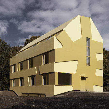
German architects J Mayer H and Sebastian Finckh have completed Home.Haus, a foster home for children and adolescents in Hamburg, Germany.
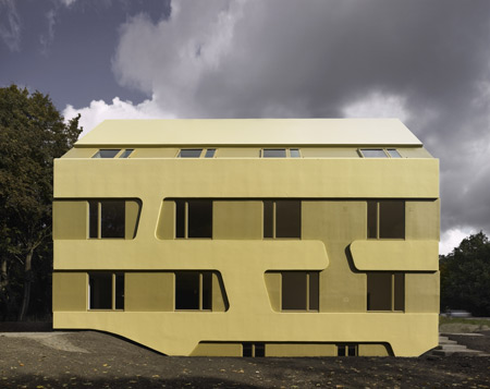
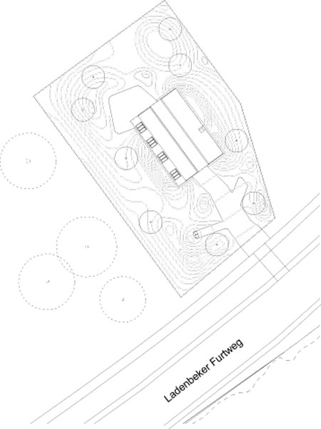
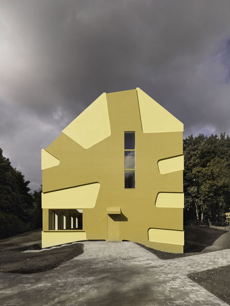
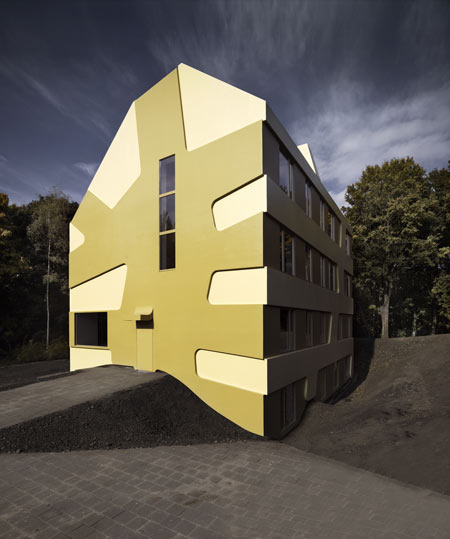
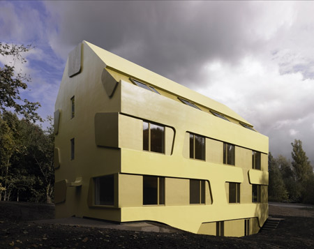
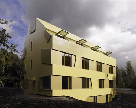
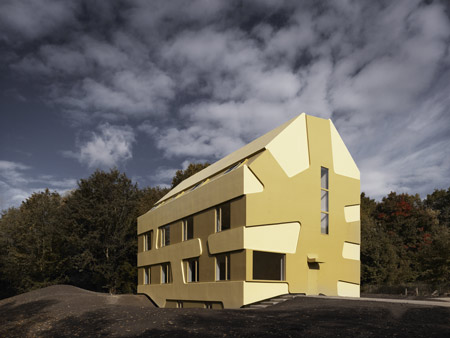
The building is located next to a forest and has facilities for twelve girls in a mixture of single and shared rooms.
The home includes a sports and music room. There is also a toddlers' room, kitchen and living room.
Photographs by Dirk Fellenberg.
The following information is from J Mayer H Architects:
--
Home.Haus - Home for Children and Adolescent
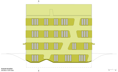
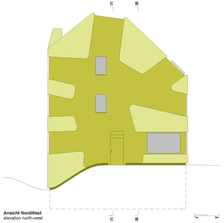
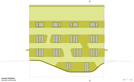
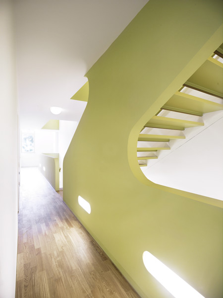
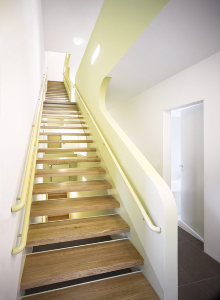
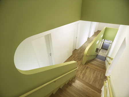
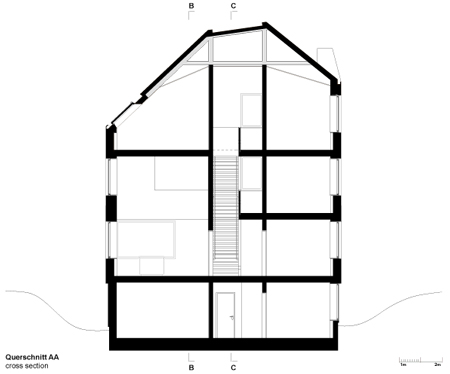
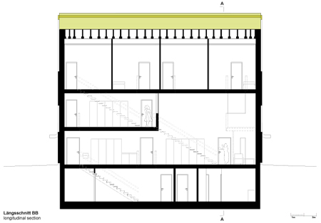
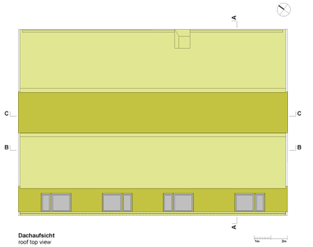
Located near the edge of the forest in Hamburg, a new residential building is now finished as a home for children and adolescents. The characteristics of the building are based on a two colour relief facade embracing a compact house volume. A central staircase penetrates the division between floors in favour of communication to create a central open space for the community.
J Mayer H Architects with Sebastian Finckh
Project Team: Juergen Mayer H, Sebastian Finckh (Project-Architect), Marcus Blum.
Location: Hamburg-Bergedorf, Germany
Project: 2007-2008
Completion: October 2008
Client: Stiftung “Unternehmer Helfen Kindern”, Vorstand: Andreas Barke
User: Städtischer “Landesbetrieb Erziehung und Berufsbildung” (LEB), Hamburg
Architect on Site: Arch 3, Dirk Reinisch, Berlin
Structural Engineers: WTM Engineers, Hamburg
Fire Protection: HAHN Consult, Hamburg
Building Services: Energiehaus Ingenieure, Hamburg
Landscape Architects: Breimann & Bruun, Hamburg
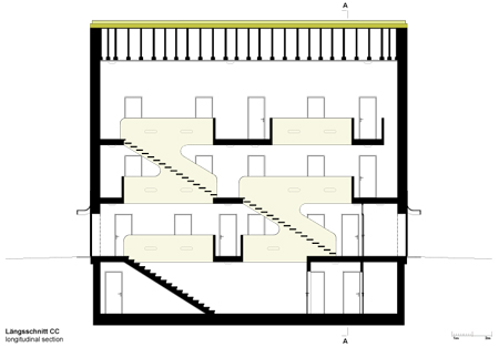
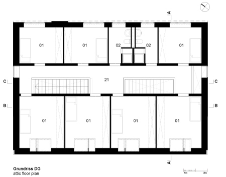
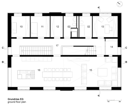
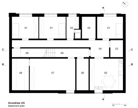
homehaus - layout key
01 - room
02 - bathroom
03 - technical service
04 - hallway
05 - eat-in kitchen
06 - washing and drying room
07 - sports and music room
08 - storage room
09 - basement staircase and hallway
10 - infant room
11 - attendance room
12 - larder
13 - office
14 - vestibule
15 - living zone
16 - kitchen and dining zone
17 - staircase ground floor
18 - emergency accomodation
19 - play and study room
20 - staircase upper floor
21 - staircase attic floor