
More from UNStudio: the Dutch architects have completed Star Place department store in Kaohsiung, Taiwan.

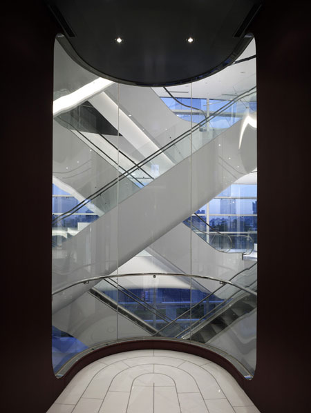
The structure centres around a 10-storey atrium, where each escalator spirals up to the next floor.

Called Ta Lee Plaza during development, the completed building has been renamed Star Place. More information about the project in our previous story.

Photographs by Christian Richters.

–
Posted by Rose Etherington


November 26th, 2008 at 2:20 am
I could read endless stories about UN Studio - keep ‘em coming! Their built works contain all the enjoyment put forth in the renderings. More than Zaha, UN Studio seems to be pushing forward a new working vocabulary in the world of architecture. Here’s hoping that all of their projects on the drawing boards become a reality.
November 26th, 2008 at 3:36 am
Wow, thats extravagant
November 26th, 2008 at 9:36 am
it really looks like in the renderings before!!!!!!!!!
great work ben!
November 26th, 2008 at 10:33 am
I really like the interior…well done!But the Facade looks kind of cheap…
November 26th, 2008 at 10:50 am
These guys are like the elegant version of Hadid. I love it. More.
November 26th, 2008 at 11:41 am
What does it look like during the daytime?
November 26th, 2008 at 12:05 pm
why should a building looks like a rendering?
November 26th, 2008 at 12:17 pm
Ben Van Berkle has consistantly displayed his wonderful design philosopy, he so readily showed off in his first publication with the architecture journal EL Croquis no 72[1] 1995, and this is no exception.
Just another serious cognitive notch in his glamourous belt of very credible achievments.
silicon m
November 26th, 2008 at 1:44 pm
Beautiful through inside and out. Wicked concept put to life.. Love the spiralling inside and great use of technology on the face..Lovely building in all..
November 26th, 2008 at 3:06 pm
why should a building looks like a rendering?
99 % of the buildings do not reach the quality of the renderings in the competitions!!!!!! UN Studio did it!!!!
November 26th, 2008 at 8:10 pm
what a question!!
November 27th, 2008 at 12:44 am
have to say UN Studio is getting better recently with elegant proposals, but for this specific project, can anybody explain a little more of what exactly is the “wicked design” and “pushing a new architectural working vocabulary” that is so “radically” different from contemporary commercial architecture design with a fancy (LED) facade?
November 28th, 2008 at 1:30 am
what is it with all the 70’s-looking curves, down to the shape of the elevator? and the LED’s.. which forms a star sign on the facade of the ‘Star Place’. it’s just too much.
tacky, that’s what it is.
ben should look back to the good ol’ days; mobius house and erasmus bridge - they were really something.
November 28th, 2008 at 1:27 pm
would be a nice casino, but not a really nice facade design for a department store
November 29th, 2008 at 4:58 pm
The lighting is a very east asian tradition in many respects, what may be considered ‘tacky’ by your conservative western sensibilities, is actually an interesting, animated and appropriate feature.
Oh, and this is contemporary commercial architecture, its just a little better sculpted than most because they have put in the time and effort to envisage and detail it. There aren’t too many commercial architects managing to incorporate a parametric twist in their built work.
December 27th, 2008 at 6:10 am
i have seen the building, i think they did a good job, the facade is pretty nice at both day and night.