December 18th, 2008

 library-and-learning-centre-at-the-university-of-economics-business-by-zaha-hadid-architects-squzha_library-learning-c.jpg

Zaha Hadid Architects have won a competition to design a library and learning centre for the University of Economics & Business in Vienna, Austria.

library-and-learning-centre-at-the-university-of-economics-business-by-zaha-hadid-architects-3zha_library-learning-cen.jpg

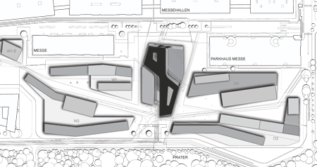
The 28,000 square metre building forms the central part of a new campus for the university.

library-and-learning-centre-at-the-university-of-economics-business-by-zaha-hadid-architects-2zha_library-learning-cen.jpg

The learning centre will include a library, tutorial rooms, administration offices, student centre, book shop, cafeteria, and event space.

library-and-learning-centre-at-the-university-of-economics-business-by-zaha-hadid-architects-zha_library-learning-cent.jpg

The project is due for completion in 2012.

Here’s some more information from Zaha Hadid Architects:

Zaha Hadid Architects wins competition for the Library and Learning Centre at the University of Economics & Business, Vienna, Austria

Zaha Hadid Architects have been selected as the architects of the Library and Learning Centre (LLC) at the University of Economics & Business, Vienna. The new Library and Learning Centre will be the centerpiece of the University’s new campus and provide a significant upgrade to the University’s services. In addition to the new library, the LLC will also provide a language laboratory, tutorial rooms, administration offices, student centre, book shop, cafeteria, clubrooms and event space.

library-and-learning-centre-at-the-university-of-economics-business-by-zaha-hadid-architects-10zha_library-learning-ce.gif

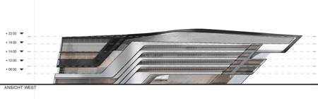
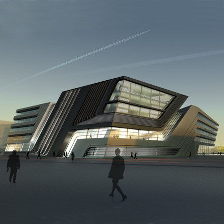
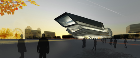
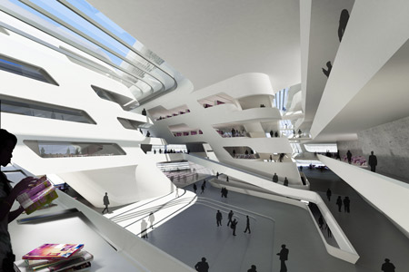
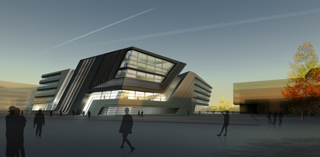
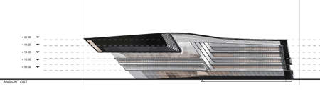
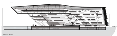
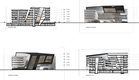
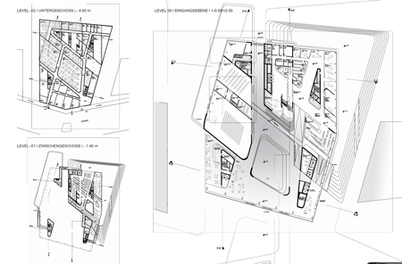
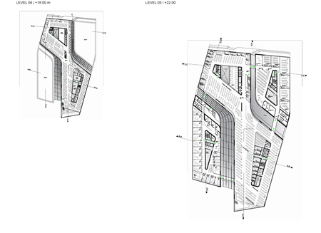
The new Library and Learning Centre rises as a polygonal block from the centre of the new university campus. The LLC’s design takes the form of a cube with both inclined and straight edges. The straight lines of the building’s exterior separate as they move inward, becoming curvilinear and fluid, generating a free-formed interior canyon that serves as the central public plaza. All the other facilities of the LLC are housed within a single volume that also divides, becoming two separate ribbons that wind around each other to enclose this glazed gathering space.

library-and-learning-centre-at-the-university-of-economics-business-by-zaha-hadid-architects-8zha_library-learning-cen.gif

“I am delighted to be working in Vienna as I have a close affiliation with the city. As a centre of research, the Library and Learning Centre is forum for the exchange of ideas. It is very exciting for us to be part of the University’s expansion.” states Zaha Hadid.

library-and-learning-centre-at-the-university-of-economics-business-by-zaha-hadid-architects-9zha_library-learning-cen.gif

Rector of the University of Economics & Business, Christoph Badelt said “A library and learning center should be more than a mere library in the classical sense: it is a research and a service facility, a workplace and lounge, a place of communication and a traffic hub, at one and the same time. With its breathtaking architecture, the design by Zaha Hadid manages to combine all the key functions of study in a most wonderful way. It is a vision that embodies this innovative concept of a university.”

library-and-learning-centre-at-the-university-of-economics-business-by-zaha-hadid-architects-6zha_library-learning-cen.gif

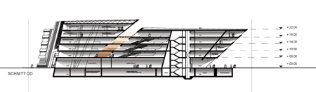
PROGRAM: The LLC comprises a “Learning Center” with workplaces, lounges and cloakrooms, library, a language laboratory, training classrooms, administration offices, study services and central supporting services, copy shop, book shop, data center, cafeteria, event area, clubroom and auditorium.

library-and-learning-centre-at-the-university-of-economics-business-by-zaha-hadid-architects-zha_library-learning-cent.gif

CLIENT: University of Economics Vienna

ARCHITECT: Zaha Hadid Architects
Design: Zaha Hadid and Patrik Schumacher
Project Architect: Cornelius Schlotthauer
Project Team: Marc-Philipp Nieberg, Kristoph Nowak, Enrico Kleinke, Stefan Rinnebach, Niels Kespohl, Jan Hübener, Romy Heiland, Richard Baumgartner

library-and-learning-centre-at-the-university-of-economics-business-by-zaha-hadid-architects-4zha_library-learning-cen.jpg

CONSULTANTS:
Structural Engineers: Arup Berlin
M&E Engineers: Arup Berlin
Façade Engineers: Arup Berlin
Cost Consultant: ATP Wien
Fire protection: HHP West, Bielefeld
Render Studio: Vectorvision, Leipzig

222zha_library-learning-c.jpg

SIZE: 28.000m² net area
42.000m² gross area (205.000m³)
136m length,

library-and-learning-centre-at-the-university-of-economics-business-by-zaha-hadid-architects-5zha_library-learning-cen.gif

Competiton
Two phase competition with six competitors in the first phase and three in the second phase.
1st prize: Zaha Hadid Architects
2nd prize: Morphosis
3rd prize: Prof. Hans Hollein
Other competitors: Studio Massimiliano Fuksas; Kada Wittfeld Studio

Start first phase: August 2008
Start second phase: October 2008
Decision: November 2008

Jury: Wolf D. Prix (head of jury)
Dietmar Eberle
Laura P. Spinadel (BUS Architekten, new campus masterplanner)
Peter Ehrenberger
Sepp Frank
Brian Cody


Posted by Rose Etherington

56 Responses to “Library and Learning Centre in Vienna by Zaha Hadid Architects”

  1. Oxotnic.gr Says:

    I wonder how does she not get tired of this. All this astonishing talent just recycled. The old material displays in this years Venice Biennale was just astonishing.

    Btw. Wolf D. Prix and Zaha Hadid are teachers of the same post-grad program, ‘Urban Strategies’. Pfff…

  2. eric luyckx Says:

    j’en ai marre de ces exercices de dis-torsions.

  3. odris Says:

    i agree with oxotnic…
    is the same project once again….

  4. scruces Says:

    Love Her, don’t understand the haters

  5. blackcrow Says:

    of course…..maybe the nex when zaha hadid will be in the juri Prix will win something….

  6. Architcl Says:

    Political win. As usual.

  7. NELSONBRIDGE Says:

    I agree. The displays were amazing.

  8. Peter Says:

    I like it.

    its like old Zaha, like her old paintings.
    Nice plans and sections, very cool central space.

    Would be great to see the morphosis project too… We know that Zaha and Prix are friends, but nobody wants to go down that road.

  9. Daniel Says:

    that interior image its really irritating, so distorted by the camera angle that ends up feeling like a cheat. I completly agree with Oxotnic.gr, this office just won’t escape from their own formula, even the plans are standarized. such a waste.

  10. peridotprince Says:

    Of course, the first appreciation of the image was an automatic indicator of origins. And as much I loathe the absolute predictability of this, It appears like her first distinct volume to bring the graphics of plan into the section. I just don’t understand the adherence to these hermetic contours – the space within seems to exist in complete independence of all walls slanting. Whatever. Go forth and prosper, Zaha.

  11. FPC02 Says:

    NO SOUL.NO SOUL.NO.SOUL.

  12. arhitease Says:

    Totaly agree with Oxotnic

  13. james Says:

    i agree. it seems its always the same approach, language, etc… doesn’t really mater what the program it. school, museum, dog track, strip club, hotel, whatever…

    i guess you can say this about anyone, she became a “star-architect” because she was pushing and testing the boundaries. now its just become meh another angled / fillet wall with custom panel facade and not only in plan is it angles but in section too. or the building massing is defined by the path traveled, yada yada yada.

    that being said. i’d still like to be working on a project of that scale and stature.

  14. Azm Says:

    Finally Zaha out of her curves!!

  15. Claudio Says:

    So she is not into melting her projects anymore…

  16. Mowgli Says:

    wow, if i had a library like that, i’d go everyday…

  17. Pfff pt 2 Says:

    I thought I was looking at a diploma student’s initial sketch design…

  18. tman Says:

    Zaha is the new Michael Graves

  19. scarpasez Says:

    This is so 2008 Zaha. Oh wait.

  20. Michael Says:

    I rather enjoy this expression of movement. Similar Hadid projects have fallen flat after construction because closer attention was needed to understand structure. As long as the engineering is done correctly, this project will be excellent. It has a fantastic controlled digital quality to it. It certainly does not look like a digital model went into the blender and the first blob was rendered afterward. It also looks much better laid out. If the solar angles are correct, the atrium will be a treat for those who have to use the space. Well done on Phase 1.

  21. andy Says:

    it would be like having vertigo ALL the time at work.

  22. boby Says:

    maby she has permanent paramnesia.

  23. MR Says:

    Why are there so many one-eyed ZH fans here? It’s bordering on nationalist fervour. A chamfer here, an angle there… this is a pretty ordinary bit of architecture and another piece from the style manual at the House of Hadid.

  24. jmg Says:

    I feel vertigo when I go up the stairs in the metro if the tiles of the wall are parallel to the stairs, so imagine entering that central space… but I like it, so I´d try to get used to it.

  25. future architect Says:

    Its truly amazing..architecture has been brought to another level!!!

  26. m Says:

    I think this project was long overdue from Zaha Hadid. It’s the first time in a long while that she has been ale to create impressive architecture wthout abandoning reality.
    I hope she keeps walking down this path instead of her most recent work in the past few years.

  27. silicon m Says:

    OuHhh, itsss sooo Zaha

    silicon m

  28. Manu Spain Says:

    I just cant imagine reading a book between that walls!!!! i would take a headache for sure…. and i know what i say, i mean, i live in Zaragoza, where the Zaha’s “Bridge Pavilion” for Expo 2008 is, and is the same: very sculptural, beauty outside, white inside, i liked it a lot but, staying in more than 5 minutes means to have a headache for the same, distorsioned walls so… a library!!?!?!?!

  29. step_out_of_a_triangle_and_into_striped_light Says:

    the interior rendering is funny. the camera angle is so over the top in an immature kind of way.

  30. antonius Says:

    Think I’ll get myself an extra prothese to walk around in this building. I need al least 25 cm

  31. Pranav Says:

    I love it, she is best.

  32. J Says:

    The only reason Zaha still designs things like this, is because people expect it from her. People want a ‘Zaha’, so they get a ‘Zaha’. What would happen when she suddenly came up with a square, plain, Sanaa-like building?

  33. Trukz Says:

    I kinda like this project comprared to all her latest stuff. This brings out more of the old Zaha which in my opinion has more quality than her latest distorted blobs…

  34. dipu@form.3 Says:

    i love it….

  35. dipu@form.3 Says:

    amazing both in day n nite.

  36. Tim Says:

    To some extent, I don’t really get the comments stating that “Hadid always does the same”. Sure, much of her formal language stays the same over the course of several projects, but those interior spaces and such are clearly something else than any of her projects that I can think of.

    It appears to be the case that all the criticism revolves around the exactly some elements of her formal language: curves and dynamic shapes. However, to say that she’s repeating herself would be exactly the same as saying that every building that uses straight angles and is based on a orthagonal system is the same. Is pretty useless, and killing all coherent discussion to use such an argument.

    I do have an issue with the architecture of the Hadid office, however, in that it is a very “unmaterial” architecture, by which I mean that it’s all very much a computer visualisation. All shapes have been smoothed – and even though there are some variations in colours, it’s hard to imagine actually differences in textures. And that tends to become difficult: an amalgamation of smooth and sexy form with textures of building materials. I think the cable car station in Innsbruck was a good example of a materialization of a form, and it is yet to be awaited what the result of this building will be when it’s thought in materials, in stead of only in form.

  37. alan Says:

    its wonderful forum and plan

  38. nFormas Design Says:

    so beaty and modern…

  39. navid Says:

    more like a logo of a new airline

  40. Berny Says:

    Well if household appliances were designed like this they would all look like buildings. But this one is definitely an appliance.

  41. gaque Says:

    I agree with Tim. I recall an exhibition at the Natl Building Museum in DC called “Liquid Stone.” And what disappoints me is the notion that any curved shape is suitable for concrete, or vice versa.

    Perhaps the “ease” with which concrete can be contorted into acrobatic shapes influences Zaha’s design? Anything goes, so to speak. If Zaha can bring herself and her staff to look at some new issues, especially materials and energy, she could really push things forward…

    The atriums don’t seem like any new exploration, by the way. Past projects of the office incorporate such atriums.

  42. Gabs Says:

    Although she is quite repetitive, I think that it’s projects like these ones she does best (at least much better than the blobs or the apparel). At least her background still shows here and projects like these we have seen built somewhat successfully.

  43. scarpasez Says:

    All joking aside, what architect as prolific as Zaha is less repetitive? Though her work is clearly her own, she has a number of different styles that she employs. Compare this project with any number of her other works: the BMW plant, her winning competition entry for the Museum of Nuragic & Contemporary Art, the Contemporary Art Center in Cincinnati, or her project for the Abu Dhabi Performance Art Center, to name a few. Each of these is clearly distinct, with its own thesis, intent and formal language. Yeah, she’s into the swooping curve / intensely acute angle, and she generally sacrifices tectonics for a pure formal expression. She also seems to be succumbing to the temptation of becoming an architectural “brand” a la Gehry, or even OMA. But her work is disciplined and pretty amazing. She is clearly one of the greats.

  44. ajua Says:

    Ouch, another “competition” organized for sure by Peter Noever and Wolf Prix, is terrible the Angewandte mafia, really bad …

  45. OLGV. Says:

    well, I love this, sort of old Zaha style indeed, great.

  46. Joaquin Says:

    The question is: Why go back to her old jar of cookies? Though her curvy organic forms weren’t liked by some, she’s evolved. Why step backward? Or, my hypothesis is that M. Schumacher is the man behind the “New Zaha” Style. Who agree?

    I’ve to say that since the world’s economic break down, Hadid’s “visual” works seem to vanish away from the media focus, compared to before. I guess clients don’t have money and time to waste with her “brand” and nice cool pictures anymore.

  47. schumacher Says:

    box -> duplicate-> boolean some smaller boxes and skew for the awesome zaha effect!

    in all seriousness i love zaha :)

  48. Howard Says:

    The final step of Zaha projects will be an extreme sophisticated tomato with the capacity to transform itself into a huge ecological system inside of a proletarian fridge. Zaha as a mass product vegetable.

  49. iSun Says:

    she’s really something!
    i”m speechless!

  50. Abdullah Says:

    It really amazing

    I love it so much

    but how you support the structure????

    is there any idea about the structural system in it?

  51. maximaxi Says:

    For those of you interested, you can find the 2nd and 3rd prize and all the other amazing buildings on the future campus here:

    http://www.big.at/wettbewerbe/beendete-verfahren/2008/neubau-der-wirtschaftsuniversitaet-wien-suedportalstrasse-1020-wien/

  52. mauro Says:

    that’s incredible

  53. dc Says:

    bellissimo progetto.
    ZH è uno dei pochi architetti che provano a esprimere se stessi.è l’unico che ci riesce.

  54. Kais Says:

    Tim & Scarpasez summed it up. Not my favorate of Zaha’s work, but if you compare it to all other projects submitted, she is definately sits at the top, unchallenged.
    Zaha has a different vision of things, some shortsighted people criticize blindly when they cannot understand.
    “she is the visionary of our time” said Philip Johnson

  55. nilo Says:

    well, I love this, sort of old and recent Iosa Ghini style indeed.

  56. nav Says:

    zaha hadid is a pioneer in the “deconstructive” era. her designs do well to explain the major challenge in architecture today. what happened to the sheer joy of designing.?????all her projects hav a signature element or fluidity in them which i appreciate.

Submit a comment

See our comments policy