January 12th, 2009

perspective_02_sq.jpg

Peter Barber Architects have won a competition to design a new urban quarter at Goldhawk Road in London.

axo_outlines-roof-terrace-s.jpg

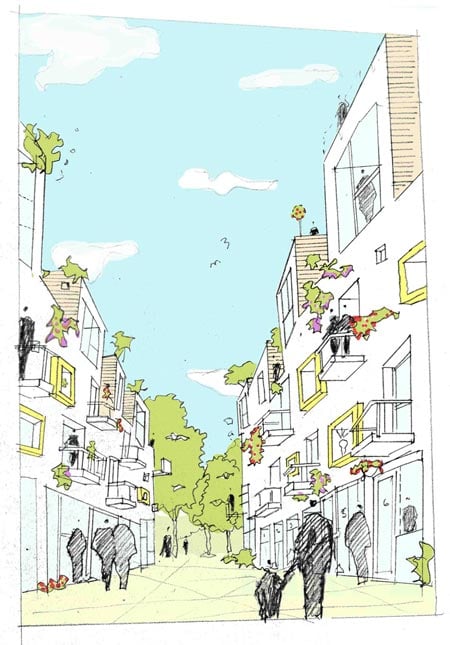
The development will feature 68 homes set around pedestrian streets.

perspectivelow-res.jpg

Here’s a little bit of info from the architects:
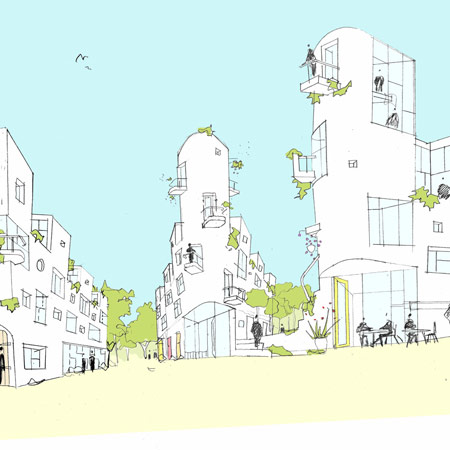
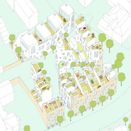
GOLDHAWK VILLAGE

perspective_02.jpg

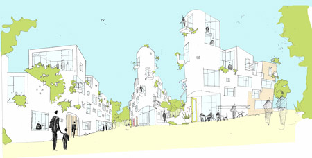
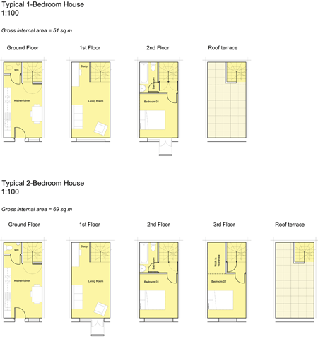
Peter Barber Architects, with Places for People Developments, have this week been announced as winners of a high profile competition run by the London Borough of Hammersmith & Fulham to design a high density urban quarter of 68 homes in Goldhawk Road.

site-plan.jpg

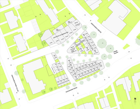
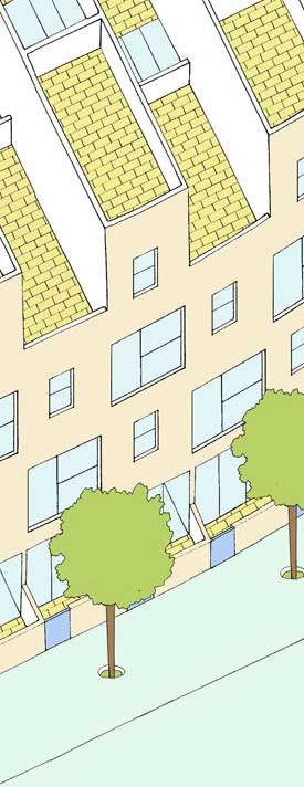
Goldhawk Village is a network of intimately scaled streets widening into a little square. A density of 240 dwellings per hectare is achieved through a radical reworking of the traditional ‘back-to-back’ terraced house.

typical-units-board-3.gif

typical-unit-axo.jpg


Posted by Marcus Fairs

22 Responses to “Goldhawk Village by Peter Barber Architects”

  1. waka Says:

    seems quite similar to their Donnybrook Quarter. that might be a good thing!

  2. modular Says:

    I’m speechless. This won?

  3. eric luyckx Says:

    what a “fresh air” : an architect who present a concept with simple pencil drawings !

  4. Arjan Scheer Says:

    Floorplans of 51 sqm – 69 sqm GIA?? Multitude of very complex corner solutions… typical floor plans that seem like the exception looking at the site plan… Come on Brits, when are you catching up with the Dutch?!!! Like the sketches!

  5. Anon Says:

    My lil sister does better.

  6. ary indra Says:

    was it hand drawn? the tintin-esque style presentation is a refreshing departure from the achingly crisp computer generated drawing.

  7. nomad Says:

    nice to see that you can still win a competition without the aid of a high end rendering firm.

  8. Boo Says:

    Looks attractive in the sketches. Even friendly! And like it might have room for a person to own some books and more than one change of clothes.

  9. LOW Says:

    There’s something about hand rendering that just adds something special to a project, a warmth that cannot be achieved by using only computer models.

  10. Jeremiah Says:

    The concept is nice, though not necessarily a revolution in modern dwelling, but i think the the graphics are amazing. The simple, almost cartoon-like graphics communicate the concept clearly and contrast greatly with the photo realistic renderings and CAD drawings that have become the norm.

  11. plopp Says:

    Who wants a 69 sq m apartment divided on 4 floors? 25% of the apartment is stairs….

  12. Tim Says:

    I don’t think hand sketches as competition material is not that “new” or “refreshing”: it’s just another tool. And if you don’t see those tools more often, you are probably only looking at the results of high-end big-shot international competitions.

    Oh, and I definitely have to agree with plopp: to me, it doesn’t make much sense to divide a relatively small floor area over four floors…

  13. gaque Says:

    anyone else see the japanese influence?

  14. Crusty the Clown Says:

    Stairs are not accessible for the Handicapped!

    Will Europe ever catch up with the States regarding equal access for the disabled?

    It’s like y’all are living in medieval times – no cars and no wheelchairs

  15. nickthegreek Says:

    OH MY GOD IS THAT A PEN!!!

  16. Indi Says:

    The ‘hand sketches’ have the look of something at the very least drawn over a CAD drawing, or scanned in and then coloured with Photoshop. Very effective but not quite the real touchy-feely deal.

    Not all apartments need to be huge, or all in a development accessible to people with mobility difficulties. Typical means just that. And a biog Hey Hey to Krusty- maybe you wouldn’t want a car if you lived there!

  17. m Says:

    Nice to dee a competition winner who did not spend ££££ on super realistic renders, but manage to convey a nice atmosphere of the environment they are proposing. Well done.

  18. Hibai Says:

    Wonderful. Not only the concept of car-free compact and friendly city, but the presentation as well.

  19. Milly Says:

    Yes the sketch presentation is very refreshing, but where is the design, surely we can be a bit more creative than that, just look at Hollland!!. And in my experience living in a flat split over 4 floors does not work…

  20. huff Says:

    the comments say so much about dezeen and its readership, its all about images.
    One of the most successful aspects of this scheme, and indeed peter barber’s previous work, are their engagement with the urban environment, they are very human spaces, they engage the occupier with the street and the surrounding community, this is presumably the reason why they won.

  21. David Zutta Says:

    heyy, a think this is a new concept for the representation, the architecture must be always revolutionary, whit new things, evolutive, and the people think that the architecture whit rare forms is very good, but this architecture is an show, whit farandula.

  22. Abdelatif Says:

    Oh, very good presentation, but not only ! the spaces hierarchy and the humanist and complexe design contrasts with the cold habitat units that we often saw !
    I only regrete that all buildings are the same and there isn’t a lot of customisation.
    I learnt something today.
    excuse my bad english !

Submit a comment

See our comments policy