Marchesini headquarters by LAN Architecture
Parisian architects LAN Architecture have completed the company headquarters for packaging manufacturer Marchesini France in Paris, France.
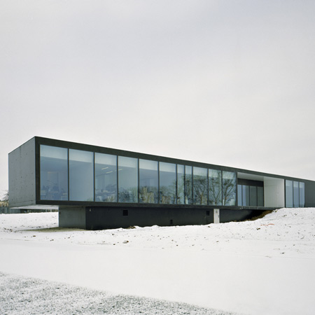
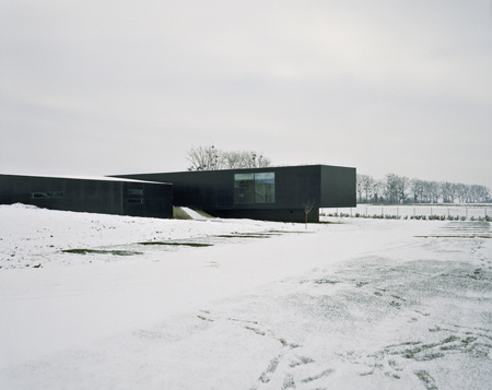
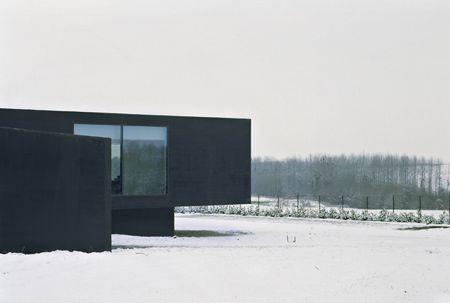
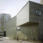
The building is composed of two main volumes, designed to separate the office space from the workshops. The entrance is located at the intersection of the volumes.
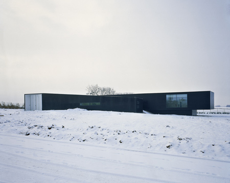
It is constructed from concrete and painted black.
Photos by Jean-Marie Monthiers.
The following text is from LAN Architecture:
--
Company headquarters
Saint Mesmes
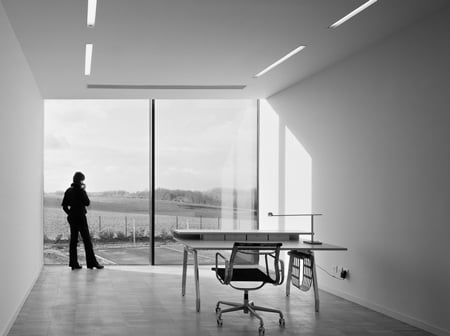
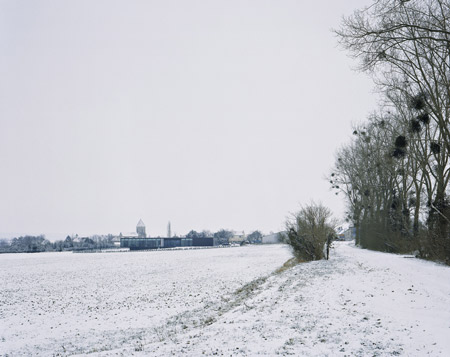
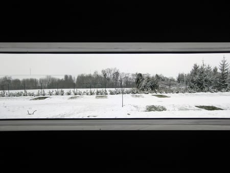
The primary intention of the programme is to explore the relationship between the building and its surroundings and between the building users and the landscape. One of the main design concerns was the building’s environmental adaptation and appropriation.
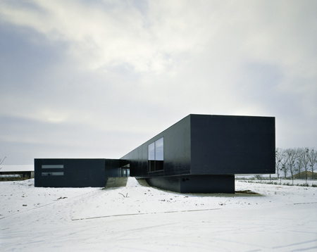
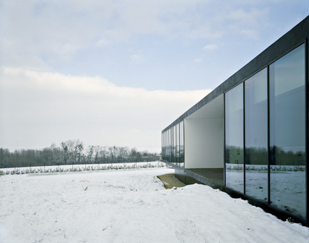
The site slopes down three metres towards the west, offering attractive views over the neighbouring hills. Our solution was to create two hierarchically related volumes placed perpendicular to one another along a north-south axis and follow the slope of the site.
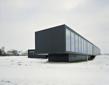
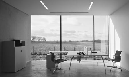
One of the volumes contains flexible workspaces while the other encloses a workshop, exhibition space and storage areas. The offices occupy the upper area of the site and are raised above ground level to provide an impression of lightness. The idea was also to erase distinctions between the different kinds of work by avoiding the use of corridors. The result is that the transition areas also act as settings where people can meet one another or as waiting spaces with pleasant views looking out over the countryside.
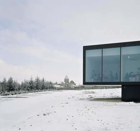
The workshop volume is located at a lower level and gives the appearance of being solidly anchored to the ground. The intersection of the two volumes serves as the entrance, with a sloped ramp rising up into the building.
The elevations and roof are completely constructed from black painted concrete. The roof finish allow it be read as the building’s fifth elevation.
PROGRAMME: Design and construction of a company headquarters
CLIENT: Marchesini France
LOCATION: rue Royale, Saint Mesmes, France
NET PLAN AREA: 1250 m²
COMPLETION: 2008
More Dezeen stories about LAN Architecture:
.
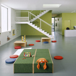
Toy library in Bonneuil-sur-Marne
Toy library in Bonneuil-sur-Marne Interior