
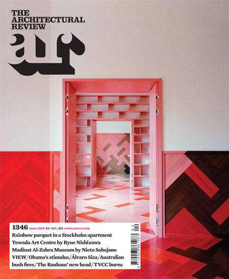
Architectural Review redesign by Alexander Boxill
Graphic designers Alexander Boxill have redesigned architecture magazine the Architectural Review, which relaunches this month.
The redesign is the first in 20 years for the magazine, which was founded in 1896.
Here's some text from the AR followed by a design statement from Violetta Boxill of Alexander Boxill:
--
The AR will launch its redesign in the April issue. With it, we aim to extend the AR's reputation as the most beautiful, inspirational and insightful architecture magazine in the world. It will be the first update of the AR's graphic identity in more than 20 years, carried out by award-winning designer Violetta Boxill in collaboration with the AR's art director Cecilia Lindgren, and edited by new editor-in-chief Kieran Long.
--
in honour of the architectural review's tremendous legacy we decided to start our redesign journey by looking back through it's archive. visually, it's graphic heyday was under the art direction of william slack so we chose to re-draw/re-configure one of his original mastheads. therefore embracing the past but introducing a contemporary slant by rendering the letterforms as a merged unit. impossible in Slack's day as he used metal type.
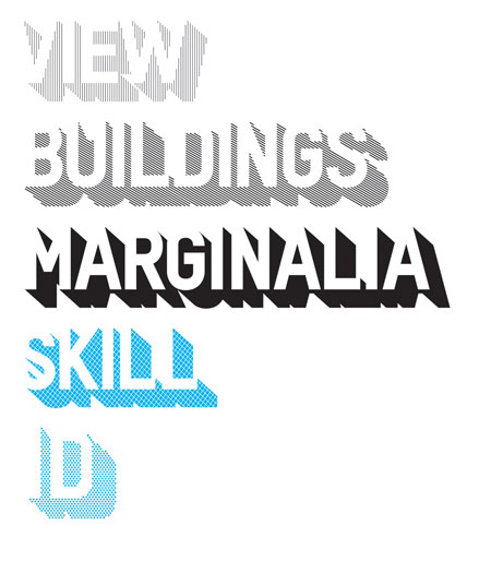
this concept of resurrecting echoes the editorial with the new editor, kieran long, reintroducing sections by reclaiming the names from previous issues of the same era, (skill, marginalia, id, dr, etc).
spec:
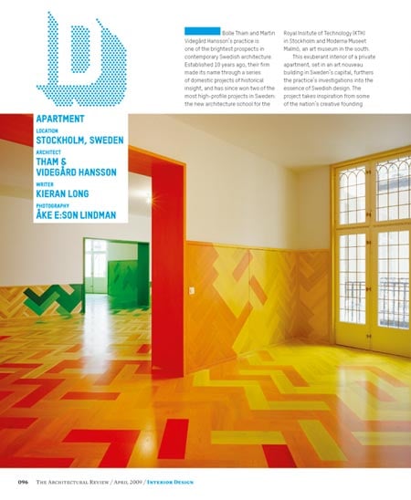
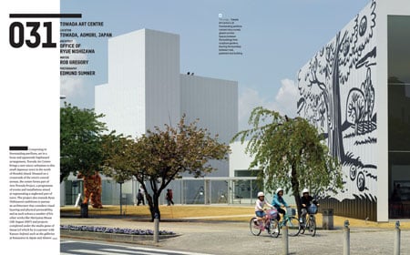
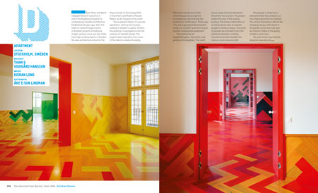
the magazine is broken down in to 3 main sections, (view, buildings, marginalia)
view - news/current affairs
buildings - global architectural projects
marginalia - reviews/previews
with occasional reoccurring sections, (such as id, dr, outrage, skill) to add variety to each issue. each section has a mini-brand based on one font but rendered with various patterns/colours to introduce an eclectic nature to the magazine. as the year progresses we hope to play with these mini-brands using different paper stocks, spot colours, etc to surprise the reader.
fonts:
two fonts, (mercury and t-star), a serif and a sans are used in varying hierarchies, weights and intensities throughout the magazine to bring texture and diversity.
headlines:
we have removed all traditional headlines.
each section has a particular treatment to entice the reader.
view: a large brief overview of text
building: a number - a cataloguing system has been introduced so buildings are numbered for an entire year.
marginalia: a quote