
Photographer Leonardo Finotti has sent us these photos of the Galeria Adriana Varejão pavilion, designed by Rodrigo Cerviño Lopez for Inhotim Centro de Arte Contemporânea in Brumadinho, Brazil.

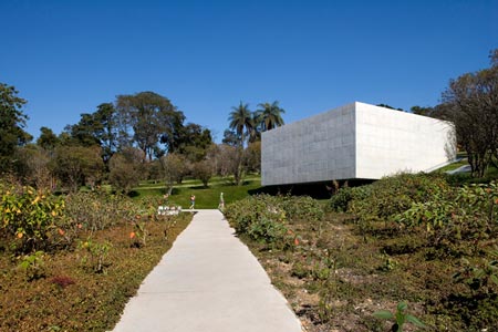
The museum is made up of multiple pavilions throughout the 35-hectare park.

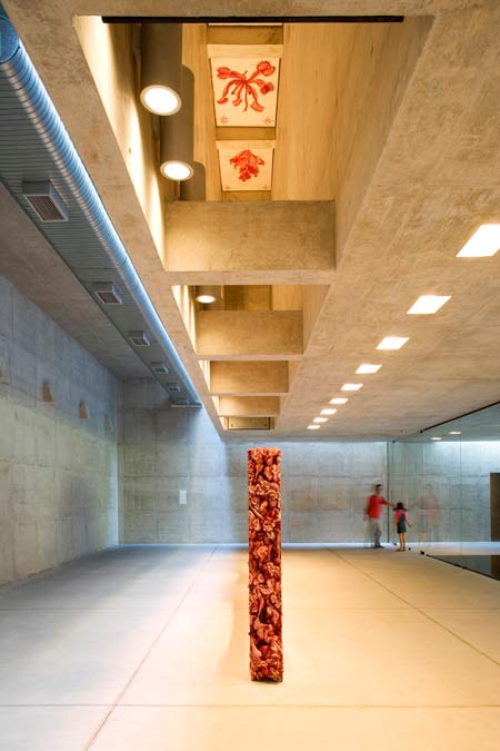
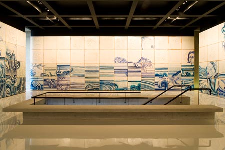
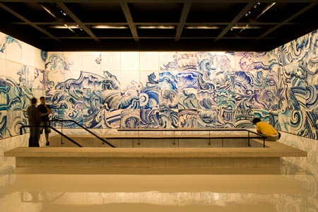
The Galeria Adriana Varejão pavilion was commissioned to house a sculpture and polyptych by Brazilian artist Adriana Varejão.

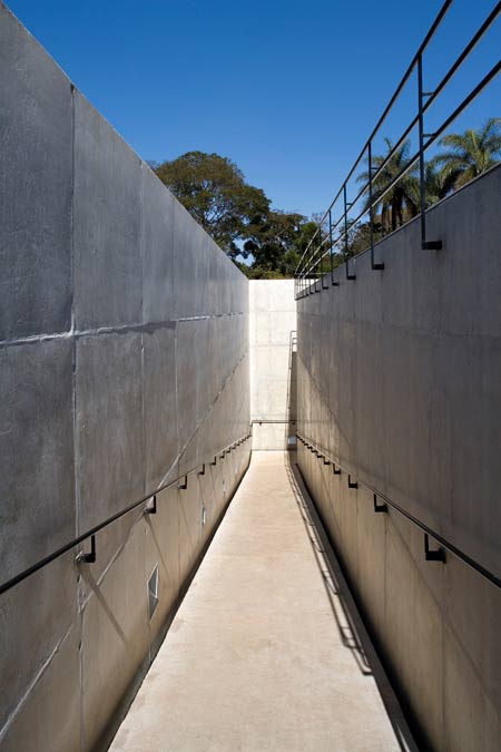
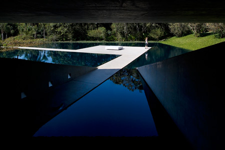
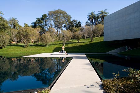
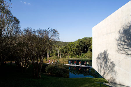
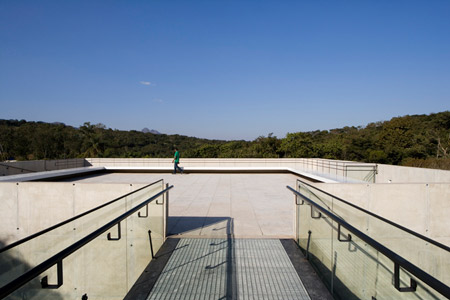
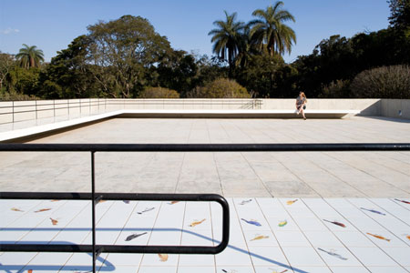
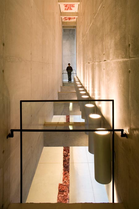
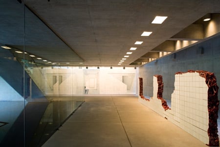
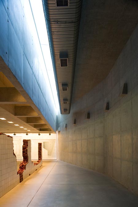
Visitors move through the building following a spiral path that leads them between two levels of the park.

Here’s some more about the project from Rodrigo Cerviño Lopez:
–
Inhotim Centro de Arte Contemporânea is located in Brumadinho, a village near Belo Horizonte, the capital of Minas Gerais state. A personal initiative of the mining industry businessman Bernardo Paz, the museum has an unusual architectural concept.

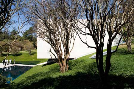
Instead of summing up all its installations into a unique building, it is composed of many pavilions spread out in a park of approximately 35 hectares.

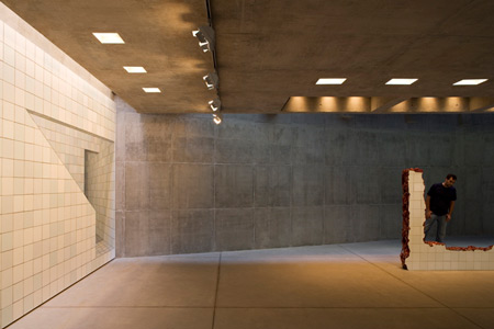
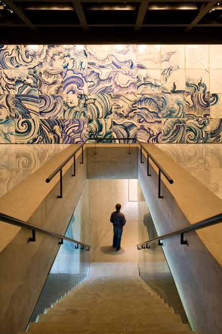
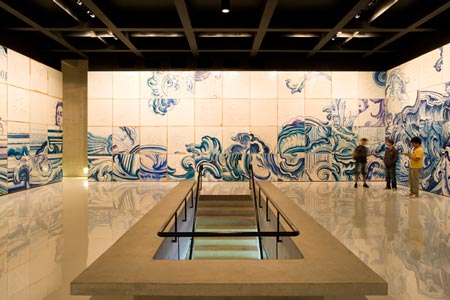
The Adriana Varejão Gallery was commissioned to shelter two works of the artist acquired by the museum and exhibited at Cartier Foundation: the sculpture Linda do Rosário and the polyptych Celacanto Provoca Maremoto (with the further development of the project, the artist created another four works for the building).

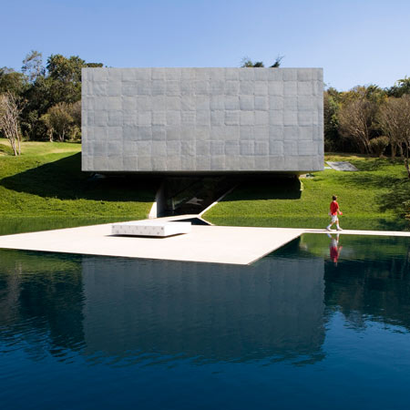
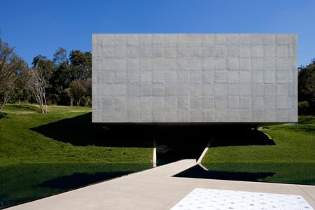
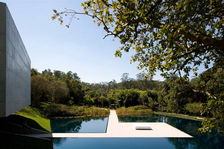
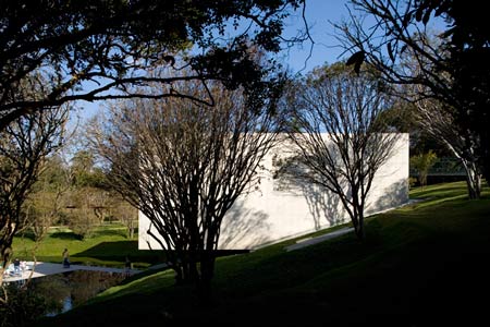
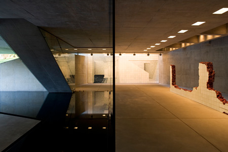
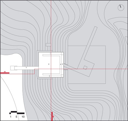
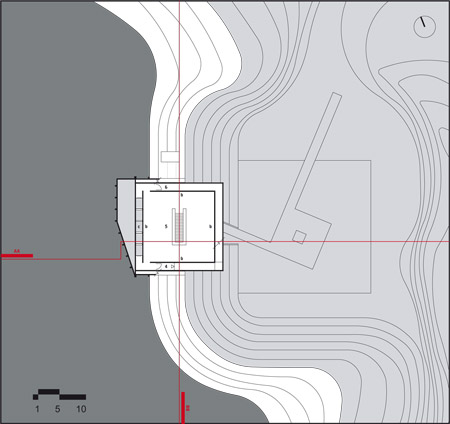
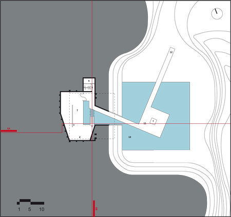
The project should occupy a hillside with a small slope (typical of the topography of Minas Gerais, composed of old and smooth hills) partially surrounded by the native forest, an area formerly used to store containers. The original topography was modified for this new use: a huge displacement of earth has cut it, creating the great horizontal plane necessary to the storage.

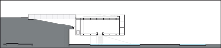
The orientation of the project aimed to recompose the site’s original topography and inserting on it an artificial element: a regular block in reinforced concrete (prestressed wasn’t necessary), partially inserted in the hillside. The building structure is composed by an irregular retaining wall that gains the space in the ground floor and receives the loads of the block, in its deepest part, trough two beams, in the middle, through 4 columns integrated in the wall.

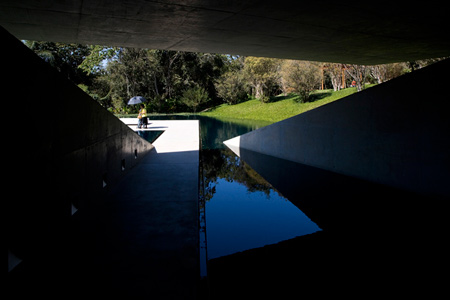
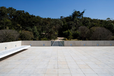
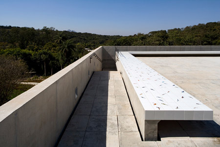
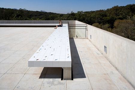
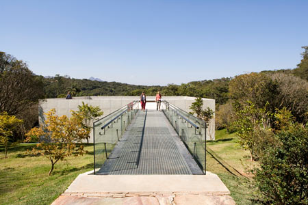
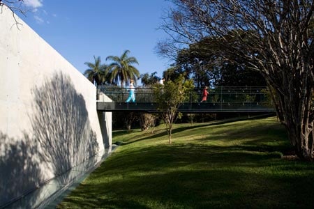
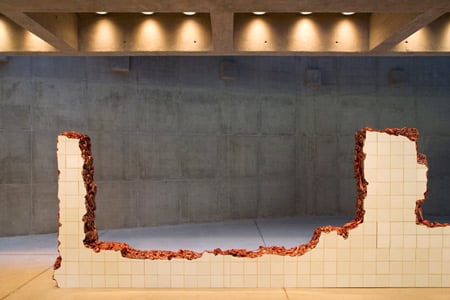
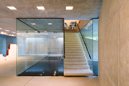
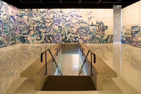
The building was also conceived as a spiral path that connects two different levels of the park, alternating moments of contraction/passage and expansion/exhibition: from the ground floor, (1, contraction) in the middle of the water pond, in a narrow promenade, away from the building; (2 expansion: Varejão’s piece Panacea Phantastica, a tile bench with drawings of hallucinatory plants) The small square plaza of the groundfloor; (3 contraction) The promenade turns to the building; (4 expansion: the sculpture Linda do Rosário and the paiting The Collector) the ground floor, inside the hill, below the concrete block; (5 contraction) The stairs; (6 expansion, the polyptych Celacanto provoca maremoto) The first pavement, inside the concrete block; (7 contraction) The ramp; (8 expansion: another tile bench, now with drawings of birds, Passarinhos-from Inhotim to Demini) The terrace, above the concrete block; (9 contraction) The bridge. And vice versa.

Name and site of the project: Galeria Adriana Varejão
Inhotim Centro de Arte Contemporânea.
Brumadinho, Minas Gerais, Brasil.

Architect: Rodrigo Cerviño Lopez
Design team:
Architect: Rodrigo Cerviño Lopez
Collaborators: Fernando Falcon, Eduardo Chalabi
Trainee: Marcus Vinicius dos Santos

Structural engineering: Suely Bueno, engineer, JKMF
Construction management: Felipe Salim, engineer, Janaina Mello, architect, Inhotim
Client: Inhotim Centro de Arte Contemporânea

Built area: 558 m_ (gross)
Design phase (beginning and ending month, year):
November 2004, November 2006
Construction phase (beginning and ending month, year):
March 2006, March 2008
Maximum height of the building from ground level: 10,10 meters
Minimum and maximum temperatures of Brumadinho:
Minimum: 80C, July
Maximum: 290C, January, February, March


More photography from Leonardo Finotti on Dezeen:
.
House at Sobral da Lagoa Bak Gordon
–
Posted by Megan Wilton


March 24th, 2009 at 1:36 am
Ahh this project is so beautiful. It was featured in the Italian magazine “Domus” last year
March 24th, 2009 at 1:40 am
Wow. Box architecture: alive, well and fresh. I love this project. The approach is exquisite, the levitating box is gorgeous, and the detailing is phenomenal. That staircase is a work of art. This strikes me as a project that a minimalist master such as Zumthor would produce. Kudos to the project team!
March 24th, 2009 at 1:54 am
havnt seen such simple & touching project for a while, i would luv to see more of d’ plans & sects in wider context. seriously, really great work!
March 24th, 2009 at 2:12 am
I would really like to visit this place… loved it…
March 24th, 2009 at 2:21 am
excellent!
March 24th, 2009 at 2:33 am
i kind of hate the simplicity of the block in the landscape. its crude and offensively mute but you can’t deny its very effective.
everything about this project is very effective. there are many things to like, especially how the stair spans the water and parts the glass case to land on the lower floor with out the appearance of touching.
these guys are astute detailers and fine renderers of form.
in the end though, this project is a narcissistic folly and it looks like it. philip johnson, eat your heart out.
March 24th, 2009 at 6:41 am
looks like a modern Quake level for me … but interesting
March 24th, 2009 at 8:14 am
Minimum and maximum temperatures of Brumadinho:
Minimum: 80C, July
Maximum: 290C, January, February, March
C? Really? OUCH!
Really good though.
March 24th, 2009 at 9:29 am
Nice tiles.
March 24th, 2009 at 10:12 am
Like Dudley Moore describing a Volvo
“boxy but good”
March 24th, 2009 at 10:30 am
really beautiful/has this peaceful, but also powerful balance to it…. compliments…
March 24th, 2009 at 11:11 am
Bernardo Paz made this galery as a sort of gift to his wife, the artist Adriana Varejão.
Kindda romantic isn´t it?
March 24th, 2009 at 12:52 pm
congrats to everyone: designers, architects and photographer.
beautiful project
beautiful photography
March 24th, 2009 at 1:33 pm
This looks really beautiful and well-integrated into the landscape. I wish projects like this were funded in the United States.
March 24th, 2009 at 5:19 pm
BANG! In your face… love it.
March 24th, 2009 at 8:08 pm
Brazilians do it better!!!
March 24th, 2009 at 9:44 pm
LOVE IT.
March 24th, 2009 at 10:27 pm
I have been there earlier this year and I loved it!
The whole place is just so beautiful and well planned, I feel proud that something like this was built in my state, in my country.
I’ve taken pictures of my visit, here is the link of the photos:
http://www.flickr.com/photos/jpbrazil/sets/72157612442519817/
March 25th, 2009 at 1:45 am
This architecture is not the best context to show this art ?
March 25th, 2009 at 8:35 am
Quite simply one of the best gallery interiors that I have ever seen. I love the contrast between the artificial/natural lighting methods and the smooth glazing/off-shutter concrete. Thank you Dezeen for posting such a fantastic example of gallery.
March 25th, 2009 at 10:18 am
In the processional quality of the design the influence of Oscar Niemeyer is legible at its very best. What is particularly beautiful is the idea of passing in, under, through, or over water as a purification rite on entering a sacred or otherwise important space.
The formal language of strong juxtaposition with a verdant landscape, though inorganic in form, is absolutely aligned with this school of architecture (again expressed at its best).
It always seems to me that within the choice of siting a building lies its fundamental telos. Will the building triumph on the top of a hill (and here I am thinking of Vincenzo Scamozzi’s La Rocca Pisana), will it rest in the brow of the hill as FLW suggests, will it follow the contour of the landscape resting upon it sculpturally (as Siza teaches), or will it incise itself into the terrain itself in the way that KWK Promes has shown to be absolutely contemporary and relevant.
This building, to my eyes, is most effective in its balance of the incision and topographic (Siza) schools without losing the effectiveness of the water passage, and indeed the controlled circulation that is experienced in the FLW Guggenheim (for example).
The one thing that cannot go unsaid is that monuments to love always have their own justification. Shah Jahan’s caused him a great deal of trouble in his life but somehow it still seems worth the effort. Here the building seems to perfectly merge with the work either in counterpoise (as it does with the sculpture) or in harmonious texture (as it does with the panels).
Terry Glenn Phipps
March 25th, 2009 at 3:10 pm
I don’t agree with Rodger about the project being offensive to the landscape!
I’ve being there and it is really beautiful and integrated, but I agree when he says is narcisistic!
I would like to remind, tha Adriana Varejão is the wife of the “owner”of the
museum, and that explains a lot; but the merit is still there.
March 26th, 2009 at 3:49 pm
I am generally not a fan of the ubiquitous and overused Box, mostly i wish people would get it over with and get on to some new ideas.
This however is beautiful, and twice as effective because it makes me see the possibilities of a form that is so often overused , often with much less poetry. I is also ans excellent way to deal with a gallery space, it is not so much the sterile void one often encounters in a gallery, but seems to exist rather as someone above mentioned, as a purified space…
April 9th, 2009 at 9:49 am
Exquisite clean, minimal form, contemporary detailing. Uncluttered and stark aesthetics are such a treat to see. Such simple details that are unobtrusive within the space. This must be quite an experience in real world terms, look forward to visiting this space someday!