September 4th, 2009

the-interlace-by-oma-12.jpg

Architects Office for Metropolitan Architecture have unveiled new images of a residential project for Singapore, comprising long low apartment blocks stacked in hexagonal configurations.

the-interlace-by-oma-6.jpg

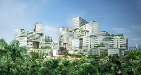
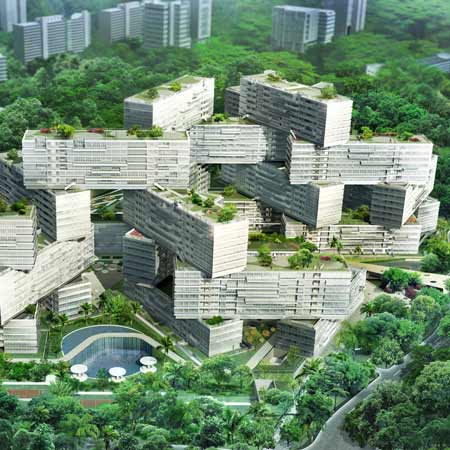
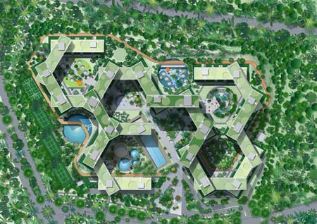
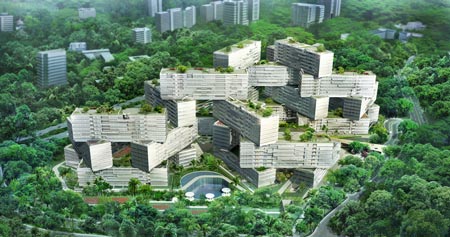
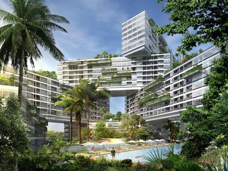
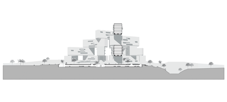
Called Interlace, the project will consist of 31 interconnected six-storey blocks stacked around communal gardens, containing 1,040 apartments.

the-interlace-by-oma-2.jpg

The arrangement allows for communal spaces, roof gardens, terraces and balconies.

the-interlace-by-oma-5.jpg

More information in our previous story.

More about OMA in our special category.

the-interlace-by-oma-4.jpg

Here’s some more information from OMA:

OMA unveils design for The Interlace residential complex in Singapore

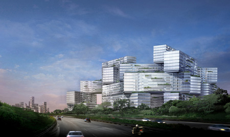
Ole Scheeren of OMA introduces a new residential typology to Singapore with The Interlace, a large-scale complex of interconnected apartment buildings stacked in an innovative hexagonal arrangement, developed by CapitaLand and Hotel Properties Limited.

the-interlace-by-oma-7.jpg

The Interlace is located on an elevated eight-hectare site, bounded by Alexandra Road and the Ayer Rajah Expressway, amidst the verdant Southern Ridges of Singapore. With about 170,000m2 of gross floor area, the development will provide 1,040 apartment units of varying sizes with extensive outdoor spaces and landscaping. The site completes a green belt that stretches between Kent Ridge, Telok Blangah Hill and Mount Faber Parks.

the-interlace-by-oma-8.jpg

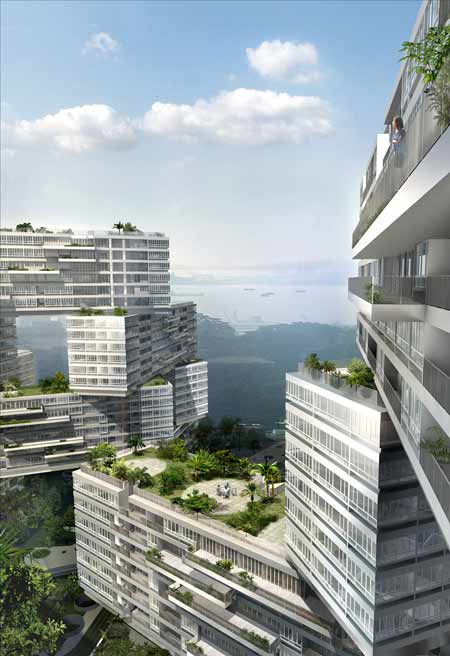
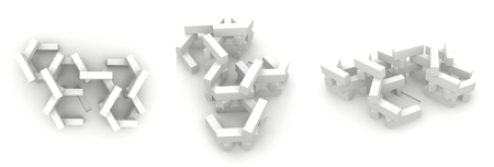
Designed by Ole Scheeren, partner of the Office for Metropolitan Architecture (OMA), The Interlace breaks away from Singapore’s standard typology of isolated, vertical apartment towers and instead explores a dramatically different approach to tropical living: an expansive interconnected network of living and communal spaces integrated with the natural environment. Thirty-one apartment blocks, each six-stories tall and identical in length, are stacked in a hexagonal arrangement to form eight large-scale open and permeable courtyards. The interlocking blocks form a vertical village with cascading sky gardens and both private and public roof terraces.

The design capitalizes on the generous size of the site and further maximizes the presence of nature by introducing extensive roof gardens, landscaped sky terraces and cascading balconies. Above-ground vehicular circulation is minimized, liberating large green areas within the development. The Interlace incorporates sustainability features through careful environmental analysis of sun, wind, and micro-climate conditions on site and the integration of low-impact passive energy strategies.

the-interlace-by-oma-1.gif

While maintaining the privacy of individual apartment units through the generous spacing of the building blocks and far-ranging views, the design also features communal spaces for shared activity. Extensive residential amenities and facilities are interwoven into the lush vegetation and offer opportunities for social interaction, leisure, and recreation.

Ole Scheeren said: “The design addresses concerns of shared space and social needs in a contemporary society and simultaneously responds to issues of shared living and individuality by offering a multiplicity of indoor/outdoor spaces specific to the tropical context.”

the-interlace-by-oma-11.gif

Patricia Chia, CEO of CapitaLand Residential Singapore, said: “This is a great opportunity to create and build a residential destination at the Gillman Heights site that will challenge the present architectural definition of living spaces. While developing the dramatic external form, we have also given much attention to creating comfortable internal spaces. The name, The Interlace, reinforces the interconnectivity of the community with the surrounding natural environment. Ole Scheeren has created a new landmark for Singapore.”

The design is led by Ole Scheeren together with Eric Chang, Associate of OMA. Scheeren is responsible for the office’s work across Asia, including the China Central Television Station (CCTV) headquarters and the Television Cultural Center (TVCC) in Beijing, and the MahaNakhon Tower in Bangkok. His previous work includes the Prada Epicenters in New York City and Los Angeles.


Posted by Rose Etherington

79 Responses to “The Interlace by OMA”

  1. cpcp Says:

    from the point of view of shared communal space, this is much better than a tower. the prob is quite a few of those apartments will always be under a shadow of the block directly ontop.
    I like the roof-top gardens, and i’m sure structurally this is very interesting to work on… but man its ugly
    ‘maximises the presence of nature’ but in a very unnatural form.

  2. mp Says:

    I think the arrangement is absolutely dull.. if you want to see something interesting in this regard just check out Renaudies work

  3. Cian Says:

    Wow, intersting development of the slab block but the scale and lack of articulation of the junctions between blocks is astounding. It’s like a bunch of models of the unite put together by a child.

    This is the most worrying project from OMA i have seen in a long time….

  4. urbanizr Says:

    …and I thought it was a photo of Amsterdam’s suburb ‘Bijlmermeer’ by Filip Dujardin!

  5. Alex Prodan Says:

    nice concept…very simple idea…
    i like it

  6. archilocus Says:

    why do they think stacking building blocks instead of arranging them flat like we did (wrong) in the 60’s will solve all the problem those 60’s blocks have nowadays ? Ole Scheeren did a nice job for the Mahanakon, but this is just outrageous…

  7. matt Says:

    … simple and complex … nice

  8. Ninian Says:

    Nutters!!!

  9. bodkin Says:

    i can understand experimenting with twisting and stacking blocks but then why combine that with absolutely bog-standard elevational treatment looking for all the world like the exposed concrete floor slabs and infil panels of the 60’s and 70’s? is this meant to be ‘ironic’? i just find it really unpleasant to look at and i feel really sorry for the 100s of poor residents that will have no view except the jautily twisted block in front of them

  10. KJS Says:

    It reminds me of buildings made out of shipping containers – which would be fine were it actually made out of shipping containers. I’d rather the extraneous corners were cut off.

  11. beam Says:

    they shouldn’t be allowed to have a foam cutter anymore at OMA…

  12. Geniy Says:

    There is no architecture. Just troublesome complication.

  13. Timo Says:

    boooooo! OMA used to be really creative but this is such a fast draw!

  14. kolohe Says:

    wow, what a nightmare to find your way around in this thing…

  15. Marton Mazzag Says:

    OMA is following the footsteps of soviet designers.
    http://www.flickr.com/photos/danielzolli/2497272343/

  16. Gollumpus Says:

    This tickles me.

    regards,
    G.

  17. kanwal Says:

    mind blowing…OMA does wonders with simple boxes, while others have forgotten them!!

  18. KB Says:

    why didn’t anyone thought of that? nice.

  19. rek Says:

    Cargo containers meet Habitat 67.

    I like how much space is created for greenery, though I’d rather there were fewer patio tiles and more trees in the rendering.

  20. Cody Says:

    I agree with Cian…very worrisome.

  21. J. Says:

    I am from singapore.
    this concept totally does not go well in my country.
    it does not give consideration to south east asia weather. and this always happen when foreign architects try to design for us.
    One of the failed project is this condominium by Paul Tange. It looked great on paper. but when it was built and launched, it failed miserably. the reason being its minimal consideration for Singapore’s climate. Till now 2 years after launching, not even half the units are occupied.

  22. franjo80 Says:

    A block is a block is a block…

  23. Keith Says:

    amazing design, if you consider all the volume, which is broken into a nice ensemble…. sometimes a foamcutter does better than 3d modelling….

  24. gillesr Says:

    I wanted to make the same reference as Marton Mazzag did: for anyone who thinks this is modern/innovative/original : check the former ministery of transport in Tblisi, Georgia. Why do our best architects come up with housing concepts which are conceptually more or less the same thing Sovjet regimes liked to use as government buildings back in the 70´s? I also really like this reference, but it´s not responsable to force your personal interest for the 70´s to thousands of innocent inhabitants.

  25. Jason Says:

    “I’d rather the extraneous corners were cut off.” Yes I agree wholeheartedly.

    and.. lol @ beam

  26. Jurgen Says:

    How do they dare to call the arrangement in a hexagonal grid innovative?
    I can’t imagine that no-one at OMA knows about something called Bijlmermeer. And we all know never to go that route again.

  27. Rohit Arora Says:

    This seems very disturbing in many ways. Maybe we have over trained ourselves to associate square and plum structures as stable!? Just looking at it makes me think of an earthquake and things toppling over…

  28. mcmlxix Says:

    It’s as if a giant played pick up sticks with Soviet era housing blocks.

  29. David Says:

    what a dissapointment. it has got all the outofscale inhumanity of the sixties, but none of the corbusier vision that started it off. foamcutters do not make architecture.

  30. matt Says:

    Toulouse le Miral redux.
    Thanks god they didn’t put the “honeycomb” reference on the table.

    That’s a very bad project served by a very poor explaination, but I assume it’s a nice way to build thousands of sqm and easily sustain the office…somehow sincerely reassuring after having get rid of half the employees.

  31. gaque Says:

    my goodness this is an awful one. when you look out the window all you see is hundreds of other sad suckers locked up in this grey, completely glazed, hothouse.

    same stacking blocks story..ok…
    arbitrary hexagonal arrangement..ok…
    completely energy-wasteful façade with no articulation..NOT OK.

  32. arctong Says:

    when will these days of playful forms will over?
    If the designers think this is the right form, do they actually think about how this form will influence to local ? Local can be discuss for many hours even though we do not live there. right !! Am I being too old fashion for caring to know what “local” mean.

  33. tony Says:

    if you guys have experienced the residential design in singapore you might see something different from this design.

    Residential in singapore are dominated with flats and condos that have typical-boring-extruded mass. the flats would be even worse in term of design.

    this OMA’s would be something new and fresh (even after some previously “fresh” residential design from zaha and libeskind that are going to be constructed in singapore).

    i like the idea, simple.

    however, i am curious how they can assure the developer to built such a design. I bet this is going to be very very exclusive-expensive condo

  34. FLOW Says:

    Just super wrong! A second year school of architecture JENGA design concept without any understanding of the tropics.

  35. Obayashi Says:

    It just amazes me why would a prominent Singapore developer engaged OMA to come up with a design that is simply just a stack of container boxes placed above one another. A year 1 architecture student can do that just as well, if not even better.

    I live in Singapore and I am definitely not looking forward to this development. The interlaced layout looks messy with a backward slump like quality to it, what a disappointment from an office with a Pritzker prized architect. It is very simplisticly to think that having more roof top gardens and just a couple of landscaped balconies here and there will draw your development closer to nature. It will just end up as a nightmare for maintenance and add costs to the residents living there. Not a sustainable idea definitely.

    For a truely successful tropical living that truely engages the nature, one should look at the Arcadia Condominium in Singapore, an understated and unpretentious development that uses green balconies as transition spaces between the outdoor and indoor. Please Ole, learn from the locals before your profess to be an expert in tropical design.

  36. antepostnow Says:

    horizontal or vertical, volume will be volume and a box will be a box – the most inhumane form of living.

  37. sell-out Says:

    who would ever want to live there? it totally disregards human comfort. The roof terraces are barren ‘imbetween’ space with little relationship to the community they serve, and the private balconies are just sterile.

  38. Tyler. Says:

    Suppose those guys should change their name for OMG. OMA, please stop designing such a things. Suppose most of your works are failures :(

  39. m Says:

    ho ho, wait a minute. I can appreciate OMA for it’s coolness for the sake of coolness – and it’s anti-utopian thinking that creates architecture for the sake of architecture. But a city is first of all a social structure – you cannot get away making urbanism like a sculpturer. If Ole Scheeren thinks this will succeed where other utopian (but very well thought) projects like Bijlmermeer unfortunately failed – I want to hear a very very good argumentation of him why.

    But to take the most delecate and sensitve subject in urbanism and just bulldoser over it by means of sleak renders makes me affraid you are just playing dangerously naive…

  40. fran Says:

    madness… don’t forget housing is made for people to live in

  41. luke Says:

    love it…

  42. pop Says:

    Prince Charles wont be happy to see this monstrosity ;)

  43. João Antunes Says:

    Oh !

    Please don´t let them build this. It is just so wrong…

  44. (NOT) BIG Says:

    EXACTLY Bjarke Ingels ’s South Harbour office and housing in 2007.

    http://www.big.dk/projects/sh/sh.html

  45. pai Says:

    THE BEST OMA

  46. howard Chung Says:

    interesting and ugly
    when OMA only thinks of boxes these days
    because they only design by blue foam massing?

  47. Cordelia Says:

    I’really like the idea of this project, but I doubt the practical implementation
    lot’s of greenery is great! But who really believe’s, that large trees are growing on average rooftops and balconies?
    who is in charge of taking care of all theese plants and who is willing to pay this not minor amount of money for care?
    Plants are making lot’s of money, to stay beautiful! Just got a little terrace ;-)
    I like the boxes!

  48. Barf Boy Says:

    This is hideous. Absolutely disgusting glorified commie blocks!

  49. Elmira Aghs Says:

    I was rather surprised knowing that this is a project by OMA. Actually I didn’t expect this kinda work from them. The idea is very simple and the shapes and specially the joints are so crude.

  50. realzealman Says:

    like a lazy Moshe Safdi

  51. MioDino Says:

    “BIG Says: EXACTLY Bjarke Ingels ’s South Harbour office and housing in 2007.
    http://www.big.dk/projects/sh/sh.html

    Yes, certainly a rip-off of BIG’s scheme. But what sets BIG ’s scheme above Ole’s is that the former has kept the form with a maximum of 2 stack. With this, the form and spatial quality is one of controlled chaos without loss of sight & direction within the development. Whereas Ole has stacks of up to 4 which made the scheme looked incredibly chaotic. I pity the residents who have to contend with looking out into a seemingly endless sea of sharp pointy angles pointing at your face every morning. Not a pleasant sight at all. There is beauty in chaos but certainly NOT in this scheme.

  52. histruct Says:

    geat ideal, i love it

  53. abeer Says:

    woooooow

  54. zanzi Says:

    simple design but scary.maybe futuristic.but in future i think this will be the vintage one with those poor pools.it could be more humane. and come on don’t build this.looks white looks clean but it’s huge.it’s crude.

  55. Ursus Says:

    ….seems to make sense… if BIG was right, Ole can’t be wrong….

  56. Ex-Pat Says:

    I think the reason it looks so awful is right there in the location of the project: Singapore. We’re talking about a place that is still extremely authoritative even when compared with other SE Asian governments. I know someone will point out some beautiful buildings in Singapore but that’s not how the majority of the people with the money investing into these projects feel. For every Arcadia there’s ten of these “Interlace by OMA.”

  57. A N OTHER Says:

    Every architectural student had at one point or another thought of this concept- nothing new. Credit to OMA for getting done for real, however.

  58. (> Says:

    Genius. If everybody, especially all the junk architects of Singapore, hate it it means it’s fantastic.
    By the way, OMA started to do this kind of cubic, generic, algorithmic architecture since 8 years, so…BIG just copied OMA, as always.

  59. larry seow Says:

    ha! with all the trainings and writings of, and about architecture… so architects are dumb after all!

  60. Jürgen Says:

    i agree with BIG … looks very similar to BIG’s South Harbour …
    But i like the extensive green areas …

  61. Reinhard04 Says:

    oh my god.. we are doing the same mistakes of the 70ties… those big-scale living complexes developed into problematic social districts. It seems like it was designed for people.. the greenzones in between will never work… its just another academic programmatic act of OMA without relation to the reality.

  62. fai Says:

    this is an interesting try, but would be a disaster if someone buys and lives in a flat where locates under another cargo, no daylighting throughout the year.

    We receives quite a lot of challenges and restrictions when designing residential blocks, therefore we find it difficult to breakthrough in design. It is obvious that OMA has neglected all the basic requirements, and the project becomes a form finding exercise only.

  63. Clonic Says:

    The unsuccessful embodiment, simply ugly not to like me

  64. Stefan Joderberger Says:

    ” (> ” i’d rather be one of the “junk” architects of Singapore than to be so groupie minded like you. you talk like primary school kids. can you tell what is so genius about this idea? what do you exactly mean with OMA’s (especially those three together) cubic, generic and algorhytmic architecture that has been going on since 8 years and been copied by others?
    And other normal people out here, who can teach me about OMA phenomenon more detailed? With concrete, working, real examples in the non paper&screen world what they did so revolutionary and so genius, so I could join prayers of Mr. Holly Koolhaas and his fellows.

  65. student101 Says:

    i love it. brilliant

  66. Orient Says:

    not that I’d like to live there but hey THAT look so much what comics used to sketch when I was a kid. That for me is 21st century architecture nightmare or dream !

  67. rima Says:

    Mixed block salad + green rethoric ??
    I appreciate the work of OMA but i think this project is really hard-to-digest..
    (and so similar to BIG!!)

  68. Michael P. Says:

    I lived at Gillman Heights for 9 years, in one of the buildings they are tearing down to make way for this abortion. The whole beauty of the site is that it is on some of the highest ground in Singapore, and consequently enjoys a constant supply of wind — an exceedingly rare commodity in Singapore. This design completely squanders this advantage. And as for breaking away from the existing “typology” of private residential architecture in Singapore, that’s just a bad joke. Instead of taking advantage of the large (by Singapore standards) land area by leaving a big chunk of it open and undeveloped (which is how it is now), they are going to chop it up into a bunch of claustrophobic little hexagons, each cluttered with the Singapore standard-issue “resort living” crap (water fountains, potted palms, and God knows what else). Moreover, the hype-artists fail to mention that the site is bounded on one side by *the busiest* — and loudest — highway in Singapore (the Ayer Rajah Expressway). A main flaw of the existing design is that several of the blocks face this road. At the very least, I would have expected the new design to do better in this regard (to be fair to the designers of the condemned estate, the AYE was probably much quieter when Gillman Heights was built, some 20 years ago). But as far as I can tell, there will be (proportionally) *more* rather than fewer units facing this road. I’m sure the units will sell like hotcakes, because hype sells in Singapore, but I pity the people who have to live in this thing.

  69. yaulee Says:

    so OMA is saying that orientation of living units can be ignored alltogther in housing design? the blocks are virtually facing all directions you have on the site (with the same window treatment). Just look at those bldg in the background, dont know whether they are accurate representation, but their major face are somehow mostly facing a certain direction.

  70. Obayashi Says:

    To yaulee,

    I live in Singapore and due to the harsh sunlight, building blocks are oriented to be non-west facing, i.e. preferably N-S facing, to lessen the impact of heat onto the bldg surface. Thus, the background bldgs with a common orientation are largely a response to the tropical environment.

    You are right in the sense that in OMA’s scheme, it seems that form prevails over function with little regard to the orientation which is an important element for planning in tropical architecture. With so many bldg facade that faces the west, there will be a great reliance on airconditioning and thus it is certainly also not an energy efficient design, quite contrary to the world trend towards sustainable living.

  71. Andreas Lambrinos Says:

    After being in Singapore and extensively studying the building typologies this is a very good response to climate, need for greenery and communal areas. Good design! Unfortunately the facade design is poor.

  72. Beanoo Says:

    It’s nice visually …. Doesn’t seem practical tho … then again … interesting and practical rarely ever meets.

  73. Q Says:

    Interestingly enough, its an exact copy and duplicate of the South Harbour project by BIG (Bjarke Ingels)! hmm…

  74. jacqueline pruskin Says:

    Energetic design, crazy, too helter skelter, and I would not want to live in the apartments immediately below the overhang.

  75. maya Says:

    functional problems on the horison……

  76. Cam Says:

    To mp…

    I think this is not to be compared with Renaudies’ work. Personally I find Renaudies’ work a little crass and unrefined much of the time. This to me is a more worldly and up-to-date version of a simlar concept however.

    I think it looks great, and could be great to live in… until it becomes a ghetto (kidding). I hope it gets built.

    I actually think the apartments under other blocks could be quite nice to live in. I quite like indirect light myself.

  77. Lim Says:

    Check this website out ==> http://www.interlacecondo.com

  78. Tan Says:

    Like all developments, there are premium and the less preferred units.
    One can’t have it all.
    Its a project that either you love it or hate it.
    Bought 2 units on super level 4.
    Overseeing Sentosa
    Fantastic view then

  79. CG Says:

    This is a great challenge for an C&S Engineer to design the foundation and structure! I hope I could get a unit out there. Staying at this great building and environment will be enjoyable…

Submit a comment

See our comments policy