web tracker
October 13th, 2009

San Fransisco designers Studio O+A have completed the headquarters for social networking website Facebook in Palo Alto, California.

Located in a former laboratory constructed in the 1960’s, the building houses over 700 employees.

The designers re-used many of the former lab benches and equipment for the new offices.

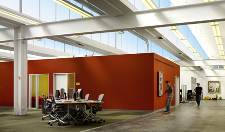
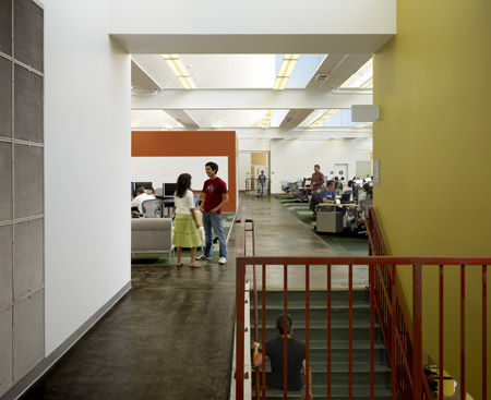
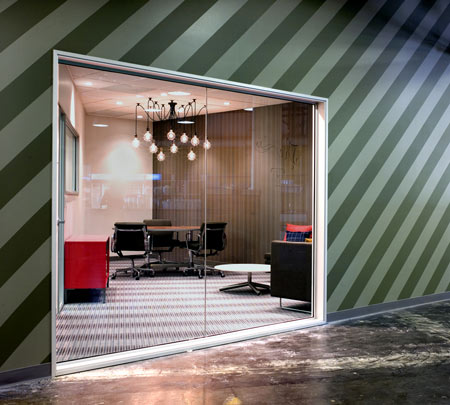
The design uses colour-coding to differentiate between teams within the open-plan space.

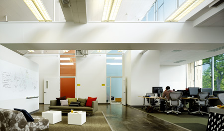
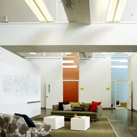
Some walls are left unfinished so that employees can add writing and artwork to them.

The Facebook website itself was used to consult employees about the new design and to keep them up to date about it’s development.

Here’s some more information from Studio O+A:

Facebook Headquarters
Palo Alto, California

Employees of Facebook recently moved to a new headquarters that facilitates interaction and connection, reflecting the company’s mission as a social networking website provider.

Formerly a laboratory facility for high-tech manufacturer Agilent Technologies, the 150,000-square-foot structure at Palo Alto’s Stanford Research Park brings together more than 700 employees originally scattered throughout 10 locations in and around downtown Palo Alto.

The design of the space relied heavily on input from the users, appropriate for a flatly structured company that weights every employee’s opinion equally. O+A designers interviewed employees about what they wanted from their new headquarters.

The Facebook platform was used to conduct company-wide polls about design decisions, post construction photos and updates, and keep everyone informed of the thought process behind the project.

An advisory board of employees from every department collaborated with the design team on the design process, from space planning to finishes to final move coordination.

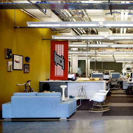
Because the new facility houses employees coming from various locations, the company wanted to maintain each division’s distinct identity. The design takes its inspiration from the patchwork nature of Facebook users and employees, bringing together seemingly disparate elements to form a cohesive pattern and using color and interior spacing to create neighborhoods within the open plan space.

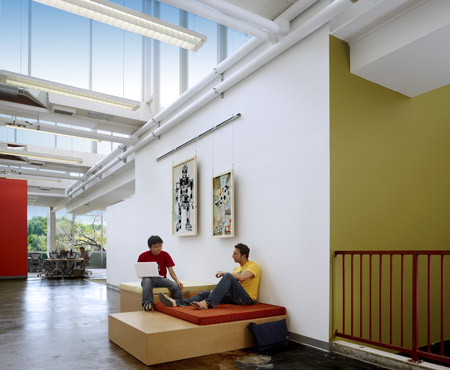
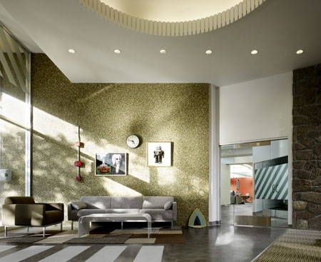
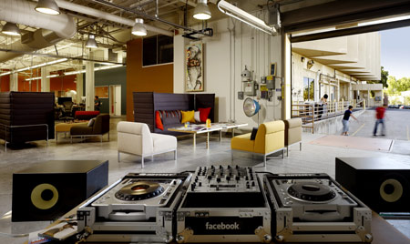
The company’s executives sit in central areas, accessible to all employees. Large lounges and open spaces provide venues for the community to come together.

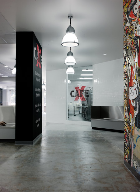
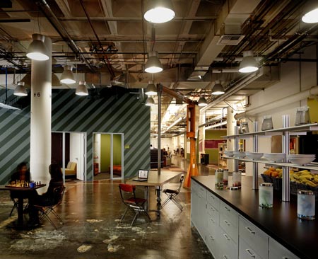
A kitchen and café continue Facebook’s tradition of providing gourmet meals to staff at all hours, while drinks and snacks are available at micro-kitchens throughout the headquarters.

Reflecting employees’ desire for a green headquarters, the facility is the first commercial project completed under Palo Alto’s 2008 Green Building Ordinance, making extensive use of existing architectural features, recycling millwork from the original lab, and repurposing industrial components for post-industrial use.

Other sustainable features include high recycled-content carpet and energy-efficient lighting.

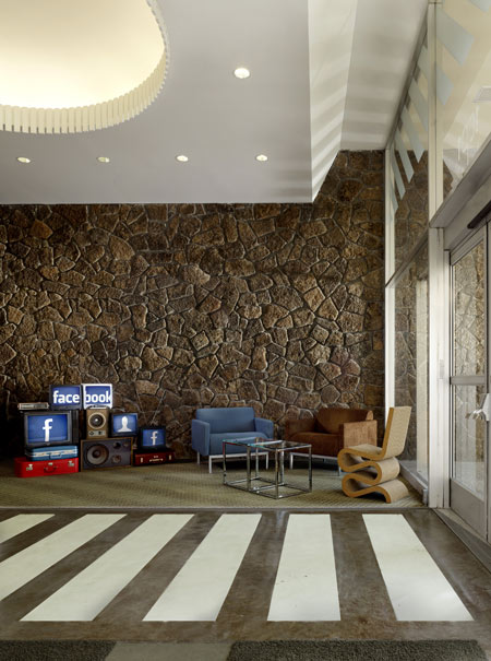
The design goal for the new facility was to maintain the history and raw aesthetic of the building and create a fun dynamic appropriate for the company’s youthful staff.

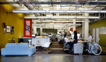
Many walls and spaces are left unfinished: employees are encouraged to write on the walls, add artwork, and move furniture as needed, allowing the building to evolve continuously.

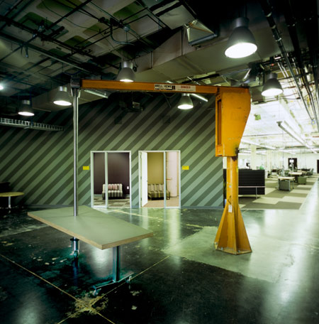
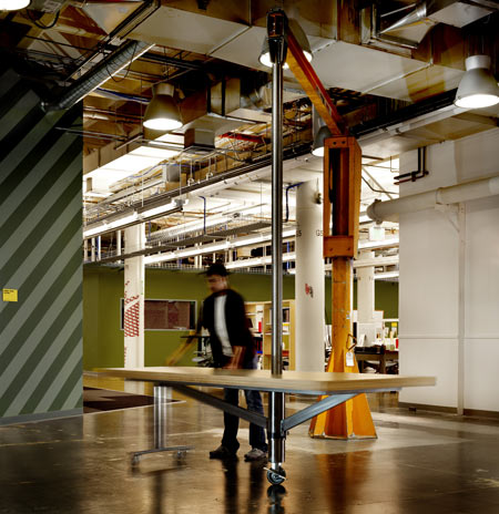
A bright orange industrial crane, left over from the building’s previous user, was repurposed by San Francisco sculptor Oliver DiCicco to support a table surface from its heavyweight hoist, offering maximum maneuverability. Referencing the industrial aesthetic of the building, a felt canopy spreads up one wall and onto the ceiling, defining a central meeting area that can double as an impromptu auditorium.

Mounted on threaded rods of varying length to achieve an undulating effect, the canopy absorbs sound and is penetrated at intervals by overhead lighting. An outdoor basketball court and indoor ping-pong table offer opportunities for recreation. And it is not unusual to see employees zipping along the concrete floors on two-wheeled skateboards.

Click for larger image

Designers: Studio O+A

Studio O+A is a San Francisco interior design firm serving companies nationwide. Founded by Primo Orpilla and Verda Alexander during the dot-com boom of the early 1990s, the studio began with a mission to bring sophisticated SOMA design to Silicon Valley start-ups and the venture firms who supported them.

Click for larger image

That start-up mentality is still a key feature of the Studio O+A aesthetic, but through the years, the firm’s mission has broadened to include a range of services for a client base that includes such major American corporations as eBay, Levi Strauss, and Williams Sonoma. Earlier this year, Studio O+A was recognized by the International Interior Design Association with an award for its remodel of the San Jose hairstylist W’s Salon.

61 Comments

  1. Ninian Says:

    Cool!!

  2. AJ Says:

    Why isn’t it all blue? ;)

  3. lovely Says:

    Sorry obut the negativity here, but…fancy pants. Most of the budget must have gone into the overpriced designer chairs and other alogical rotating furniture. Other than the Facebook aspect, nothing extraordinary about this project. I hope O+A got a good comision from the supplier for specing the furniture.

  4. gab xiao Says:

    it’s a nice building. the interiors’ casual look is a bit contrived and stylistically scruffy, of an overall banality

  5. tanya telford - T Says:

    it does look cool, plus nice to see a large organisation using designers to re-use & re appropriate to create the interior,

  6. momafresh25 Says:

    whow!cool!It seems like the atmosphere of Google headquater. I am wondering is that built in a factory or not? I really wanna see the out side bird view of this building.

  7. Donn Says:

    5 years from now when Facebook falls to become another MySpace…

  8. andie Says:

    a bit disjointed

  9. david cr Says:

    stuning!

  10. Saiman Says:

    This really looks like a awesome place to work! The new google?!

  11. gijsmans Says:

    Nice pictures. Silly architecture.

  12. Emerson Says:

    So eighties.

  13. vortekxt Says:

    …more like nineties.

  14. student101 Says:

    looks like a fun place to work, clever use of colour and “funky” – as an architectural piece of work… meh.

  15. llll Says:

    i HATE facebook, but i like the manipulation between bare exposure of pragmatical services and decoration of materiality….

  16. CUSH Says:

    Is it compulsary for employees to ride fixies? or are they part of the fitout?

  17. OV Says:

    This looks like an Ikea catalog, but with Design Within Reach furniture. So many missed opportunities to investigate new ways and spaces of working, playing and socializing. But like Donn says, most likely will become another myspace.

  18. Nikki S. Says:

    I agree. Feels disjointed.

  19. Emilio Says:

    Why can anyone see design? and architecturally speaking say something about this fantastic space? forget about what do you think of FB it is about what do you think about the great space that the architects did here….
    Think twice before posting

  20. Gabriel Lai Says:

    It’s an awesome design… Love the way they kept the 1960′ style

  21. Augusta Says:

    wow..that’s cool.. SUPER! :)

  22. HOT Says:

    …and in the end its only about one table + computer set next to another!but better tell the photographer not to focus on that!:-)

  23. bebo Says:

    i think its realy cool and down to eartth…simple ideas.

  24. urbanizr Says:

    nice job – too bad their site does not reflect any of that!

  25. Brian Says:

    Dude,

    THIS IS PALO ALTO, CALIFORNIA NOT LONDON OR MILAN!!!!!!!!!!!!!!!!!!!!!!!

    Lab type settings, peppered with designer furniture is the ‘Design Language’ of Techies there! (Remeber the Context lecture at Design school?)

    Anyway, I think it is rather boring and so 1993- Web based/ youth enterprise/ funky/ jeans wearing/ beanbag hippy engineer! (Although I am not adverse to this!!) I think they could have pushed it a bit more!

  26. antepostnow Says:

    interesting. reminded me so much of all the dot-gones i visited when i was in venture capital. i believed times changed. thought there was a process of maturity. a new cool. guess not.

  27. ira Says:

    gosh.. awesome.. wish i could join the team ^^

  28. RK_La Says:

    All you guys commenting on the pictures should care to read the descsription… this is a retrofit of a lab building originally built in the 60’s. Not “Silly Architecture” or “so Eighties”.

  29. The Fake Sartorialst Says:

    would not mind working here at all. I’m sure it will help in keeping the creative juices flowing at Facebook.

  30. Mads Says:

    trendy trendy…
    looks like google istn´t alone anymore

  31. BOLDFACE Says:

    Cool place to work with a casual feel overall. Love the bicycles parked here and there, crane table, choice of materials and the art inclination.

  32. Davidsign Says:

    A little “google-ish”, but I like it! It’s a space I would love to work in!

  33. verena Says:

    … and so ikea

  34. aYo Says:

    A large playspace for big children

  35. Merguez Says:

    Good. But what annoys me is that it exactly looks like I thought an office from facebook will look like. so good, but boring. yeah we own a billion dollar website but we’re still so cool. feed the cliché.

  36. ss_sk Says:

    Actually, it does look like a furniture showroom.

  37. michael Says:

    it seems a bit messy, doesnt it? Like they’ve just thrown in everything that can be cool, with no real common theme.

  38. haydy Says:

    I liked the “spider”-lamp (lightbowls hanging from the roof). Who made them?

  39. Jen Says:

    I’m in <3

  40. mattia Says:

    a bit messy..

  41. Chuck Says:

    Very nice. On the other hand, I have this weird loathing of “creative” office spaces. Maybe it’s the this-much-and-no-further, where the office pretends to encourage the staff to be further out, whereas it’s almost more constricting than a plain vanilla office in the sense of imposing a corporate culture, turning its style limits into a glass … Read Moreceiling, then lying about it by calling it out-there creative. You ain’t the boss o’ me!

    I think I’d find it consistently irritating, especially the panopticon aspect in the open office plans. That said, my take is probably weird, and I’ll probably just rebel against anything regardless. It’s probably more for the clients and investors and keeping up with the Palo Alto Joneses. How else could they live with themselves.

  42. tishaq Says:

    You are all jealous that your workplace is not as fun (turntables?? Beat that). I think this place creates an overall very cool atmosphere that fits with the company. This is no architectural masterpiece but is a decently developed scheme. I will qualify it more as interior design than architecture.

  43. arbol Says:

    Disney Club!

  44. george Says:

    MTV’S THE REAL WORLD PALO ALTO

  45. Tom Says:

    Very nice photos – I also like the 2 single speed bikes for decoration, especially the blue “facebook” bike. Does anyone know what bike it is?

  46. Johnson Mark Says:

    http://www.youtube.com/watch?v=ZMWz3G_gPhU

  47. Nihar Says:

    Thats the best part of working in web2.0 firms. Its all about cool offices :P

  48. Bud Smith Says:

    YES. What a bunch of horrid little people making snide little comments. Feel better about your lovely beige cubes now? Thought not.

  49. Kristopher Adams Says:

    I think this ultimately would be a fun place to work in theory although I am not sure the reality would match the design concept.

    I also agree with the eighties comments style/concept wise and also feel this matches the companies ethos too or atleast how I see it being on par with a lot of eigthies business agenda’s.

  50. Sascha Says:

    So funny comments! I really like that 60ties style design!

  51. sc hu yl er Says:

    lol at fixed-gear in waiting room.

  52. Remo Argenti Says:

    Geniale la facciata a spicchi, colori morbidi, assenza di soffitti, ambiente quasi domestico con angoli conversazione, tecnologia non aggressiva ma quasi al passo con la bicicletta, niente di superficiale
    ma solamente pretico

  53. minB Says:

    facebook is so cheap.. thought they would be making a lot of money out from their website.. yet.. built their HQ so cheap and not inspiring…

  54. TJ Downes Says:

    And still not made a dime in profit…

    Amazing how companies like Facebook can spend millions on niceties such as this without having a proven business model. Yet companies who have a proven business model have a hard time getting funding. It’s reveals the failure that is our economy and the simpleton mindset of investors who didn’t learn from the DotBomb.

  55. Rafs Says:

    Amazing, like the fact that the building’s older elements were just refurbished with modern touch of colour. So much aesthetic appeal, gotta love this! Brands who go this route, similarly to Saatchi & Saatchi’s lovemark environment has a goldmine…

  56. Diego Says:

    It’s a shame that Facebook traded their more urban offices across Stanford to this suburban one story building.

  57. ssh Says:

    who designed this building? it looks quite beautiful – any interior shots of the original state – minus the styling mess…?? And shouldn’t the original architects be credited?

  58. Steven Says:

    CDJs…! shame…

  59. Tim Rombach Says:

    WOW :-)

  60. Fernando Says:

    Nice Space. Architecturally, yes, there is always more you can do. What’s interesting here is that this kind of funky – eclectic design / decoration, rich in colors, textures, patterns and contrasts, will keep stimulating your brain and your imagination. Again, YES, there could be more done, but, is your office a more interesting space than this all together?

  61. ตี่ Says:

    แจ๋วหวะ

Submit a comment

See our comments policy