GKK Dental Ambulatory by Xarchitekten
Xarchitekten of Linz and Vienna, Austria, have completed a dental clinic that is based on an illustration of a set of teeth.

The GKK Dental Ambulatory, for the Upper Austrian regional health insurance company, is predominantly white with touches of mint-green, representing both the client's corporate colours and a fresh, toothpaste-y vibe.

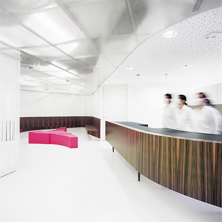
The clinic also has a curved reception area representing a throat, and a red seating area suggesting a tongue.

Xarchitekten's five partners are David Birgmann, Bettina Brunner, Rainer Kasik, Max Nirnberger, Lorenz Prommegger. They collaborated on this project with Anna Moser.

More Dezeen stories about Xarchitekten:
Folded house
Salon Mittermeier
Mayrhofer jewellery store

Here's some text from the architects:
--
Task: The relocation of various businesses from the Voestalpine steel manufacturer’s premises included the dental clinic of the Upper Austrian regional medical insurance company. The nearby “Service Zone” was chosen as the new location. The task was to create a modern and service-oriented clinic on a 525 m2 plot which offers the dentists the best possible hygiene and functionality at work and which receives and guides the patients.

Draft: The draft was defined by the clinic’s central theme, with the concept of a double row room structure for the extension, being derived from the two-dimensional illustration of a set of teeth. Five treatment rooms, as well as one room for prosthetic dentistry, are lined up next to each other on the southern side, benefiting fully from the natural sunlight. The separation of the rooms and their doorways are clearly defined by angular niches recessed into the walls that help guide the patients to their destination. Several functional rooms such as X-ray, rest and sterilising rooms can be found opposite the treatment rooms. The general concept is also emphasised by the colours used. The ubiquitous use of the clinical colour white, accentuated by the mint- coloured Corporate-Identity-Green of the regional medical insurance company, is the perfect analogy for hygiene and fresh breath.

Implementation: The general tone, created by the use of the colour white, is experienced by the visitor right from the doorstep. A white and soft PVC floor coating and a transparent back-lit ceiling made of polycarbonate web plates compensate for the reduced daylight in the hall and waiting area. The rolled-on pattern on the walls, as well as the mirrored “mouth hygiene” area with its display cabinets, completes the friendly and almost glamorous character. The latter was coated with acrylic glass rods reminiscent of the bristles of a toothbrush making it a success aesthetically as well as conceptually. This interpretation is successfully continued with a curved reception and seating area with desk and bench representing the throat, complemented by a red seating element as the tongue.

The dark wood veneer of Australian nut wood used for the desk and bench gives a warmth which counteracts the hygienic impression of the premises, disrupting the clinical theme and adding to the atmosphere. The high degree of technology typical of such a facility remains mostly in the background to produce surroundings that are considerate to the patient’s needs. It can only be seen through the translucent ceiling as well as the supply and exhaust air nozzles. The labelling and signposting of treatment and special rooms was also reduced and concentrated. The logical and clearly differentiated room structure demonstrates the recognisable success of the overall concept.
Text: Andreas Kump, March 2009 Translation: Anja Ganley, March 2009 Revision: xarchitekten, April 2009