Lad Musician Nagoya by General Design

| 30 comments
More:

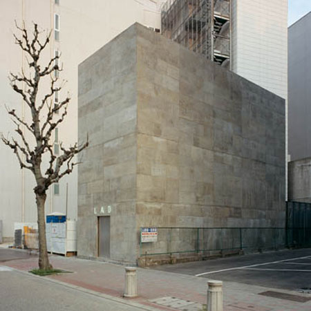
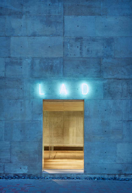
Japanese studio General Design have completed a tall narrow concrete flagship store with no windows for a clothing brand in Nagoya, Japan.

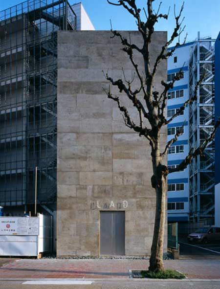
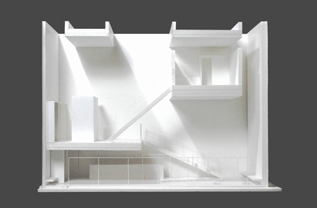
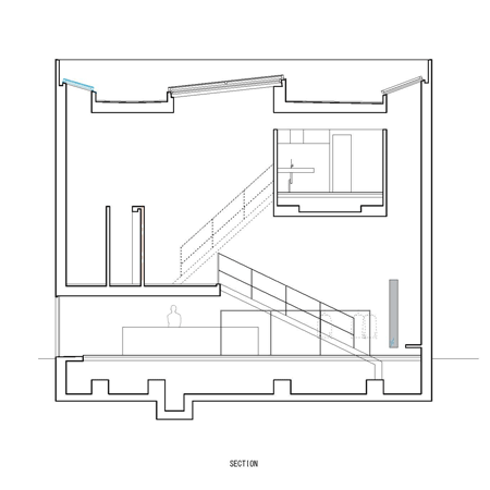
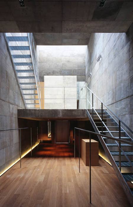
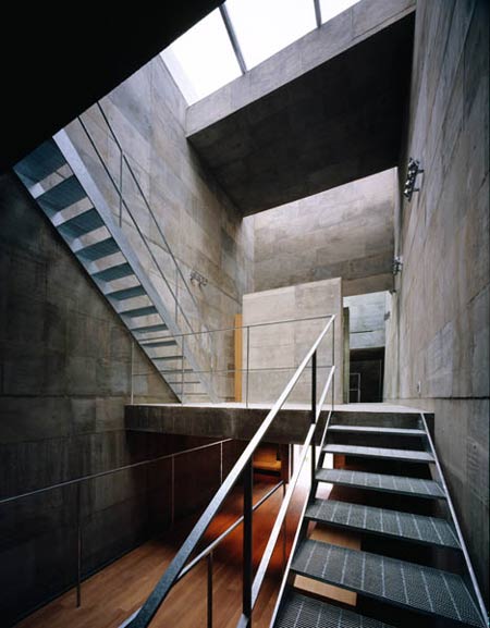
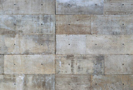
Called Lad Musician Nagoya, the building consists of an enclosed concrete box with three skylights in the roof.

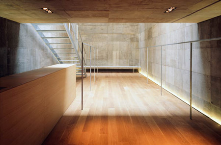
The interior features three split levels and uses only three materials: concrete, oak and galvanised steel.

Photographs are by Daici Ano.

Here's some text from the architects:

--

LAD MUSICIAN NAGOYA

We were approached by a prestigious apparel brand to design its new flagship store in Nagoya, Japan.

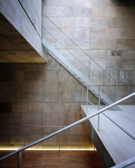
Conceptually, a concrete shell was created completely shutting out the sides while allowing its interior space to be filled with light by three skylights from above.

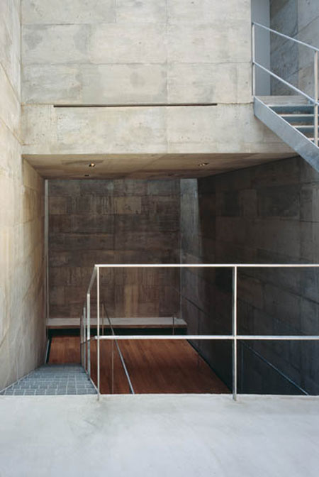
Intentionally playing with one’s visual perception, interior space transforms from a low ceiling-intimate space into a 10 meter-high space with soft light coming in from above. The stairs then leads to a fitting space on the top floor filled with light streaming down from the skylights.

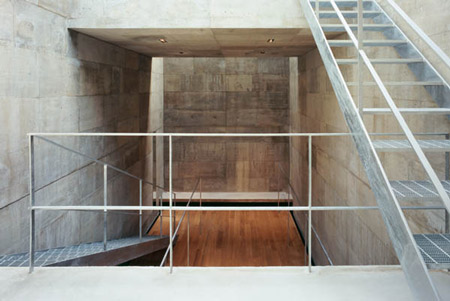
Playing with light and shadow, the interior is designed to differentiate spaces with different degrees of lightness though the physical space itself is still perceived as a whole.

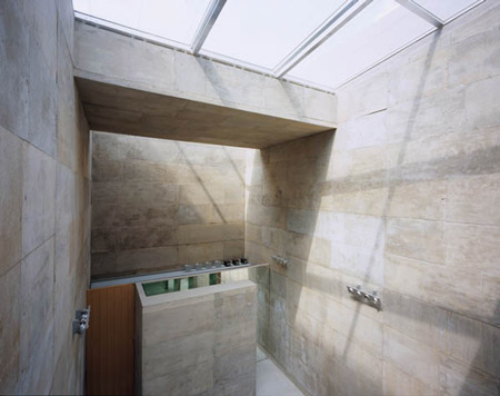
The building materials are intentionally limited to three: rough concrete, plain oak, and zinc-processed steel. Rough concrete is chosen over a smooth refined one because it gives a powerful feeling reminiscent of civil engineering work that has withstood the test of time.

Our design intention for this flagship store was to avoid a cosmetic approach of interior design by integrating more architectural concepts emphasizing beauty and strength of space and materials.

LAD MUSICIAN NAGOYA
LOCATION:NAKA-KU NAGOYA
SITE AREA:82.99m2
BUILT AREA:64.04m2
TOTAL FLOOR AREA:114.88m2
STRUCTURAL SYSTEM: REINFORCED CONCRETE

One Response to Lad Musician Nagoya by General Design

  1. ste says:

    really like the concrete surface! raw n sensual!
    the spice is nice too… looks very inspiring to me… only the artificial light is annoying… cant understand the light between floor and wall… so annoying

  2. guisforyou says:

    what an entrance!!!!! (third image)

  3. Christopher says:

    Brutal. Interesting, though.

  4. Mystie says:

    But it is not wheelchair accessible….

  5. peeween says:

    like the early Tadao Ando, very radical, harsh, yet appealing.

  6. name says:

    @Mystie

    It’s Japan… They don’t care about it.

    It’s still great a design.

  7. harsh severe. would make a great dance club!

  8. CROFTdesign says:

    IS much of anything wheelchair accessible in Japan?

  9. ness says:

    solitary jail cell

  10. Jovanny True says:

    The Spirit & Atomsphere are very closed to Tadao Ando’s projects.

  11. William says:

    funereal.. i would live in it.. like a monks retreat

  12. JOEF says:

    the indulgence of architects….is it there first time?

  13. AJ says:

    Powerfully innovative!

  14. Jimmy says:

    Wish all clients were this open-minded! I think this is great!

  15. angry catalan says:

    Uncomprimising, I like it.

  16. angry catalan says:

    by the way, not only it’s not wheelchair accessible, but the 2F stairs are quite steep! Look at the section.

  17. concrete+concrete+concrete, it’s just a closed cube…intriguing.

  18. Ali Manco says:

    Looks like an SM club from outside.
    Where are the clothes by the way? I am really tired of all those Japanese projects with completely empty interiors.

  19. PERTH GLORY HOLES says:

    if that was a jail.
    i would confess to public urination any time

  20. Daga says:

    Great.
    In Japan they would carry you upstairs if you come in a wheelchair.

  21. DrewDrew says:

    That’s the greatest idea ever. They are selling the emperor’s clothes.

  22. graeme says:

    a beautiful project – well done. nicely managed sequence of spaces (including deliberately low entrance) within an austere shell. I like the recessed light detail – I’m sure it adds a lot at night.

  23. Horrible Haridas says:

    Beautiful! I don’t even miss the windows…

  24. amsam says:

    Interior layout is AMAZING. But the sun is our friend. Why hate her light so?

  25. peppy says:

    the concrete work is superb!
    very strong and uncompromising space…

  26. TH says:

    i wonder how the space feels like when the shop put in their clothes and everything… squeeze people…

  27. xtiaan says:

    @th I wouldnt worrry they probably just display 2 socks and a t-shirt….
    via holographic projection.

    the japanese are CRAY-ZAY.
    crazy awesome that is.

  28. Robert says:

    In Japan people in wheel chairs wouldn’t even be able to reach the store front, so if it’s accessible or not is a moot point.

    I wonder about the insulation though. Oh, I forgot, this is Japan. We don’t do insulation here.

    Beautiful building though.

  29. yrag says:

    The hard wood floor and underlighting are your only assurances that you are not to be interrogated.

  30. gaga says:

    what?
    how do people make such bizzare comments!
    its japan, buildings are small, you do sqeeze through stores, you do scale steep stair cases.
    the light in this project is a miracle….architects are not indulging themselves, they are indulging anyone who walks into this building in a miracle!

Leave a Reply

Your email address will not be published. Required fields are marked *

*

You may use these HTML tags and attributes: <a href="" title=""> <abbr title=""> <acronym title=""> <b> <blockquote cite=""> <cite> <code> <del datetime=""> <em> <i> <q cite=""> <strike> <strong>