web tracker
February 19th, 2010

Here are some photographs of the VitraHaus by Swiss architects Herzog & de Meuron, which has opened at the Vitra Campus in Weil am Rhein, Germany.
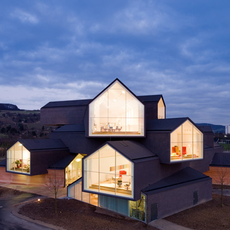
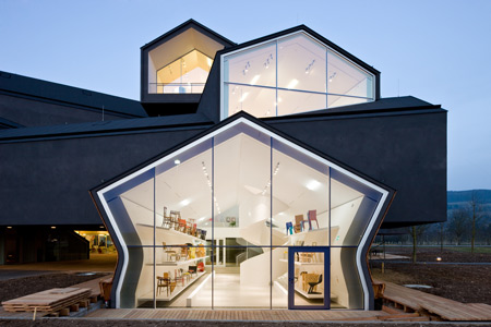
Designed to display the furniture brand’s Home Collection, the five-storey building consists of stacked volumes with pitched roofs covered in charcoal stucco.

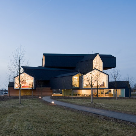
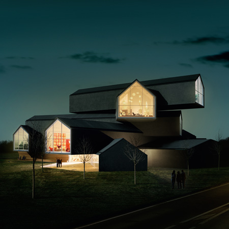
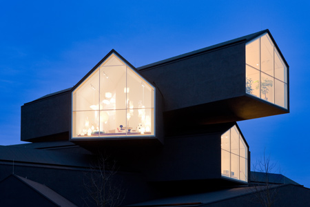
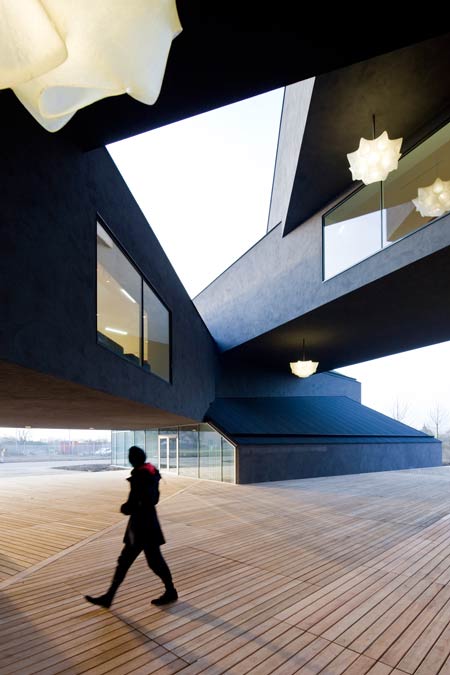
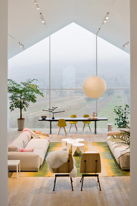
Each gabled end is glazed and cantilevers outwards up to five metres, creating the impression of a pile of houses.

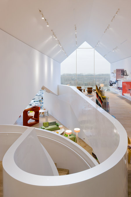
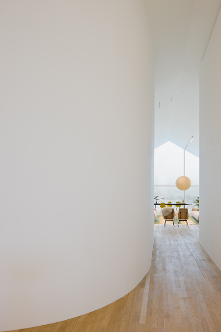
Internally, spiral staircases connect the intersecting white-painted interiors.

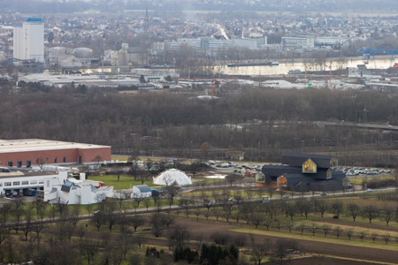
The VitraHaus project joins existing buildings on the Vitra campus by Frank Gehry and Tadao Ando.

More information in our earlier story.

Photographs are by Iwan Baan.

The text below is from Vitra:


Herzog & de Meuron: VitraHaus, Weil am Rhein

In January 2004, Vitra launched its Home Collection, which includes design classics as well as re-editions and products by contemporary designers. As a company whose previous activity was primarily focused on office furnishings and business clients, Vitra created the Home Collection with a new target group in mind: individual customers with an interest in design.

Since no interior space was available for the presentation of the Home Collection on the Vitra Campus in Weil am Rhein, the company commissioned Basel-based architects Herzog & de Meuron in 2006 to design the VitraHaus. Thanks to its exposed location and striking appearance, it not only enhances the already outstanding ensemble of Vitra architecture, but assumes the important role of marking the Vitra Campus. Standing on the northern side of the grounds in front of the fenced perimeter of the production premises, the VitraHaus joins two other buildings in this area, the Vitra Design Museum by Frank Gehry (1989) and the Conference Pavilion by Tadao Ando (1993). The ample size of the plot made it possible to position the new structure a good distance away from the Vitra Design Museum and adjacent gatehouse, making room for an extension of the orchard meadow in front of the buildings, a typical feature of the local landscape.

The concept of the VitraHaus connects two themes that appear repeatedly in the oeuvre of Herzog & de Meuron: the theme of the archetypal house and the theme of stacked volumes. In Weil am Rhein, it was especially appropriate to return to the idea of the ur-house, since the primary purpose of the five-storey building is to present furnishings and objects for the home. Due to the proportions and dimensions of the interior spaces – the architects use the term ‘domestic scale’ – the showrooms are reminiscent of familiar residential settings. The individual ‘houses’, which have the general characteristics of a display space, are conceived as abstract elements. With just a few exceptions, only the gable ends are glazed, and the structural volumes seem to have been shaped with an extrusion press. Stacked into a total of five storeys and breathtakingly cantilevered up to fifteen metres in some places, the twelve houses, whose floor slabs intersect the underlying gables, create a three-dimensional assemblage – a pile of houses that, at first glance, has an almost chaotic appearance.

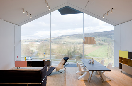
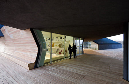
The charcoal colour of the exterior stucco skin unifies the structure, ‘earths’ it and connects it to the surrounding landscape. Like a small, vertically layered city, the VitraHaus functions as an entryway to the Campus. A wooden plank floor defines an open central area, around which five buildings are grouped: a conference area, an exhibition space for the chair collection of the Vitra Design Museum and a conglomerate comprising the Vitra Design Museum Shop, the lobby with a reception area and cloakroom, and a café with an outdoor terrace for summer use. A lift takes visitors to the fourth storey, where the circular tour begins. Upon exiting the lift, the glazed northern end of the room offers a spectacular view of the Tüllinger Hill. The opposite end – where the glass front is recessed to create an exterior terrace – opens to a panorama of Basel with the industrial facilities of the pharmaceutical sector. As one discovers on the path through the VitraHaus, the directional orientation of the houses is hardly arbitrary, but is determined by the views of the surrounding landscape.

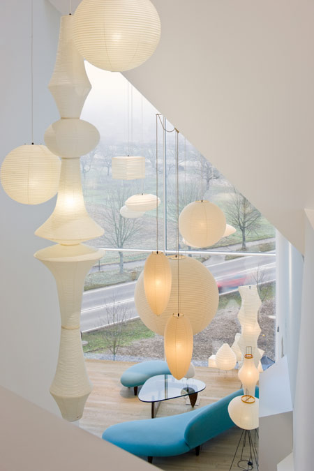
The complexity of the interior space arises not only from the angular intersection of the individual houses but also from the integration of a second geometrical concept. All of the staircases are integrated into expansive, winding organic volumes that figuratively eat their way through the various levels of the building like a worm, sometimes revealing fascinating visual relationships between the various houses, at other times blocking the view. The interior walls are finished in white in order to give priority to the furniture displays.

With maximum dimensions of 57 metres in length, 54 metres in width and 21.3 metres in height, the VitraHaus rises above the other buildings on the Vitra Campus. The deliberate intention was not to create a horizontal building, the common type for production facilities, but rather a vertically oriented structure with a small footprint, which grants an overview in multiple senses: an overview of the surrounding landscape and the factory premises, but also an overview of the Home Collection. Just as interior and exterior spaces interpenetrate, so do two types of forms: the orthogonal-polygonal, as perceived from the exterior, and the organic, which produces a series of spatial surprises in the interior – a ’secret world’ (in the words of Herzog & de Meuron) with a suggestive, almost labyrinthine character. On their path through the five storeys, visitors traverse the Vitra Home cosmos, ultimately returning to their starting point.

The VitraHaus has a daytime view and a night time view. In the evening, the perspective is reversed. During the day, one gazes out of the VitraHaus into the landscape, but when darkness falls, the illuminated interior of the building glows from within, while its physical structure seems to dissipate. The rooms open up; the glazed gable ends turn into display cases that shine across the Vitra Campus and into the surrounding countryside.

This website uses IntenseDebate comments, but they are not currently loaded because either your browser doesn't support JavaScript, or they didn't load fast enough.

47 Comments

  1. Tayab Says:

    To be fair, that is pretty brilliant.

    Well done

  2. the designdummy Says:

    Is it a house?

  3. Freddy_C Says:

    gorgeous, epic and fresh!
    you can always relay on H&M!

  4. m Says:

    And that’s exactly where it all went wrong with Herzog & de Meuron. When the fresh and sensitive conceptual design became a gimmick.

  5. rodger Says:

    great project, partly because it is so straight forward conceptually.
    the idea is not lost in its execution.

  6. Christopher Says:

    Oh darn I’ll have to go back to Weil am Rhine…

  7. bibo architect Says:

    sections will be appreciated guys! .. I hate posts where there is no drawings

  8. Andy Says:

    Remember back in the 90s when H&dM still cared? Yeah, me too.

  9. design traveller Says:

    One more great project. I’ve become Herzog & de Meuron’s humble fan when I saw Tate Modern.

  10. francesco Says:

    how is the circulation inside?

  11. stan Says:

    Nice, simple, but short of brilliant. It may be the photos. I’ll reserve final opinion until I can visit but it seems like a 5 minute concept without the intellectual rigor to make it special.

  12. Gary Barber Says:

    As much as i like H&Dm
    And who am i to criticize…
    But its an object… any designer could do just as well
    Architecture is meant to be so much more then that…
    Close up its rather cool but ists not mutch diferent than what we’ve already seen…
    In the last picture it looks like a spaceship landed “somewhere” or even “anywhere” :p but thats just my opinion!

  13. CROFTdesign Says:

    who makes those wooden chairs in the 3rd interior picture from the top?

    House is quite nice, a little too much white to be warm and welcoming for my eclectic taste, but nonetheless, quite nice.

  14. edie Says:

    i wish i could see an image with the sunlight hitting the building

  15. alex Says:

    this is seriously cool. never seen anything like it.

  16. Abhi Says:

    HdeM are awesome ! brilliant !
    Any drawings

  17. 60403020 Says:

    Pritzker?

  18. sepn Says:

    this is beautiful!

  19. Eddie Mambo Says:

    Beautiful Work Of Arte !

  20. QFWFQ Says:

    vitra的家具产业园区已经成为建筑大师的作品展区,我觉得这个是最棒的。

  21. recon::decon Says:

    This seems like more of BIG or JDS project. Maybe even OMA at their most gimmicky. After the Beijing “Birds Nest” Stadium, this feels like a really huge letdown. After all this is the Vitra campus that houses one of Zaha’s best buildings and then we get this rather trite, over simplistic design? I think there might have been more of an innovative way to approach this concept that didn’t involve stacking some Monopoly houses and covering them with stucco.

  22. cacas Says:

    os caras sao bons demais! ja estive em algumas obras deles e o acabamento sempre impecavel.. well done!

  23. romance-bad Says:

    we need plans to understand the circulation…

  24. Keunert Says:

    sou fujimoto will be pleased to know that h&dm like him.
    very nice building.

  25. tlf Says:

    @CROFTdesign

    i think the wooden chair you asked for is “antony” designed by jean prouvé from – what else, being in these pictures – the vitra home collection.

  26. wii Says:

    Nice as ice!

  27. lorenzO Says:

    Quando la forza delle idee anticipa le forme non esiste manierismo.
    Grandi Herzog & de Meuron!

  28. Attila Bujdoso Says:

    yes, Sou Fujimoto evoked…

    I was lucky to see Mr. Fujimoto’s great lecture in Budapest, organized by KÉK – Hungarian Contemporary Architecture Centre. (http://kek.org.hu)

    What was funny that Fujimoto’s similar project was the only project I disliked. Such a deconstruction of the archetypal house form is too evident and but also awkward for me.

  29. Nicholas Szcepaniak Says:

    Puritanical brilliance; idea, execution, delivery. Well done.

  30. MrCoolTeapot Says:

    Super cool design but isn’t this reminiscent of another recent building built or soon to be built?

    I’m not an engineer but doesn’t all that surface exposure, i.e. roof/siding, send energy costs thru the roof?

    Increased roof area increases leaking possibilities, exposed underside increases heating/cooling costs?

    just wondering?

  31. Cpt. Poon Says:

    I guess a project like this made it even easier for Harry Gugger to leave HdM.

  32. Lucas Gray Says:

    in response to recon::decon:
    Hadid’s building for the Vitra campus is not one of her best and not even a great work of architecture. It was her first built project I believe. It currently sits empty because it didn’t function as a Firehouse and doesn’t have the thermal control needed to be a furniture showroom. Basically it is just used for parties and other events from time to time. Not good architecture at all.

    As for the Herzog and de Meuron project. I like it although I agree it doesn’t necessarily live up to the rigour of many of their past projects. However, I feel that they have outgrown themselves. Their office has gotten too big and thus the design talent has been diluted. Some of their other projects that are in the works are rather bland, gimmicky and flashy – not the traits that earned them their superb reputation. Their new project near the Basil Train Yards (I think it is some sort of retail center) looks atrocious. I also hated their design for the Gazprom Tower in St. Petersburg. I expect more from them, although perhaps they set their standards impossibly high with such an amazing catalog of past work.

    -Lucas Gray

  33. Samuel Ludwig Says:

    I wish I had a better sense of the interaction between the extrusions. All the photographs show are stacking on the outside, and then gables on the inside. The one shot that ‘kind of’ does this is just, a gable shot with a staircase.

    It would be great to see some sections/axons/diagrams of this to make up for the lacking photography.

  34. recon::decon Says:

    Just to clarify:

    The fire districts were reestablished which then included the Vitra campus within an existing district, therefore the fire station was no longer needed and thus converted to showcase and store the furniture collection. Considering the building has been repurposed it’s hard to criticize things like thermal controls that may not have been an issue when it was designed to be a fire state.

    Obviously “best” is a personal decision, however I find the Vitra to be one of the few projects that really isn’t too far away from her original vision and was done during the period when Zaha actually designed projects. I find her work today to be totally the product of the software that created it and lacking in any sort of imagination, rigor or talent.

  35. Doug Osborn Says:

    DesignDummy, truly…. do you read? …or just start your blabbing fingers?

  36. Mark Says:

    The kiddies will love it.

  37. lior Says:

    the masters in action again.
    they never stop to explore shapes and always come with innovative and new ways to architecture.
    i love it, love the shapes and the spaces it creates from such a simple shapes.
    they almost creating a new architecture from the most traditional shapes….

  38. pi Says:

    wow! it looks unreal..veeery nice

  39. mi Says:

    维特拉里面喜欢这个,像童年的梦。
    dream of children

  40. anel Says:

    simpy- very, very, very……..nice.:)

  41. José Monteiro Says:

    STUNNING!

  42. Reinier Says:

    Amazing. But do we need amazing buildings screaming for attention? Personally I prefer their earlier, more subtle, less gimmicky work….

  43. up_today_arch Says:

    It was presented long time before by pictures from building site etc. Most interesting it has a lot of small detailes inside… I thought it is pure and simple, like paper model, but… I afraid it is IKEA showrooms…

  44. Ralph Kent Says:

    RE: The Sou Fujimoto comments – the concept images for this and his buiilding came out around the same time. If anything, I think H&dM were before him (first images for this were around 2004, weren’t they?).

    I do find it tediously boring though, a concept diagram faithfully translated into a building. I’m hoping that the Tate Extension will sing as architecture should, because this scheme doesn’t, in my eyes. But then again, its at the vitra showroom, so subtlety was never really on the cards, was it?

  45. b9G Says:

    A fan of H&M, but…
    Space looks inspiring on the inside (on photos at least) but it is a visual disaster on the outside. It is an energy knot of straight uncompromising get-the-hell-out-of-the-way lines. Caskets on top of caskets. WT*? ….Feng Shui, anyone?

  46. sameh arar Says:

    i need for the plan and the section of this design so please if some one can do that !?????iam very interested in that!!

  47. Aaron Says:

    herzong & de meuron tan locos como siempre, exelente diseño

Submit a comment

See our comments policy