Jesolo Magica by Zaha Hadid Architects
Zaha Hadid Architects have designed a retail and business centre for the resort of Jesolo near Venice in Italy.

Called Jesolo Magica, the project will include shops, bars, restaurants, offices, a hotel, a congress centre and health centre.
The building is due for completion in 2014.
See all our stories about Zaha Hadid in our special category.
The information that follows is from Zaha Hadid Architects:
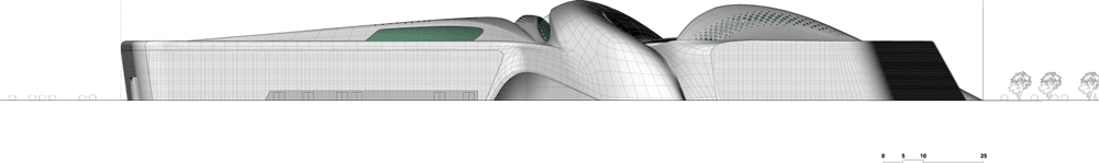
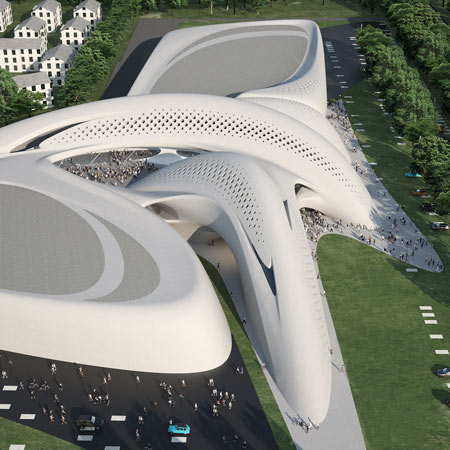
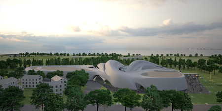
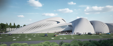
Jesolo is one of Italy’s most established seaside resorts and the design of Jesolo Magica makes full advantage of its location near the Venice Lagoon.
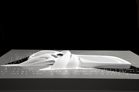
The project aims to be the catalyst for reinvention and regeneration – giving the of the town of Jesolo an excellent opportunity to further develop as a conference and holiday destination.
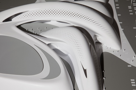
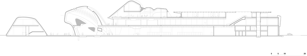
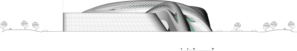
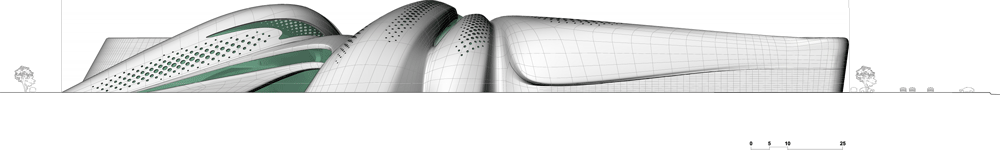
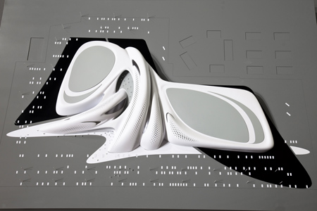
The design creates a continuum of fluid space that instigates a renewed sense of possibility.

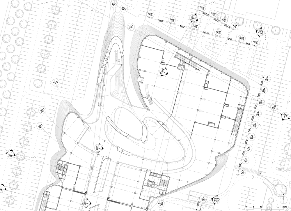
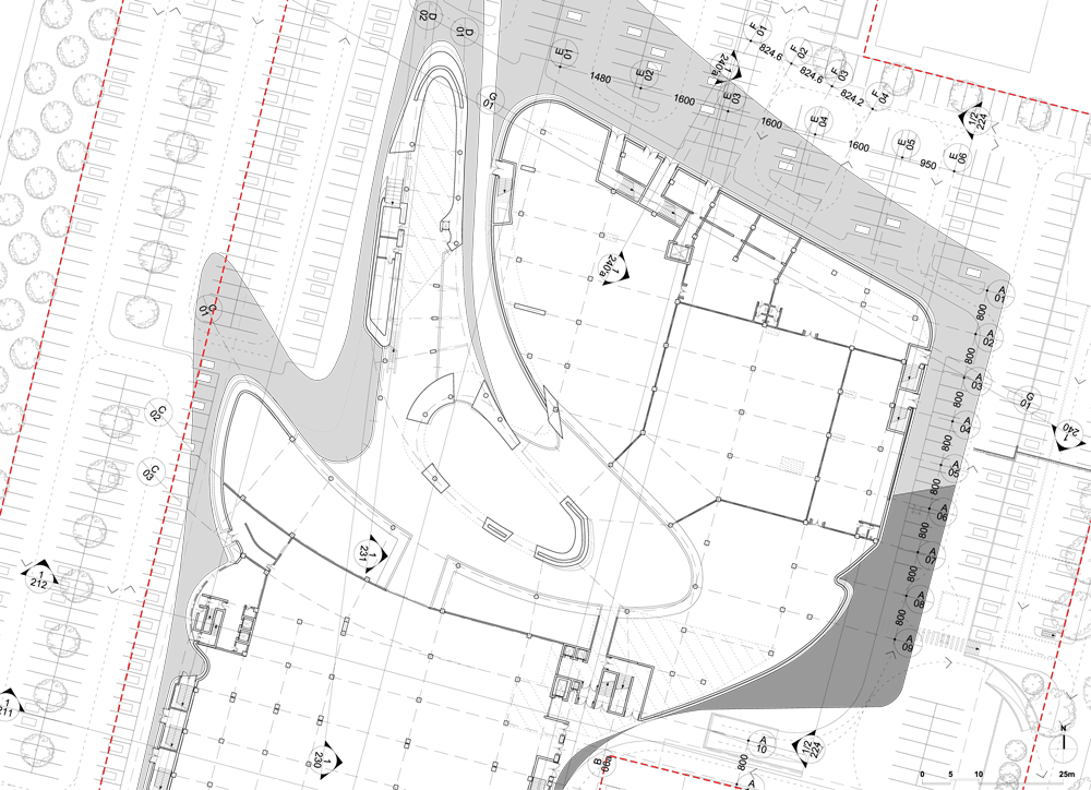
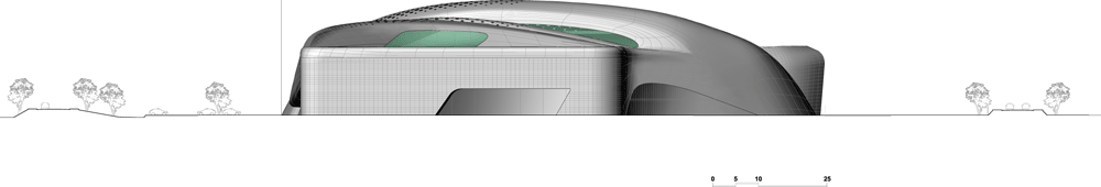
The disparate elements of the Jesolo Magica complex fit together to form a coherent field of buildings, each one separate - but logically connected to the next in a continually changing ensemble.
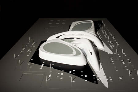
The volumes encompassing the retail centre “open-up” around a central space, like the petals of a flower. The hotel building forms the final “petal”, framing the views over the adjacent lagoon.

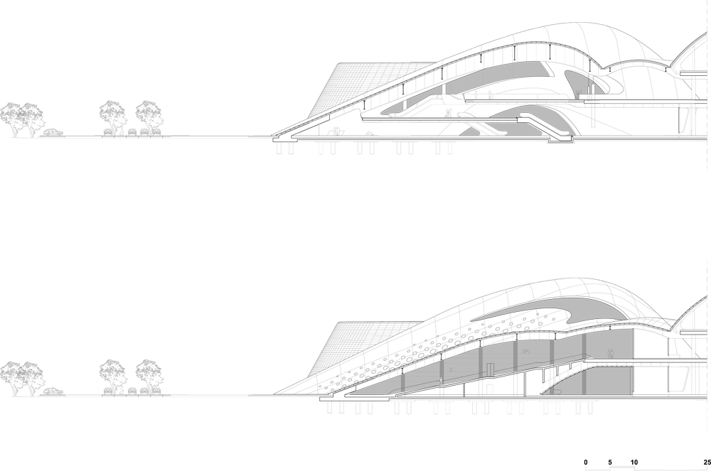
In addition to offices, retail spaces and restaurants, the Jesolo Magica project features a hotel with conference center, spa, nightclub and outdoor spaces for events.

JESOLO MAGICA - RETAIL & BUSINESS CENTRE
2010 - 2014
PROGRAM: Retail, Bar, Gymnasium, Hotel, Restaurant, Offices, Congress and Wellness centre
CLIENT: HomeGroup
ARCHITECT: Zaha Hadid Architects
DESIGN: Zaha Hadid with Patrik Schumacher
PROJECT DIRECTOR: Gianluca Racana

PROJECT ARCHITECT: Paolo Matteuzzi
DESIGN TEAM: Marco Amoroso, David Campos, Ayat Fadaifard, Massimiliano Piccinini, Ivan Valdez, Francesca Venturoni
STRUCTURES: Favero & Milan Ingegneria
M&E: Manens Intertecnica
COST: Building Consulting
CITY PLAN CONGRUITY: Proteco