Livraria de Vila by Isay Weinfeld Arquitecto

| 31 comments
More:

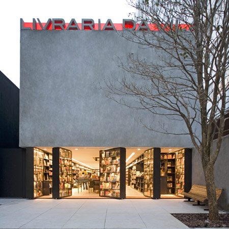
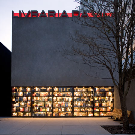
Livraria de Vila is a bookshop in São Paulo with a store-front made of revolving bookcases, designed by Brazilian studio Isay Weinfeld Arquitecto.

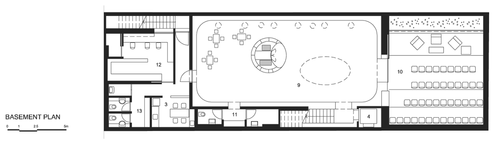
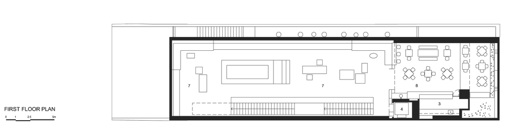
Completed in 2007, the project involved the renovation of a two-storey house on the deep narrow site and included the addition of a basement.

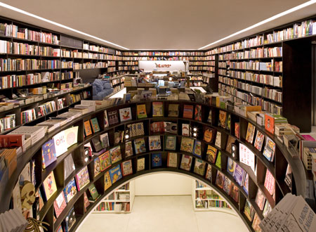
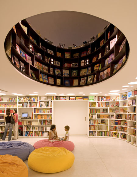
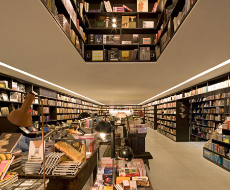
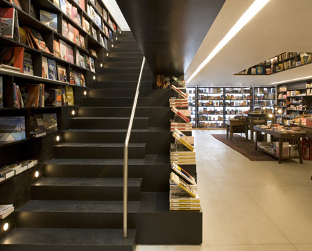
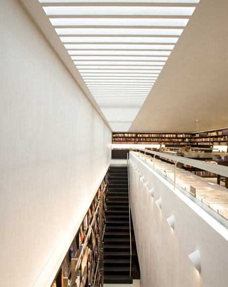
The walls of each level are covered with shelves from floor to ceiling and apertures between floors are lined with books too.

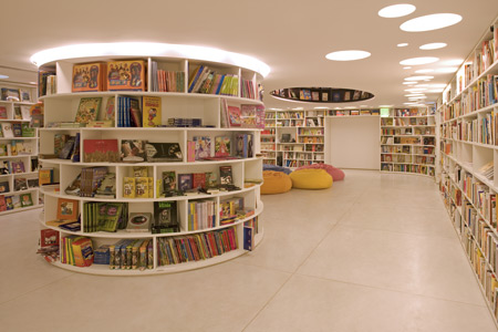
The basement level is dedicated to childrens books, in addition to a small auditorium for lectures and courses.

See also:

Dezeen’s top ten: shops (August 2009)
Sumaré House by Isay Weinfeld Arquitecto (December 2009)

Here is some more information from the architects:


The Livraria da Vila is the result of the refurbishment of a two-story house, built on a very narrow plot in São Paulo.

From start, it was clear an open plan was needed, as to better arrange products and circulation. For that reason, significant structural alterations were performed to the existing building, such as the incorporation of metal parts that would make it possible to displace the pillars to the outer sections of the building, and reinforce its foundations.

The inclusion of one level – basement – allowed for the setting up of an entire floor exclusive for children, in addition to a small auditorium, to hold courses and lectures.

We believe that in a commercial venue, a project must always be developed to enhance the product, its in-store merchandising, and its sales.

Click for larger image.

There are, undoubtedly, innumerable ways to achieve this goal, and it is probably the nature of the approach that distinguishes each project.

Click for larger image.

We, in particular, strive for solutions that will allow customers to experience the product as comfortably as possible.

Click for larger image.

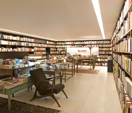
In the case of Livraria da Vila, such comfort is translated into the composition of low-ceiling spaces, dark tones, indirect lighting and infinite shelves – in careful disarray – covering all walls to the ceiling.

Click for larger image.

Whichever direction one looks at, there are books, and an unpretentious feel, reminding that of used-book stores, making customers at ease to browse the shelves for the books they want, to leaf through or even read them in the couches and easy chairs scattered around the multiple stories.

Click for larger image.

The pivoting window-shelf-doors, and the voids “connecting” one floor to the next, are other project elements that, unexpected, invite customers to enter and explore the store and its various spaces.

Click for larger image.

Architect: Isay Weinfeld
Collaborator: Domingos Pascali
Project manager: Monica Cappa
Team: Marcelo Alvarenga / Juliana Garcia / Leandro Garcia
Date of commission: Sept 2006
Date of completion: Apr 2007
Buit area: 790,00 m²

Click for larger image.

One Response to Livraria de Vila by Isay Weinfeld Arquitecto

  1. pi says:

    i really like the pivoting window-shelf-doors ..but i guess it works only in a warm climate :)

  2. angry catalan says:

    The façade is beautiful. That little entry “plaza” looks nice too but I’d like to see a picture of how you get there, I guess there must be some buildings around so it all depends on how it relates to them (or obscures them, if needed).

    I wish the interiors were a bit more “Sao Paulo school” – it’s all a bit too polished, and I don’t like the silly fluoro circles at all. It’s a bit dark too, but it’s a store so I guess it’s ok.

  3. Very cool idea! Gives a real feeling of being surrounded by books. The open planning and addition of books in the apertures between level gives it a feel of a grand old library with a bright modern take.
    I’d love to go for a visit!

  4. Bandar says:

    This project represent the idea of how interior design can be the key design.

  5. WOW! now this is when you can tell people the time of bookstores is not over!
    What a magical place. I would want to go there, sit and read through some books, and then buy lots more just to keep it going.

    • logotipo says:

      Agreed… great work of architecture and use of space… somehow reminds me of Howard Roark in Ayn Rand's "The Fountainhead". It would probably be something he would enjoy.

  6. Anja says:

    Simply greatful… Nice place great design…

  7. Priscila says:

    This is an amazing bookshop in SP! But on your post you’ve published livaria instead of livraria with an R after de V!
    But it still is an amazing post and a great place to go!

  8. DK says:

    Love the enrance! the bulding looks like its hovering in mid air! The bookshelves have been designed carefuly and respond to the tight narow site. Good to see plans, although wats up with those sections….?

  9. poster says:

    love it

  10. Q says:

    very nice! books everywhere! =)

  11. leandro locsin says:

    atrium books… nice! works well if i can fly

  12. hayden says:

    What a beautiful space. Perfect execution.

  13. Kristen says:

    is the gap in between the floor function as a display area?quit hard to see though its nice.

  14. Viktor U says:

    Great entrance concept! Love it

  15. modular says:

    I dig it!

  16. klejdi eski says:

    It’s the wonderland for books !

  17. abdulqadirabas says:

    a simple gesture turned into a great features!

  18. amelia says:

    Putting the children’s book section under an opening surrounded by hundres of precariously placed books. Isn’t that brilliant or what ?

  19. Felipe Góes says:

    I have been there. Its a great building!

  20. aveclaudenum says:

    I like it, but in a warm climate like Sao Paulo, aren't there a good deal of bugs that can fly into the store and nest? Yes? No?

  21. I love that large square of cement. On a clear day with the light just right, I bet the imperfections are interesting. It’s blankness really makes those everything else stand out.

  22. Ayham says:

    Besides the beautiful facade, nothing’s interesting.

  23. aonie says:

    super facade, nice building

  24. bodkin says:

    stunning. particularly love the sign at the top with the coloured band behind

  25. nique7 says:

    very interesting design. but another issued not tackled is the issue of categorization of books. usually people have hard time finding books in the library because the department divisions are sometimes confusing. seems the architect only took the books as advantge to beautify his facade.

  26. mohamad_makouk says:

    i wd love to stand for like an hour just contemplating the facade!

  27. ghull says:

    love his work

  28. enrico says:

    A great project ! I am glad everyone seems to agree.

  29. ivan says:

    it is livraria DA vila, not livraria de vila…

    great project! congrats!

Leave a Reply

Your email address will not be published. Required fields are marked *

*

You may use these HTML tags and attributes: <a href="" title=""> <abbr title=""> <acronym title=""> <b> <blockquote cite=""> <cite> <code> <del datetime=""> <em> <i> <q cite=""> <strike> <strong>