Notariaat by Atelier Vens Vanbelle
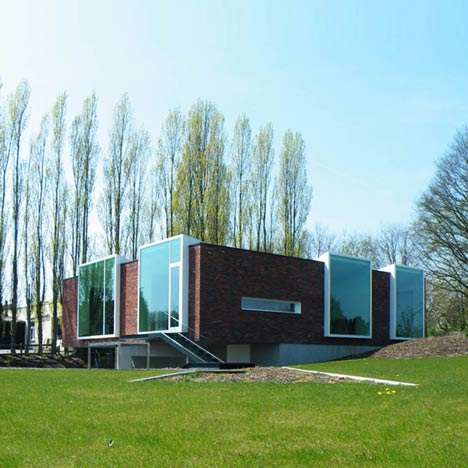
This office building in the Belgian hills by architects Atelier Vens Vanbelle has a brick facade broken by huge windows overlooking the surrounding farmland.

The offices, waiting room and kitchen open out to the views on two sides, turning away from the adjacent street and restaurant.

The building is cantilevered at the back to accommodate staff parking beneath.

Here are some more details from the architects:
The building site is situated at the end of a small street in the small village of Horebeke in the Flemish Ardennes, next to a restaurant. The view from the site is splendid: the landscape slopes slowly and offers an overview to an untouched agricultural area spread over two kilometers.

This kind of impressive landscapes asks for discrete admiration, just like the design assignment itself.

A notary must be a building that establishes itself in a neutral way and it should be accessible for each type of visitor.

We believe building in a landscape like this asks for the same kind of neutrality.

This was translated in a rough brick volume which is semi-closed to the street side and the restaurant.

The entrance to the building is marked by a white volume made of steel plates.

Walking through this white volume, the visitor enters a corridor looking out over a patio on the right side.

On the left side the corridor bends to the waiting room which opens cone-shaped to the landscape.

The kitchen and the offices open in a similar way to the outside. The peaceful landscape is framed through the windows like colourful paintings in the white interior.

The back of the building cantilevers over the sloping terrain. The staff can park under the building and the cars form no visual obstruction from within the building.

Click above for larger image
location: Horebeke, Belgium
construction: 2009
architect: atelier vens vanbelle
See also:
.
 |
 |
 |
| Casa Orquidea by Andrés Remy Architects |
VitraHaus by Herzog & de Meuron |
More architecture stories |