
Frei + Saarinen Architects of Switzerland renovated this 100 year-old parish centre in Zurich by installing walls at all angles.

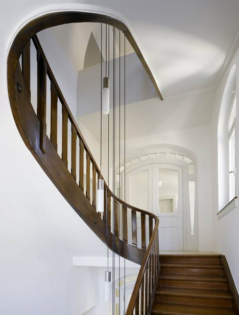
The project, entitled Parish House St. Josef, involved creating a glazed entrance on the ground floor, wood-clad lobby with sloping, faceted walls, and the priest's accommodation above.

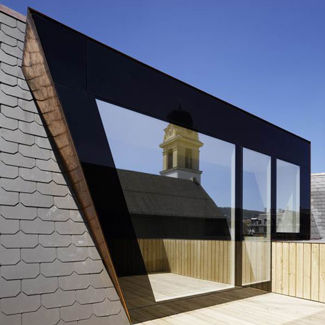
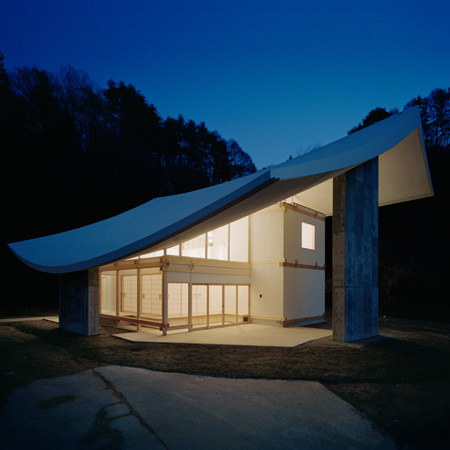
The priest's apartment leads onto a small terrace, with the angled roof translating to one of four sloping walls inside.

The following information is from Frei + Saarinen Architects:
Frei + Saarinen Architects converted a 100-years-old Parish Centre in Zurich and implanted a new wooden lobby with a unique atmosphere that is generated by a clash of "trendy“ facetted geometries and an old fashioned way of detailing.

The geometry of the new lobby is the consequence of stretching the formerly enclosed space towards the facades and respecting the given bearing structure.

A new rooflight accentuates the entrance to the hall.

Additionally this vertical element "slows down“ the dynamic character of the lobby.

Aditionally, a new appartment for the priest was designed at the top level.

Since a part of the former bigger terrace was covered by a roof-extension, a portion of the tilted roof became a tilted interior wall.

Thereby a new pentagonal room with four tilted walls is generated – the priest’s new "tilted“ living room.

Only two new elements are seen from outside: The new fully glazed entrance to the lobby (the glass is a custom product weighting 1.5 tons) and the new dormer window leading from the priest’s living room to the terrace thet can be partly covered.


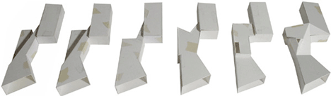
Above: lobby process

Above: priest's home
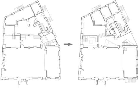
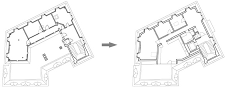
Above: ground floor

See also:
.
![]() |
![]() |
![]() |
| Kuri at Chushinji Temple by Katsuhiro Miyamoto |
Kuokkala Church by Lassila Hirvilammi and Luonti | Lumen United Reformed Church by Theis and Khan |


that last section is epic
This is a fantastic project. Conceptually brilliant intervention using architecture as an installation – yet far more than an academic exercise. This structure within a structure has a truly transformative effect on the entire existing building effecting it in a profound way both inside and out. insonwood.com
There must be plenty of space here to allow so much to be wasted with these angled walls. It's lucky there's not much furniture—or does that get put in once the photographers leave?.
Of course the cleaners will be grateful for all the extra dust catching surfaces.
very beautiful … like this
the sharp angles make me nauseous
even though it´s well done and nice to look at, you will get dizzy, living in it, I guess (the kitchen f.ex) – I think I like most the "Herrgottswinkel" ;-)
like the design and would love to go and see it (but only with a helmet)
The lower levels look really interesting, but there are overtones of the uncomfortable interior spaces in the Kubus woningen in Rotterdam in the priest's apartment. I am not convinced by sloping walls for living spaces…
paintngs wouldent like right on the walls
Amazing adaptation to an existing site with it's own urban tradition, bringing new vitality to the building. the new generated spaces add new events, such as:
-the new minimalistic glazed framed entrance to the public space reflects the nearby buildings.
-the inner-courtyard small substraction; adds a skylight that baths with natural light the lobby of the ground floor.
-the new terrace of the priest invites no doubt to read outside or to reflection. (spiritual reflection, i wish, hahaha)
-the geometry of the interior design has interesting features such as the integrated handrail banister to the wall or the angled niche.
great project, i would like to know more about the structural experiences they had to make.
things change when you start to put in furniture. the furniture will not tally with the angles and unwanted left over spaces will be unsightly. still the bold experiment of slanted geometry deserve a round of applause.
I'm considering renouncing Satan, apparently the collection plates passed around at Sunday masses are making a killing these days.
It's a beautiful design but, being a religious building to house one priest, it seems like a slap in the face to those in his/her community who don't have anywhere to live or are on the bones of their arses, struggling to raise a family 'the way God wants.'
An impressive presentation of simplicity that is mixed with artistic touches, the angled walls creates a very special experience, the wooden floor gives warmth and whiteness gives calmness. It is where simplicity finds it strength.
I really don't think this works for a spiritual space at all. The volumes are nice, but over all its just a little too aggressive.
The handrails in the 3rd and 4th shots are genius though. Love them.
The floors are stunning.