
Architectural photographer Fernando Guerra has sent us his images of a nursing home in Alcácer do Sal, Portugal, by Portuguese studio Aires Mateus Arquitectos.

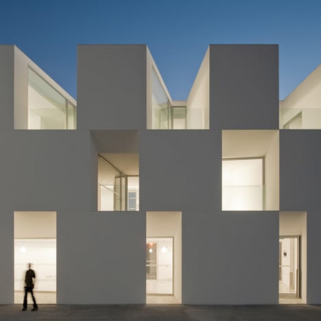
The façade is reminiscent of a checkerboard, with its white surface punctured at intervals by recesses to shade its glazing.

The long building meanders over the site, rising and falling with the topography of the landscape.

A surrounding landscaped garden reaches up to the roof of at some parts, giving access to the top of the building.

Photographs are by Fernando Guerra.

More projects by Aires Mateus Arquitectos on Dezeen »

More photography by Fernando Guerra on Dezeen »

More photography stories on Dezeen »


Here's some information from the architects:
ALCÁCER DO SAL FORM
The project is based on a attentive reading of the life of a very specific kind of community, a sort of a micro-society with its own rules.

It is a program, somewhere in between a hotel and a hospital, that seeks to comprehend and reinterpret the combination social/private, answering to the needs of a social life, and at the same time of solitude.

Independents unities aggregate into a unique body, whose design is expressive and clear.

The reduct mobility of those who will live in the building suggests that any displacement should be an emotive and variable experience.

The distance between the independent units is measured and drawn to turn the idea of path into life, and its time into form.

The building, designed path, is a wall that naturally rises from the topography: it limits and defines the open space, organizing the entire plot.

Name of the project: Residências assistidas em Alcácer do Sal. Houses for eldery people in Alcácer do Sal.

Location: Alcácer do Sal (Portugal)

Date of project: 2006-2007

Date of construction: 2008-2010

Brief project description: Authors: Francisco Aires Mateus, Manuel Aires Mateus

Collaborators: Giacomo Brenna, Paola Marini, Anna Bacchetta, Miguel Pereira

Client: Santa Casa da Misericordia de Alcácer do Sal

Engineer: Engitarget, lda

Constructor: Ramos Catarino, Sa

Landscape architecture: ABAP Luis Alçada Batista

Footprint Area: 1560 m2

Floor Gross Area: 3640 m2
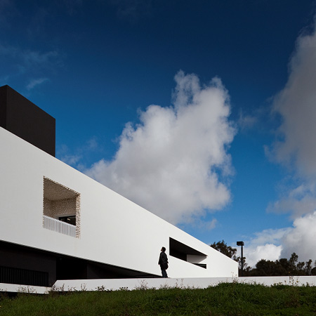
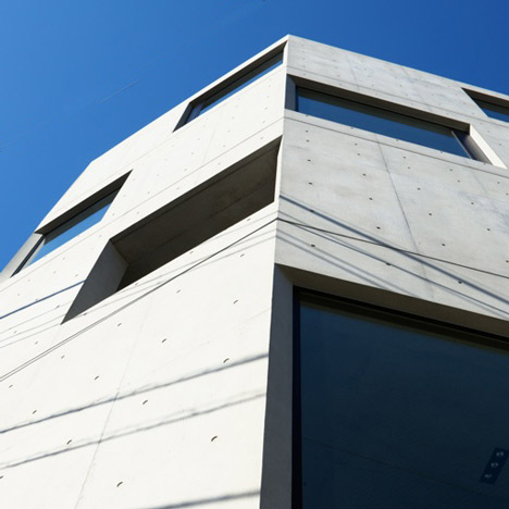


See also:
.
![]() |
![]() |
![]() |
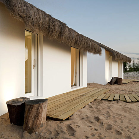
| School by Nuno Montenegro M+P Architects | Damier by Apollo Architects & Associates | Casa Areia by Aires Mateus Arquitectos |


It's beautiful architecturally, and I love that there is access to the outdoors from each room, but the lack of visual contrast between surfaces and apparent wayfinding markers could actually make life pretty difficult for the elderly, whose vision always decreases. They will have trouble seeing the handrails, and in distinguishing between walls and floors.
And why such narrow doors out onto the patios? They don't look wide enough to allow passage of wheelchairs.
High Ceilings and they look narrow, and the photo don't help., and the doors have at least 90cm for passage of wheelchairs. Is a rule in Portugal. With out that is impossible to build something, they are very strict with acessible rules.
on its own merit not a bad looking building… but totally not appropriate for an elderly home… their not dead already… so why the plain lifeless look?
What a wonderful place to end a life, I love the general volume and the way it is implanted in the site.
The building itself looks very monumantal, and from the definition the monument is to commemorate those who passed away, not very cheering for the elderly. Where is the joy of life part?
The idea of giving a view and a private "court" to each person is a good one… And I like the big windows and the angled court created. But I totally agree the comment of Hoechstetter Interiors. Strangely small doors, no contrast, too lifeless… colder than an hospital. Like the idea… but I'm not sure it is truely adapted to ederly.
comon ppl! its a fantastic building!
The plans are really good also the way it's implemented at the site is nice! I appreciate the cleanness of the rooms they can be adopted to individual taste easily (though its a little too clean for my taste) but in my opinion it works for the short amount of time people will be using it. I disagree that it has a plain lifeless look as archinerd suggests… the volume is very playfull including the way it is segmented. the way this creates a play of light and shadow can be very beautiful and anything except boring! I wonder what the function of the supposedly accesible roof is it doesn't seem to be suited to be used for public (no railing for example)
This makes me want to grow old faster!
A nursing home for architects
Slippery floors, lack of visual distinction between walls/floors/ceiling, lack of wayfinding – this is totally not designed with the elderly in mind, unless it's trying to convince them they're already dead and in heaven … or a morgue.
If this was supposed to be a frontyard to heaven, and that's what it is supposed to, t'd think I've seen enough.
I saw prisons warmer and more inviting (I bet also less expensive) than this elderly home. I will cry my eyes out if my granny lives (lives…it's a euphemism) there!
It looks like a mental hospital for old architects
What was the brief for this, I have to wonder. There seems to be no sensitivity for what it means to be old, or for physical frailty. One slip on those incredibly slippery floors and you can kiss your hips goodbye (and nothing speeds you to the grave faster than a broken hip). When will this kind of modernism, and this focus on form rather than humanity, roll over. I don't mean to be rude, but the symbolism of this building (pointed out by several other posts) is so overwhelming I wonder how it can escape the architects. And if one thinks of the average home of the elderly (as much as one can generalise about such things) and its qualities of light, texture, shelter etc – well how does this space reproduce that sense of home and comfort for its 'inmates'?
Sorry for the rant. It looks lovely in photos.
Boxes for the elderly….
Don't like it at all, it looks like a hospital, or a prison (look at all those prison cells!).
It is not designing from the perspectives of the elderly, and disregarding the needs and wants of the users.
oh you are just jealous that someone managed to build something like this. You wish you had this client.
Wow, I'm surprised by all the negative response. Yes the interior could do with some more colour but the sculpturality, the use of light and shaping of the site is beautiful. Inspiring even. Paint each room a different colour and you have a brilliant project.
Really nice! I like it as someone is thinking outside the box… by making it boxy.
Me gusta mucho el concepto, pero igualmente, no creo que se puso en el lugar del usuario, en mi opinión, los arquitectos somos intérpretes, ésto incluye las necesidades, sensaciones y gustos de las personas que habitarán nuestra arquitectura…
I'm gonna give the architects the benifit of the doubt and assume they have considered building regulations on things such as door widths and floor surfaces – if not then there are serious issues – but yes, generally its a beautiful building that needs some colour.
This form would easily suit having blocks of colour/texture/pattern.
Once the courtyard gets some life it will be much more inviting I think. Those full height windows will take on a life on their own.
yeah, the old and getting-there really want to spend ones final hours as far removed from the safety and comfort of our fonder memories, in a goddamn futuristic hospital with nowhere soft to land and the merciless sun glaring into our enfeebled eyes from dawn to dusk.no colour or texture or content or anything to remind us we are not actually dead yet.id rather die at home!
Worthless, some more life on the courtyard? For what?
It seems this place isn't designed from the eyes of the older person in his bed. When you're lying in your bed you aren't able to look to outside at all! Only indirect light is what they get.. very very bad.
When your daily life is shrinked in highlight to your visiting family and the look outside you're just an asshole when you remove one of those factors. Unbelievable this can be build. Better take a look at Aalto's Paimio Sanatarium!
I love it, my husband hates it. The architecture is so ephemeral that it feels as if you've crossed over to the 'other side' of white light and pure forms. My husband hates it because it's 'inhumane' with no personalisation of space. Yet I reminded him that whatever photographs, books, momentos that you may want to have around you are exactly things that you can't bring to the nether world. Yet who am I to say that he can't hang on to them for as long as he can. The whiteness accentuate the meditative quality of the inevitable to come. The space prepares….
A bit too much shocking. A bit too much experimental. Do they have anything too prove? Is this exaggeration needed?
One important point in architecture is UNITY. in these projects as in the most very good reputated portuguese projects this is readed in the white light.
that's a good service to the architecture!
it's inocente to thing tat we all need colour, and contrasted colors to distinguish rooms, functions, etc. folowing the same reasoning why not write the name of each colour, for those who kann't recognze it?
I hope only architects get put there. What quality of life would one have in a place like that? No individuality and no privacy. If I'm old and feeble the last thing I want is an audience. And MARBLE floors? Can't think of a better way to break a hip!
There is alot of ageism here in regards to "what the elderly would like". I think this project is very beautiful and when I am eighty, I suspect I would still find it beautiful.
so in resume: it needs color to bring more hapiness…but is a beautiful building! i was just wondering if the architects really have found the reinterpretation of hospital/hotel and the social and lonely time of the day to older people.
This is a wonderful blank canvas open to constant possibilities via individual options. The way to add colour is hang it on the walls. Then it becomes as ephemeral as the ever changing colours through the windows that also keep changing the white values on the walls.
Individuals will naturally add their own colours. Let it be. That will factor constant change according to resident changes. Individuals will then be permitted their individuality
Too many people make the indelible mistake of reacting against space and the vital peace of natural ambience with fixed objects and permanent colours and then add disruptive noise. That is a misleading driven by hysterical emotions. The outcome is dictatorial under which individuals become depressed.
People need to step outside themselves to consider time and not their own literal immediacy: once the grounds are landscaped and the whole precinct lived in, the future here will soften even the harshest of critics.
It's very impressive in a stark angular sculpture sort of way, but I can't help but feel the architect— and WORSE, the committee that approved the design were thinking more about architectural magazines and accolades rather than their residents as there seems little warmth or comfort in the design, unless of course all the residents are modern art aesthetes.
fascinating Design with play of light and form, pasterns and silhouettes.
Would like to see it age with residents and matured landscaping.
Beautiful outside but oh my god, It's like a mausoleum inside! Not sure this is where I would like to end my life.
Architecture is so nice with massing and space but totally not work with the function of elderly people, that is so sad and sad for them. If the project is hotel or apartment, that is awesome !!!
It is exactly like a mausoleum . I’d never like that .
Looks like a swedish prison.
The 5th and 6th pics even show what looks like a footpath from which the guards can keep an eye on the inmates.
I can imagine the guy in the 10th pic in riot gear.
“… This is a wonderful blank canvas open to constant possibilities via individual options. …”
“…Individuals will naturally add their own colours…”
I don’t think the elderly actually OWN their rooms in a nursing “home”.
Something tells me the actual owner would not be too keen on people “adding their own colors” to his(her) expensive minimalist designer building.
VERY clinical.
I am glad to see that I am not the only one who has a problem with the building. It is a wonderful architectural exercise of massing, it relates very well with the landscape and it the design is so pure and rigorous, but it is surely not appropriate to seniors.
The rooms with their narrow windows and the narrow corridors give an impression of an afterlife light tunnel rather than a comfortable home. The white walls and grey marble inside suggest a hospital and not a home at all. I think the building is a great success from the outside but a total fiasco in terms of its use and interiors. We all know that architecture is not about aesthetics only, but mostly about its relation to the users and how it contributes to the users’ well being.
I am curious to see how users have transformed and personalised their rooms, and how the outside of the building is ageing. Does anyone have access to recent photos?