University of Naples Metro Station by Karim Rashid
New York designer Karim Rashid has renovated the University of Naples subway station in Naples, Italy.

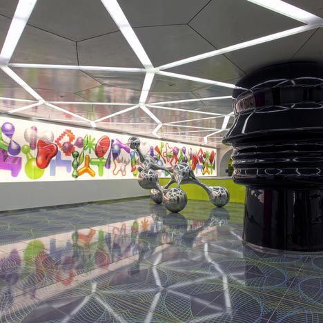
Commuters pass between huge columns with the profiles of faces towards a shifting lenticular wall of graphic patterns.

Sculptures and graphic artworks line the escalators, leading to platforms with backlit patterns on the walls.

More about Karim Rashid on Dezeen »

The information below is from Karim Rashid:
The University of Naples subway station is highly trafficked by a multi-cultural, academic community of thousands of passengers a day.

A creative concept that communicates and embodies knowledge in the new digital age, language in the shrinking global landscape, innovation and mobility in this third technological revolution.

Naples is no longer a historic southern city of Italy but instead now is an integral intellectual information haven that extends itself throughout the rest of the world.

This is the changing Italy and the station is a metaphor of this new wired global condition. It integrates the station with its surroundings, as well as provides a platform for innovative, cutting-edge design strategy.

We utilize the descension from the piazza to the subway platforms to represent a metaphorical shift from the conscious brain to the spiritual mind. Experiencing this journey, the commuter is able to define one’s own experience by interpreting the individual shift from a busy “brain state” to a focused “mind state”.

Entering into the station from the piazza to the subway station, the visitor will walk though a space clad with tiles, each one with is printed with new words created in this last century. Once the visitor arrives in the station lobby, he/she is impacted by the soft nature of the space, the striking palette of colors and patterns.

Along the back wall of the station lobby level, lenticular iconography changing colors and perspective provides an interesting siteline as commuters proceed to the platforms below. Intersecting the space between the heads profile benches (metaphorically intersecting the dialogue) is an abstracted, SYNPOSIS sculpture reflecting the nodes of the brain and the synapses which occur within.

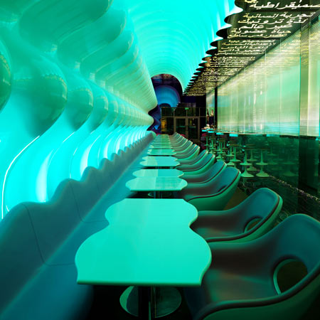
When descending to the subway platforms via escalator, a visitor experiences a transition from the busy piazza to a more intimate, focused environment. It is here where we display various artworks and other graphic art as a focal point. These abstract images invoke the user to shape the environment according to his/her own creative interpretations.

Rolling LED programming situated behind frosted glass displays universally recognized words, referencing knowledge and the multicultural university setting.

Descending and ascending the stairwells on each respective platform, the steps have abstracted portraits of Dante and Beatrice. Once the commuter arrives at the end of the escalator, transformational digital art follows he/she to the platform stairways. The accent colors, lime and pink, indicates the direction and guide visitors through the descent to the final destination.

Airframe surfaces speak about the beauty of our airframe voxels of the flux and ever dynamic multidimensional information and data age (infostethiks).

The platform level of the subway station is where the people spend the most static time. One’s experience while waiting for the subway is enhanced by the tranquil, imaginative environment of the “mindstate”. Seating is provided in the form of landscape forms.

The back wall of the subway platform is a backlit artwork, providing a continuous soft glow in the space. Across the platform, digital artwork creates an entertaining distraction. In addition to related iconography, the piece could include a shadow of an oncoming train, etc. to signify a train’s arrival.

A subway station is a temporal, transitional space, yet the commuter is contained for a short period of time before continuing his/her journey.

As he/she transitions from one environment to another, he/she is most likely reviewing the day’s previous events, or preparing for the next task. Our concept focuses on the commuter experience within the train station, and how the surrounding environment can serve as a respite in a day’s schedule.

Globalove, Karim Rashid
PROJECT TEAM: KARIM RASHID, CAMILA TARIKI, DENNIS ASKINS.
See also:
.
 |
 |
 |
| Switch Restaurant by Karim Rashid |
Fluxus by Karim Rashid and Michela Vianello |
Snoop and Woopy by Karim Rashid for B-Line |