web tracker

Moscow School of Management Skolkovo
by Adjaye Associates

Moscow School of Management Skolkovo by Adjaye Associates

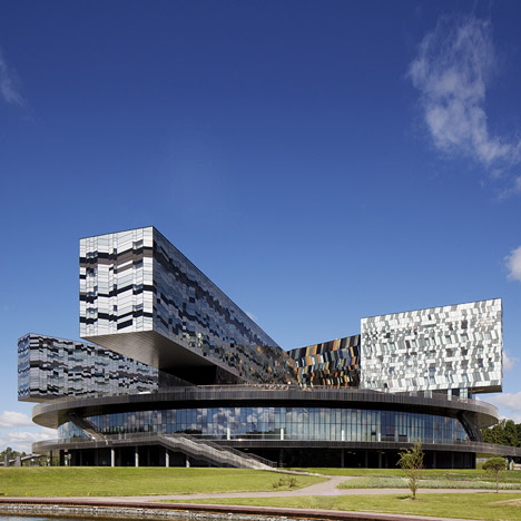
Here are some photographs of the Moscow School of Management by architect David Adjaye, where four buildings precariously cantilever over a large circular base.

Moscow School of Management Skolkovo by Adjaye Associates

Adjaye, who was today announced as this year’s Design Miami Designer of the Year, completed the teaching and research institute in the city outskirts at the end of 2010.

Moscow School of Management Skolkovo by Adjaye Associates

Classrooms and lecture halls circle a restaurant at the centre of the 150 metre-wide school-on-legs and a car park can be found below.

Moscow School of Management Skolkovo by Adjaye Associates

The four blocks above individually house administration, a wellbeing centre, a hotel and student accommodation.

Moscow School of Management Skolkovo by Adjaye Associates

The walls of the wellbeing centre display a herringbone patchwork of glass and coloured panels, while the other three blocks show the same patterns in monochrome.

Moscow School of Management Skolkovo by Adjaye Associates

A private terrace is located on the roof of the school, surrounded by skylights into the rooms below.

Moscow School of Management Skolkovo by Adjaye Associates

Other projects on Dezeen by Adjaye Associates include headquarters for design brand Moroso and a visual arts space in Londonsee all the stories here.

Moscow School of Management Skolkovo by Adjaye Associates

Photography is by Ed Reeve.

Here is some text about the project from the architects:


Moscow School of Management Skolkovo

This teaching and research institution was founded in 2005 to educate a new type of executive capable of leading Russian business through the 21st century. The founders were of the view that a campus-type development would best represent their aspirations and, with this in mind, acquired an open site in an area that is scheduled to become an advanced technology park, just beyond Moscow’s outer motorway ring. Situated in a wooded valley, the site has the idyllic qualities associated with those of a traditional campus but the severe demands of a six-month winter were a barrier to pursuing an arrangement of this kind. Rather than being in separate buildings, the main elements of the brief are therefore housed in clearly identifiable volumes that nevertheless form part of a single development.

Moscow School of Management Skolkovo by Adjaye Associates

As a result of this strategy, the external appearance of the Moscow School of Management Skolkovo changes dramatically depending on the direction from which it is seen, but practical and visual continuity is provided by the 150metre-wide disc that floats above the site. Despite its size, the disc minimises the footprint of the development on the site, and softens the visual impact of the lower stories of the development, as only a small part of it can be seen at any one time. The disc itself is two stories high and the main teaching departments are distributed around its outer edge, with the larger spaces on the lower floor. Between departments, a series of wedge-shaped spaces connection the centre of the disc, where the restaurant area is located, and the perimeter. With directional rooflights above, these informal gathering spaces bring light and views deep into the interior. The disc also includes a conference centre with its own auditorium, and the roof of the disc is a landscaped open space. This replaces the area of the site occupied by the building, where a protected car park and service area are located at ground level.

Moscow School of Management Skolkovo by Adjaye Associates

The group of buildings that stand above the disc give the development its characteristic profile when seen from different directions. Of these, the Wellbeing Centre occupies a pivotal position in anchoring the disc to the sloping ground on this side of the Setun River. Standing close to the edge of the site, its stacked recreational spaces still enjoy views of the river due to the splayed positions of the two residential buildings: student accommodation in the longer one to the north, and a five-star hotel that is linked to the conference centre below. The Wellbeing Centre is supported by the same structural grid as that of the disc, whilst the residential buildings are designed as bridge structures. Each of them is supported on two towers that cause minimum disruption as they pass through the disc to the ground; the consequences of this arrangement are visible in the long cantilevers at the ends of both buildings. A similar principle is employed in the structure of the administration tower, although the design of its facade is similar to that of the Wellbeing Centre. The gold colouring of the Wellbeing Centre reflects its importance in this powerful composition, an effect that is given further emphasis by a blue tinge to the facades of the residential buildings.


See also:

.

Edison House
by Adjaye Associates
The Periscope
by VW+BS
GMS Grande Palladium
by Malik Architecture

One Response to Moscow School of Management Skolkovo
by Adjaye Associates

  1. kms says:

    with no other information except pictures to judge from, one can only judge style, and let me say: the style of this building seems a mess to me. The overwrought pattern kills any order implied by the primitive forms, and not in a "complexity and contradiction sort of way", just an ugly sort of way. But what the hell, at least its contemporary…

  2. Jon K says:

    The synergy of Soviet modernism and a more Scandinavian detailing? I really like the result. It's idealistic but not cold, energetic but not muddled or careless. It's the constructivism I always wanted to see.

  3. felix says:

    The façade pattern looks like a reflection of tall buildings around it, of which there are seemingly none. Weird thing to do… a building of this size is uncomfortable outside of the context of other large buildings, so just pretend the context is different?

    Interiors look very boring. Willfully cantilevered boxes are becoming a stock representation of dynamism and risk taking, i.e. the opposite, a safe design choice. Benefit to this type of plan might be in the organization but can't say without plans.

  4. mik says:

    oh my GOD. it's looks like when you are trying to see if your turtle is alive.
    Really, this is not bad at all as long we can still laugh.
    I feel there should be 2 dezeens. One to show off and the other to give some hope to those who still believe.
    It is one thing to have an office with 100 people or an office with 3!.
    I really admire when people give a bit of them to achieve something reasonably fantastic.
    This Steven Holl crap is not one of them.

  5. mik says:

    And that photo with purple doors and some auditoriums chairs.
    Is this supposed to look nice? could be inside a cockpit of a space ship from the 60.
    what is this anyway? Is this a manifesto under some bizarre team?

  6. mik says:

    ah ok. It was not steven holl.
    ok ok.not bad adjaye

    • shootfirst says:

      Amazing – delivering a critique without realising who the architect is. And it's ok because it's Adjaye and not Holl? What are you on mik?!

      • carsten says:

        I guess expectations are not the same, isn't it?
        by the way, we should judge all buildings without knowing their architect.

  7. dominik.p says:

    Looks like a soviet times (stalinist) architecture

  8. awessome project and photography

  9. samuel says:

    in the future this will be in a case study of how NOT to do architecture.

  10. urlu says:

    No plans or section? Come on, we are in a architecture blog, not a photography blog! I wonder how they get light in the center of the circular base.

  11. mik says:

    I am really happy that adjaye finnaly lost control

  12. kgt says:

    I like Adjaye's work, especially his houses.
    This think is just bad architecture. Do not look for any concept here. It's plain ugliness.

  13. Juli says:

    How will you play football in this hall, with this crazy light from outside?

    • douglas says:

      My first thought, was that no thought has been put into the gym except aesthetic whim. Normally I'm not averse to a bit of aesthetic whim, but this is so utterly in conflict with the interiors intended use.

      Even Tottenham Hotspur would have problems playing their beautiful football here : )

  14. chris says:

    Reminds one of Ceausescu's communist urban systematization. Perfect display of 21st century communism. Well done.

  15. kle says:

    So Russia will never get rid of the soviet dogma…

  16. edward says:

    Mirror, mirror on the wall…who has the longest cantilever of them all? This one has got to be among the finalist on that. The form is fantastic tho' the fenestration is to jazzy for orderly businesslike thinking.and the form is closed allowing for no expansion. Why not mat building much more in keeping with the buttoned down types that would inhabit these walls.

  17. The Encounter-er says:

    I really love the look of the auditorium, especially the colors of the chairs. The angled window is wonderful, too– seems to be a nod to Aalto.

    Everything else seems a little too busy to me.

  18. Nino says:

    Ash tray with fags hanging over edge…

  19. ZZan says:

    I wonder what would the comments be if the building was in say Denmark or Germany?

  20. Black Hound says:

    Horrific. It looks as if the architect ate a meal of conventional mid-century modern, and then had a severe case of diarrhea.

Leave a Reply

Your email address will not be published. Required fields are marked *

*

You may use these HTML tags and attributes: <a href="" title=""> <abbr title=""> <acronym title=""> <b> <blockquote cite=""> <cite> <code> <del datetime=""> <em> <i> <q cite=""> <strike> <strong>