Multi-level apartment by Peter Kostelov
Russian architect Peter Kostelov has slotted a timber structure into a two-storey apartment in Moscow to create two extra floors.

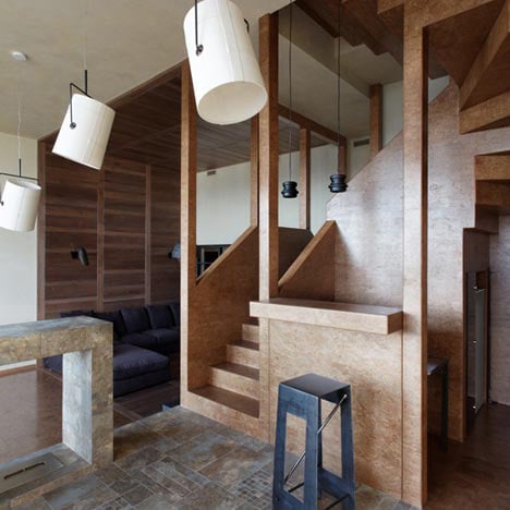
The former top level of the apartment had ceiling heights of up to 8 metres, where the architect has inserted a mezzanine and new upper storey.

Openings in the walls of the wooden structure allow views between rooms on different levels, as does a cutaway in the ceiling of the middle floor.

Bespoke angled lamps hang from the ceilings of the billiard room and dining room on this level, while specially designed furniture fills rooms throughout the apartment.

Marbled tiles line the floor, walls and surfaces of the kitchen, which opens out to a second dining room on the lower floor.

On the top floor, a semi-circular window stretches across the walls of a master bedroom and study.

Peter Kostelov refurbished another Moscow apartment in 2009, for which he used industrial materials, but readers thought that one was a bit too much like a prison. Take a look at it here.

Photography is by Alexey Knyazev.

The following text is from Kostelov:
Multi-level apartment
Characteristic of this apartment is its inner space and cubic capacity.

It is located on the top 18th floor.

Initially it was a two level apartment of total houseroom of 258 sq. meters.

As for the first level it was quite common one: three meter standard height of ceiling and a houseroom of 69 sq. meters.

The second level houseroom was larger 189 sq. meters and the height of ceiling varied from 3 to 8 meters in different zones.

Surely these unique space peculiarities caused project direction: to not only exploit maximum of this nonstandard extreme height but to make multi-level space.

The owner of the apartment approved the idea, moreover it was requested that each member of the family should have extra space so that everyone including 3 children of different age and gender could have their private space for comfortable living.

Central part of the apartment on the second level was as large as 60 sq. meters and more than 8 meters high.

The space was vertically divided into two levels by the newly made third level.

After making necessary calculation on the thickness of overhead cover 0,5 m. was put as required space for structural beams, placing ventilation and final trimming.

The highest ceiling 4,5 m was chosen for the living room located at the lower part of the second level. The upper part on the second level got 3m., where a bedroom, a bathroom and a study room are located. Thus the third level added 54 sq. m to the apartment.

The covers between second and third floors have two clear spaces. One was left for the staircase, while the second one, the closest to the window, appeared to join two spare spaces of the second and third level, the flow of light of which makes partially two-tiered space.

On the third level a dome made by glass partitions separates a bedroom and a study room, which allows the light to spread evenly. The floor space of 9 sq. m. was added to 20 sq. meters of the lower level. Consequently the floor space of each nursery room got 30 sq. m located on two levels.

A home library ceiling in the right –hand side of the apartment is 4,4 m. The same as in children’s room the second level was made here which enlarged it to 8 sq. m. All in all 35 sq. m was added to houseroom.

Rearranging turned a duplex apartment into four-level apartment having added to it 90 sq. m. of extra house room (from 258 sq. m. up to 348 sq. m.)

Click for larger image
Nearly all pieces of furniture (except settees and beds) were specially designed.

Click for larger image
The owners gave preference to warm and light colors.

Click for larger image
In contrast to upholstering the furniture was made from natural processed metal: dinner and low tables, bookstands, stools, shelves.

Click for larger image
Location: Moscow, Russia
Built Area: 348 m2
Architecture, Interior Design: Peter Kostelov
Development effort: Kovaleva T.N., Egorova N.G. “OAO Mosproect”
Projecting: 2009
Building: 2010-2011