Macula font by Jacques Le Bailly
Dutch graphic designer Jacques Le Bailly has designed a typeface of impossible shapes inspired by the optical trickery of artist M.C. Escher (+ slideshow).
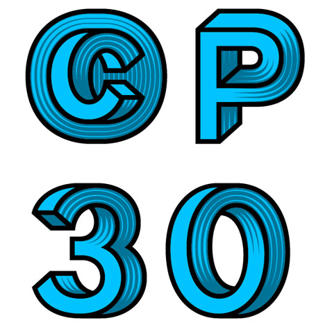
Jacques Le Bailly's Macula font is based on the Penrose triangle, a shape that appears to have depth but would be impossible to reproduce in three dimensions.
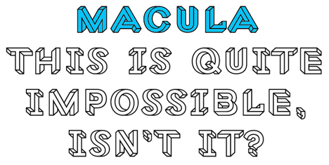
Like the Penrose triangle and the mathematically inspired paintings of M.C. Escher, the typeface's three-dimensional appearance could only exist as a flat image.
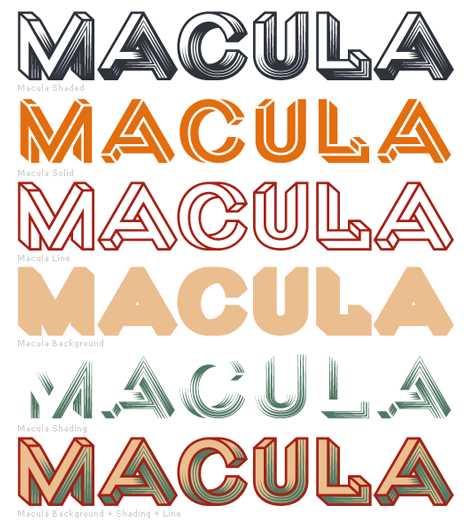
"To keep the typeface lively every single character, down to the punctuation and floating accents, needed to have two versions, as if looked at from two different viewpoints," Le Bailly explained to FontFeed.
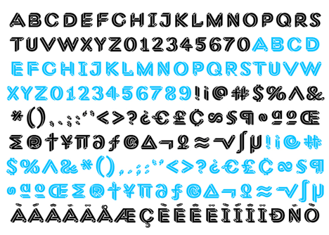
"Often the simple letters were the most difficult, because they offered very few possibilities or starting points," he added.
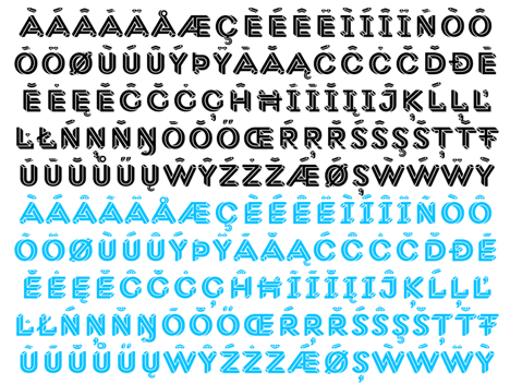
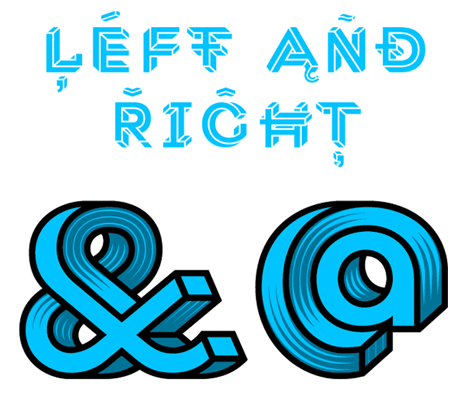
Some of the letters are less complex in order to create a more cohesive and attractive typeface, while the ampersand and the @ symbol have been given extra detailing to make them stand out.
The name macula refers to the part of the the eye that's responsible for central vision, and was chosen by the designer because he suffers from a related defect in his right eye.

We've previously featured a font designed for the Royal College of Art by Neville Brody and Margaret Calvert and a font developed by Nokia to work in any language – see all font designs on Dezeen.
Update: Le Bailly also gave a recent interview about Macula to Yves Peters at The Font Feed.