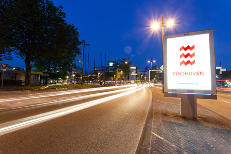
Open-source visual identity for Eindhoven by Virtual Design Agency
Dutch Design Week 2013: a team of ten Eindhoven architecture, design and advertising studios have been brought together as a "virtual" studio to design a new open-source identity for the Dutch city (+ interview).
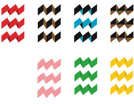
Variations of the "raw and rough" logo have been given to local businesses to adopt and design studios have been encouraged to create their own interpretations.
"We did something really unique we think," said Peter Kentie, managing director of the city's marketing organisation Eindhoven365, which commissioned the logo. "We started up something called the Virtual Design Agency and we picked the best of the best of the Eindhoven region - graphic and motion designers, fashion designers, architects, typographers - and we put them together as a new company to create the identity."
Both the logo and the process of procuring it are intended to reflect the energy and creativity of Eindhoven, which has burgeoning creative and technology industries and which was named the world's most "Intelligent Community of the Year" in 2011.
"Eindhoven is a city in development," said Kentie. "The task originally was to create a marketing brand for the city but what we also did was take the opportunity to rebrand the logo, the identity of the city council, of the city itself."
Graphic designers Raw Color, architect Marc Maurer and creative agency Scherpontwerp were among the studios selected to contribute to the project.
"Eindhoven as a city is about working together," Marc Koppen of Scherpontwerp told Dezeen. "Everyone knows each other, works together, talks about the projects together. That's why we came up with the idea of trying to work with many agencies, not just one."
Koppen added that the open-source nature of the logo reflected the spirit of multi-disciplinary collaboration in the city. "That's also the theory about the city, that everyone is involved and works together, working on it and with it," he said. "If you want to do it in your own way, then it's possible."
After initial discussions between the ten studios Scherpontwerp, Edhv and Eric de Haas were asked to take the concept ideas forward together. They worked on the project from their separate office spaces, forming the Virtual Design Agency, with designers from the earlier stage acting as consultants.
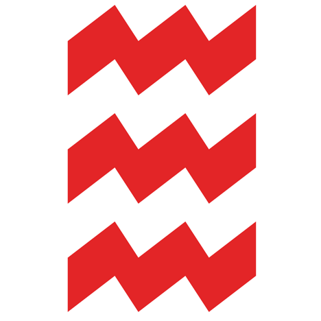
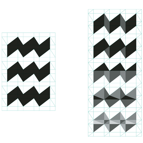
Together the group came up with a simple grid of lines to create the logo, which comprises three thick zig-zag shapes spaced on top of each other to form an abstract letter E.
"The idea is about energy," said Koppen. "We tried to find a way to visualise the energy of the city and what people often say about Eindhoven is that it's a really raw and rough city."
The grid behind the logo means the angular sections can be filled in different colours and shades, adapting it for companies or sectors across the city. A red graphic on a white background is used for the starting point as the city's historic colours.
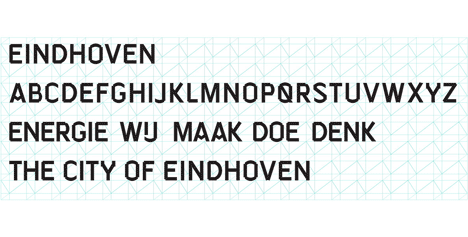
The team also created a font called Eindhoven to accompany the logo, formed in a similar style but without sticking to the grid. "[The font and logo] have the same kind of edginess," Kentie said. "The typography also gives you the feeling that its not completely finished, like a work in progress."
The identity was completed in June and has already been applied to civic vehicles, signage around the city and even T-shirts for runners competing in the Eindhoven marathon. Eindhoven365 have given the graphics to local businesses to customise and use as part of their own branding.
"With the energy symbol you can do everything," Koppen told us. "You can load it with images, make it 3D or 2D, change the colours. You can really build it up with a lot of different pieces and angles. We show it now in a really basic way but underneath there's the structure that you can use to transform it and everyone can do that in their own way."
Eindhoven is currently hosting this year's Dutch Design Week, where Daan Roosegaarde has unveiled an installation consisting of hundreds of wireless LED crystals and Iris van Herpen scooped the top prize at the Dutch Design Awards.
Read the full interview with Scherpontwerp's Marc Koppen below:
Dan Howarth: Tell me about the origins of the project.
Marc Koppen: We started about one and a half years ago I think and we were asked by Eindhoven to give a short presentation on the city as the designer with ten different companies. They chose three companies to do the job, that was a little bit strange in the beginning because you have your own style of course. We had to find a new way of working together on such a huge project and we are three totally different design agencies. It was a little bit strange in the beginning, but after half a year it started to take off a little bit, it was great.
Dan Howarth: Which other design agencies did you work with?
Marc Koppen: One of the design agencies is called Edhv and the other is Eric de Haas. Most of the time we don't physically work together, we aren't in the same room but we try to discuss the work. We make our own work for the city then we bring it back together, to the group and discuss it.
Dan Howarth: Did you work with graphic designers and architects as well?
Marc Koppen: In the beginning it was really a big selection. There were artists, architects, photographers, colour designers, graphic designers and we all worked together on the decisions, but in the end it was really necessary to get the work done so they chose to do the work with graphic designers. But right now, at the moment we are still inviting people to work with us. Raw Color are advising us on the colours, we are still working with a lot of different agencies.
Dan Howarth: And they are all based in Eindhoven?
Marc Koppen: No, one is based in Amsterdam I believe, but they are all originally designers from Eindhoven. They moved to different cities but they are from Eindhoven.
Dan Howarth: Do you think this is the first time that so many agencies have come together to work on a project like this?
Marc Koppen: I'm not sure but coming from the briefing in the beginning we discussed that Eindhoven as a city is about making and working together, taking on different project together. Years ago, for example I worked in Amsterdam and there the agencies are really working for themselves. You don't often talk with other designers or you're not supposed to meet with the clients of other designers so its nice to work in Eindhoven, it's really an open structure. Everyone knows each other, works together, talks about the projects together and thats why we came up with the idea of trying to work with many agencies, not just one. It won't be the first time but I don't know about another case.
Dan Howarth: So the logo is designed to reflect the fact that Eindhoven is a place where people collaborate.
Marc Koppen: Yeah we started that discussion very early on when we came together to talk about a vision for the city. They came up with the idea to work together, they chose three agencies to coordinate it and do the basic design work. But they are still asking us to talk with a lot of people about it and get a lot of people involved. It was their idea to do it this way yes.
Dan Howarth: So are you still operating under the title of Virtual Design Agency?
Marc Koppen: Yes because it's the closest idea to what it is! We [each] have our own workspace, we are not sitting together. It was a little strange in the beginning.
Dan Howarth: How did you come up with the coloured zig-zags of the logo?
Marc Koppen: We tried to find a way to visualise the energy of the city. What people often say about Eindhoven is that it's a really raw and rough city. For example if you take a look at Utrecht or Amsterdam, or The Hague, or Maastricht, they're cultivated in a certain way and they have a history. Eindhoven is really a rough city where a lot of work has to be done. It's called the City of Light because [electronics giant] Philips started their lighting company here. So we had to find a visual way to transform the energy and that all started with energy and lighting. That's the really basic idea about it.
Dan Howarth: The city is encouraging local businesses to use and adapt the identity. Was the idea to have an open-source logo?
Marc Koppen: Yes sure, that's also the theory about the city, that everyone is involved and works together, working on it and with it. If you want to do it in your own way, then it's possible. The basics are done but now we have to translate it to other people. So we have to find a way of inspiring other people because we cannot write a book about how to use it, it would be too difficult, everything is possible, but we have to inspire other designers to use it in the right way. We're working on it right now. That's a really nice process.
Dan Howarth: What parts of the design allow it to be adapted?
Marc Koppen: The typography is our own. We call it the Eindhoven and you can work with it as a typeface. With the energy symbol you can do everything, you can load it with images, make it 3D or 2D, to change the colours. There's a really nice grid underneath it so you can really build it up with a lot of different pieces and angles. We show it now in a really basic way but underneath there's another structure that you can use to transform it so everyone can do that in their own way.
Dan Howarth: Are red and white the colours of the city?
Marc Koppen: Yes, they are really the colours of Eindhoven and we thought about changing it, but the fact that it has to stand for energy and have a rough edge to it. When you see it with other logos, its a little bit rough, its not really "nice". We have to stand for that energy and the raw hard red does that.