"We need more museums that let us relax into knowledge"
Opinion: a 1960s institution in Mexico that gives visitors space and time to wander is a stark contrast to the commodified museum experience that has become the norm, says Alexandra Lange.
Is it perverse to be thinking about Herbert Muschamp in Mexico City? In his epic 1997 review of the Guggenheim Bilbao Muschamp writes, in one of his easiest lines, "You can go in, and you can come out."
Muschamp, quoting Marilyn Monroe from The Misfits, is referring to the way Frank Gehry designs architecture that shapes, and is shaped by, the cities in which it dwells. I have never been to Bilbao, but, as I went in and came out of the galleries, gardens and courts of the Museo Nacional de Antropologia (MNA) in Mexico City, glimpsing fragments of ancient cities and the traffic of the contemporary one, I understood why he emphasised an easy circulation as so critical to a museum's success.
The MNA tells the story of Mexico through a spectacular array of media, artifacts, cultures and histories, but its building is also embedded without pretense in the here and now, designed in 1964 by Pedro Ramirez Vasquez, Jorge Campuzano and Rafael Mijares to be cognisant of both the body and the eye. The comfort I experienced there, the casualness with which wonders can be discovered, are elements all too rare in today's internationally commodified Museum Experience. Sometimes you have to see something done right to know what's been wrong all your life. The MNA is like that.
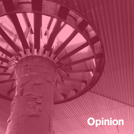
The plan of the museum (which was renovated in 2001) is relatively simple: a set of boxes, both short and long, arranged around the stretched rectangle of the courtyard. Spaces between the boxes are open, allowing light to leak around the corners, letting visitors see into the surrounding Chapultepec Park and roads passing the museum. The courtyard itself is divided into two parts, the front end shaded by a vast rectangular parasol held up by a single tree-like column, the second half of the courtyard cooled by a fountain planted with tall, rushy plants.
Above the recessed first level of the long buildings floats a metallic crown, a set of geometric fins that screen the upper storey windows and throw complex shadows on the facade and pavement. All the care given to the climate of the courtyard is essential to the way the museum works: nowhere are you exposed to unmediated sunshine, making the outdoor space as pleasant as the inside. You can go in, and you can come out.
The Teotihuacan gallery is the first one on the right. You enter and pass through a series of glass vitrines, some transparent on both sides, into an inner room whose wall is a life-size, towering replica of a temple at Teotihucan. A pair of glass doors leads to a garden on the exterior of the museum – the galleries are bracketed by accessible outdoor space. Down a path made of stones embedded like waves in concrete, there's a sprawling model of the city in the sun, introducing yet another scale. The museum's sloped concrete walls create another bridge between civilisations, referencing the Mayan slopes and tweaking international Modernism to suit this site. With every turn, and in every detail, the visitor is wandering the centuries in a rigorously curated way.
This is Mexico's most visited museum, frequented, on the day I was there, by tourists from many countries – Mexicans, families, old, young, rambunctious, quiet. There was space for them all and there was time for them all. You did not have to read a word (I don't speak Spanish) to feel that you had learned something. All you had to do was walk and look, and the alternation of indoor and outdoor spaces meant that you tired less easily. The oscillation between small and large meant that you had to adjust your eyes more often and look again. It felt like a walk in the park, but it was a museum. And we need more museums that let us relax into knowledge, showing, not telling us everything by audioguide.
In New York, at least, the friction of timed tickets, crowds and lines are now baked in to many big museum experiences: one can rarely expect to be able to just walk in, buy a ticket, see a show. Lines for the Museum of Modern Art-hosted Rain Room this summer stretched past the four-hour mark – and that's a separate line from the one for tickets that forms along 53rd Street.
My experience at the MNA caused me to think back on other museum discussions and visits of the past year, big and small: the Museum of Modern Art, the Los Angeles County Museum of Art, stunts like the Rain Room or James Turrell at the Solomon R. Guggenheim Museum, Donald Judd’s House at 101 Spring Street in SoHo. Art may be more delicate than Aztec heads, but there isn't only one way to show it. Thinking about each of these visits as variations on a theme, I have found what I crave is not more access but less: a discrete, informal, and time-limited chance to look at work in peace. To wander rather than move in lock-step. To walk in the front door, look at art or artifacts for as long as I want, and leave.
At the edges of a number of recent news stories about museums have been critiques of buildings grown too large, too busy, too expensive. Much negative feeling about post-expansion MoMA, specifically about its generic galleries and crowded rooms, was revealed in the recent controversy over its proposed demolition of TWBTA's American Folk Art Museum and Diller Scofidio + Renfro's renovation plans. Those plans seem to make more room for circulation, yes, but circulation without specificity, for performance, or events. If you are interested in more people seeing art, and concerned about congestion, selling fewer tickets seems like a more logical step than raising prices and insisting on audio etiquette lessons, as they have at the Barnes Foundation. The Museum of Modern Art and the Metropolitan Museum of Art recently changed to being open seven days a week in order to spread out their crowds. One wonders whether, as with highways, more capacity simply brings more people.
Other contemporary architects are thinking differently about circulation. In his article last year on Peter Zumthor's proposed "Black Flower" addition to the Los Angeles County Museum of Art, a seven-legged undulating building made of coal-coloured concrete, the LA Times's Christopher Hawthorne stressed the routes visitors would be able to take rather than the image of the facade, noting, "It has no single main entrance or front staircase."
"Small museums are great," Zumthor told him. "Big museums are a drag." His proposal would allow visitors to enter at any of the seven legs, each one a staircase of a different character, each one leading to a major artwork from a different time and place.
Zumthor has shaped the building to the experience he and Govan want the visitor to have. That experience is less about seeing everything than focusing on one artwork, object or theme, shaping different paths. Zumthor's design suggests you need something organic rather than orthogonal to create that openness and selection; the MNA suggests something different. The separate entrances off the central courtyard made it very easy to choose your own adventure.
If museums can't find a way to frame personal encounters with great works of art, how can they create a deeper fandom? Another museum that had me thinking about path and pace was Donald Judd's studio/home at 101 Spring Street in Soho. Unlike many house museums, it did not feel dead at all, but alive with resonance and purpose.
Donald Judd had ideas about how art should be seen, and wanted to present his own work outside the context of museums. At your appointed time, you just walk in the door. Tours are limited to eight people, with a guide, and give the group 1.5 hours to range over each of the five floors of the historic cast-iron building. That is more than enough time, an extravagance which makes it possible for you to circle back to elements, artworks, details you didn't know you were interested in when you arrived.
The minimalist art, close enough to (but don't) touch, is only the most obvious draw. Judd lived at 101 Spring with then-wife Julie Finch and his two children. Over those five floors one is introduced, at close range, to all the variations of his art and design practice. You can spend your time with the million-dollar artworks or in the kitchen on the second floor, contemplating what Judd saw in hand-painted Austrian pottery. You can nod at his choice of highchair, a bentwood Thonet, a readymade already approved for modernist use by Le Corbusier. Upstairs, there is finer furniture still by Gerrit Rietveld and Alvar Aalto. On a stand-up desk are tools carefully arranged at right angles – knolled, as the slang goes. I could believe this was how Judd left them for a meal at the end of the day, so squared-up is everything else in the house, and so loose is the relationship between the fine and old, the fine and new, and the vernacular.
At 101 Spring there is no garden, but the view of the city presses in on all sides. Judd's installation keeps the blank space within, offering the kind of pauses passages like the gaps and courts at the MNA. I could dwell longer at Judd's house because I was seeing less.
I would argue, from these experiences and tens more over a lifetime, that the best way to see art is not to saturate, not to march, but to pay what we can for the time we have and to let us spend that time in our own way. You can go in and you can go out. You can buy a snack. You can cool off under the parasol. You can look at the slightly goofy mannequins in native dress upstairs at the MNA, or marvel at a display of coloured baskets, resting on curved transparent mounts. You can be alone or in a crowd.
The question for future designers and renovators of museums seems to be how to make these many paths possible. At 101 Spring, the house is just that big. At Zumthor's future LACMA, it's which wardrobe today. At the MNA, the combination of indoor and outdoor installations, and the use of the courtyard as an internal High Street, combine to make it possible to go large or go small, without ever losing sight of the city that gives meaning to the artefacts.
Alexandra Lange is a New York-based architecture and design critic. She is a Loeb Fellow at Harvard's Graduate School of Design for academic year 2013-2014 and is the author of Writing About Architecture: Mastering the Language of Buildings and Cities as well as the e-book The Dot-Com City: Silicon Valley Urbanism.