
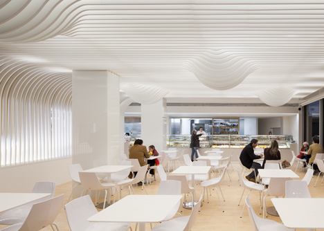
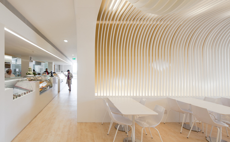
This bakery in Porto by Portuguese architect Paulo Merlini has a wavy ceiling that's designed to look like a dripping cake topping (+ slideshow).

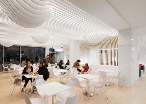
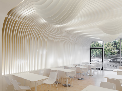
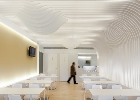
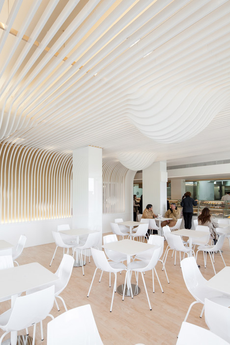
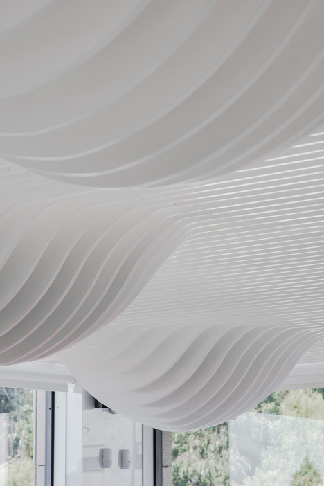
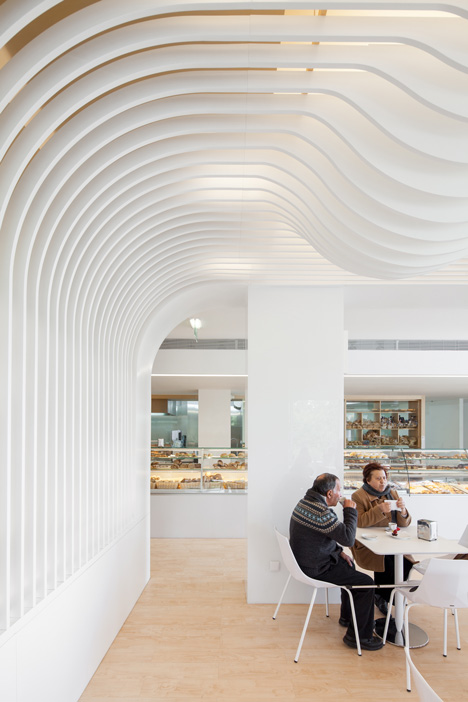
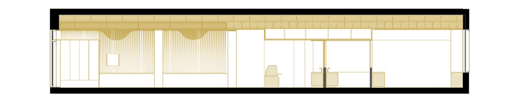
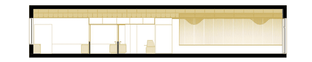
Paulo Merlini installed the stripy ceiling to fulfil two key functional requirements: reducing glare from the overhead lighting and improving the acoustics inside the bakery.

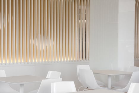
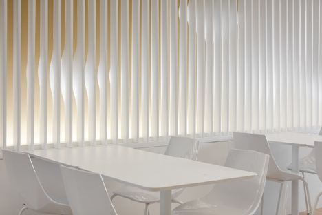
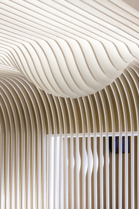
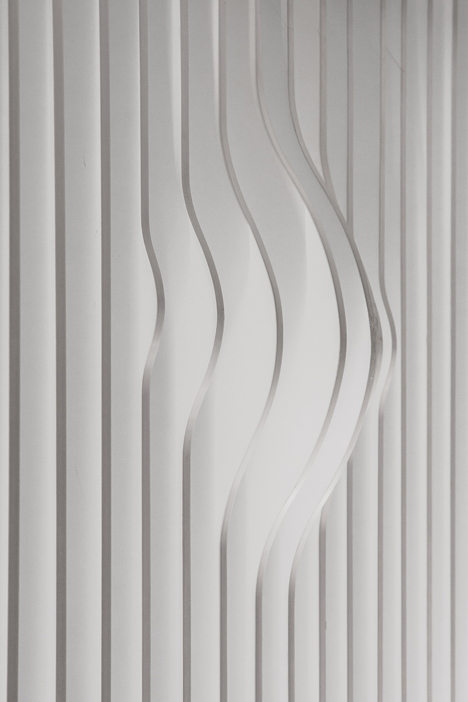
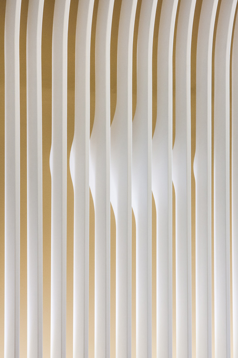
The wooden panels descend from the ceiling onto two of the walls, where shapes representing an abstracted version of the new logo designed by Merlini for the client become visible from certain angles.
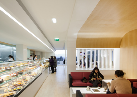
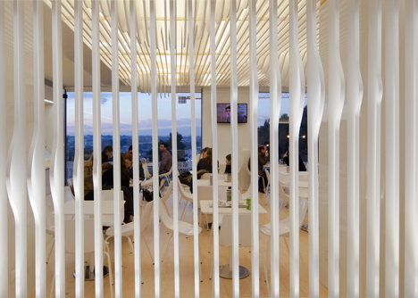
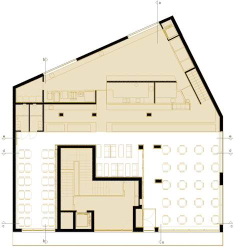
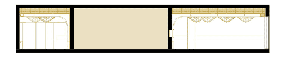
The interior comprises three separate areas with different seating arrangements so customers can choose the environment that best suits their mood.
As well as the ceiling, the colour of the walls was also chosen to reinforce the visual reference to baked goods. "We picked the twenty most wanted products of the bakery and, based on a pattern of global identification, we found a middle tone and applied it on the walls," says Merlini.
Paulo Merlini has also designed a dentist's surgery in Porto with a ceiling that resembles a gabled house.

Baking fans will enjoy this bakery in Suffolk, England, with a bird's nest motif set into the counter and this one in Melbourne, Australia, with undulating wooden slats on the walls and ceiling that resemble a bread basket.
Photography is by João Morgado.
See more cafe interiors »
See more architecture and design in Portugal »
Here's a project description from the architect:
Before designing this project we visited and analyzed other similar spaces trying to find some errors that could be corrected. We found out that a basic error being committed was that most of these services only had one type of space. This design attitude ignored the variation of mood one feels during the day, or even if he walks there alone or with friends, needs a place to read a book or just wants to socialize.

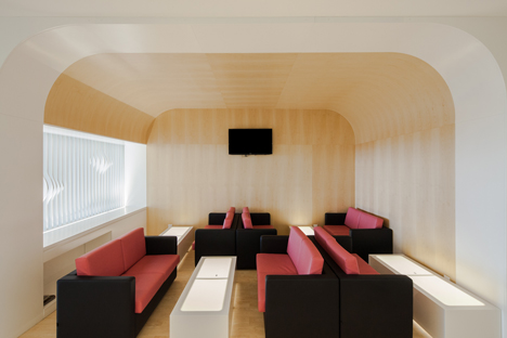
So, to bridge this flaw, we created three different environments so that the costumer can select the space that fits better to his or her mood, rather than have to adapt itself to an imposing environment. This way we provide a more emphatic place and consequently amplify three times the commercial potential.
But a customer isn't one till he gets in. How could we get him inside?
In a metropolitan style of life, everyday people deal with millions of inputs, like Billboards, Signs, People, Cars.etc. The way the brain deals with this excessive information is to send most of it to the unconscious mind, releasing the conscious from the excessive information.
As one moves through the city the brain captures the information around and gathers all the similar inputs creating a mental "scenario" that, based on predictability is perceived by the unconscious mind, releasing the conscious to all variable inputs that he experiences outside that scenario. This is a surviving system that we inherited from the savanna era, so that if for example, a predator moved between the trees, without having to consciously capture every bit of information around, one could perceive the movement and react to protect their own life.
Joining to this line of thought the known fact that 70% of those inputs are visual, and that humans as many animals have an attraction to light, we knew that we had to create an input that could distinguish itself from the rest of the city scenario in such a way that it could activate the conscious perception, guaranteeing that people would notice and feel attracted to it. For that we've used light as the main attraction.

We studied the approximation of the observer to the space and realized that the most visually relevant plan from the exterior was the ceiling, and so we focused on that.
In our studies we also realized that the use of direct light tends to heat up the space and create shadowed corners turning space into uninviting places and that, in an auditory approach, the excessive noise mainly resulting of the reverberating sound was not being properly solved.
So, to solve these problems we knew we had to break the sound waves and refract the light. And so we did, by creating a second ceiling that results from the repetition of wooden stripes, we found a system that could solve the two problems in a row.
In our research we found studies that prove that the presence of color and forms that are food-like actually makes people hungrier.

So to get that input on the users, we picked the twenty most wanted products of the bakery and, based on a pattern of global identification, we found a middle tone and applied it on the walls.

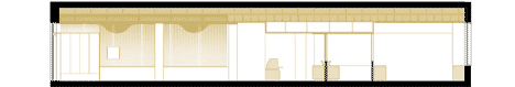
On the formal approach, we made the ceiling "melt" in some points to make it look like a cake topping.

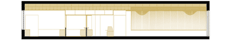
We also proposed a new logo to the client, and designed the space partially based on it. The wooden stripes descend through two of the walls creating an effect that dialogs directly with the consumer. When one moves through space realises that some hidden forms start to appear on the walls. Those forms are an abstraction of the proposed logo. The intention is to unconsciously reinforce the image of the firm in one’s mind.
We like to think of our interventions as positive manipulation of the human brain. As such we focus on giving positive inputs to all the five senses (when possible) so that we can alter one's homeostatic level, and as a result make people feel happier.
