Gadget repair shop fitted out in hospital colours by Masquespacio
Spanish design studio Masquespacio chose hospital colours for the exterior, interior and branding of this smartphone and tablet repair shop in Valencia (+ slideshow).
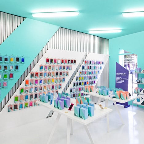
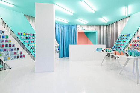
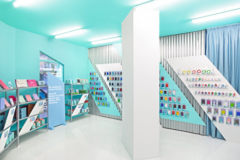
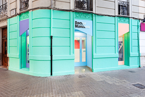
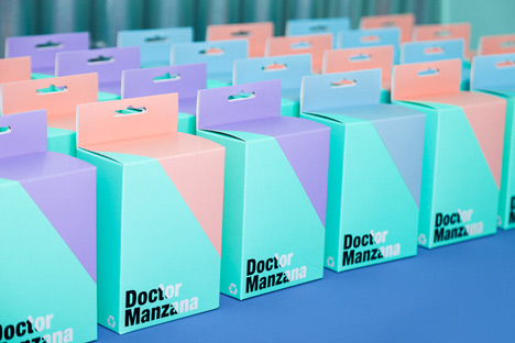
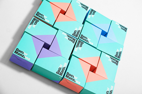
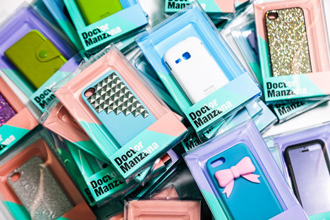
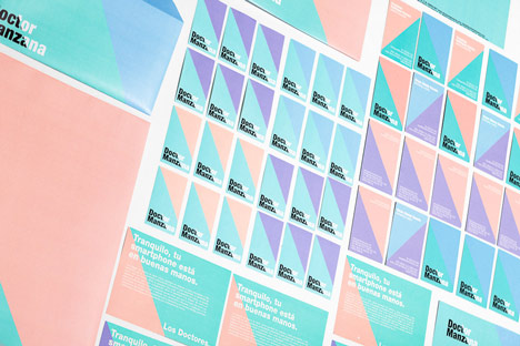
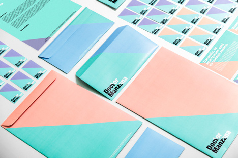
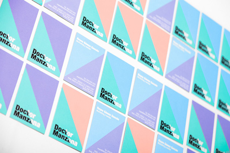
Masquespacio picked four tones to use throughout the 40-square-metre Doctor Manzana shop and on the brand's matching product packaging. The designers chose turquoise and blue to emulate a medical facility, referencing the brand's name.
"We wanted to create a concept based on a hospital, but overall we limited it to a few metaphorical details like through two of the principal colours of the brand: green and blue," Christophe Penasse of Masquespacio told Dezeen. "The salmon colour on the other hand was chosen to attract attention from fashionistas and the purple colour is for the tech freaks."
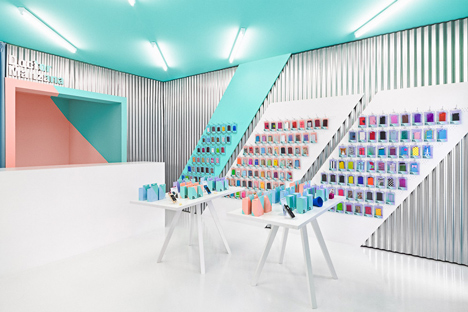
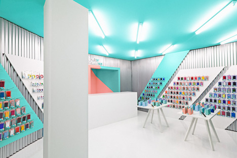
Turquoise green is the dominant colour around the shop, covering the ceiling and sections of wall, while other surfaces are mostly white. Products are displayed on diagonal panels over corrugated steel sheets that line the walls.
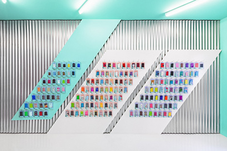
"When we saw this location for the first time the floor, walls and ceiling were in really poor conditions," said Masquespacio creative director Ana Milena Hernández Palacios. "We decided to use galvanised steel sheets, a resistant material with a lower price than that needed to restore the walls."
The diagonal motif is continued on the boxes and packets for phone cases and accessories, which also sit on white tables in the otherwise unfurnished store.
External stonework is painted green, while the doorway and two windows set into alcoves are each coloured in the other shades.
Masquespacio also used bright colours as wayfinding tools at a languages school in Valencia. Photographs are by David Rodríguez.
The designers sent us the following information:
Masquespacio designs the new brand and space of Doctor Manzana
Masquespacio presents their last Project realised for Doctor Manzana, a store specialised in technical service for smartphones and tablets, besides being a seller of design gadgets for mobile devices.
The project consists of the redesign of Doctor Manzana's branding and the realisation of the design for their first point of sale located in Valencia, Spain.
The project starts from the necessities from Doctor Manzana's brand to open their first physical point of sale after the great success reached through their technical service offered until now only online in Spain.
Due to the growth of the company in first case design studio Masquespacio redesigned the graphic identity of the brand with the purpose to strengthen the identity and apply it to the point of sale.
The logotype starts from the principal axe of the company the touchscreen and his reflection that creates an angle of 54 degrees. That angle ends being part of the whole communication and his defragmented into different applications that create an infinity of forms able for the graphic and interior design.
Ana Milena Hernández Palacios, creative director of Masquespacio: "Talking about the colours as we started from a company name allied with a doctor we wanted to create a concept based on a hospital, however as we didn’t want to create a conventional design, we discarded this option, but maintaining blue and green colours as a reference to the first word in the company’s brand name." Looking at the store everything starts from the striking façade that incorporates the same angles and colours like for the graphic identity.
The blue and green colours like a reference to the doctor, the salmon colour for the fashionistas and the purple for the freaks. Both windows contain texts like "Doctor Manzana? Is it an orthopedic doctor? No! It's a team of technicians specialised in smashes, drops and accidents for smartphones and tables" communicating Doctor Manzana's services in a funny way. Entering at the store we can see how the interior design as the graphic design contains fresh funny colours and a bunch of angles appearing continually in their original form or defragmented, making reference to the reflection of the touchscreen.
A technological air blows through the store, while some details like the blue curtain refer in a metaphorical way to a hospital.
Materials like the galvanised steel sheets are doing their more industrial work in the space, while white furniture is offering a light warm touch to the whole. Meanwhile, the different pastel colours bring the diversion part of Doctor Manzana's identity to the space.
Masquespacio, through this project, shows again that creativity has no limits and that high budgets aren't needed to obtain an explosive result for brands looking to transmit a sober or a funny image like in this case with Doctor Manzana.