
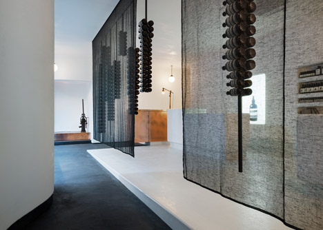
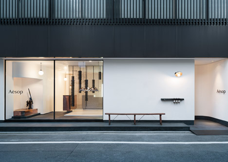
Sheets of translucent black material separate areas of this Aesop skincare store in Kyoto by Japanese studio Simplicity (+ slideshow).

Simplicity took different elements from Japanese artistic principles through the ages and applied them to the Aesop shop interior.

"The design draws inspiration from Jun'ichirō Tanizaki's In Praise of Shadows, the aesthetics of fourteenth-century actor and playwright Zeami Motokiyo, Kyoto's machiya townhouses and the vertical alignment of Japanese text," said the designers.
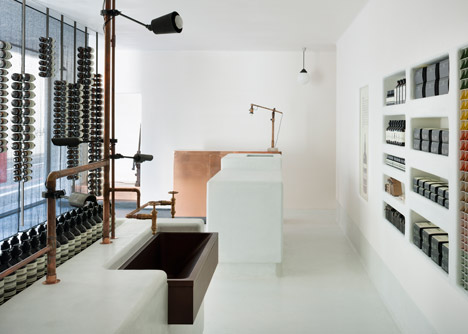
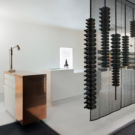
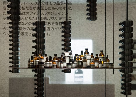
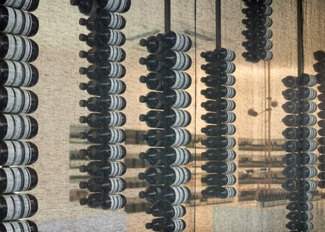
Bottles of the skin and haircare products are hung in columns against the sheer fabric to reference vertical Japanese calligraphy.
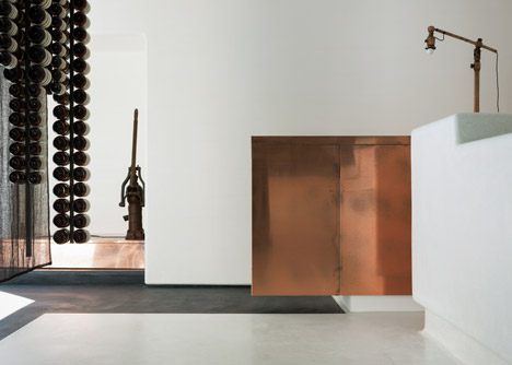
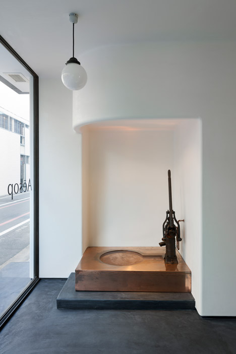
An antique water pump installed in an alcove can be spotted through the large glazed section of wall facing the street.
On entering the store, shoppers walk up a ramp and past a shelf displaying a selection of Aesop products before emerging into the main space behind the veils.
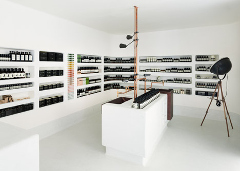
Past the blinds, the floor changes from dark polished concrete to a clean white surface.

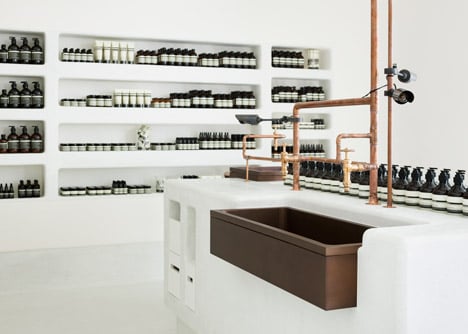
Copper plumbing runs down from the ceiling and branches into taps, which are positioned over sinks set into white islands.
Lamps hang off the pipes like climbing plants and the cashier's desk is also clad in copper. More products are on show in rounded niches set into the stark white walls.
Three of the brand's signature bottles are also presented outside the store, attached to a horizontal grey element that contrast with the white facade.
When we spoke to Aesop's founder Dennis Paphitis, he explained why no two of the brand's stores have the same design. Another Aesop store that recently opened in Kyoto features lighting previously used on squid fishing boats.