Google and Monotype collaborate on font that spans all written language
International font company Monotype has worked with Google to create one typeface that can be used by everyone in the world, writing in any language.
The two companies describe the font family – named Noto – as one of the biggest typography projects ever undertaken.
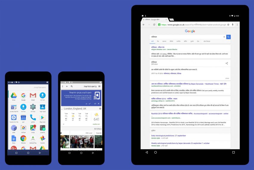
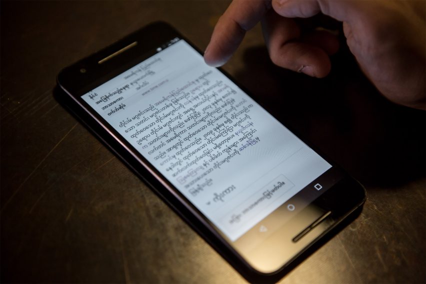
The result of more than five years' work, Noto covers more than 800 languages and 100 written scripts. And work on it will continue into the future to add scripts that are currently incompatible with computers.
Numbers, emoji, symbols and musical notation are also included in the typeface, which comes in multiple serif and sans-serif styles of up to eight weights.
Noto is designed to eliminate "tofu" – the square boxes that appear in place of text when a font is not available on the device, so-called because they look like blocks of bean curd.
The typeface is said to realise Google's dream of seeing "no more tofu".
Google and Monotype claim Noto will not only help people to communicate across the world, it will assist to preserve information written in endangered languages.
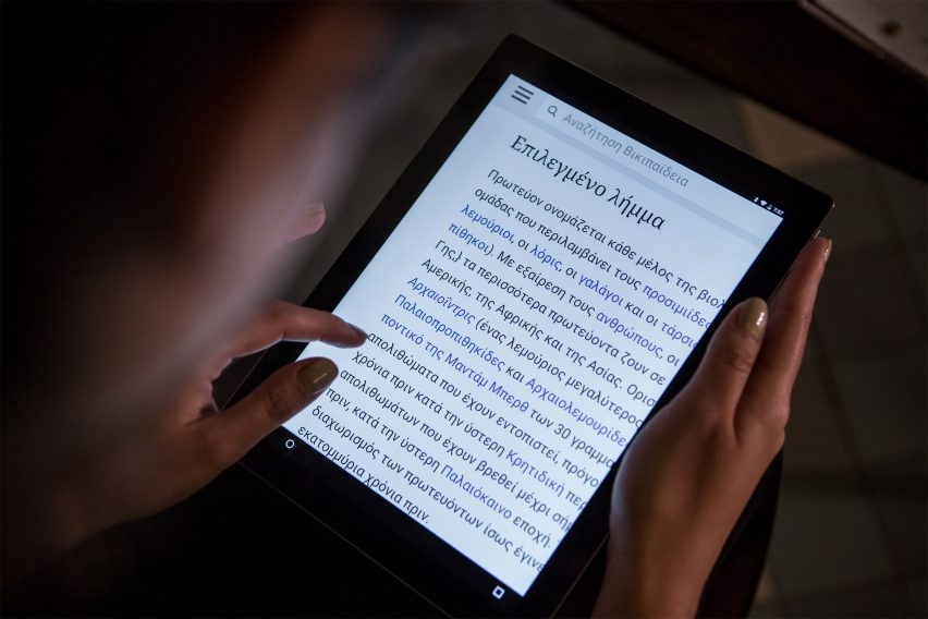
"Even though we prioritise widely used languages, we still want to support other languages, even if there are no people still speaking them," said Google product manager Xiangye Xiao. "There are some characters you can only see on stones."
"If you don't move them to the web, over time those stones will become sand and we'll never be able to recover those drawings or that writing."
Google and Monotype are sharing Noto under an open font licence, meaning it is free to use, modify and distribute. Designers and developers are invited to adapt the typeface.
Work on Noto will be ongoing to keep up with updates to the Unicode Standard – the computing industry standard for encoding text so that it can be read consistently across machines.
When Google and Monotype began their project in 2011, Unicode 6.0 had just been released. The standard is now up to version 9.0, and the companies will continue to work together to add scripts from each new standard to the Noto library.
"I feel that looking into the future of digital communications, Google Noto is going to be the go-to design for people to be using to communicate across multiple cultures and societies," said Monotype's creative type director, Steve Matteson.
Monotype, one of the world's biggest type foundries, has previously worked on high-profile projects like a digital-friendly update to the London Tube's 100-year-old typeface.
While Google provided design direction, Monotype is responsible for the look of Noto. The company worked with designers and linguists from around the world to create the characters in Noto's library.
Google's vast resources funded the project, making extensive testing and review possible. The release of Noto continues a big week for the company, which launched a new smartphone, connected home device and virtual reality headset on Tuesday.