"Apple doesn't understand how quickly we want things to advance"
Is Apple struggling to keep up with its rivals? Readers are debating whether the tech giant has run out of innovation in this week's comments update.
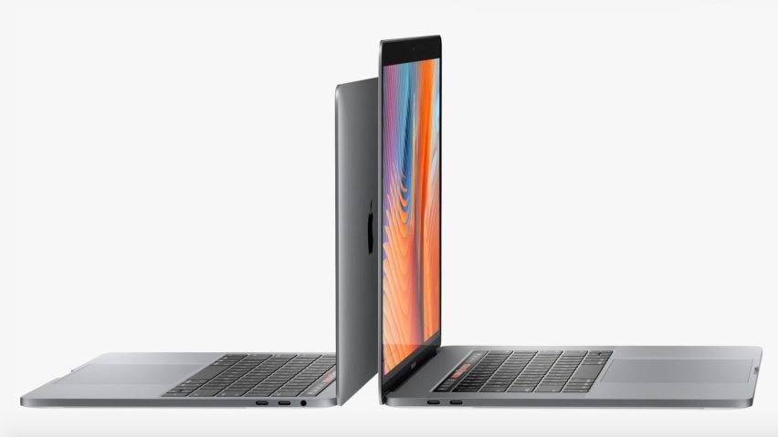
MacBook no: Apple has redesigned the MacBook Pro laptop to include a touch-sensitive bar between the keyboard and screen, but readers aren't convinced by the latest update.
"I thought keyboards were on their way out. Apple doesn't seem to understand how quickly we want things to advance," said Randy Geyer.
Some felt the addition of a secondary screen didn't go far enough. "It seems pretty obvious to add a keyboard to an iPad and call it a new MacBook," Steve Hassler pointed out.
"Nothing to compare with Microsoft's Surface. It's clear enough that Apple doesn't have any new cutting-edge ideas anymore," wrote Ale. He wasn't the only commenter to compare Apple to tech rival Microsoft:
Read the comments on this story ›
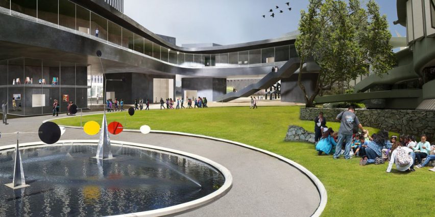
Love me render: readers are questioning whether architects should return to creating models with their hands, after Peter Zumthor admitted he "doesn't like" the digital renderings of his LACMA building.
"Renders do not maketh the building. I think architects currently put too much value on renders," said DoS.
"Unfortunately, any way they render this project, the silly faux-Japanese pavilion is still there in the middle," wrote Studio.
Others felt Zumthor's concerned rang true. "These renders are pretty poor but it's nice to know that even Zumthor has to jump through such hoops in the process of designing a building," said a user called Middlemarch.
"Let's get back to drawing and modelling with our hands and reject this fake digital 'culture'," said Jeff P.
One reader pointed out that even the most sophisticated renders have pitfalls:
Read the comments on this story ›
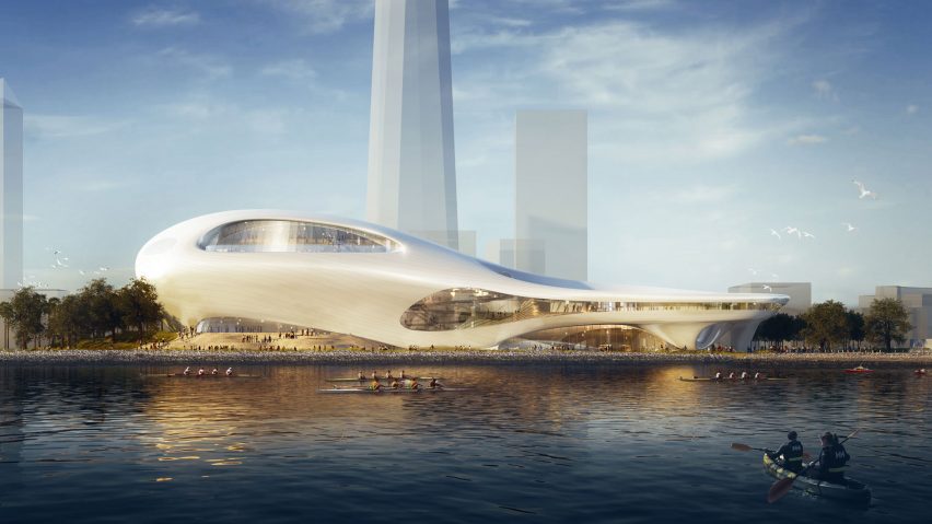
Science fiction: Beijing studio MAD has revealed two new designs for its George Lucas Museum of Narrative Art – one for San Francisco, and one for Los Angeles – which have been described as a "giant evil duck" and "military outpost on an uninhabited planet" respectively.
Some were full of praise for the undulating designs. "Curves are the new boxes," said Endrope.
"LA one looks best, more like a sci-fi village," said user Disqus_G5hXiwS1cQ.
Other were less convinced. "I can't wait until this ooze architecture falls out of vogue," said 8mismo.
Read the comments on this story ›
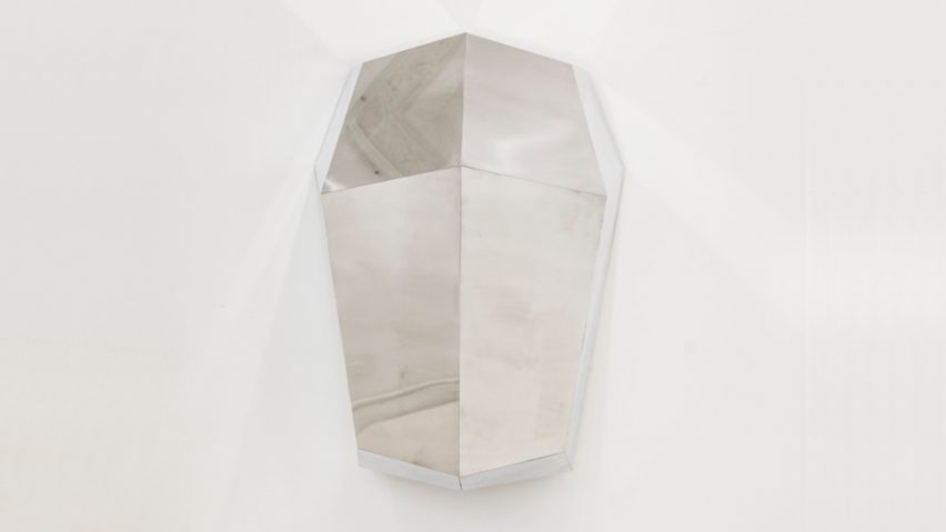
Escape route: a wall-mounted cubby hole designed to provide a secluded space for office workers proved controversial in the comments, with readers branding it "ridiculous" and "humiliating".
"Want a break from the office floor? Go cry in the bathroom like the rest of us," wrote Trent.
"I think it's even more humiliating to 'escape' into this vertical coffin!" said Tony Keith.
But one reader had a different interpretation of the product:
Read the comments on this story ›