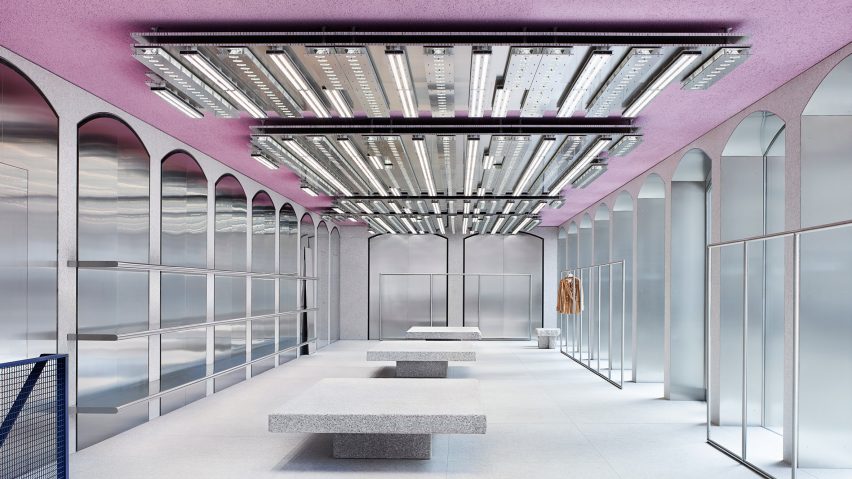
Acne Studios opens pink-ceilinged flagship store in Milan's Brera district
Acne is the latest design brand to favour pink for interiors, using it to colour the ceiling in its new Milan store.
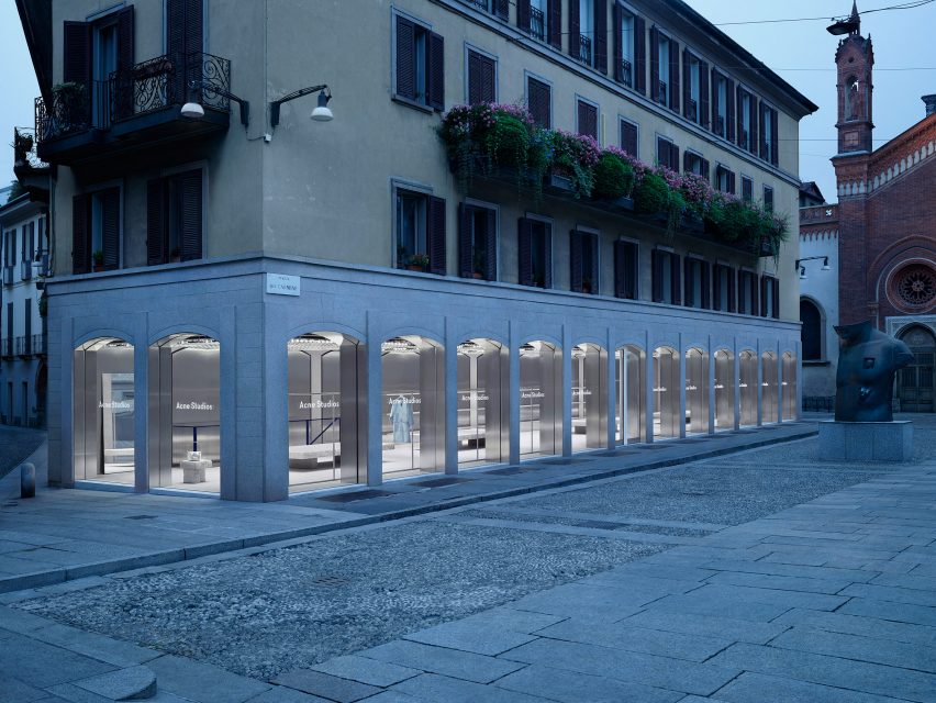
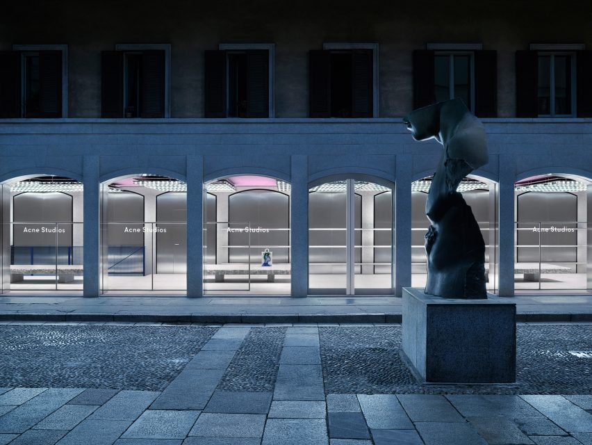
The Swedish fashion brand has opened its first Milan flagship on Piazza del Carmine in the Brera district – an area of the city populated with designer shops and galleries.
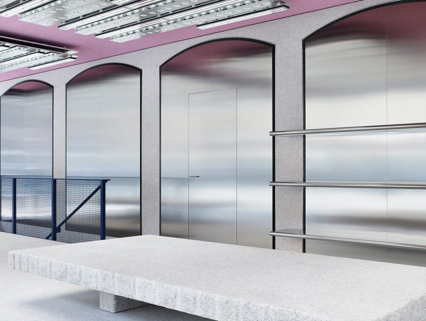
Acne was keen to reflect the artistic nature and "individuality" of the area through the interior design, while staying true to its own signature minimalist aesthetic.
"It took five years to find the perfect place for us in Milan," said creative director Jonny Johansson. "I am so happy that we waited, because the Piazza del Carmine has the exact sense of individuality and community that I like."
"The store is totally unique, and also totally Acne Studios."
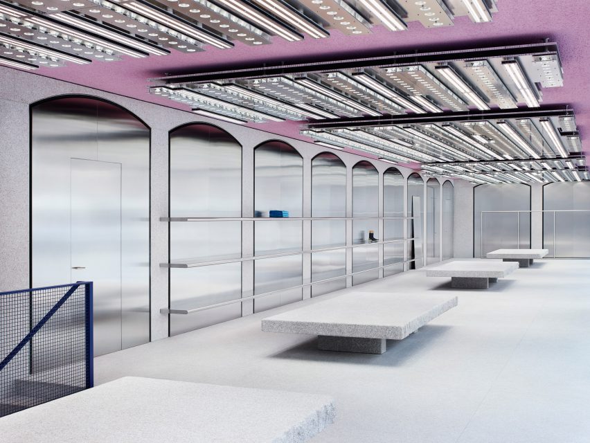
The flagship is set inside an existing building that has high, arched windows across its front and side facades. The shape of these windows is repeated throughout the store's interior, where stainless steel arches are set against grey-toned granite walls.
The same granite, sourced at a local quarry in the Baveno region of Italy, was also used for the flooring and the furniture, which was designed in-house at Acne.
The fashion brand also commissioned a custom-made lighting system specifically for the store, named The Mega.
Attached to the pink ceiling, The Mega has multiple fixtures each made of polished aluminium. While the expansive windows allow natural light to flood the store during the day, the lighting retains the same level of glow at night.
A signature of all Acne stores, the shelves, rails and fixtures are also made from stainless steel – contrasting with the granite tables and stools that the brand describes as "ancient stone monuments".
Acne, which featured on the inaugural Dezeen Hot List, was founded by Johansson in 1996.
Last year, the brand enlisted British designer Max Lamb to create sculptural furniture and colourful rugs for its store in New York City – the brand's largest opening yet.
The golden tones used throughout the shop gave it a slightly warmer feel than the brand's Seoul flagship, which was designed by architect Sophie Hicks as a "concrete monster" concealed within translucent walls.