"Where has the ambition gone?"
In this week's comments update, readers are split over the "woven tapestry" design of this year's Serpentine Pavilion by Mexican architect Frida Escobedo.
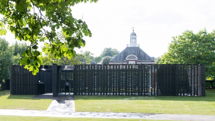
Greyscale: Escobedo failed to capture the imagination of commenters with her design for a secluded courtyard framed by latticed walls.
"A bit industrial looking. Reminds me of a grid at a power station," lamented Mark Power, before suggesting that some colour "would have helped".
"For me, this is the least appealing idea of all the Serpentine Pavilions I've seen. It's easy to be non-site specific, but there must be purpose," wrote a disappointed Jon C.
"Where has the ambition gone with these projects?" wondered Critic Al.
But Sam leapt to the defence of the pavilion: "We don't see enough restraint in architecture today. This is beautiful."
"Maybe you have to be there," suggested Steve Hassler.
One reader couldn't resist the opportunity for a pun:
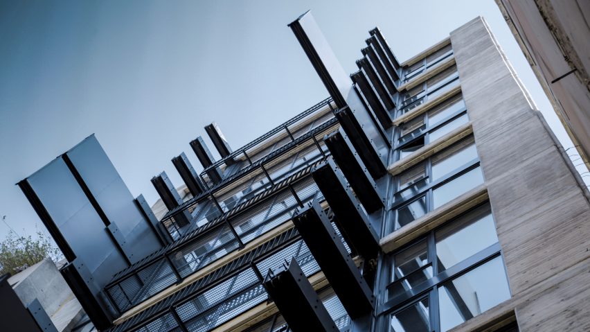
Falling short: commenters also struggled to get behind the design of an apartment tower in Beirut by Fouad Samara Architects, which features sliding steel walls on its facade that allows occupants to partition off their space as required.
"Sorry but I feel like it's a complete architectural fail. Sophisticated, but still a fail," shrugged Joel Norton.
Threefloatingorbs took the criticism one step further:"Click-bait architecture."
"As far as re-partitionable rooms go, this is like reaching your right hand over the top of your head when you have an itch on the left side of your face. Just use your left-hand dude!" explained HeywoodFloyd.
"Just a major source of maintenance. Just because you can do something, doesn't mean you should," suggested Dik Coates.
"I'm sure the neighbours on the left and right love this building," joked Miles Teg.
One reader saw the project as a challenge:
Read the comments on this story ›
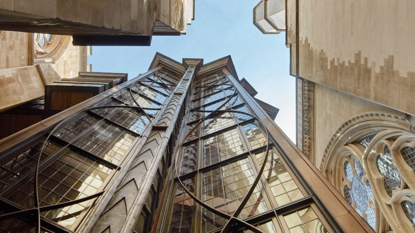
Out on a limb: Ptolemy Dean Architects' recently completed tower, an extension to London's Westminster Abbey, was described as "steampunk gothic" by critics this week, but it seemed to divide opinion among readers.
"Oh, my good Lord, what a goop! The architects should be jailed for this!" exclaimed Malgorzata.
"Goop? Well, whatever, but I think it's breathtaking. The meta work on the exterior, and on the windows? Just wow," fired back Charlie Bing.
"Amazed that they were able to build this in such close proximity to the existing historic structures without doing any damage," pointed out Heywood Floyd.
Apsco Radiales felt other architects could learn from the project: "Far, far better than some sterile glass box that others would do."
"I love it. Instead of just adding a simple looking glass cube they seized the opportunity and created something daring and playful," agreed Zea Newland.
Read the comments on this story ›
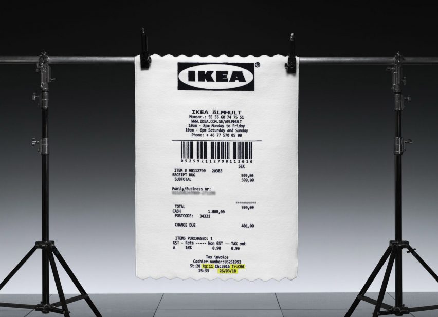
Keep the change: Readers had a lot to say about a new product unveiled by IKEA as part of its collaboration with Virgil Abloh, a giant rug designed to look like a receipt, with many feeling it was just a gimmick.
"I really hope Virgil Abloh's receipt rug has the correct item number and price tag. That way you don't need the paper receipt when you return it," sneered Kevin Noel.
"Interesting stuff, but the receipt isn't iconic enough for me. He gets a C- for that effort. Sounds like a marketing job," added Bill Barker.
"One could go to CVS to buy four items and still have a larger receipt than that rug," joked Arctk2011tj, referencing the pharmacy chain's infamous long receipts.
This reader couldn't see the point:
Read the comments on this story ›