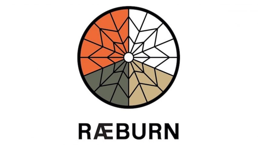
Swiss design duo Régis Tosetti and Simon Palmieri have rebranded luxury menswear brand Christopher Raeburn and introduced a new logo that references the company's heritage.
The design is inspired by an air force parachute
The new logo features a circular emblem divided into four segments of white, olive, sand and orange by a black, web-like outline.
It is inspired by the colours and pattern of a 28-foot parachute conventionally used by air forces, and the material Raeburn recycled into garments when he founded his brand a decade ago.
"We're introducing a new logo in recognition of where our brand began – an iconic, graphic interpretation of a 28-foot parachute used by air forces globally and unique for their colour-blocked construction," explained Raeburn.
"White, olive and sand hues allow for camouflage whilst fluoro-orange allows for signalling and detection," he continued.
The brand worked with Régis Tosetti and Simon Palmieri
A "snappier" Raeburn logotype is also presented in all-caps and features a black, sans serif typeface.
The new visual identity – which sees the company dropping the designer's first name – was undertaken in collaboration with Régis Tosetti and Simon Palmieri, a Swiss multi-disciplinary art direction and graphic design duo.
"We've worked with Régis Tosetti and Simon Palmieri from the very beginning. Régis and Simon have worked on everything graphic and branding related since the start, so it felt natural for them to work on the direction of the new logo and branding," said Raeburn.
The timing coincides with a decade in the fashion business
The rebrand marks the brand's 10th anniversary and the arrival of designer Christopher Raeburn's brother Graeme at the end of last year.
"It's our tenth anniversary in business and with my brother Graeme joining the company as performance director, it feels like the right time to rebrand to Raeburn as we grow our team, wholesale, retail and consultancy platforms," Christopher Raeburn told Dezeen.
The designer explained that the move was intended to put the focus on the team rather than him personally as the brand's eponymous designer.
"As we continue to grow, it becomes less about me, the designer, and more about the team and collaborators," he explained.
The brand is known for its focus on sustainability
Founded in 2009, the eco-fashion house is known for making garments out of sustainable or recycled materials.
For its Autumn Winter 2019 collection, Raeburn chose materials made from recycled bottles and reclaimed parachute nylon for its collection.
The rebrand follows Hedi Slimane's overhaul of the Celine logotype, which included removing the accent from the label's name to better resemble the original 1960s logo.
Riccardo Tisci's new Burberry logo also – in a similar move towards the brand's heritage – used founder Thomas Burberry's initials "TB" in an orange and white monogram.

