Eleven memorable graphic design projects by Milton Glaser
To mark the passing of Milton Glaser, we've rounded up 11 of the New Yorker's most interesting graphic designs from the past six decades, including a previously unreleased symbol of togetherness that he was working on up until his death.
Born on 26 June 1929, Glaser died exactly 91 years later on his birthday in New York, where he had lived all his life. His best known I ♥ NY project expressed his pride for the city and soon became a universally recognised symbol.
Around the same time as this campaign, the artist designed a poster for American singer Bob Dylan and co-founded the lifestyle and culture New York magazine.
Glaser continued to create graphics up until the last days of his life, when he was still working on a project designed to create a collective spirit during the coronavirus outbreak.
Here are 11 graphic design projects by the late artist:
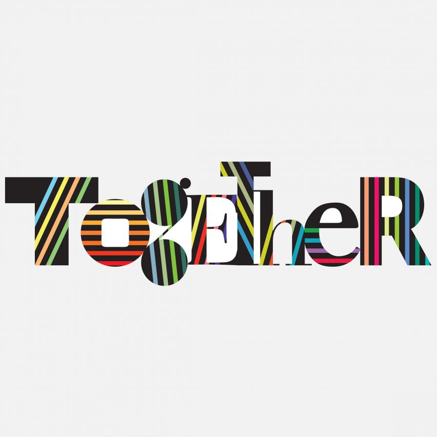
Together
Up until his death on 26 June 2020, Glaser was working on a graphic project that would represent the idea of collectivity during the forced isolation of the Covid-19 pandemic.
As the artist told the New York Times, he hoped that the project, titled Together, would be distributed to public schools across the city to spread the message that "we are not alone".
"'We're all in this together' has been reiterated a thousand times, but you can create the symbolic equivalent of that phrase by just using the word 'together', and then making those letters [look] as though they are all different, but all related," he told the publication.
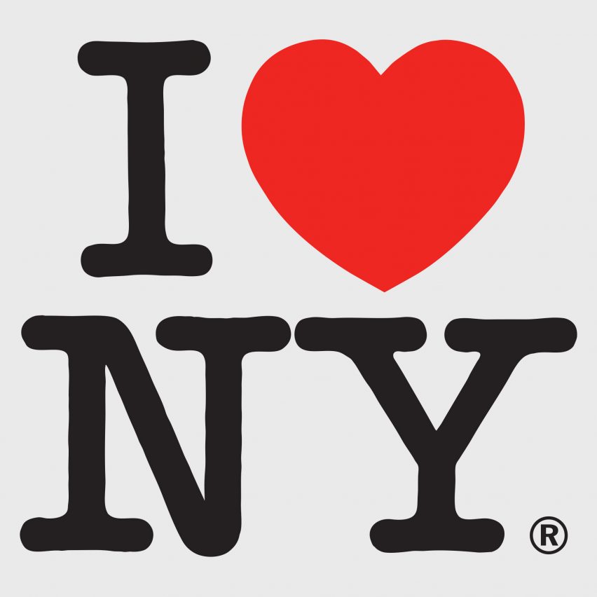
I ♥ NY Campaign
Created in 1977 as part of an advertising campaign commissioned by New York State, the iconic I ♥ NY logo was designed to increase tourism and raise the spirits of New Yorkers after the city's fiscal crisis.
Glaser, who designed the logo pro bono, chose to use a lettering similar to the well-known American Typewriter font for its "informality and literary reference", as well as the fact that it provided a visual contrast to the voluptuous heart.
The designer later revisited the emblem after the attacks of September 11, adapting it to say "I ♥ NY More Than Ever".
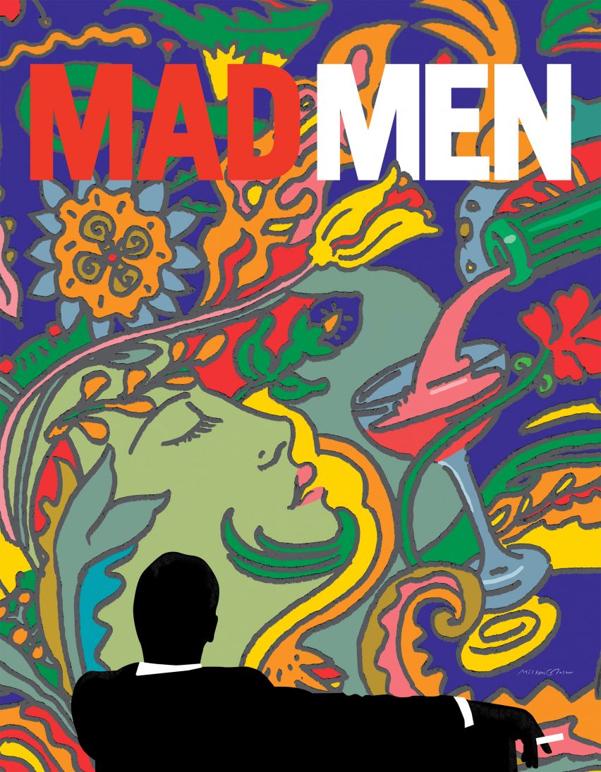
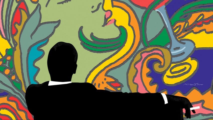
Mad Men poster for AMC
The final season of American drama television series Mad Men was advertised with a series of Art Nouveau-style posters and animations designed by Glaser in 2014.
The design features the iconic silhouette of protagonist Don Draper, as seen in the show's opening credits, set against a backdrop of an illustration of a woman's head next to a glass being filled with a drink.
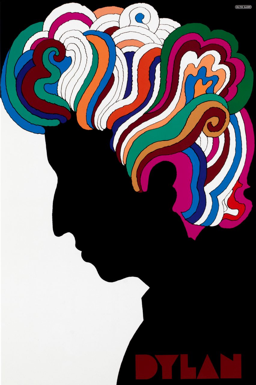
Bob Dylan poster for CBS Records
Glaser applied his signature psychedelic style to a poster he designed for Columbia Records in 1967 to illustrate Bob Dylan's Greatest Hits album. The work led to a surge of fame as a graphic designer.
Taking design cues from a self-portrait by French-American artist Marcel Duchamp, the poster sees Dylan's side profile illustrated as a black silhouette, providing a stark contrast to the rainbow-coloured, swirling lines designed to represent the singer's curly locks.

New York magazine logo
In 1968 Glaser founded New York magazine with American editor Clay Felker as a competitor to The New Yorker. Here he served as president and design director until 1977.
In addition to creating the curly logo for the life, culture, politics and style magazine, Glaser also designed a poster to promote the publication titled New York Is About New York, depicting the city's Empire State Building at four different times.
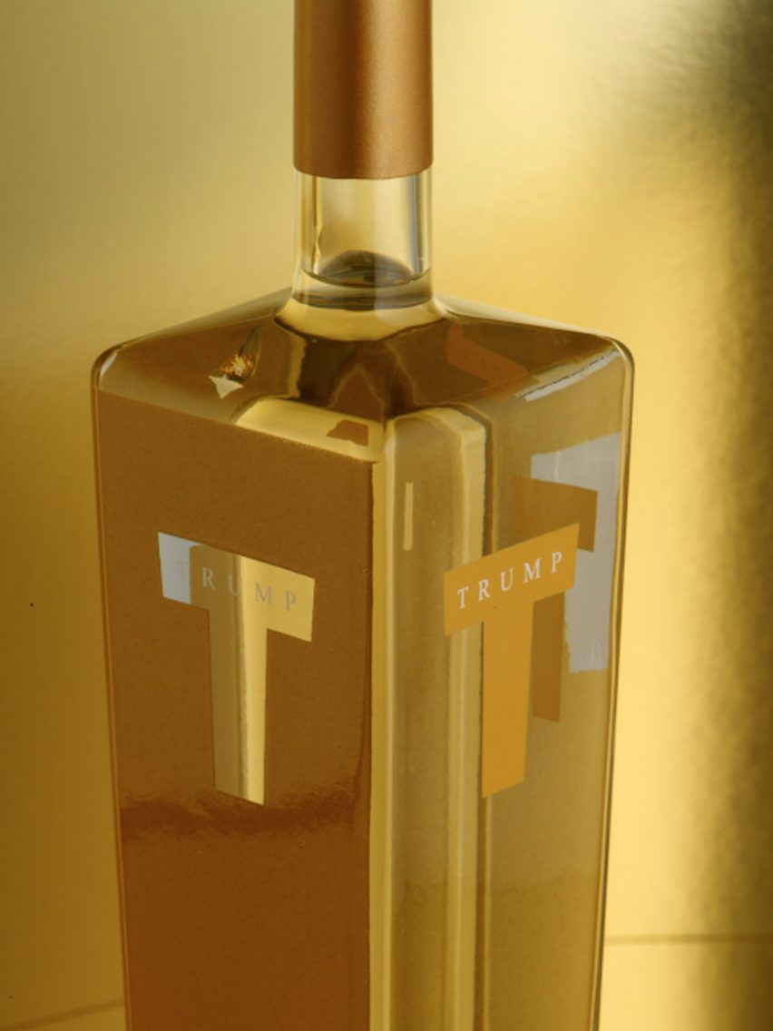
Trump Vodka bottle
Glaser was also responsible for designing a gilded vodka bottle for US president Donald Trump, shortly before the former entrepreneur licensed his name to an anonymous Dutch-distilled vodka in 2006.
The bottle, which boasts a cubic design reminiscent of a skyscraper, features two sides coated in gold with the letter T cut out to show just the transparent glass, and two sides of the design in reverse.
When speaking to Fast Company about the design in 2016, however, Glaser told the publication that the bottle appealed "to the lowest level of human activity".
"What you're selling is envy and status," he said, adding that he "wouldn't, under no circumstances, do a job for Trump today," as he saw him as "an extremely dangerous figure in American life."
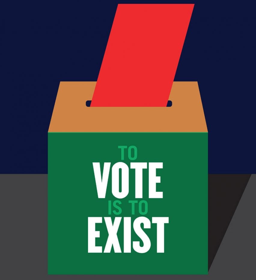
Get Out The Vote graphic for US election
Glaser was among a host of designers who created graphics to encourage Americans to travel to polling stations and vote in the 2016 presidential elections.
The colour-block poster, designed as part of the design organisation AIGA's Get Out The Vote campaign, has the words "To Vote is to Exist" written across the front of a ballot box, as a voting slip being dropped inside.
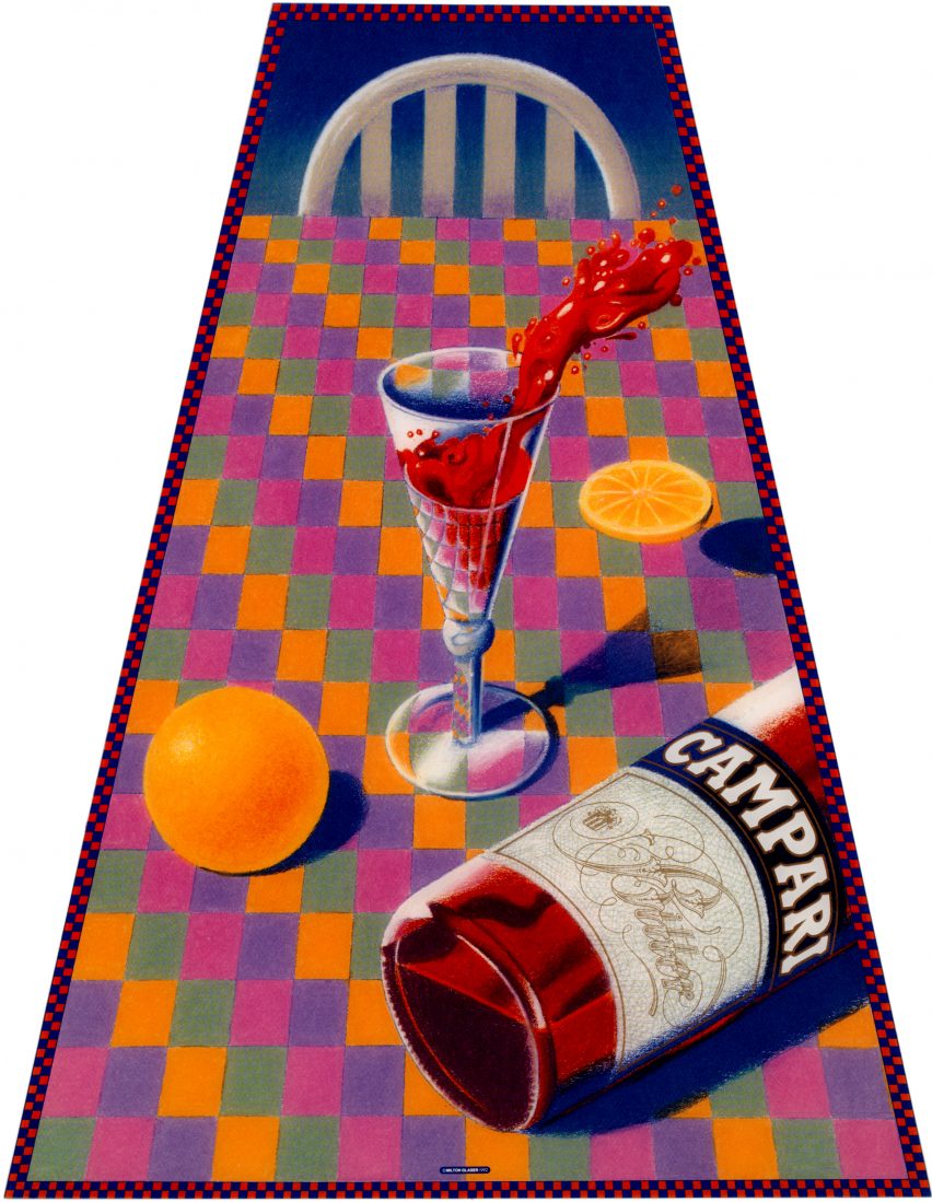
Campari poster
In 1992, Glaser designed a vibrant poster for Italian alcohol brand Campari to promote its famous aperitif, best known for its use in Negroni cocktails.
The poster depicts a trapezoidal view of a table covered with a green, pink, purple and yellow-checkered cloth, on top of which is a bottle of the liqueur and a glass of its dark red liquid spilling over.
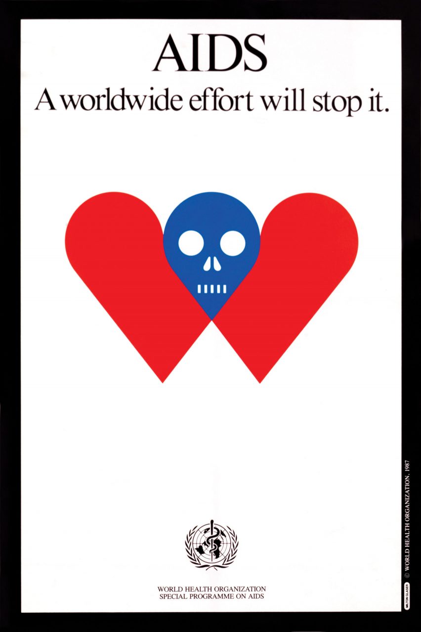
World Health Organisation
Glaser designed a poster for the World Health Organisation (WHO), titled AIDS: A Worldwide Effort Will Stop It.
The poster, released in 1987, featured a simple, red love heart symbol that had been split in half and separated, joined together in its centre by an emblem of a blue skull.
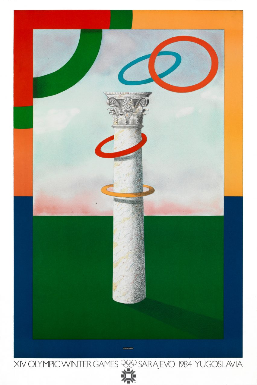
XIV Olympic Winter Games
To promote the 1984 XIV Olympic Winter Games held in Sarajevo, Glaser turned the Olympic symbol into a ring-toss game – with the imaginary player throwing the rings onto a Corinthian-style column.
The traditional Olympic colours of red, green, blue, yellow have been used to create a border around the outside of the poster.
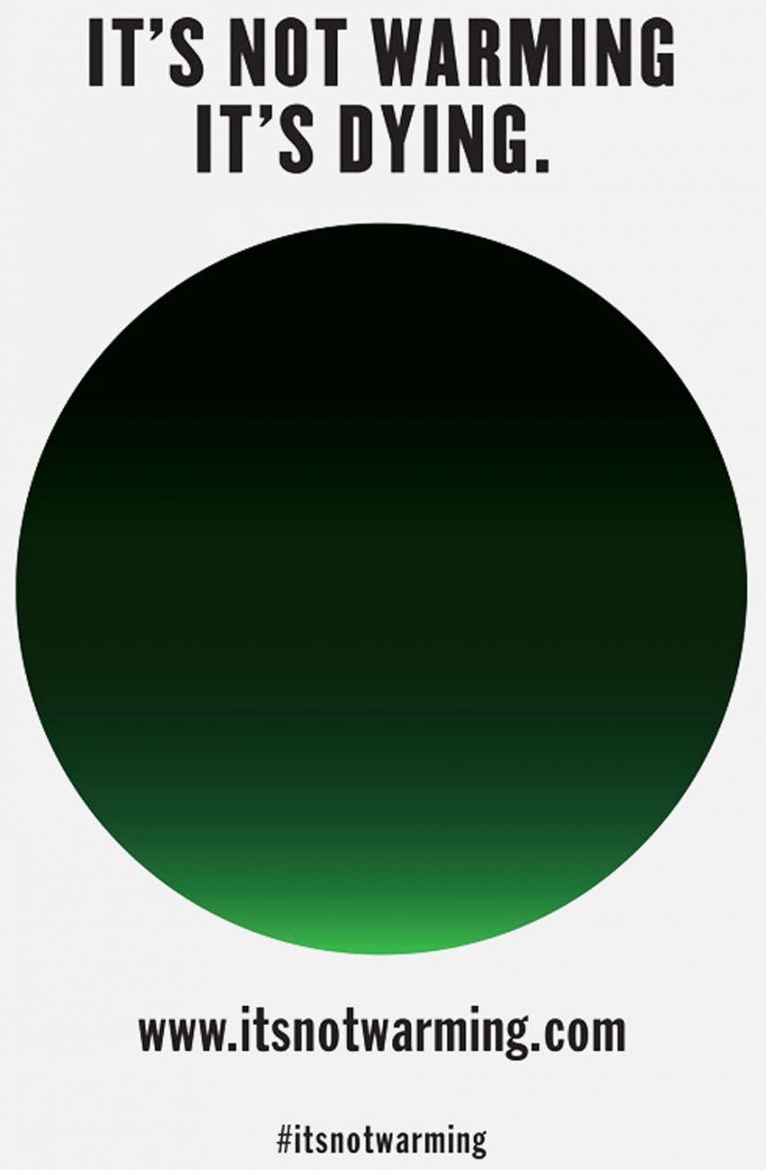
It's Not Warming, It's Dying campaign
In 2014 Glaser launched a campaign to raise awareness of climate change. Called It's Not Warming, It's Dying, the initiative aimed to create a greater sense of urgency around climate change.
The campaign's visual identity features a green disc obscured by black smoke to symbolise "the disappearance of light" from the planet.
Images courtesy of Milton Glaser Inc.