Kengo Kuma's plan for contemporary cathedral entrance "not as ugly as it could be" says commenter
In this week's comments update, readers are debating Kengo Kuma's plans for a contemporary entrance at Angers Cathedral, France, and discussing other top stories.
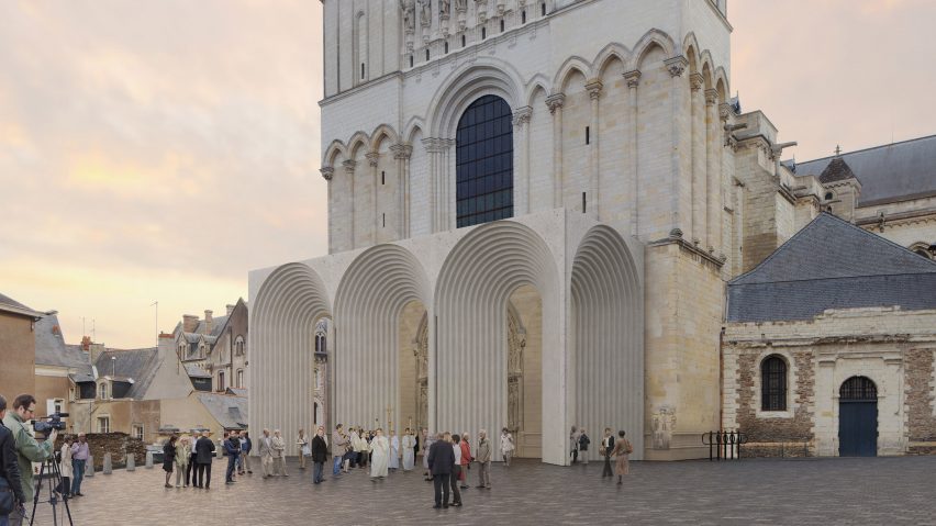
The cathedral entrance was designed to create a "harmonious dialogue" between its contemporary design and the cathedral's Middle Age architectural heritage. It will consist of a rectangular stone extension with five archivolts, creating an open gallery.
Angers Cathedral was built in the Angevin gothic style in the 12th to 13th centuries on the base of an earlier Romanesque cathedral, and five architecture studios were invited to create a new design for the entrance.
"Massive stone arches supporting nothing? It makes no sense"
Commenters aren't convinced that the winning design is suitable for a historic building. "Bizarre. It's not as ugly as it could be, but so clearly out of character with the actual building," said MB America.
Colin_MacGillivray agreed: "A pure, lean, glass structure, using 21st-century technology, would have revealed the original entrance."
"We have the right to add the new modern parts to historic buildings, but it comes with an obligation to do it well," added Marius. "This one is a rather mediocre idea; the fact that it's well-executed does not change it."
"Massive stone arches supporting nothing? It makes no sense, concluded Alfred Hitchcock. "Surely there's a more appropriate solution with a much more slender structure, which doesn't completely obscure the existing entrance and visually compete with the historic structure?"
Do you think the design is a good addition to the cathedral? Join the discussion ›
"Next step: horizontal skyscrapers"
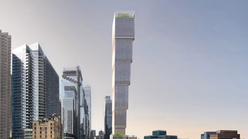
Readers aren't sold on Adjaye Associates' design of a supertall skyscraper in New York, which has a series of cantilevers to give it a dramatic form.
"The natural laws of physics demand that tall buildings need to get narrower towards the top," said Alfred Hitchcock.
"Next step: horizontal skyscrapers," added Stefano Parodi.
"I know symmetry is not necessarily in-style, but surely here at least if the building tapered out on both sides the necessary 'structural gymnastics', referred to by a previous commenter, would be basically eliminated," continued SteveLeo. "So wilfully difficult it's painful to look at!"
What do you think about the skyscraper's inverted appearance? Join the discussion ›
McGrath Road housing project is "a bit marmite," reader says
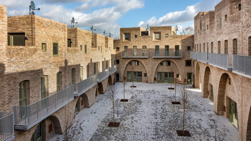
Readers have mixed feelings about Peter Barber Architects' McGrath Road housing project, which has won this year's RIBA Neave Brown Award for Housing. The social housing estate is made up of 26 townhouses that are fronted with recessed arches and surround a central paved courtyard.
"Nice to see a public housing project that doesn't look like death," said disqus_Qlc3NGnnSS. "The window looking out onto a brick wall isn't exactly inspirational, though."
"It's a bit marmite," agrees James. "The catenary arches aren't really something that works for me, but I think there are a lot of interesting ideas about internal and external space, as well as some interesting rhythmic things going on."
"An interesting and complex project, but I can't help thinking that the forms would be more at home in North Africa or the Middle East than in Newham, London," added Walter Astor. "Certainly, it does nothing to reinforce the prevailing local context."
Do you love it or hate it? Join the discussion ›
"A lot of formalism going on for the sake of formalism”
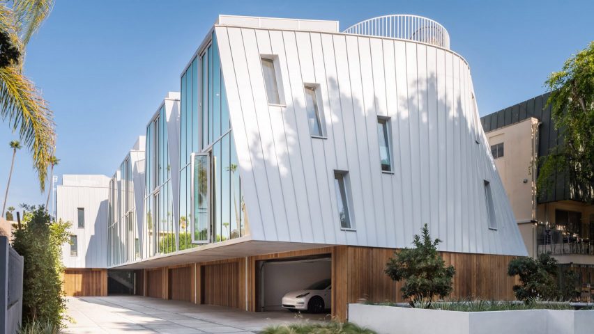
Readers are divided over the shape of new metal-clad homes in Los Angeles designed by LOHA. The project is located near Hollywood and consists of five three-story units on a slender rectangular lot.
"I like the shapes but technically those spaces in between are absolutely impossible to maintain, said Sim. "Imagine that space cluttered with leaves that you have to clear out."
"Faux formalism really – the units are an interesting shape," continued davidspiher. "But why just line them up in the most uninteresting/boring /least sculptural way possible (flat back facade), with the least consideration of the empty spaces of the site?"
Zea Newland agreed: "Like another user stated there's a lot of formalism going on for the sake of formalism but I would like to appreciate the layout."
What do you think of the housing complex? Join the discussion ›
Read more Dezeen comments
Dezeen is the world's most commented architecture and design magazine, receiving thousands of comments each month from readers. Keep up to date on the latest discussions on our comments page.