Chromasonic makes "light audible and sound visible" for Google's Milan installation
Google has returned to Milan design week with a kaleidoscopic installation by research studio Chromasonic, designed to simulate the experience of having synesthesia.
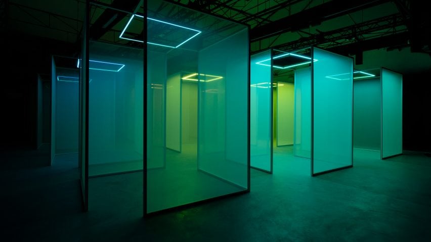
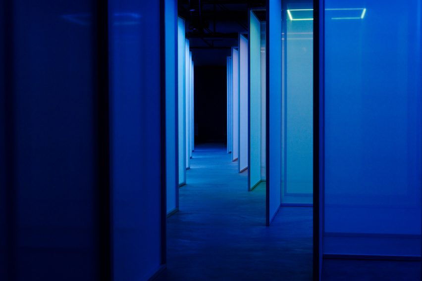
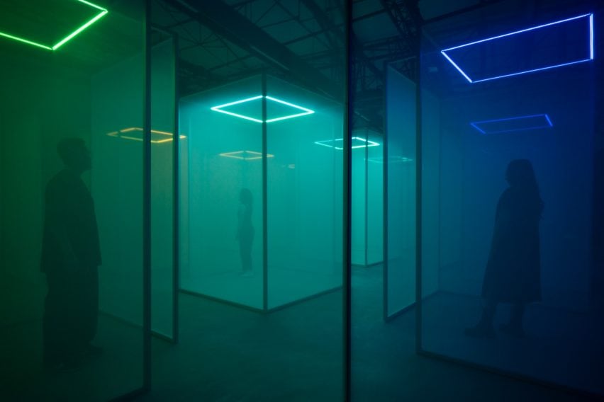
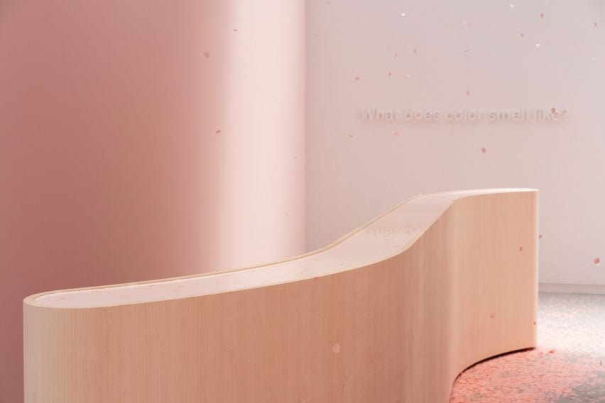
Stretching across 600 square metres inside a redeveloped industrial building near Porta Venezia, Making Sense of Color takes visitors on a "sensorial journey" through a maze of semi-transparent screens.
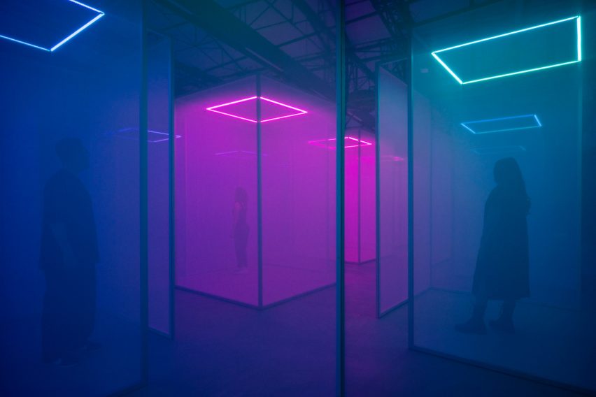
Changing patterns of coloured light are projected onto these screens, accompanied by sound in frequencies equivalent to the real wavelengths of the various shades.
Red light has the longest wavelengths and therefore generates the lowest sound while yellow, green and blue have progressively shorter wavelengths that result in higher-pitched sounds.
This effectively allows visitors to experience the colours through two different senses simultaneously, leading Chromasonic co-founder Johannes Girardoni to describe the experience as an "artificial state" of synesthesia – a perceptual phenomenon where people experience one sense through another, for example hearing colours.
"We make light audible and sound visible so it's this cross-pollination, this merging of the senses," he told Dezeen.
By augmenting people's natural sensory perception without relying on a device like AR goggles, Girardoni says the installation can help visitors feel more present and grounded in their bodies.
It approximates the experience of mindfulness meditation, which involves honing an awareness of feelings and bodily sensations in the here and now, rather than ruminating about the past or the future.
"It's a way to connect to your senses, but also just to connect to yourself and feel very present, which can be hard to find sometimes in a very busy and distracted world," said Chromasonic co-founder Harriet Girardoni. "It's a bit like a meditation practice, although it's sort of effortless."

The installation's three-metre-high fabric screens were arranged to form 21 volumes, each illuminated by a single LED square from above.
A matrix of 24 speakers were positioned to provide localised sound that changes based on the colour that is being projected in a given area at a given time.
"We algorithmically link light and sound so we can move them together through that space as a linked object," Johannes Girardoni said.
"So when you see colour moving, you also are hearing or feeling that colour in your body and in your ears," his partner added. "Because the sound is really a physical expression of the light."
To achieve this, the studio developed a "refrequencing" software that can take any waveform – whether light, sound or even the frequencies of our bodies – and translate it into another.
This technology also forms the basis of Chromasonic's permanent Satellite One installation in Venice, California. The studio is currently working on a study with a scientist from the University of Southern California (USC) to gain more concrete data about how the experience impacts visitors.
"We've had thousands of people through our site," Harriet Girardoni said. "And we know from the research that we've done that there are quote unquote benefits to this, everything from reducing stress and anxiety to just becoming more joyful."
"Participants feel a momentary sense of awe much like what happens out in nature when you're standing in front of a mountain range or on the ocean," Johannes Girardoni added. "It's these moments of awe that connect us to our own senses and our own sense of presence."
"You can get this through meditation, you can get this in nature but for a lot of people, these things are not so accessible."
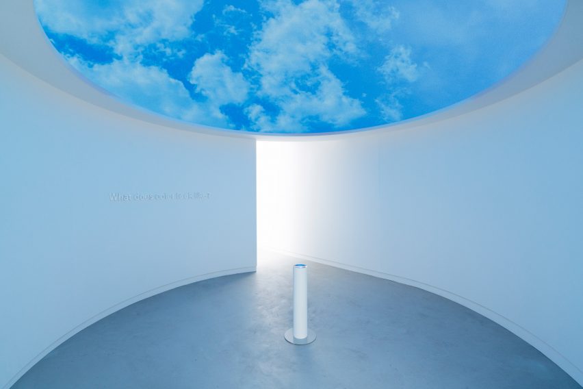
The Making Sense of Color installation was co-created by Google's vice president of hardware design Ivy Ross and culminates in a series of rooms exploring how her design team uses colour to shape users' perceptions and experiences.
"Each color gives off a different vibration and has a biological and psychological effect on people," Ross said.
"We are conscious of always having a range of colours that feel right for the moment in time. For example this year we have a particular tone of blue in our products that is very calming."
Google is a regular figure on the Milan design week circuit, with previous contributions including giant water-covered speakers and a string of interiors designed using the principles of neuroaesthetics.
Making Sense of Color is on display at Garage 21 as part of Milan design week 2024. See our Milan design week 2024 guide on Dezeen Events Guide for information about the many other exhibitions, installations and talks taking place throughout the week.