Gen Z apps inform approachable wayfinding for V&A East Storehouse

On a mission to draw in museum sceptics, Hackney design studio Fieldwork Facility looked to an unexpected source of inspiration when creating the Dezeen Award-shortlisted wayfinding for London’s V&A East Storehouse.
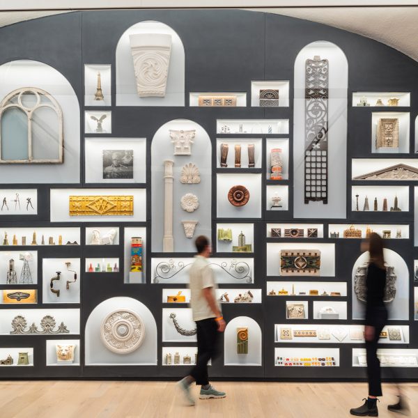
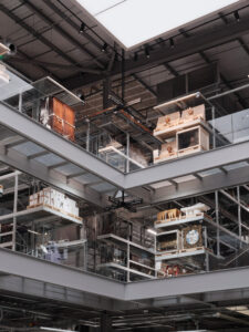
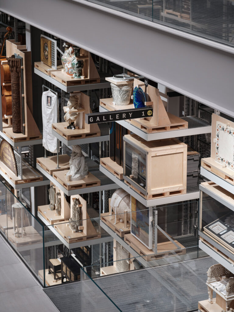
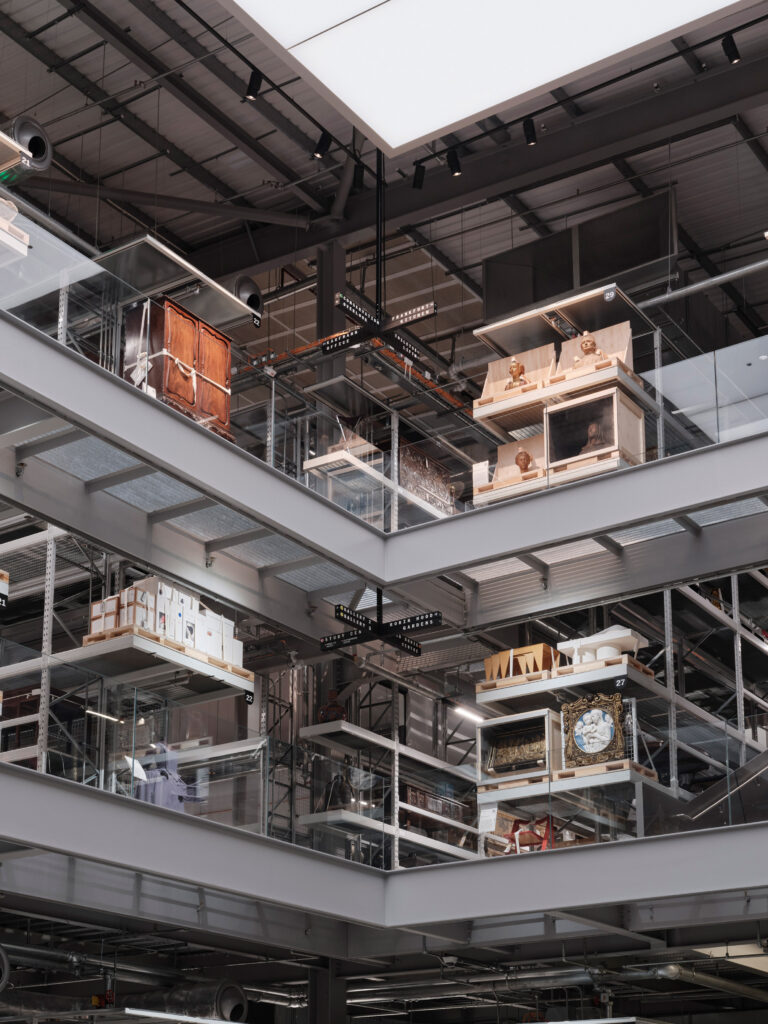
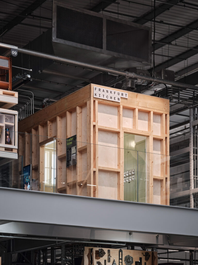
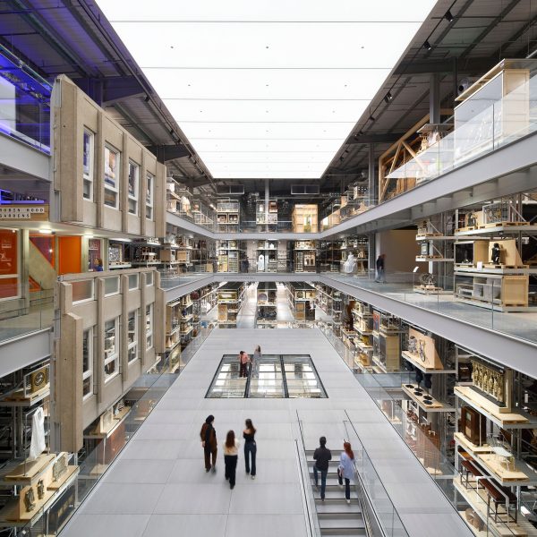
The landmark museum, completed by Diller Scofidio + Renfro last May, has been lauded for opening up the V&A‘s storage vault, including 250,000 historic art, craft and design objects, to the public for the first time.
The challenge for Fieldwork Facility was to help visitors navigate and interpret this trove of artefacts – especially a younger, more diverse crowd who might normally feel excluded from museums.
To speak to this demographic, studio founder Robin Howie decided to borrow a visual language they’re already intimately familiar with.
“We studied popular Gen-Z apps and services to understand how to make Storehouse feel intuitive as soon as you walk through the door,” Howie told Dezeen.
“Cultural institutions can all too often feel like exclusive environments with many barriers to entry. It’s unfortunately far too easy for so many people to walk into a museum, gallery or national organisation and feel a queasy sense of ‘this isn’t really for me’.”
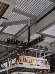
As an antidote, Howie and his team decided to treat the wayfinding design like an operating system in itself, looking to the UX of much-used apps like TikTok to inform signage and interaction points across the museum.
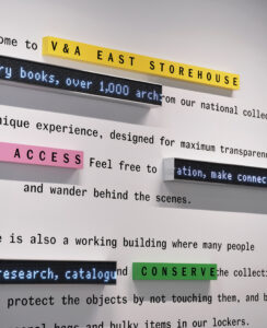
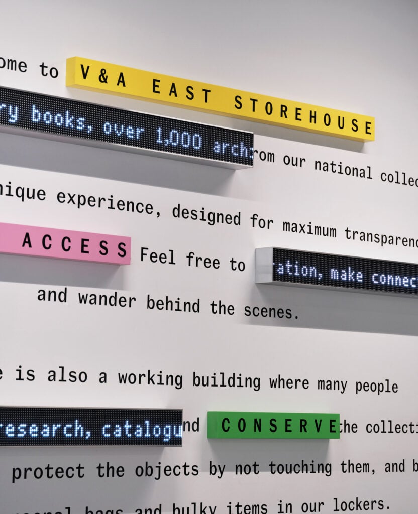
From the get-go, visitors are welcomed with an “onboarding text” that introduces them to the Storehouse and how to navigate it.
“It’s a moment that purposefully feels like opening an app for the first time where you are given a quick orientation of the experience held inside,” said Howie.
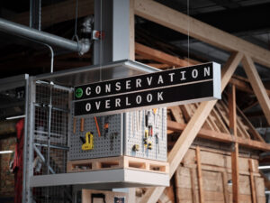
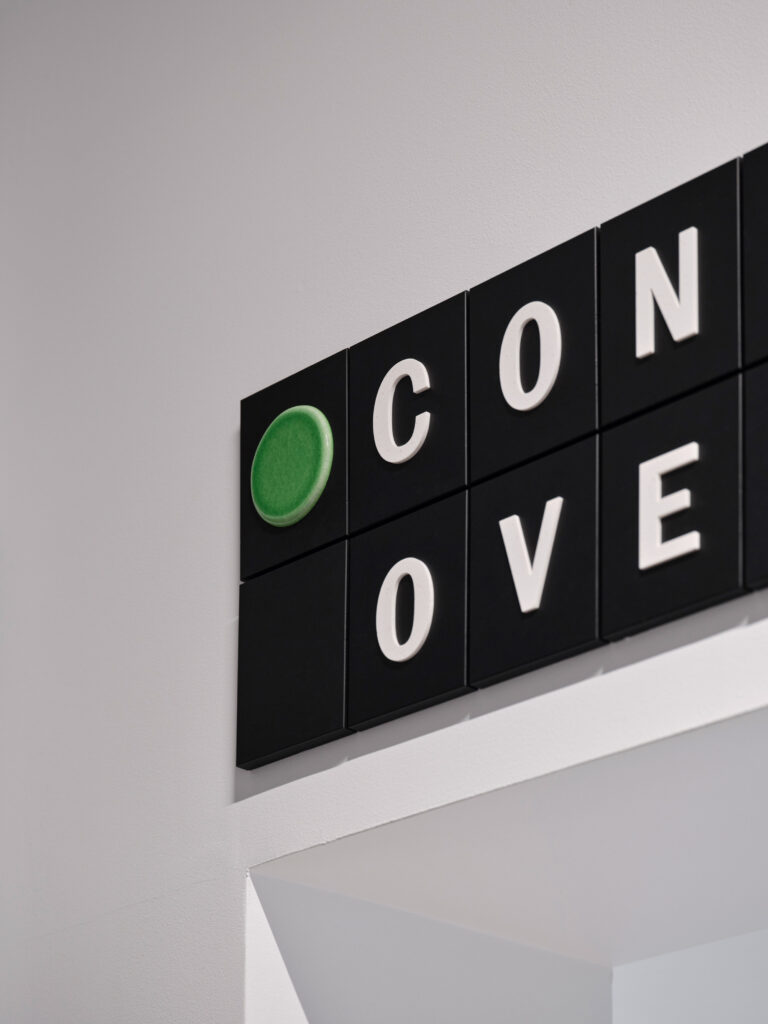
The text combines a range of different media, including printed typography, ticker tape screens and recycled paper tiles.
Topped with recycled plastic letterforms, these tiles provide a first introduction to three key colours used to mark different areas across the building.
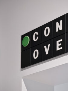
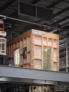
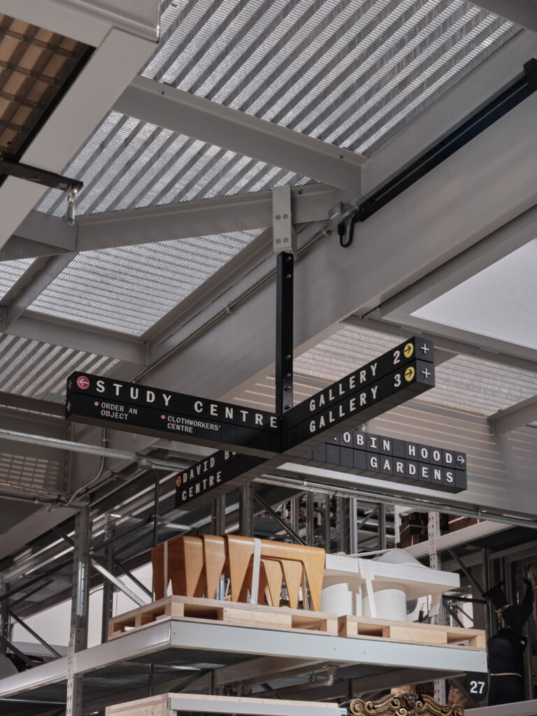
Yellow points out viewing galleries, green is for the museum’s viewable restoration labs and pink for the Study Centre, which gives the public unprecedented access to the collection through the V&A’s Order an Object programme – a service traditionally reserved for researchers and academics.
Set into aluminium cases, these recycled paper tiles were used to form adaptable, modular signage across the building. Much like a Scrabble tile, each is emblazoned with a single letter, allowing museum staff to adapt the wayfinding based on what objects are currently on view.
“Storehouse’s signage system looks and feels programmable in an analogue way,” said Howie.
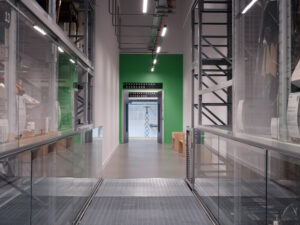
To suit the use across separate tiles, Fieldwork Facility commissioned a bespoke version of the V&A’s brand typeface Spiller that is monospaced.
This technique, normally used for typesetting computer code, involves shaping each letter so it occupies the same amount of horizontal space.
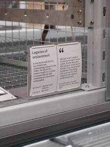
“The resulting Spiller Mono helps give V&A East its own unique language that is atypical for a museum,” Howie said.
“We also love that monospace typefaces were widely used in early computers and are still standard for writing and editing code – great nod to the ‘building as software’ concept.”
On some signs, a colourful, enamelled lava-stone disc provides colour coding, echoing the yellow, green and pink first introduced in the onboarding text.
Several other interventions were also designed to encourage interaction, either from visitors or from staff, who engage with the building both as a museum and an active storehouse.
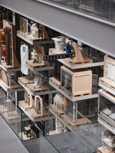
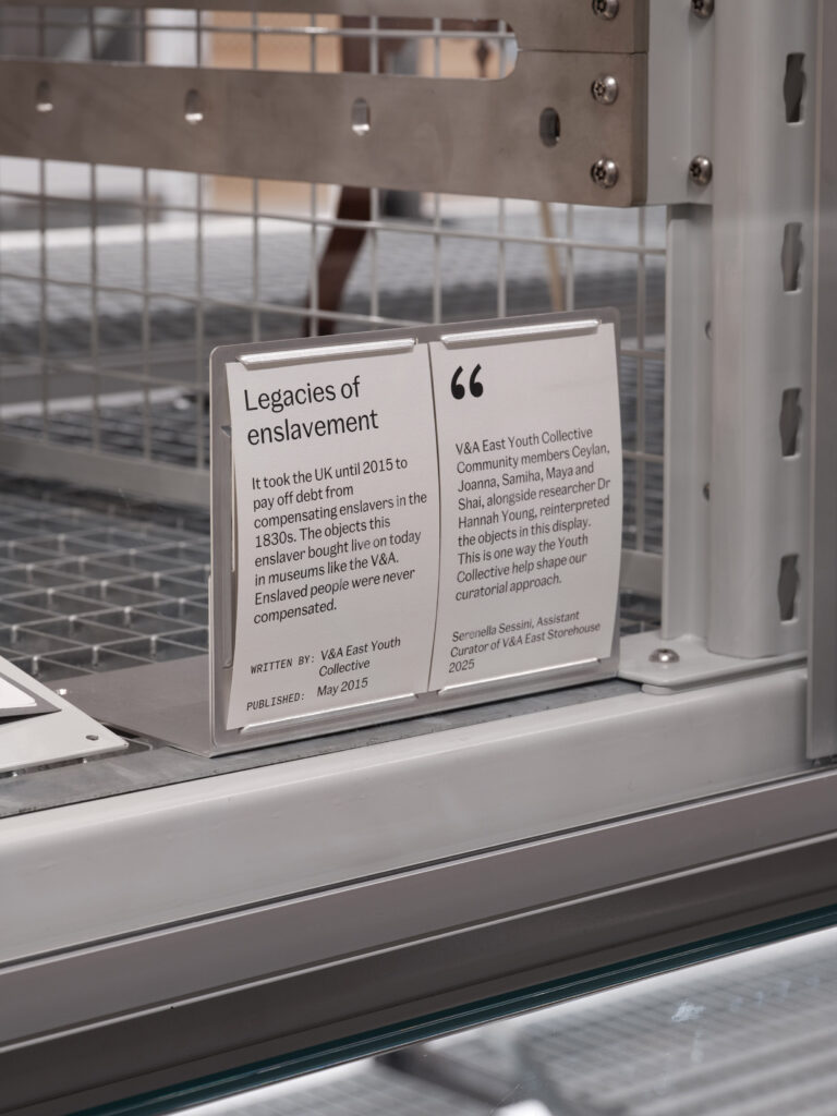
To provide museumgoers with context and explanation about the pieces on show, Fieldwork Facility created interpretation labels that exist as a modular kit of components, allowing them to be fixed to Storehouse’s standardised crates, palettes and forklift-accessible shelving. Digital templates allow staff to amend these labels without relying on the designers.
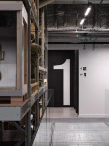
The design studio even introduced dedicated “expression points” where visitors can share their opinion with the V&A staff or take part in public polls using a voting coin system.
“The operating system approach welcomes everyone to explore, define their own experience, make connections and have agency within a national institution,” Howie said.
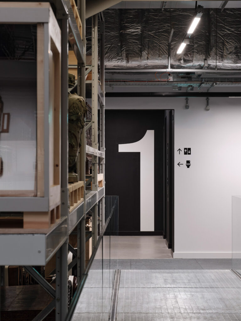
All of the museum’s signage was designed to be adapted and reused to cut out waste, with icons for permanent fixtures – such as toilets, elevators and floor numbers – screen printed or painted directly onto the walls instead of relying on disposable vinyl decals.
Fieldwork Facility’s graphics for V&A Storehouse East have been shortlisted for graphic design of the year at the 2026 Dezeen Awards. It is up against seven other projects, including the visual identity for Dorte Mandrup’s Arctic whale watching facility and ink-free tea packaging for a Song Dynasty-themed restaurant in Guangzhou.
Read more
Recommended stories
V&A East Museum by O’Donnell + Tuomey unveiled in London

This week we looked at how Norman Foster became the most successful architect in history
Snøhetta creates “ephemeral” retail concept lab in New York
This week we published IKEA’s tongue-in-cheek plans for a two-kilometre-long store
BOB Design reveals four projects that show the secrets to successful signage
Young V&A designed as “national resource” for creative learning
Diller Scofidio + Renfro transforms London hangar into V&A East Storehouse