A Rebours by Matali Crasset and Peter Halley
A Rebours is a collaboration between artist Peter Halley and designer Matali Crasset that opened at Ropac Gallery in Paris over the weekend.
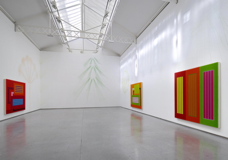
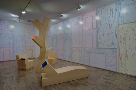
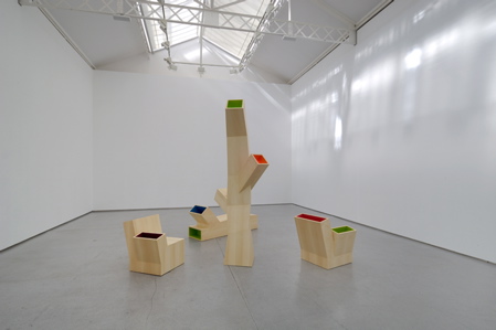
The exhibition consists of paintings by Halley that respond to drawings by Crasset, and a Halley Mural surrounding four new pieces by Crasset.
Photos are by Charles Duprat, Galerie Thaddaeus Ropac.
The exhibition continues until 13 October.
Below is the press release followed by an interview between Crasset and Halley written by Jeff Rian:
--
From the 15th of September to 13th of October, Galerie Thaddaeus Ropac is delighted to present the first exhibition teaming an artist represented by the gallery, Peter Halley, with a designer, Matali Crasset.
The painter and designer have discovered a number of strong affinities, and Galerie Thaddaeus Ropac has taken the initiative of encouraging a collaborative undertaking by the pair and, by the same token, of opening its space to design. The gallery will be producing an exclusive edition of pieces by Matali Crasset designed specially for this project.
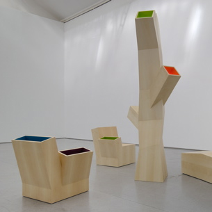
In the main room, Peter Halley will be exhibiting a series of paintings conceived specially to interact with Matali Crasset’s wall drawings. In the project room, Matali plans to install four of her pieces, around which Peter Halley will paint a mural composition.
This is the first in a planned series of collaborative undertakings at the gallery combining art, design and architecture, for each of which Galerie Thaddaeus Ropac will produce an exclusive new series.
--
Cosmic Connections
Interview Matali Crasset / Peter Halley with Jeff Rian
JR How did this show come about?
PH Whatever goes into Matali's work—the underlying things like the proportions, use of materials, humor—is very much the same as art. I got a better overview of her work from the interview we published in index [June–July 2005]. We were all very enthusiastic about her work.
MC I was working at Thomson, and the intention was to return to the essentials: better sound and better control.
JR Is this your first collaboration with a designer, Peter?
PH In 1995, at Jay Gorney Modern Art, I showed my paintings with Ettore Sottsass’s ceramics.
JR How is this show going to happen? Who does what when?
PH The wall drawings will go on first.
MC The idea was to create a connection between our works..Peter thought I should do wall drawings upstairs to be placed with his paintings, while he would do something on the wall downstairs, around a composition of mine.
PH I'd noticed trees in Matali's works. But these are really a latticework of geometric lines and abstracted shapes that will give the walls light and scale.
MC The most important thing for me was to find a way to work together. Peter asked me to do come up with a wall drawing for the paintings, and to do something about nature. What I'm making in the wall drawings is more like the vibrations of trees; the objects downstairs diffuse these vibrations. I'm preparing tests using mason's chalk lines. Peter thinks the background might be better in a pale gray. The chalk lines are pretty stabile and have a nice kind of fuzzy quality.
JR In the index interview, Matali, you said that purpose and context determined her design and materials; the function of an object being integrated into the form. How did they determine the purpose and context of this show?
MC At first, it wasn't clear how or where to do the drawings.. I also wondered about the status of the two works. We know the paintings; what they're basically about. I wanted to work on a more ephemeral system. So my work is for the exhibition, while his are more enduring.
JR In France, the word "status" has grave importance: What's your status as a taxpayer? What's the status of a work of art? What's the status of your look?
MC [Matali laughs.] I want to take away the status of an object in order to propose something else. In Europe, you have to deal with current codes. You enter a room and the sofa gives you all the information about the owner: if it's leather, if there's more than one. All these codes are clear, but they create barriers. I try to get rid of them.
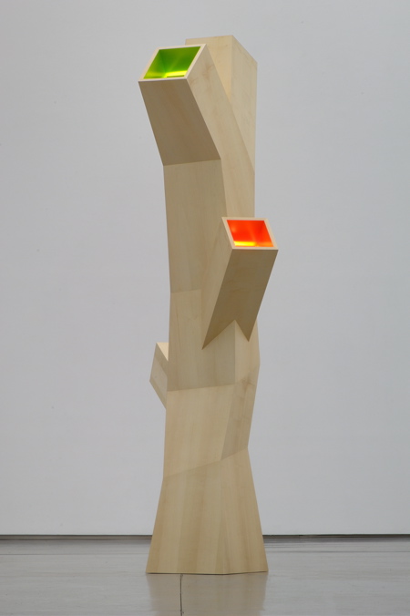
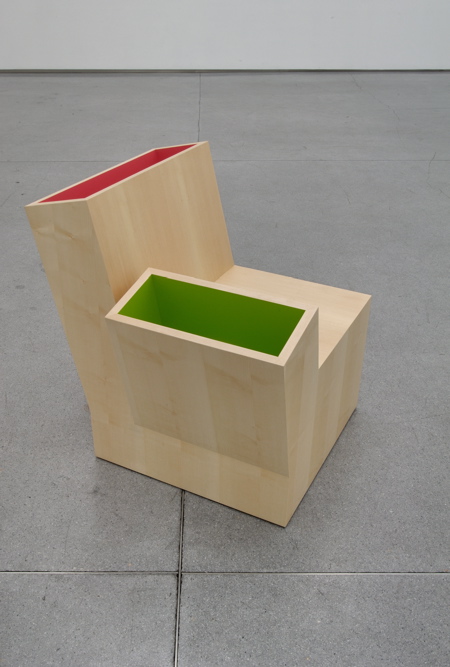
JR What are those objects downstairs. They look like sculptures to me.
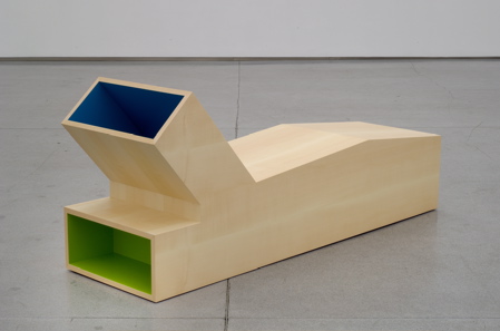
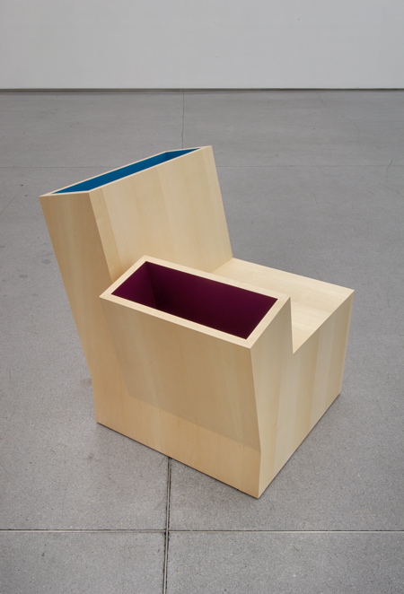
MC They're furniture: armchairs and a tree lamp.
JR Abstract art—paintings, sculpture—is for meditation: devices for contemplating the organization of mental process. Peter's pattern of representation is based on what he refers to as "cells" and "prisons," which are related to the architecture of control. But the colors make them sensual, and more thought provoking. Matali's designs seem to put the mental aspect before their function—you have to look at them and think about them before using them. What's the difference?
MC My work still has a function. Peter's paintings go a step further, more like mental architecture. I want to bring more freedom into objects and spaces, and to create fluidity, because places can change from one minute to the next, whether for working, sleeping, or whatever.
PH Her work also makes me think of sixties avant-garde art. Weren't you making portable, movable, even nomadic objects?
MC I explore for different typologies and different ways to combine them—kind of forms, not the symbolism of form—and ways to make objects, such as a chair, which usually has a prescribed height, etc. My objects are simple shapes, or modules, which I combine to make more flexible and to make you think differently about your daily life. This is similar in a way to the way Peter works: modular possibilities in infinite combinations.
PH Module is the right word.
MC But like I said, Peter's work is more mental, while mine is more functional.
JR Matali, you've called Peter's colors radioactive, as if they were light-emitting objects. Can you describe your colors—where they come from, what they might be about?
PH I'd like to know that too.
MC I think neither of us is afraid of color. For myself, I think of color as a common language. I try to break existing color codes, which can allow people to understand what I'm doing. Color allows me to give a different logic to a space; not just for the eyes, but for the emotions—an emotion generated by the combinations of colors and how they are imprinted on our memory. Some colors seem more spiritual, some more fun.
PH I often hear people say they're afraid of color. Why do you think that is?
MC When you're a kid you like color. Then, little by little professionals start taking over. Color is pre-selected in the different industries, for fabrics, paint, etc. People become afraid of color because they no longer experiment with it. They don't even try, they follow what deco professionals decide for them.
PH Sottsass once said that when he's designing a cabinet or a room he looks at a palate of available colors. He uses found colors like collage. Is that the same for you?
MC Yes. Designers use prefabricated materials whose colors are decided by so-called experts. I have to know all the palates and combine them.
PH Twenty years ago I was interested in relating color to a technological light and not a natural light. I thought Rothko's were nice, but the light was about nature. I was interested in the kind of light at a shopping mall or, as it turned out, in a computer. I used florescent colors. But I also tend to think expressively with color. I guess it's the way I'm wired. But what Matali says about color being a common language is interesting. I've shown in many different countries, and the paintings are read in a similar fashion.
JR Don't Europeans see your paintings as American?
PH I think so. But what Matali said about how people are afraid of color could also be their fear of sensuality—which, in my experience, is especially the case in protestant or puritanical settings. Northerner Europeans always ask me if I make paintings in gray.
JR I get the feeling you and Matali reside in the same aesthetic planet.
PH She emphasizes playfulness, using simple gestalts, like the block shapes and colors.
MC But I would never have done the work I did with Peter in another context.
Interview with Jeff Rian.