Apartment in Bucharest by A.A. Studio
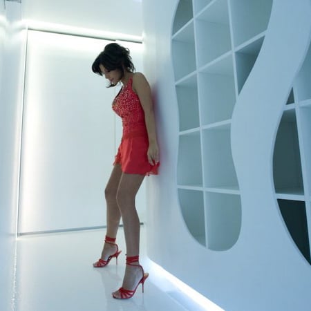
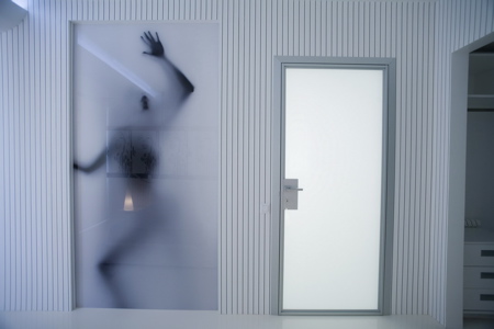
We're just glad she survived her ordeal in the closet... Romanian architects A.A. Studio have sent us a set of pictures of an apartment they have designed in Bucharest, nicknamed The Big White.
The text below comes from A.A. Studio:
--
a.a.studio
40, Mircea Voda Avenue, block M11, 6th floor, ap. 60, Bucharest, Romania
Project: Apartment B.S.
Project Design Manager: Alex ADAM
Project Design Team: Roger Pop, Madalina Florea
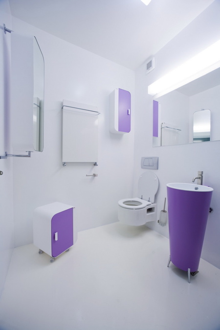
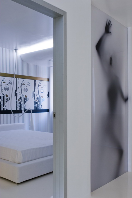
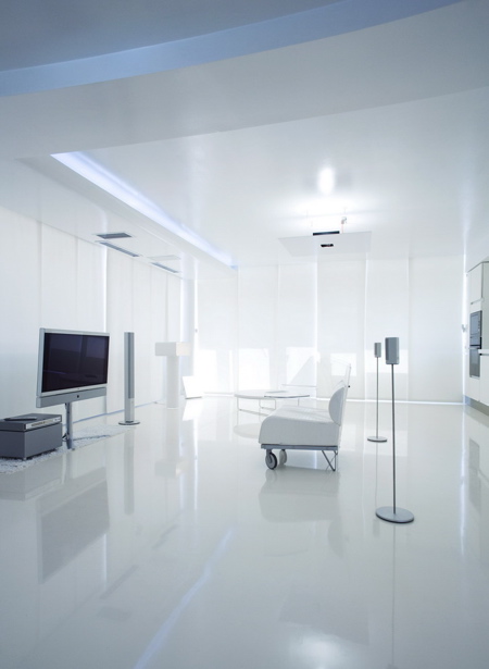
This unconventional interior design of a three rooms apartament combines elements from the pop-art age, from the aesthetics of the years '60-'70 and from the contemporary minimalism, all under the influence of white, used so predominant as a manifest against the impure context where the habitation takes place.

The architecs took this project while the building was still under construction, and the first proposed partition of the apartament wasn't made.
Even so, the architects felt like restrictions some characteristics of the space like the irregular shape of the plan, the dimensions of the columns which was bigger than usual or the small height under the beams.
But above all an incovenince was the surface of the apartament: 110 square meters that include two bedrooms with bathrooms and dressing-rooms, and one living space with dinning room and kitchen.
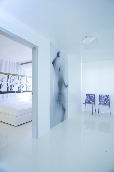
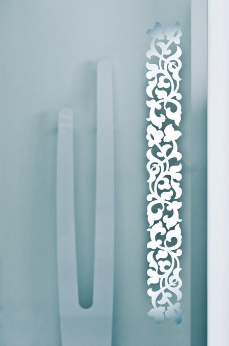
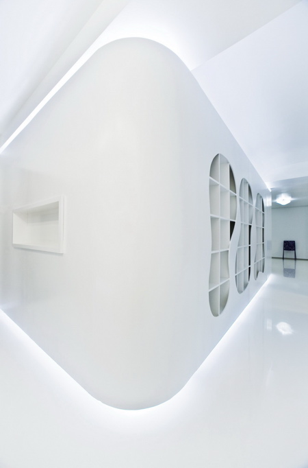
The white, with all its shades,on varied textures and shapes was used to create depth and bigger height and also to give an abstract, luxurious feeling to the place beside his apparent simplicity.
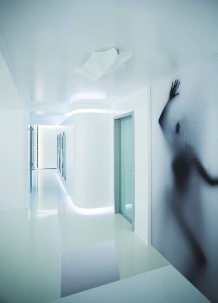
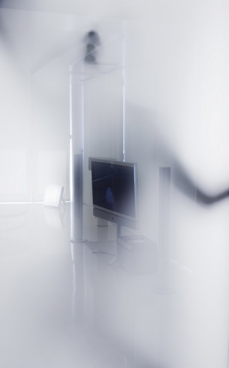
Using the white with no limits, the architects made the space more dinamic,and they played with the light, natural and artificial light. The first step to achieve a unitary style was to build a dialog between all the spaces in the apatament.
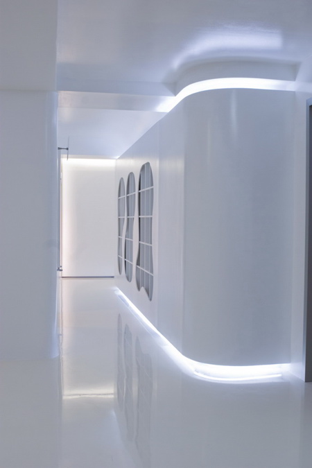
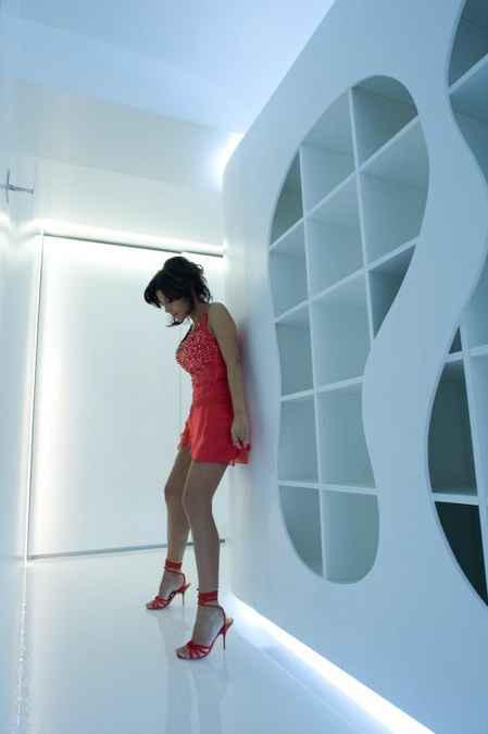
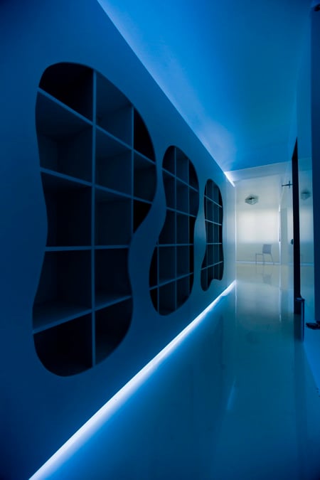
The long hall was designed to be an extention of the living room: on one side of he hall the architects designed a bookcase with a decorative but functional structure. Every piece of furniture was carefuly chosen to unify the concept.