
Parabola House is a new family home in Tokyo designed by Japanese architect Yasuhiro Yamashita of Atelier Tekuto.

Photographs by Makoto Yoshida.

The following information comes from the architects:
–
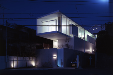
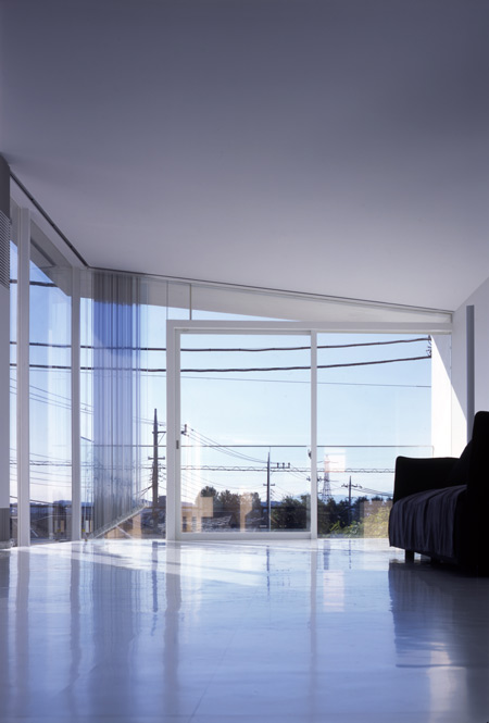
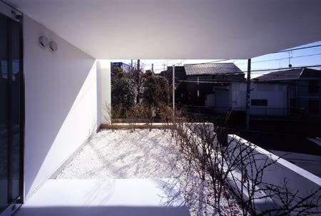
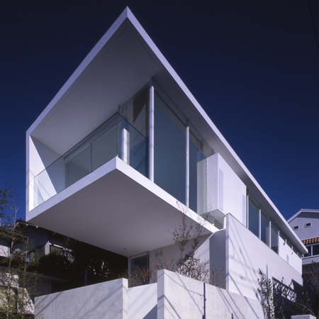
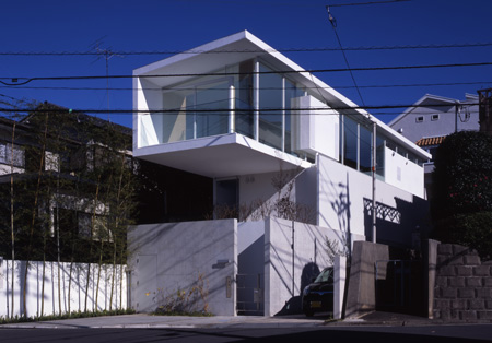
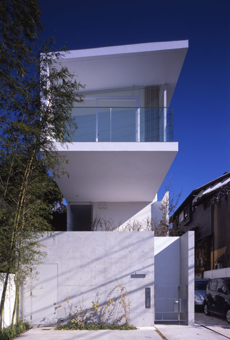
The site is located in a quiet residential area surrounded by nature. 6m in width and 27m in length, it is a long and narrow site, which has been constructed 3m above road-level so that on clear days, it enjoys views of Mount Fuji.

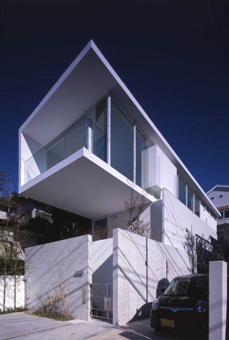
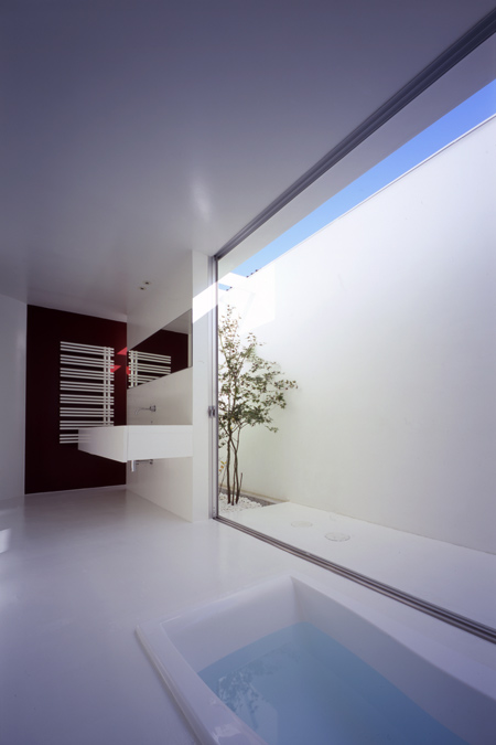
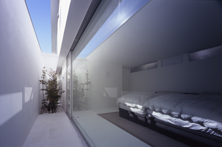
As the client’s family spends the most part of the day in the living room, this room has been situated on the top floor, which benefits from scenic views. In order to fully exploit the length of the site, a cantilever has been constructed on to the front of the building.

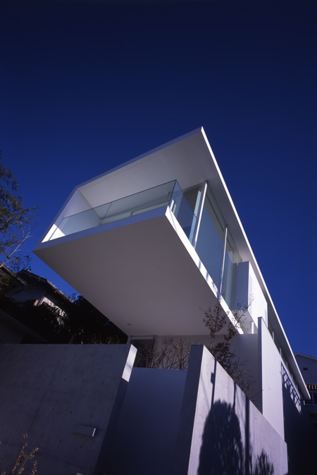
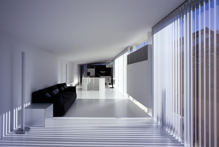
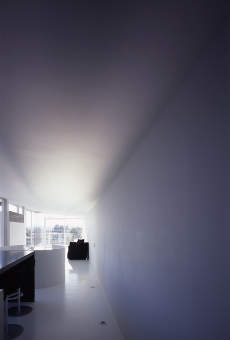
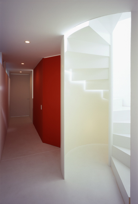
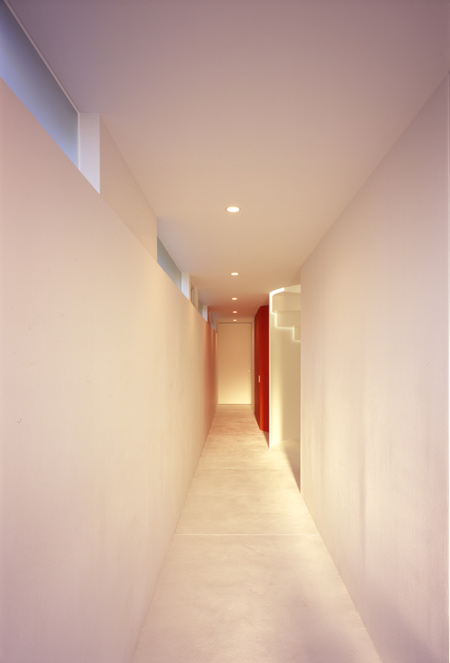
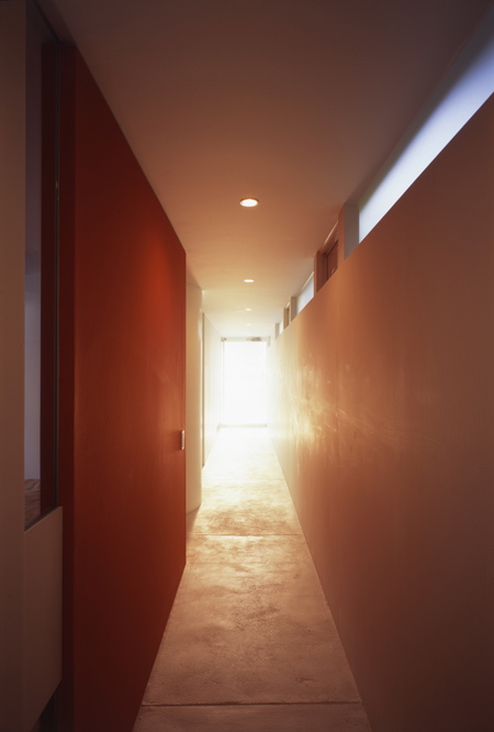
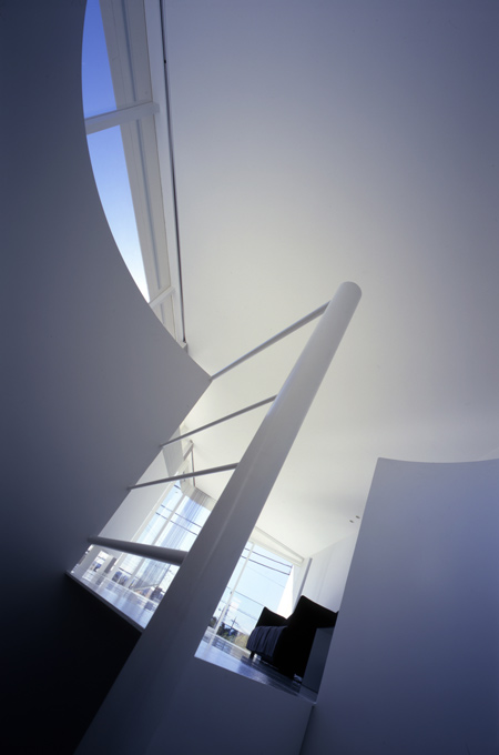
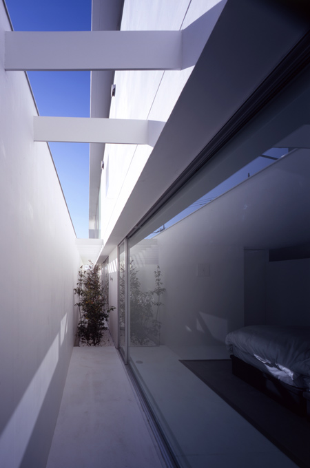
Minimal design and a parabolic ceiling on the top floor are the building’s distinctive features. Splashes of colour provide a contrast to the undulating white surroundings, giving rhythm to the space.

The flowing “three dimensional” ceiling, which dips and rises to varying levels of height, arouses contrasting feelings of “tension” and “release” and gives the room a sense of boundlessness.

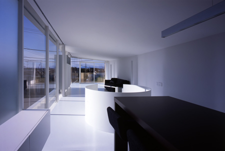
Thus, even when observing the room from a fixed position, the fluctuating density invokes a sense of movement, which unconsciously guides the observer right through and beyond the room’s boundaries, as if following the flow of air, giving the impression of endless space.

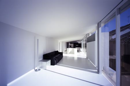
It is normally the floor and the walls that delineate the boundaries of the interior space but in this case, it is the parabolic ceiling that defines its essence.

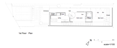
Above: first floor plan

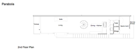
Above: second floor plan


–
Posted by Rose Etherington


The exterior doesn’t reflect the softness and hominess of the interiors. I guess this is the case of “Exterior follows Interioir.” Love that circular stair, it’s so sexy!
February 12th, 2008 at 12:59 amWow, that’s just gorgeous, I love it.
February 12th, 2008 at 1:01 amMuy buena obra. Mis felicitaciones a los arquitectos.
February 12th, 2008 at 1:12 amThis is beautiful!
February 12th, 2008 at 1:19 amlooks slick! well done.
February 12th, 2008 at 4:53 amVisually stunning, and the spare furnishings enhance the structure.
February 12th, 2008 at 6:53 am10/10
amazing how some time small scale projects can be so much invigorating!!!
February 12th, 2008 at 9:09 amLove the workings with the light. great contrasts
February 12th, 2008 at 9:26 amThis is a small wonder of space what they created with the light penetrating the otherwise closed side of the building. It is probably difficult to convince clients to build a full-glas facade facing a wall, but the only possibility to let natural light into the interior.
February 12th, 2008 at 9:37 amA confident, accomplished and imposing use of space and light. Appearing stark in its external facade, it commands attention, offering little insight to its inner space. Its high apical design is somewhat reminiscent of Californian Stilt houses. Given the initial footprint, the perceived and actual increase of space is immense.
February 12th, 2008 at 12:22 pmInspired calculated use of light, furniture placement and shadow create perceived zonal ideals. Reflection plays a critical part of the overall design project, utilising a surface colour other architects/ designer’s usually only use for contrast. Lighting, natural and artificial is strategically directed to emphasis the buildings characteristics of length, lightness and its complex design. Traditional Japanese colours are used modestly to duel effect, breaking and structuring space. Fixtures, sadly as necessities within the building gallery like appearance, are kept minimal.
Personally, I am fast becoming an admirer of Atelier Tekuto, their uses of cubist design styles, concrete, glass and light is first-rate, though I can’t shake the feeling of a stylised art-deco influence.
wow… this house is amazing! Love the Moomin chairs in one of the rooms as well!
February 12th, 2008 at 3:33 pmi love how the bath-tub sits in the floor and having the ability to open the sliding door to the outdoors. where can i find these type of clients….
February 12th, 2008 at 8:38 pmEnjoy the simplicity of the language of the slip that allows for light and outside spaces: one strange aspect is the inauspicious entrance corridor that seems at odds with the otherwise spatial invention happening elsewhere.
February 12th, 2008 at 9:52 pmgreat!!
February 13th, 2008 at 2:07 amits amazing what they (japanese) do with space. Excellent photographs by the way
February 13th, 2008 at 3:04 amPerfect! I wish i lived there!
February 14th, 2008 at 12:57 ami love the bathroom!
February 15th, 2008 at 4:42 amit is like going down.
I’m looking and looking and I still can’t see the parabola in the ceiling. Time to buy a new monitor?
February 18th, 2008 at 10:58 amClean lines,beauty of minimalism,traditionally… one more time we are witnesses that Japanese architecture is One of the best in the World!
February 20th, 2008 at 12:24 pmi love Japanese!
March 11th, 2008 at 6:22 pmBrilliant…..!
A
March 12th, 2008 at 12:06 pmthis is bliss..
March 12th, 2008 at 2:29 pmGod Bless:)
I love the simplicity of the intirior , so smooth , excelant work
March 12th, 2008 at 3:25 pmkeep up the good work
fareed Bahrain
As far as aesthetics are concerned, this is a remarkable specimen.. however, I wonder how a different surrounding environment will affect its interior living conditions an ambiance?
March 29th, 2008 at 7:56 pmQuite gorgeous.. Love the simplicity!
May 1st, 2008 at 10:09 am