
Hogarth Architects have remodelled the interior of a listed apartment on Queen’s Gate Terrace in South Kensington, London.

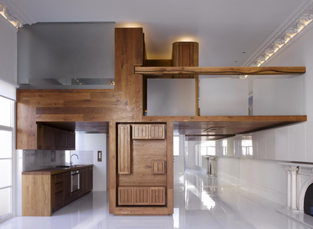
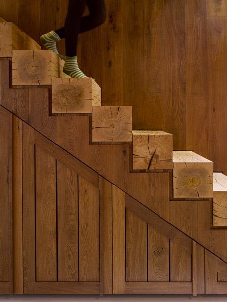
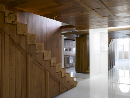
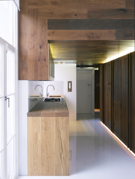
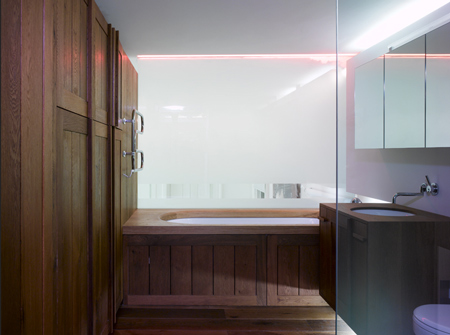
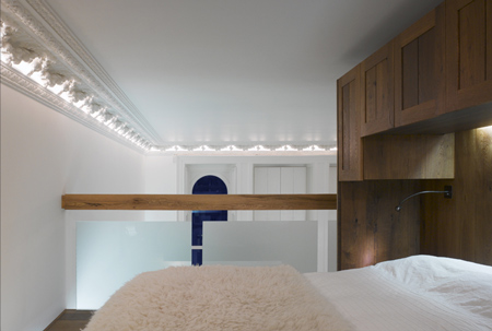
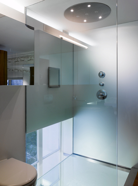
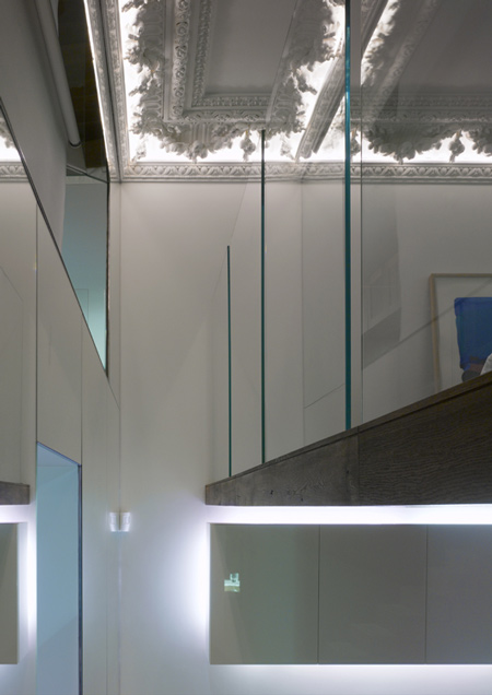
Retaining the historic fire surround and cornice but removing later partitions and a false ceiling, the architects inserted a two-level timber structure containing the kitchen, bathroom, a mezzanine and storage.

“The space is located on the first floor of a listed building,” explains project architect Hamish Herford. “The fire surround and cornice, by law, had to remain.”

Herford adds: “The existing space was divided into three rooms with a false ceiling while the new design aims to restore the space back to its original proportions, which would have been as one room.”

“The new structure was designed as a large piece of furniture to provide all the functions required by a man about town.”

Photographs are by James Brittain.
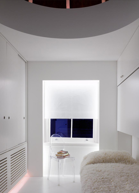


“The picture of the small room [above] with a fold down bed is located on another floor but is part of the same project,” says Herford.
–
Posted by Rose Etherington


Slinky! Is the shower base a glazed panel?!
March 28th, 2008 at 4:00 pmtoo woody
March 28th, 2008 at 4:42 pmbeautiful mix of modern and almost country… I appreciate the combination of the sleek glass with the rustic woodwork
March 28th, 2008 at 5:44 pminterestingly unique, but definetely not my style. buäh!
March 28th, 2008 at 6:12 pmOops…I’ve cum
March 28th, 2008 at 7:33 pmpersonally i would have liked less heavy wood but i still think this is marvellous. however, i wouldn’t like to be standing on a glass floored shower stall 3 metres above the floor below (is that really what it is?) and i pity the person who accidentally looked up while i was in there!
March 28th, 2008 at 7:40 pmbeautiful composition weather wood is your thing or not!
March 28th, 2008 at 8:10 pmit looks like the shower tray is directly abobebthe kitchen sink. Food, sex and architecture. Nice work
March 28th, 2008 at 8:15 pmit is a very interesting project.
the only but in my opinion is that the house is going to be ‘dressed’, and the wood will not favour the interior design. it’s going to be a very challenging project. probably it will be a quite monochromatic style.
but i love the lines. the wood always reminds me round shapes, which in this project are beautifully square.
the materials work very well together. the balance between wood, white walls and glass.
beautiful.
March 29th, 2008 at 7:45 pmelegant on its way.
Feelin’ the wood…
March 30th, 2008 at 5:26 amBeautiful. Sleek. I could even live with the damn cornice on the ceiling. The wood is exquisite. Only the slick looking floor bothers me.
March 31st, 2008 at 5:03 am