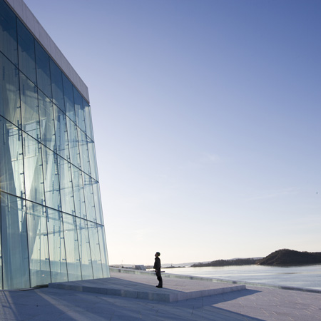
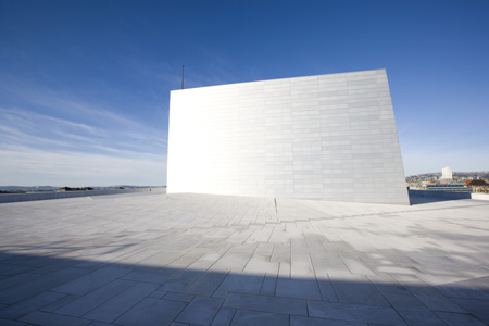
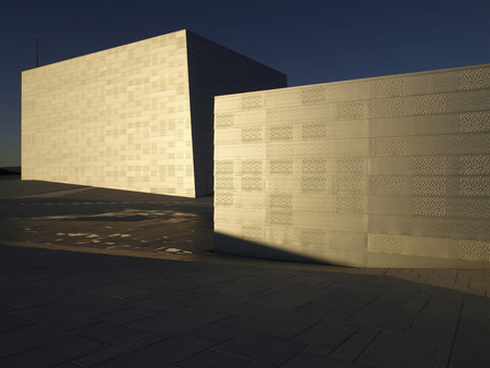
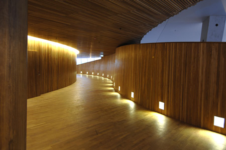
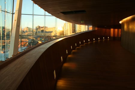
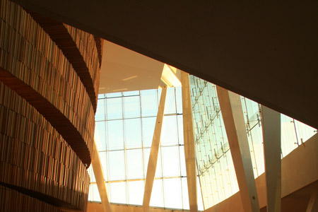
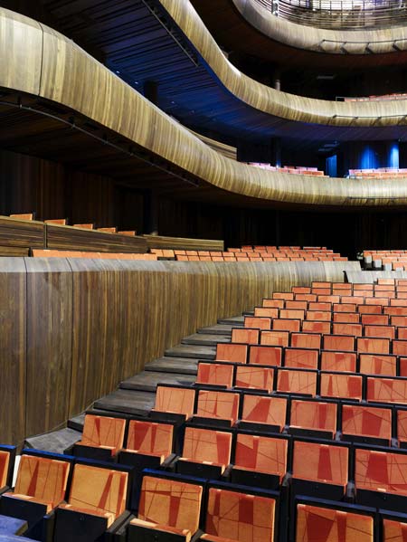
Opera House Oslo by Snøhetta
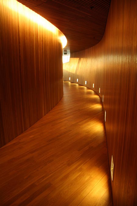
Opera House Oslo, designed by Norwegian architects Snøhetta, opens next week.
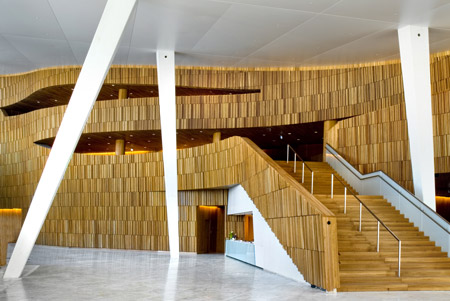
More info, drawings and plans from the architects coming soon; meanwhile here are some preview photos provided by the opera house.


Opera House Oslo, designed by Norwegian architects Snøhetta, opens next week.
More info, drawings and plans from the architects coming soon; meanwhile here are some preview photos provided by the opera house.