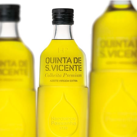
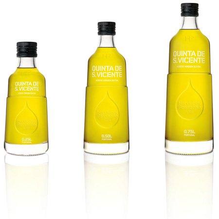
Michael Young for Herdeiros Passanha
Industrial designer Michael Young has designed a new glass bottle for Portuguese olive oil brand Herdeiros Passanha.
The press release isn't ready yet but we have a bit of info from Young's office:
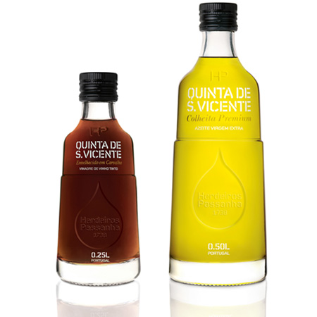
"Michael Young was commissioned by Base Design and Passanha oil to design this new glass bottle. The Passanha brand dates to 1749 and this bottle marks the re-launch of this historical olive oil company."