June 12th, 2008

squpizza-perez_francesco-mo.jpg

Italian architect Francesco Moncada has designed the interior of a pizza restaurant in Syracuse, Italy, using materials normally associated with construction sites.

10pizza-perez_francesco-mon.jpg

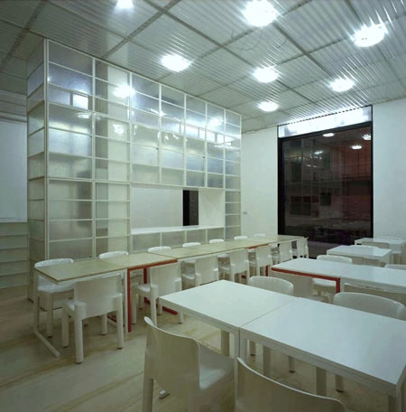
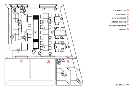
A fibreglass wall divides the restaurant in two, accommodating take-away and eat-in customers.

6pizza-perez_francesco-monc.jpg

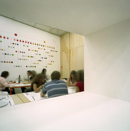
The wall is used to store and display ingredients as well as customer’s coats and bags.

3pizza-perez_francesco-monc.jpg

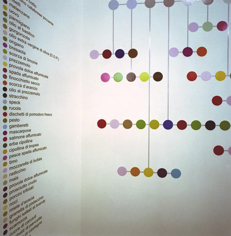
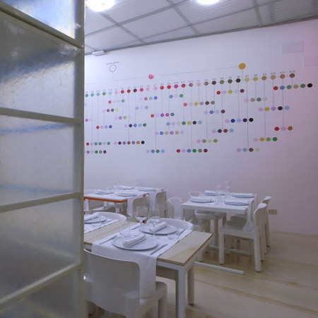
The graphics, by Point Supreme, represent possible combinations of pizza ingredients.

9pizza-perez_francesco-monc.jpg

Photographs by Alberto Moncada.

4pizza-perez_francesco-monc.jpg

Here’s some more information from Moncada:


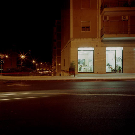
The restaurant is lodged in the ground floor of a 70’s building, in the business district of the city, beside the Archimedes’ tomb in Syracuse (Italy).

8pizza-perez_francesco-monc.jpg

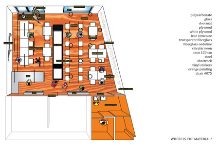
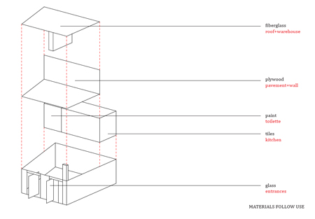
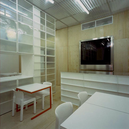
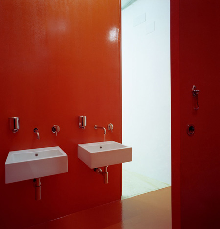
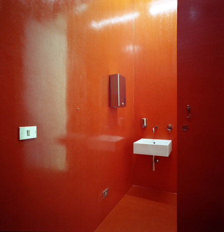
The budget was really low so the client accepted to use very cheap materials, normally used in construction sites, and cover the surfaces of the bathroom with waterproof painting. Ceiling and warehouse-wall are covered by fiberglass, usually used in garage’s canopy, and bar is made just assembling metal painted boxes, that allow to hold the steel shelf. The pavement and kitchen-wall were covered by plywood, used in shipyards, and supported by a metal structure.

5pizza-perez_francesco-monc.jpg

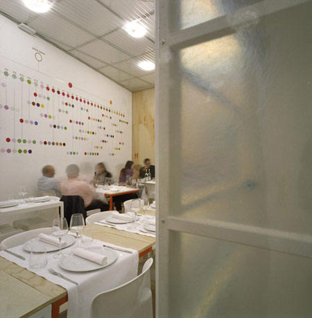
The space is divided in half by a fiberglass wall. On one side is the fast-food area, where people can drink a beer while waiting for take-away orders to eat at home. On the other side is the slow-food area where you can sit to take your time eating pizzas and drinking wine.

2pizza-perez_francesco-monc.jpg

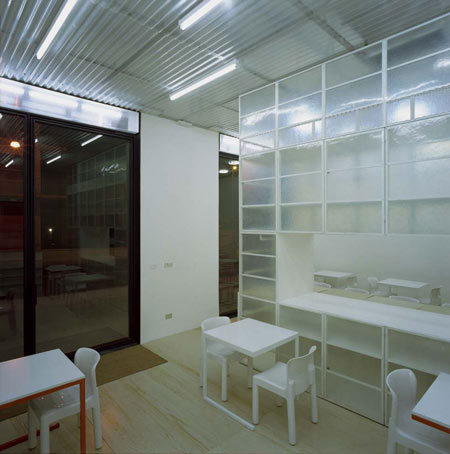
The fiberglass wall, totally opened from any side and transparent, is used as an informal display for wine, ingredients and tools used by the restaurant, and as a wardrobe for the client’s coats and bags. In the upside the grid-band hide the speakers for the music and the air conditioning.

perez_022.jpg

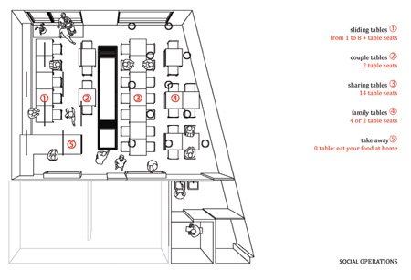
The design emphasizes the social aspects of meeting for dining. Usually tables and chairs allow customers to sit in closed groups, while interaction between groups is not facilitated. So we decided to minimize the volume occupied by 1 single module/table (a cube 70×70x70 cm) and the distance between modules, so people have to share the same table.

perez_023.jpg

The main room is illuminated by circular and linear standard neon used in garages. The main windows are totally opened, allowing customers to use the terrace as an extension of the restaurantin the summer.

7pizza-perez_francesco-monc.jpg

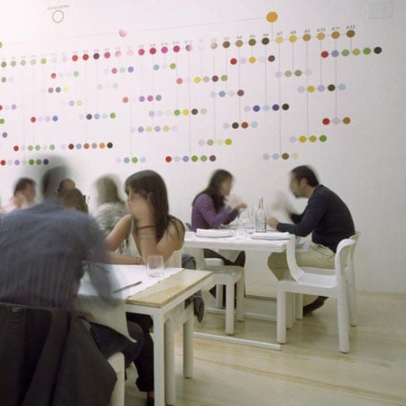
The graphics (by Point Supreme, Athens ) complement the simplicity of the space; they express and celebrate the variety and richness of taste in the food served. All the ingredients used are mapped and symbolized by colors and codes. Their combinations result in the different pizzas. A very precise and scientific looking matrix, with these ingredients, covers the wall in the seating area. The pizzas are exhibited and arranged according to the season of the year. It offers an abstract overview of all the possibilities of choice.

organisation-pizze-perez.jpg

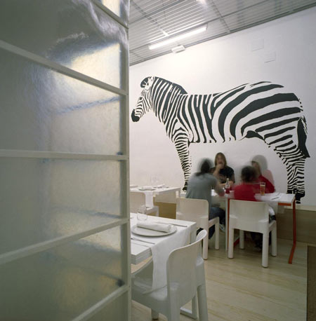
On the wall next to the entrance appears a real size zebra. The zebra is simply the other side of the scientific information; It is colorless, simple in its appearance and it refuses to suggest an explanation. It is simply standing there beautiful, mysterious, surreal and inspiring thoughts and discussions between the customers waiting for a table or some take-away food.

social-operations-pizza-pir.jpg

Architect: Francesco Moncada
Collaborators: Marco Pizzo, Carmelo Zappulla
Graphics: Point Supreme , Konstantinos Pantazis and Marianna Rentzou
Photos: Alberto Moncada
Area: 90 m2
Budget: 90.000 euros
Date: March 2008
Client: Vincenzo Perez
Location: Syracuse, Italy

materials-pizza-pirez.jpg

materials-2-pizza-pirez.jpg


Posted by Rose Etherington

Subscribe to our Newsletter: Dezeen Mail

23 Responses to “Pizza Perez by Francesco Moncada”

  1. edward Says:

    Really nice work. I love to see ordinary materials used in such a clever way,
    imparting a casual atmosphere but a strong design sense as well.

  2. James Says:

    the ingredient map looks like a lot of fun! (especially for diners short of a conversation hehe)

  3. Jo Yana | Blog Déco-Design Says:

    So beautiful !!!

  4. headplow Says:

    Some of the smallest budgets lead to the most creative solutions. The space appears to be working but how’s the pizza?

  5. jay Says:

    ..with a low bdget as well..nice work

  6. zuy Says:

    great graphic work i thought before reding it was….

  7. Murhaf Says:

    the colors r harmonious , the black and white concept,and the materials r wonderful

  8. unpopular Says:

    apart from the design merits that others have mentioned before, there are some quite glaring failures. in general the atmosphere seems quite insipid and i assume this is due to the ill considered lighting. the use of fluorescent lighting seems to fit the concept of using ordinary technology well, but in my opinion it doesn’t create a good environment to eat in. feels more like a 7/11 and i’m sure the food will look like the 2 day old pies and beef jerky they have there in those glass cabinets…
    the loo actually seems to have a more pleasant eating environment than the restaurant itself.

  9. aldo Says:

    dalle foto sembra un po freddino, soprattutto i toni dell’illuminazione.
    Non cerchi l’intimità nella relazione con la strada, mettere la gente in vetrina non mi sembra il top.

    Per il resto, materiali e tutto va benissimo!

    besos

  10. jet Says:

    restaurants should never be of a white concept

  11. Tracy Says:

    no comment! overall just a normal restaurant design in a very clean & careful way.

  12. popular Says:

    Great work! Very beautiful and fun!
    Different from the dark, small, old, pink, yellow, red and “you don’t know what happens in the kitchen” places in the city.
    The pizza is fantastic and also the finger food that they serve at lunch (no beef is served!)!
    An unique place and a reference in the city where young people go but I must say that I also saw some business lunches!! Is really an elegant place where the big windows, the clean and peaceful environment allows you to breathe (not an usual thing in sicily!).
    Must return! Congratulations!

  13. sterella Says:

    GREAT resoult! spetially for the service wall! I doubt about the lightening, maybe it’s too.. laboratory like, but it has its interest also.
    About the authors, it’s a shame some names are lacking.
    Anyhow, like the resoult very much! Congratulations!

  14. zuy Says:

    why not white concept?

  15. Doctor Subtilis Says:

    As far as (some) formal features are concerned, the general conception is fine, part of the furniture is ok (if one doesn’t mind the colours, especially the Shining-red lavatory), tools and crockery showcased ok… generally speaking, it smells a sort of minimalist and constructivist…. except I’ve been told the (general) project has been PLAGIARIZED and, ultimately, STOLEN! ahaha!

    Hail to the (architectural) thieves!

  16. Doctor Invincibilis Says:

    Awful! Uncomfortable, gloomy, bleak atmosphere, which could only make me feel melancholy and uneased. Definitely, not a place where you could ever possibly enjoy a pizza.

  17. chiara Says:

    I’ve been there and “definetely” eaten pizza, too. Nice night and friendly atmosphere, because some friends were there. (People first, architecture follows.) Pleased to find some others here in the forum guessing about things (including pizza’s taste) known only by photos. How smart you are! And congratulations for your English skills surprisingly improving though living in Spain.
    Ciao Carmelo and best regards to all your ‘nothing personal’ remarking team.
    See you soon for a pizza!

  18. edward Says:

    Don’t sweat the trolls chiara, they come with the territory.

  19. luca Says:

    Bel progetto! Bravo francesco, belin!

  20. renderman Says:

    it’s a smart project cause it relates with an italian atmosphere to eat a pizza in a “real” and honest place (have you been in napoli? than you know what i mean) and also try to merge all this with the actual sleek bi-dimensional world of architecture. context is something to understand sometimes..

  21. lucy g. Says:

    Friedrich Nietzsche said, “I never attack persons, but only ideas, and only after they have become successful.”
    In this way Lebbeus Wood starts his post about CRITICIMS in his own blog.
    The LW post is very interesting for all those architects who don’t understand that to criticize our colleagues is important and really useful when it shows how to go ahead in a better or a different way.

    For those who won’t read the LW post I’d like to report his conclusion:

    ‘’There are ways of criticizing that are harsh, brutal, and destructive. These are, needless to say, counterproductive. But also there are ways to criticize that are honest and direct, but emphasize what is valuable in a given work, leaving what is not to simply fall away. Einstein’s critique of the “aether’ concept in his first Relativity theory was in simply not mentioning it at all. Thereafter, no one else did either. Generally, criticism should show the way forward’’.

    Long life to critics! (Only the clever ones…)

  22. oujaz Says:

    beautiful design but the lights gives it a cold atmosphere . its too bright you have the impression that you are being watched .

  23. french dave Says:

    bloody hell, who wants to go and eat there?

Leave a Reply