
Here’s a second new project by Dutch architets UNStudio: these images show a proposed flagship store for fashion house Louis Vuitton in Japan.

The location and construction schedule of the ten-storey building are secret for now.

See also our earlier story on UNStudio’s Post Rotterdam project.

The following information is from UNStudio:
–
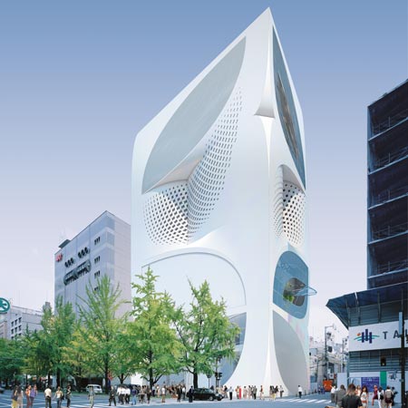
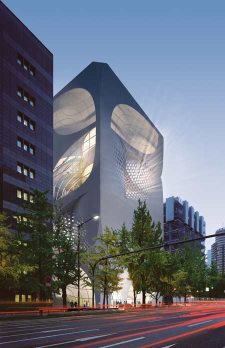
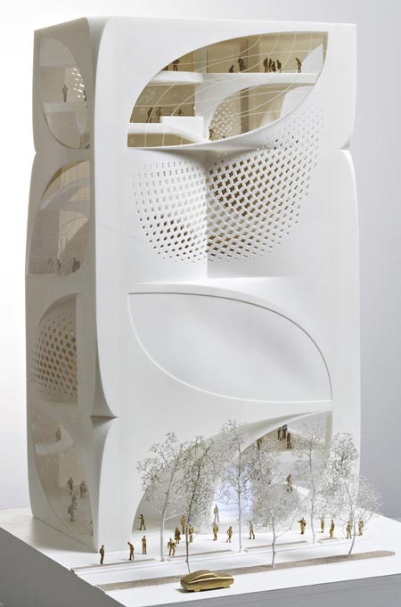
Flagstore Louis Vuitton, Japan
The design for the 10 storey (54 meter tall) flagship Louis Vuitton store in Japan aims to establish an architectural equivalent of the identity of Louis Vuitton in which classical and modern qualities are blended, reinforcing each other. The design inspires the visitor with a feeling of being in the House of Louis Vuitton by celebrating the qualities that make up the essence of the company, its products, its history and its future.

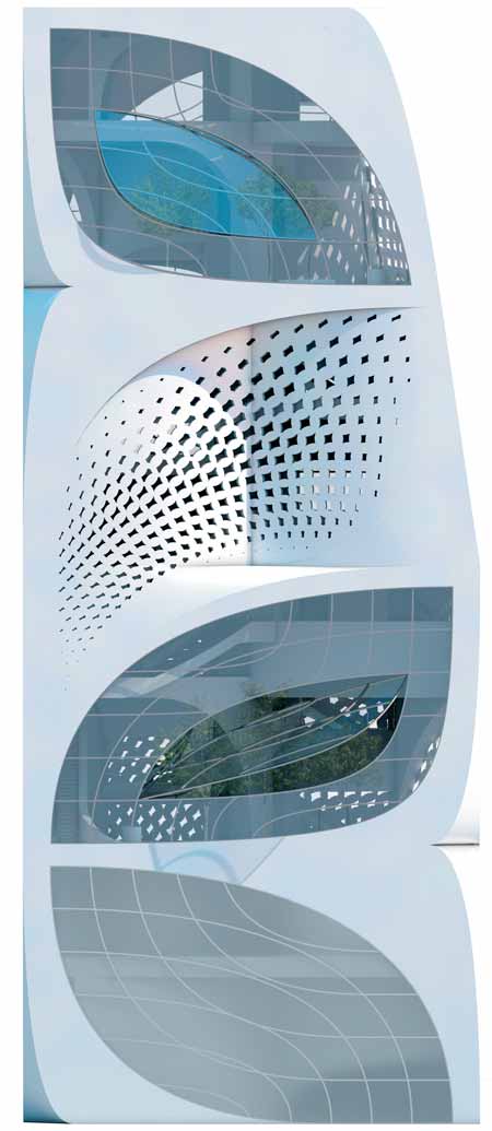
The elements that represent the classical values connected to the Louis Vuitton brand are implicitly present throughout the design. These elements are to a large extent identical to the modernity also implicit in the name Louis Vuitton, along with the value of inventiveness. The element that moves through all the scale levels of the design is the leaf shape. The leaf is found in the floor plan, in the section and in the elevation. It has been applied to the construction also, responding to location-specific constructional demands. Leaf-shaped openings in the façade give the building a strong identity with landmark potential, while complying with the necessity for discreetness with respect to visibility from the outside. The leaf shape can be seen as bearing a connection to the famous Louis Vuitton monogram.

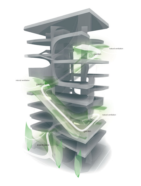
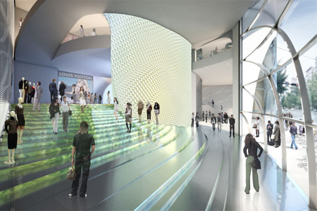
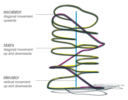
The building follows the structure of a (grand) house: with three levels, each spanning a varying number of split-level floors and each with its own atmosphere and purpose. Each floor is in principle divided into four leaves, which are set in a spiral pattern with a height difference between each leaf of 2.70 meters. Terrace zones, which offer a mix of functions in a garden setting, mark the different vertical sections of the house, with the sense of intimacy growing towards the top of the building.

Client: Louis Vuitton Malletier
Program: Flagship store / Landmark building. Retail, café, spa, bookstore, event and exhibition space.
Building surface: ca. 6.000 m2
Building volume: ca. 40.000 m2
Building site: 746 m2
Competition dates: Nov 2006 – Feb 2007
Credits
UNStudio: Ben van Berkel, Caroline Bos, Astrid Piber with Mirko Bergmann and Sebastian Schott, Ger Gijzen, Cristina Bolis, Juliane Maier, Albert Gnodde, Andreas Brink, Michael Knauss, Morten Krog, Silvan Oesterle, Machteld Kors.
Advisors:
Structure, SMEP: Arup, Amsterdam
Lighting design: Arup Lighting, Amsterdam
Façade Engineering: Arup GmbH, Berlin
–
Posted by Rose Etherington


July 31st, 2008 at 1:19 am
bizarre. I guess I like the whole concept with the different ways of circulating vertically but visually, it is just bizarre.
July 31st, 2008 at 1:25 am
as a pure reaction to the text as clearly the building speaks for itself (dear god!).
“classical and modern qualities are blended, reinforcing each other”
-nothing is reinforcing anything other than the most geometrical cliches of the past decade.
“Leaf-shaped openings in the façade give the building a strong identity with landmark potential”
- wow, this project really puts the B in suBtle. When will this trend get over itself….
July 31st, 2008 at 3:21 am
It is too elementary to conceptualize from a fixed object that is related to the client or to a product. You are enclosing your design ideas in a box.
July 31st, 2008 at 3:58 am
1. Louis Vuitton already has a Japanese flagship, one of several stores for the franchise designed by Jun Aoki: a very fine building on Tokyo’s Omotesando. How many flagships could they possibly need?
2. This leaf-embossed proposal by UN looks incoherent and a long way off their best work. Van Berkel probably knocked out the concept on a busy lunch break. Or maybe he was smoking some leaf at the time…
3. I’ll take Aoki’s store over this one any day.
July 31st, 2008 at 4:12 am
amazing design, nice mixture of shapes and forms, beautiful use of the space, beautiful enviroment inside the building. AMAZING!
July 31st, 2008 at 6:58 am
cool!! I love the incorporation of garden into building these days!!
July 31st, 2008 at 7:53 am
so not Vuitton - its a bit gimmick - its more H&M than Vuitton
July 31st, 2008 at 7:58 am
amazing
July 31st, 2008 at 9:42 am
Out of the latest three dematerialized white rendered buildings on dezeen (this one, MAD’s towers, and the other UN Studio project) this one intrigues me the most… it is quirky enough in composition to be interesting and the building is doing some nice things with inside-outside relationships. The narrative of the leaf shapes having a symbolic relation to the Louis Vuitton monogram is definitely contrived. However, the truth is that a lot of clients get enthusiastic about these kinds of one-liner concept statements… even if the design really didn’t necessarily come out of that line of thinking.
July 31st, 2008 at 10:09 am
Making something out of nothing. That whole circulation diagram is such of waste of that persons effort!!
Nothing like the more meaningful collaboration between H&dM and Prada.
I am looking forward to what they are coming out with Rei now!
July 31st, 2008 at 10:31 am
The shape of the trees, the medium strip in the model, and the surrounding buildings mean this project is located in Osaka.
July 31st, 2008 at 10:31 am
I think the design is quite simple as branded,
really this is the way architecture goes?
with a building designed like in the 60’s, but in white colour
and patens as the latest trend says! That is beauty or market capitalism???
Where is the thought or answer towards an experimental architectural design who made famous UN studio?
Sad that architecture is marketed!
July 31st, 2008 at 11:01 am
Urgy…. this building does not make much sense in any way I can see…
Should this building represet Luis Vuiton? If so in which way, beyond the talks made by the designers… it looks like a huge form hike to me…
Can architect expects the clients of Luis Vuitton to like this building? If so how… It looks like a another version of UN’s Mercedes benz building which I can hardly imagine affinity to the Luis Vuitton clients, perhaps merly a matter of SURPRISE…
IS this building far from architecture such as Shin Takamats…
July 31st, 2008 at 11:13 am
unbeautiful
July 31st, 2008 at 12:19 pm
The lack of human scale elements (windows, floors) give the structure a kind of gigantism that would take some getting use too. The complex interior circulation may, or may not work, but then the program seem varied and recreation oriented, so inefficiency could be tolerated, even be adventagious. I’d like to see it when complete.
July 31st, 2008 at 1:14 pm
the first render looks like a pair of thighs wearing fishnets don’t you think?
July 31st, 2008 at 2:04 pm
fresh & poetic design.
July 31st, 2008 at 2:20 pm
a leaf as the design concept??!…..god, i thot we left such things behind in the 1st yr design studios; apparently not!!
…..Its bizarre, and seems to have been conceptualized purely for a “hit you between the eyes” value!!…..
….and I totally agree wid sa(critic) abt the concept text……is that wat the clients fell for???!
July 31st, 2008 at 2:28 pm
what’s happening to architecture???!!!
July 31st, 2008 at 2:29 pm
Ca claque!
July 31st, 2008 at 4:23 pm
no one has noted that the form is directly relatable to LV’s lable. in that sense, i kind of like that the form is related to its inhabitants.
July 31st, 2008 at 5:37 pm
a sculptural architecture , with complex spatial interior, not facade only.
without emotion , exciting is not architecture.
this is a exciting project, i think there is not problem if architects are artist also, they remember we: aesthetical is for the soul , function is for the rational mind and the human body, and soul is the most important part of human life
July 31st, 2008 at 6:04 pm
this is a very appropriate design considering the connection between high end branding and architecture that has been at the forefront over the past decade. i think UNStudio has done an excellent job in representing the identity of Louis Vuitton and still keeping it aesthetically apparent as a UNStudio design. Japan might begin to be oversaturated with these sculptural/iconic flagship buildings but atleast the association of architecture to the scale of high-end shopping is successful.
July 31st, 2008 at 6:31 pm
Lots to like about this project, just a shame the exterior isn’t one of them. It looks like a cheap, tacky desktop p.c. speaker from the 90’s!
x
July 31st, 2008 at 10:53 pm
I like the circulation concept… but this is so not Louis Vuitton! This form does not combine with the brand “LV”. It’s a shame because I really like UN Studio.
August 1st, 2008 at 12:14 am
DO THE ‘LEAVES’ FALL OFF IN AUTUMN? WHAT HAPPENS TO THE ‘CONCEPT’ THEN?
TRITE.
August 1st, 2008 at 3:38 am
I think the term “flagship” should be changed to “flogship” in the case of Japan. They already have 3 “flagship” stores in Tokyo already, how many can they possibly support? This is an interesting concept for a building, but it could be anyone’s building. There’s no visual association with anything LV stands for.
August 1st, 2008 at 10:51 am
trash
August 1st, 2008 at 5:48 pm
Fascinating way to incorporate the fleur motifs into everything in the exterior. Flogship is witty. It would be suited to that title in Europe or the states, but in the context of Japan, seems normal for the amount of business LV does there including how normalized the LV brand simply is, both in the consumer and larger cultural landscape. Lastly, it’s charming to read the righteous indignation of the purists, i.e: ‘Is UN Studio jumping the shark’? Seems a dated charge.
August 1st, 2008 at 8:53 pm
Man, you guys are long winded. It looks like my coffee maker.
August 2nd, 2008 at 1:10 pm
場所は御堂筋のようです。
http://maps.google.co.jp/maps?q=%E5%BE%A1%E5%A0%82%E7%AD%8B&lr=lang_ja&ie=UTF8&oe=utf-8&client=firefox-a&t=k&ll=34.671335,135.500634&spn=0.001401,0.003465&z=19
August 3rd, 2008 at 1:13 am
WOW! an extruded LV symbol… can you be more symbolic ?
this was surely designed to please the client, how can this structure get away from the sin ” branding ” ?
oh man, id rather be a boring yet truthful architect than a foolish folly
August 3rd, 2008 at 7:30 pm
Its…. interesting - but I have to agree that the form doesn’t fit in with the Louis Vuitton brand @ all.
The design would be more fitting to a sports store frankly. Oh dear.
Perhaps however, the brand is trying to modernize their image with this new flagship?
August 4th, 2008 at 1:39 pm
This one is for Osaka,…. I see as it needs to rise the attention for all metropolitan citizens, as Osaka v.s. Tokyo is like Paris v.s. London…. As the inter-city competition should finally rise the popularity of the brand…
August 6th, 2008 at 10:50 pm
Friend of mine’s comment: looks like a 15 story ipod dock/speaker thing.
August 10th, 2008 at 2:07 pm
If this was done by a first year student at university, he would fail with negative grade.
How this kind of amateur work gets to the spotlight, is beyond me, but its anything but to do with the architectural quality which is close to none. Im sure they have some social skills and connections in that studio, because for the rest…
August 12th, 2008 at 4:44 am
It’s more suitable for adidas!
September 5th, 2008 at 4:03 am
Wo~ so cool~like a magic box~
September 12th, 2008 at 6:49 pm
Hey you…
1. I have actually been talking to THE building, and it thinks YOU are quite bizarre and elementary too/ you look like a 15 story ipod dock/speaker thing… hmm…
2. To all you positive people… no YOU are amazing!!!
Ilike