
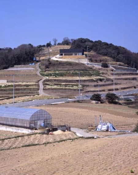
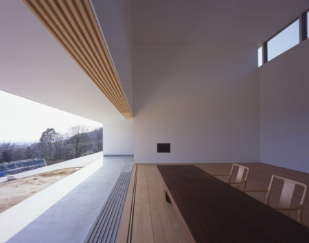
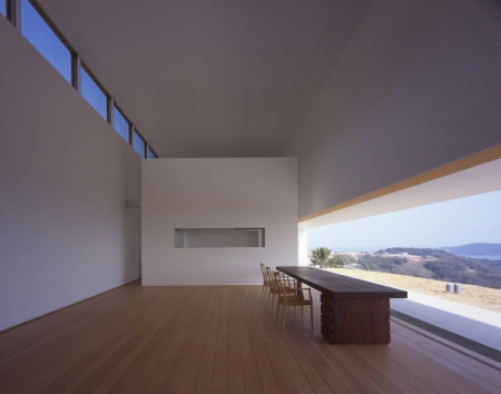
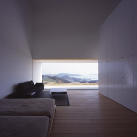
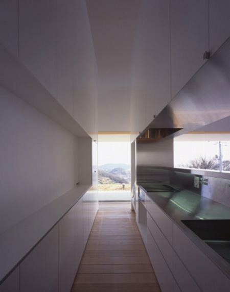
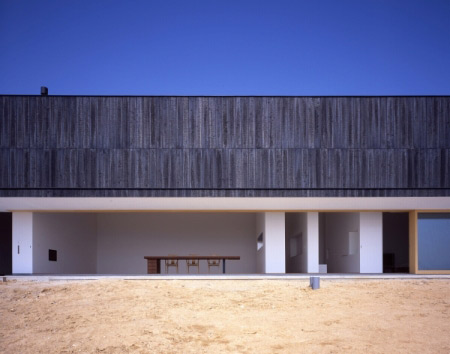
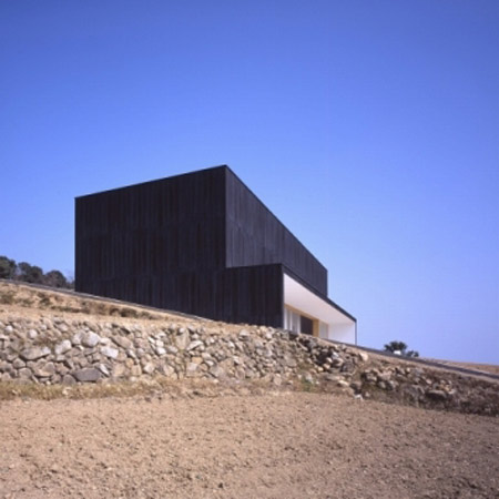
Tezuka Architects have designed a hillside studio-house in Ushimado, Japan.

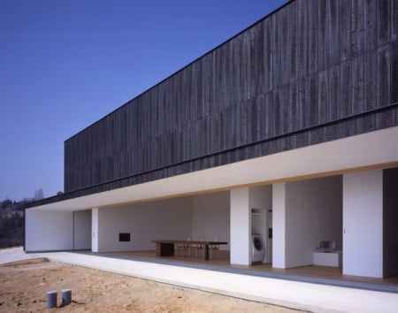
The house has a total floor area of 152 square metres.

Photographs are by Katsuhisa Kida.
Lighting design by Masahide Kakudate Lighting Architect & Associates.
Construction by Fujiki Koumuten.

That’s all the information we have for now.


–
Posted by Rose Etherington


August 27th, 2008 at 11:31 am
Beautiful framing of nature in the views
August 27th, 2008 at 11:52 am
nice design. object-like architecture. what about the context? It doesn’t fit. I think the hill is to small for such a form
August 27th, 2008 at 12:10 pm
Superb essay in minimalism.
August 27th, 2008 at 12:46 pm
A woderful yet overwhelming sensation of emtyness
August 27th, 2008 at 12:59 pm
it’s so thirsty looking
August 27th, 2008 at 2:21 pm
sweet
August 27th, 2008 at 2:37 pm
once again…masterpiece from Tezuka… GR8!
August 27th, 2008 at 3:05 pm
Its incredible that simplicity would never stop to be beautiful.
Its refreshing to see that some architecture.. remains architecture.
August 27th, 2008 at 3:26 pm
That is one STEEP driveway!
August 27th, 2008 at 5:17 pm
…sweeeet though!
August 27th, 2008 at 6:04 pm
great but kitchen is tiny..cant cook in there..
very pleasant place.
August 27th, 2008 at 7:09 pm
I wish it were a bit moremenal.
August 27th, 2008 at 7:44 pm
by japanese standards, that is a very generous kitchen space… and I actually think that the stepped layering of the hill’s landscape combined with the house’s horizontally proportioned front elevation makes it blend quite nicely from a distance.
lovely work and beautiful sleeping and lounging space. Incredible views, oh wonderful Japan and wonderful Tezuka….
August 27th, 2008 at 9:39 pm
sweet
August 27th, 2008 at 9:42 pm
Edward, do you have to sound so pretentious?
August 27th, 2008 at 9:45 pm
huh.
August 27th, 2008 at 11:28 pm
please post some drawings and more interiors… lovely project!
August 27th, 2008 at 11:51 pm
…omg!
It is so cold….
… nature?
Sweet?
I am so sorry but I canot see this elements here!
R
August 27th, 2008 at 11:56 pm
Bleak
August 28th, 2008 at 4:52 am
Tidy.
August 28th, 2008 at 7:43 am
who lives like this? don’t these people sit down?
August 28th, 2008 at 8:24 am
If design is to make sense, then I guess only Japanese designs do nowadays. Many developing eastern countries are too eclectic, while look at the nonsense designs from the west. Where is the balance?
August 28th, 2008 at 10:16 pm
landscaping seems not finished or disconnected
August 28th, 2008 at 10:52 pm
Beautiful project and enormous by Japanese standards.
The landscaping is clearly not planted yet.
August 29th, 2008 at 10:27 am
yes a very nice project indeed,..but…..why doesnt anybody refer here with some copy paste criticism to shigeru ban???…so can we say that that copies of less expressive forms do not associate peoples mind to similar projects,??,..id like come comprehensive answers or a discussion….
August 31st, 2008 at 11:37 pm
I simply love the inability of design professionals (are they?) to realise that architectural photographs are NOT about the way people LIVE. Often these are to support the actual concept, first as an abstract model and then as a built result. They give the architect an opportunity to communicate the actual spatial intentions using the photographic media as a follow up to the initial sketches. These photographs are mostly taken before any occupants move in. And the Japanese do this beautifully - they keep the spaces empty or very sparsely furnished so that the architecture is kept visible rather than being concealed behind mountains of design objects and general clutter absorbing all the attention.
September 1st, 2008 at 1:52 pm
am the only one who things it is a bit dark inside?
September 2nd, 2008 at 10:44 am
To add to Mama’s text; can I just say that when we look at architectural intentions and the way they are portrait by our eastern friends… this is not at all dissimilar from most western architects apart of course from the zhahhahahahahas of this world whose concepts are hollow and cold but truly consistent when realised… they remain pointless exercises of inflated egos….
This project on the other hand captures a Zen like quality which only true architecture can achieve.
September 2nd, 2008 at 9:21 pm
Well…that’s one solution for a house on a hill. It might have worked better in the valley.
September 10th, 2008 at 4:09 pm
Minimalist, minimalist, minimalist, LESS IS MORE!! Mies Van Der Rohe was right!! All of Tezuka’s work are superb. Great Work..
October 23rd, 2008 at 1:40 am
It’s like a Japanese version of something Mies would have done. Beautiful. I think this would make a fantastic place to work and live.
October 23rd, 2008 at 1:44 am
One thing though: does that thing in the front of the house ever drop down/close? Or does it just never rain wherever this is? Because if it doesn’t and it does, those nice beds and desk and washer/dryer thing are gonna get WET.
October 24th, 2008 at 2:52 am
Ismeal: There’s a big muti-stacking-sliding door to the side.
Amazing space inside but the proportion of the low level extrusion at the front seems a bit squat.
Love the rough, dark external texture contrasting the smoothness of the pure white interior.
November 6th, 2008 at 5:43 pm
woooooooooow