
Venice Architecture Biennale: here are some images of Symbiotic Villa, a house designed by Zaha Hadid for the Next-Gene 20 project in Taiwan.

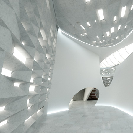
The project has invited ten international architects and ten Taiwanese architects to design houses. More info and images in our earlier story.

The project was launched in Venice last week during the architecture biennale.

–
Posted by Matylda Krzykowski


September 17th, 2008 at 1:40 am
Appropriatly extravigant architecture as we have come to expect
from our mathematical and technologically driven philosopher.
September 17th, 2008 at 1:49 am
Yet another reason why Zaha is heralded as the World’s Greatest Architect
September 17th, 2008 at 3:55 am
This geological form inspiration is so tired–when will we see real inspiration from the landscape? I’m talking about orchestrational architecture. One that is less a solid, permanent form that tries to look like the plane of the land, and more one that is involved in a network of flows and forces in the environment…
Hadid and Schumacher need to push themselves more.
September 17th, 2008 at 7:10 am
Jetson’s family house ? … but it’s nice …
September 17th, 2008 at 8:18 am
wow! but i think we had enough, no !!!!
it’s so deja vu.
September 17th, 2008 at 8:30 am
LuvS it MY gurlFreens!!
Hottness we can Hav sum cRUNK parties in this shaggin pad
September 17th, 2008 at 8:36 am
I love this structure. Zaha never stops to impress I mean those windows are stunning the way they capture the light. Well done zaha another triumph in design!!!!!
September 17th, 2008 at 8:37 am
Hmmm, website doesn’t seem to mention anything of Zaha? Nor do the firtst and last render seem to match.
September 17th, 2008 at 9:03 am
Maybe she convinced the client she can design all the villas for half the price
September 17th, 2008 at 9:10 am
more information
September 17th, 2008 at 9:17 am
thank you 3Dsmax !
pictures are wonderful ! light is perfect ! textures are nice !
architecture is … zaha hadid …
(not surprising)
September 17th, 2008 at 9:20 am
hehe, it really is so, the first two renders are of a different house than the other two…
anyway, it so boring… recycling, recycling
to me it seems a waste of material and energy… i want to see some modesty and humanity..
doom is the new religion
September 17th, 2008 at 9:23 am
Finally!…something nice from zaha……wooooooooo…thought so lost her luster for a sec
September 17th, 2008 at 9:47 am
the 2nd picture is great… i love the inside with the perforated walls in different angles… nice wall… the building? well not much to talk about with this couple of images which doesnt even match each other…
September 17th, 2008 at 9:56 am
Nothing dates faster than Zaha Hadid
September 17th, 2008 at 10:21 am
Yet another reason why Zaha is heralded as the World’s Greatest Architect…. WTF!!!??
September 17th, 2008 at 10:39 am
another museum!!! i’m sick and tired of seeing another sculpture of Zaha.She designs buildings like dresses .another female artist!!!!
September 17th, 2008 at 11:08 am
mariusz… do you really think SHE designs these buildings?
September 17th, 2008 at 11:37 am
crap
September 17th, 2008 at 12:03 pm
i agree with sandor, the first image and the last image, from above, do not match. She pumps this stuff into the atmosphere like no other and seemingly has forgotten to edit. Slow down…look at what you are producing…take a big giant step back and find something interesting to say again. If you dont know, the horse is dead.
September 17th, 2008 at 4:02 pm
why do we choose do build so complex, so expensive, when so much easier is available and can be beautiful.. oh.. I guess it’s because we can..
September 17th, 2008 at 4:22 pm
ups she did ist again
nice, but hadid. always the same, the same, the same, the same,……..
looks like two different designs (image 1+2 and 3+4)
September 17th, 2008 at 4:30 pm
yup The first & last dont match, if so please show us the relation!
&
Yet another reason why Zaha is heralded as the World’s Greatest Architect…. WTF!!!?? WTF???
September 17th, 2008 at 4:52 pm
So many haters on Zaha, I wonder why…should only our own works be anywhere near what she’s accomplished. Coincidentally, no one here posts anything of their own worthy of praise, or of what’s more typical of the dezeen crowd, senseless criticism on the purely subjective. Bullshit, I say. If only you had clients willing to want the unconventional. I guess you’re all haters of Eisenman, Tschumi, Libeskind, Gehry, Moss, Mayne, Himmelblau, Denari, etc. etc – all of whom, pump out a signature style.
September 17th, 2008 at 4:55 pm
Looks very Hadid!!:D
September 17th, 2008 at 4:56 pm
Looks very Hadid!:D
September 17th, 2008 at 4:58 pm
ITS GOING WORST AND WORST!! NO FORM..NO IDEA.. NO TOUCH…JUST SOME GUY PRODUCED THIS BY RHINO…..SAUSAGE FACTORY………..
September 17th, 2008 at 5:28 pm
I totally agree with scruces above.
September 17th, 2008 at 5:51 pm
“You’d be surprised how much it costs to look this cheap!”
{Dolly Parton}
September 17th, 2008 at 5:52 pm
Zaha’s game is over
September 17th, 2008 at 6:21 pm
soooooo “WHATEVER!”
September 17th, 2008 at 6:22 pm
worlds greatest architect? according to who? Jamie are you actually zaha punting yourself online-shame on you!
September 17th, 2008 at 9:00 pm
wow this must be the best project ever conceived my a human mind! … I tell you what it is a good thing we’re heading into recession, coz it will stop a lot of this crap even coming out of the sweat shop
September 17th, 2008 at 9:08 pm
scuces;
don’t forget spuybroek.
does anyone ever wonder if these images are produced and ‘”launched” just to create this kind of bickering?
September 17th, 2008 at 9:37 pm
scruces and others who super back Zaha. I like Zaha but you cant tell me her recent stuff isint starting feel a bit… Formulaic. She clearly can think out side of conventional forms but I’d like to see something new not something that feels a little rehashed.
September 18th, 2008 at 12:36 am
It is an interesting light based design, but I am left wondering what they did with utility? Is it just not apparent from the pics, or did they completely ignore the needs of a person living in the space? Also, all those small windows with their angled sills appear to be a magnet for dust, making the place lose it’s appearl after an initial year of wear. Not trying to be overly harsh, but it is supposed to be a house first, sculpture is nice, but the identity should come first.
September 18th, 2008 at 4:52 am
I think I am as bored with this Zaha branding architecture as she herself seems to be. This is really uninspired stuff.
September 18th, 2008 at 6:34 am
its so funny how so many of u hate her style of architecture but are still compelled to view her work and comment on it.
September 18th, 2008 at 10:23 am
so boring. blobitecture at its worst. who on earth would really live in a place like this? It looks like it will cost $10million to build.
September 18th, 2008 at 11:00 am
I bet damien hirst would have no problem dropping 10 million on a zaha house.
September 18th, 2008 at 1:15 pm
an aura of insincerity and lack of depth.
September 18th, 2008 at 5:43 pm
She seems popular on this site(slurp)
I have not seen the shoes she did for Melissa- will get to see them tonight..
September 18th, 2008 at 6:25 pm
yeah, Zaha’s done!
Nothing left to salvage here.
September 18th, 2008 at 7:47 pm
I only can repeat what Benjamin says:
“an aura of insincerity and lack of depth.”
September 19th, 2008 at 2:44 pm
yeah, game over…
September 19th, 2008 at 4:11 pm
WTF. Bullshit. disgusting building
September 20th, 2008 at 4:21 am
This architecture don’t have an identity, well.. may be we can guess who is the architect that design it, but this architecture can be place in everywhere, it has no context !!
Meaningless architecture…
September 20th, 2008 at 1:38 pm
September 20th, 2008 at 1:45 pm
Now on a more serios note. Wenn a building looks one way on one side and another on the other it’s usually due to some site conditions. Usually this happens in an urban setting. I could easily picture Noah’s ark facade between 2 firewalls and the back of the house between them also, but at the back. Here thow there seems no need for this approach.
September 21st, 2008 at 8:20 am
leave her alone will ya… at least she’s proven herself… and for a woman, it’s outstanding.show what you haters has achieved, and compare it to what zaha has.look in the mirror first before you start comparing yourself to others.no one is perfect.everything has it flaws…critics and comments are important…but i think it can be really appreciated better if it’s being said ellegantly.i’m not a fan of zaha either,but at least she’s one of a kind.i like rem koolhaas better.but everybody has their own identity and uniqueness…how they approach the design.we better start to appreciate each other more responsibly.
September 21st, 2008 at 1:06 pm
enough is enough!!!!!!!!!!!!!!!!!
September 22nd, 2008 at 12:06 pm
i suppose the first 2 fotos show the house for the maid..located about a lime away from tha main site………
September 22nd, 2008 at 12:06 pm
a MILE away!
September 23rd, 2008 at 9:55 pm
This truly impressive the curviture in the lines to the structure almost make it life like, very natural feeling, very beautiful landscapes to go with the works of art.
October 8th, 2008 at 7:47 pm
This is getting awful,… somebody take her in their practice, this woman is the uber-ugly-design-and-persona… and for those that are wondering,… I love the women in architecture, but c’mon, Zaha has to quit early enough to remain as an influence and not burry herself in the humility that is already starting to grow on her buildings-to-be