
Slovenian architects Ofis have completed an apartment block in the centre of Nova Gorica, Slovenia.
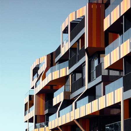
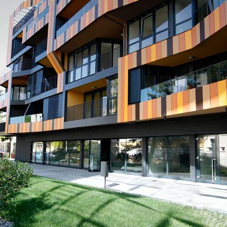
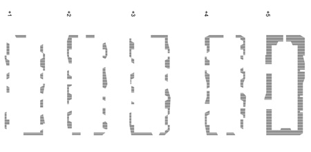
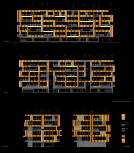
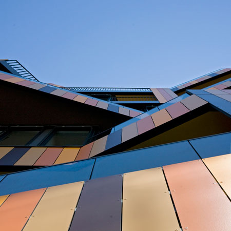
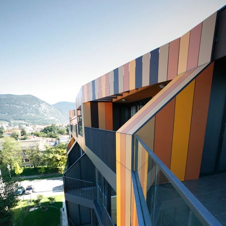
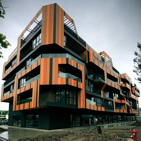
The facade is composed of a 3D “lace” pattern that generates elements such as balconies, terraces and pergolas.

Photographs are by Tomaz Gregoric.

The following information is from Ofis Arhitekti:
–
Lace apartments
The location of the apartment block is in the centre of Nova Gorica (population 32.000) – Nova Gorica is situated in the west of Slovenia, adjacent the Slovene – Italian border. It lies 92 meters above sea level.

The town has also very specific climate conditions – it is renowned is the hottest town in Slovenia in summer and very strong winds in winter.

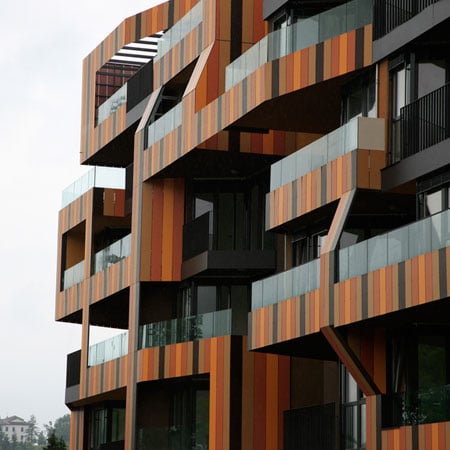
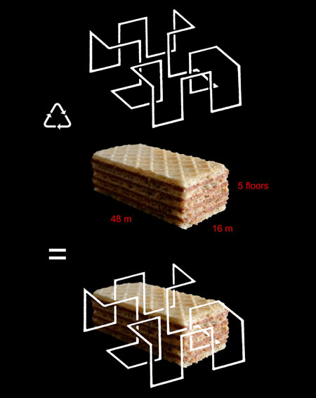
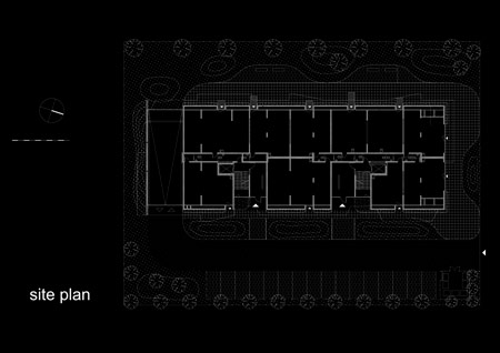
The object is positioned on the fixed urban plot 48 x 16m x 5 floors. The formal concept reinstates three-dimensional lace which embraces the volume of the building.

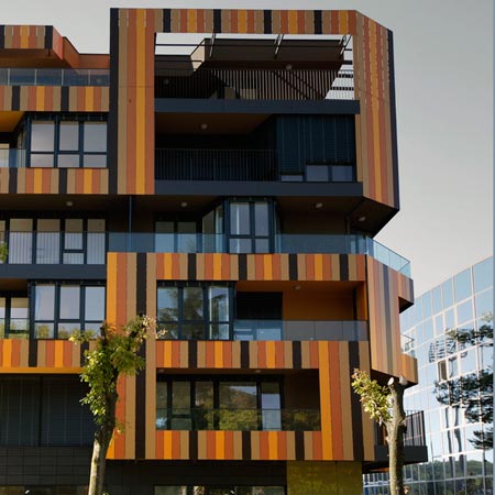
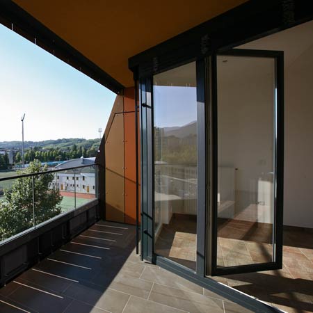
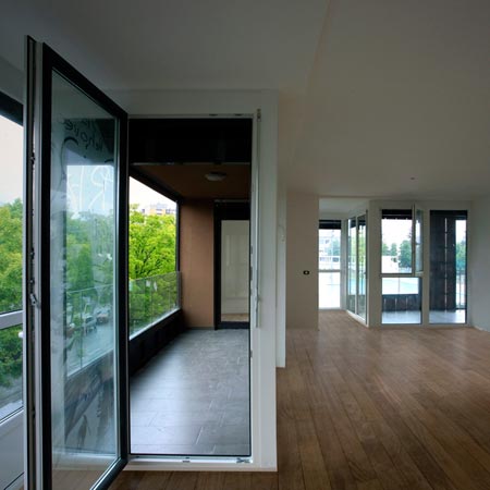
Furthermore, the lace is transformed into functional elements – projecting roofs, pergolas, apartment dividing walls, terraces and balconies with loggias.

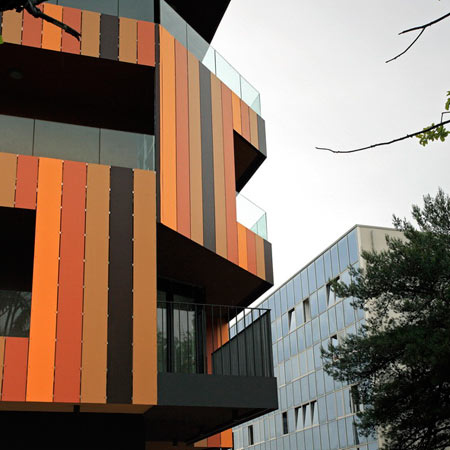
These elements are protecting external spaces and interior of apartments and provide additional privacy to inhabitants.


–
Posted by Matylda Krzykowski


September 23rd, 2008 at 9:03 am
booooooooring!
September 23rd, 2008 at 9:54 am
I like this!! Pretty interesting..
September 23rd, 2008 at 10:17 am
It is funky, but it looks like a cheap imitation of dutch architecture…with undetermined relation to the context.Apparently we need a waffle and a hint of continiuos mobius loop….made out of Alucobond..and here we are-CONNCEPTUAL ARCHITECTURE……instead of trying to make buildings ugly and to show that proudly here, some rchitects should concentrate on the fact that at the end of day they have maybe produced nice typologies for the flats
September 23rd, 2008 at 10:43 am
Love the use of colour on this building.
September 23rd, 2008 at 11:53 am
happy happy.. joy joy..
September 23rd, 2008 at 12:35 pm
This is a better Dutch architecture!
September 23rd, 2008 at 1:01 pm
how do the rooms and the users profit from this facade game? and why is there a moebius-like (non moebius at all…) loop? why not creat spaces with the context and the neighbours in mind? hmmm… looks a bit like made in the lab and then planted into the real world to me…
September 23rd, 2008 at 1:05 pm
I like that ; and much more advanced than current trends of spinning architecture and similar. And some comments here are so of-the-road that you can actually feel frustration of the writers of that comments much more than published projects.
September 23rd, 2008 at 1:12 pm
pretty and interesting! It is not very easy to do something of 16×48 waffle
September 23rd, 2008 at 1:26 pm
looks like a mid 70ies town hall that you can find in every german city destroyed during ww-II….even painted in such colors (inside only though). people will beg to blast it in 20 years…
September 23rd, 2008 at 2:30 pm
Knowing german architecture : I wish german architect would produce architecture like that; ..they wish.
September 23rd, 2008 at 2:53 pm
the corner looks a if the house number would be 69…
Is it?
September 23rd, 2008 at 3:33 pm
oh dear, the kids these days.!
September 23rd, 2008 at 3:50 pm
As usual plans are necessary to really understand the project, but the guiding concept seems to be private terraces-a worthy goal. I dislike the orange color and the industrial aluminum storefront type for glazing. The interior shot looks attractive except for that.
September 23rd, 2008 at 5:00 pm
I see quality in transforming cube into dynamic form like that; also agree with pekka
September 23rd, 2008 at 6:14 pm
horrible y conceptualmente flojo.
September 23rd, 2008 at 9:45 pm
ugly as can be.
September 23rd, 2008 at 9:51 pm
I saw their other projects, these guys are obviously colorblind.
September 23rd, 2008 at 10:42 pm
Congratulations! The world is a bit better.
September 24th, 2008 at 2:21 am
…biscuit…?
September 24th, 2008 at 2:33 am
the concept looks so superficial and smoked. if this form is what the designer wants, please admit it.
September 24th, 2008 at 7:24 am
too 70’s… poor materials quality, in 5 years will look like shit
September 24th, 2008 at 12:45 pm
I don’t get the loop. It is so superficial and unnecessary. In combination with the complicated facade topography it is too much. The building would been much better (maybe even great) without it.
September 24th, 2008 at 3:41 pm
ick.
September 24th, 2008 at 3:42 pm
akward……
September 24th, 2008 at 5:26 pm
they used a cookie? haha awesome.
September 25th, 2008 at 8:26 am
GREAT OFIS! You’ll beat them all
September 25th, 2008 at 11:37 am
I don’t know why, but I like this building very much; but I don’t know if I’d want to live there. I think it will look a little silly to some people twenty years from now — in fact it may look silly next year. Perhaps they’ll replace the panels, probably with wood.
However, the wafer crisp business is extremely silly. As punishment they must stand in the corner for five minutes.
September 25th, 2008 at 1:22 pm
Art coming to architecture; why not
September 25th, 2008 at 3:00 pm
Its easy to get it wrong using colour like that.
but i think they’ve got it spot on.
September 26th, 2008 at 8:46 am
I am very impressed by their opus OFIS already did till now. Each project has new inventions I have not seen before. It is worth to study it. They certainy make a powerfull stuff. Check the other projects on dezeen
September 26th, 2008 at 8:49 am
TI AMO OFIS
September 27th, 2008 at 3:31 pm
beautiful
October 4th, 2008 at 11:28 am
i love it