November 6th, 2008

fortis-iq-watch-by-rolf-sachs-squiq-watch-fortis_rs.jpg

Designer Rolf Sachs has created a watch with a blackboard-style face for watch brand Fortis.

fortis-iq-watch-by-rolf-sachs-rolf-sachs_fortis-watch.jpg

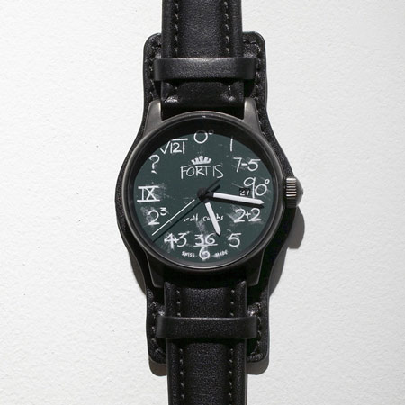
The watch, called IQ, has a dark green face and all the markings and hands glow in the dark.

fortis-iq-watch-by-rolf-sachs-fortis_rs.jpg

According to Sachs, the concept emerged from a shop window he designed for London department store Selfridges, shown below.

fortis-iq-watch-by-rolf-sachs-iq-watch-fortis_rs.jpg

The following information is from Rolf Sachs:

FORTIS IQ Watch Rolf Sachs

“I am always in search of the new”

FORTIS IQ Watch Rolf Sachs

“I am always in search of the new”. This quote characterizes the artist who is well known for his puristic design. With this design he wants to address the human senses, in his art the decorative and graphic steps into the background. Chalk is transitory, waking the childhood memories in everybody - leading from the sterile to the human.

fortis-iq-watch-by-rolf-sachs-9-detail.jpg

Originally the concept for the Rolf Sachs artist edition “IQ Watch” emerged from a surrealism shop window design for Selfridges, a department store in London, on the occasion of a DADA exhibition in the Victoria and Albert Museum.

fortis-iq-watch-by-rolf-sachs-rolf-sachs-surrealist-selfr.jpg

It deserves closer attention to be understood better. The humorous aspect of this design characterises the artist’s personality. Only at second view the secret of its concern is revealed. This inventive FORTIS edition, created in the spirit of the Dadaism unites playful and ease with the perfection of its mechanical inner life. Limited edition of 999 exemplars individually numbered.

Available to buy from:
www.fortis-watch.de


Posted by Rose Etherington

22 Responses to “Fortis IQ watch by Rolf Sachs”

  1. K. Rimane Says:

    Oh look, a silly watch someone decided to call IQ. A Constant search for the “new”
    Dezzen, we’re still waiting for the “rubbish” section.

  2. Emerson Says:

    I don’t get it. It’s not really clever or witty or pretty. It’s just chalk lettering.

  3. isobel Says:

    it doesnt seem like they thought too hard about the “numbers” - im no mathematician but surely there are more interesting equations etc. they could have put there? not “7-5″ (= 2.)

    1?? surely there’s some non-real maths thing that equals 1? like square root of negative 1? or square root of 1, even??

    sheesh, come on!! for 10 they put a question mark!! thats just lazy.

  4. pangkcoy Says:

    ahhhhh! like this watch alot! its like bringing back the school days! nice…

  5. Kim Says:

    It’s an homage to DaDaism.
    It should be as simple as that, a play on materiality with humor, something very beginning of the 20th century…

    Obviously, K.Rimane and Emerson have no clue and maybe no knowledge about art history….

  6. monsieur! Says:

    well art history is pretty boring

    the question mark for the 10 is rubbish

  7. pop Says:

    it could have been nicer if they replaced the cover glass with an empty chalk board surface and then you can fill in whatever suits you..

  8. weaksauce Says:

    Why does everybody on dezeen critique projects on the negatives. There is never any intelligent dialogue critiquing projects on an intellectual level. Criticism is is left to how it looks/how it works. Isnt there more? No wonder all of zaha’s formal investigations end up the way they do. That is the only thing people know how to “critique” if it can even be called that.

  9. joe Says:

    i like it a lot!!

  10. Flip Says:

    Well, I think its a nice and tough looking watch. The thick-stitched leather has something airborne - 30ies/80ies to it. The Face is ambivalently schoolish yet reminds me of militaristic planning and coding. It would have been consquent to skip the brand and find another face for the date, eg at least have the digits on a chalkboard green background. Obviously a narrative design like that tires most people quicker than a sober layout. But for the overall feel, I like it. I wonder how moch it costs?

  11. Matt Says:

    I like the concept, but the math is aggravatingly wrong:

    0^0 = 1, not 0 or 12.

  12. sc hu yl er Says:

    Yeah, clever enough, but it’s really weird that the date remains so conventional

  13. theobold Says:

    A little ordinary for the price they are asking, and Schuyl, the date is conventional because it is from a external movement manufacturer that i suspect is totally unmodified by fortis.

  14. theobold Says:

    Cost is around US $1k btw

  15. Stan Says:

    It’s nice!

  16. Plankton Says:

    Again, I am bored about guys who are just able to post bad and stupid comments… That watch is very cool, you like it or not, and it’s definitely not rubbish.
    Well done Mr Sachs, I like your style!!!!!

  17. Matty D Says:

    Matt, the 0^0 is actually ‘0 Degrees’, not zero to the zero power which is one, as you said. Just like to 3 is ‘90 degrees’. That being said, i like the concept, but some of the equations are pretty lame. I mean, 36/6, come on…

  18. steff27 Says:

    I guess the 0^0 is not 0^0 at all but 0 degrees=0 (or 12). What do you think???

  19. gaque Says:

    the face is unique and fun. its not cheesy or over the top, so i think its quite cool.

    besides that, the band is also quite cool. id love to have this watch.

  20. Harlem Loves... Says:

    I think this watch is great although it might make some take just that little bit longer to tell the time…

  21. JANE Says:

    CAN I ORDER THIS WATCH???(FORTIS IQ Watch Rolf Sachs)

  22. kevin Says:

    I want to buy one. Is it available now???

Submit a comment

See our comments policy